Wall Art Guide, Wall Art Tutoriels
Mustard Wall Art: Yellow Gold Warm Retro Color Designs
Oct
So I just finished rearranging my living room for the third time this month and honestly mustard wall art is what finally pulled everything together, which sounds dramatic but wait let me explain.
Why Mustard Actually Works When You Think It Wouldn’t
Okay so mustard yellow gets this weird reputation like it’s too bold or too retro or whatever, but here’s the thing – it’s literally one of the most forgiving accent colors I’ve worked with. I had this client last year who was terrified of color, like full-on beige everything, and we started with one mustard print above her couch and suddenly the whole room felt intentional instead of just… existing.
The trick is that mustard sits in this perfect spot between warm and earthy. It’s not screaming at you like bright yellow, but it’s also not trying to disappear into the wall like cream. Think of it as the color equivalent of that friend who’s always down to hang but never makes everything about them.
What Actually Looks Good vs What Pinterest Lies About
I’m gonna be real with you – not all mustard art is created equal. I’ve bought some truly terrible pieces thinking they’d look like the Instagram photos and then they show up looking like someone printed them at a gas station.
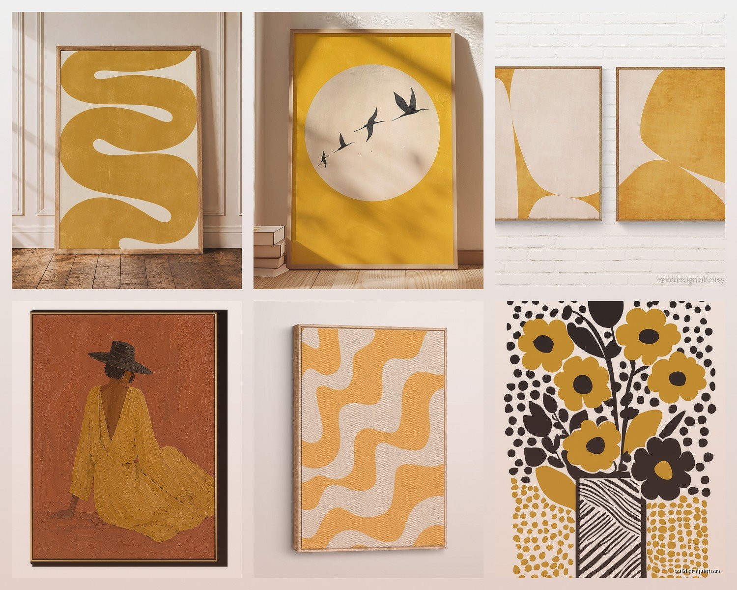
Abstract geometric stuff works ridiculously well in mustard. Those mid-century modern circles and lines? Chef’s kiss. I have this set of three prints with overlapping circles in mustard, burnt orange, and cream that I literally stare at while drinking my coffee. Got them from this Etsy shop after my cat knocked over my previous art and shattered the frame, which was honestly a blessing because those old ones were kinda ugly.
Botanical prints in mustard tones are hit or miss. The ones that work are usually more illustrated or vintage-looking rather than photographic. Like those old botanical study drawings but colorized in gold-mustard shades? Yes. A photograph of yellow flowers with a mustard filter? Usually no.
Typography and quotes – okay this is gonna sound weird but I’m super picky about these. Most quote art feels very 2014 Etsy to me, but if you find something with really good typography in a deep mustard with maybe navy or charcoal text, it can work. The key is the font can’t look like it came from Microsoft Word circa 2003.
Size and Placement Because Everyone Gets This Wrong
I see people buy these tiny 8×10 prints and hang them on a massive wall and wonder why it looks off. Here’s what I actually do:
For above a couch or bed, you want your art to take up roughly two-thirds to three-quarters of the furniture width. So if your couch is 84 inches, you’re looking at something around 56-63 inches total. This can be one large piece or a gallery wall situation.
Gallery walls with mustard art are tricky because mustard demands attention. What works: mixing mustard pieces with black and white photography or charcoal drawings. The neutral pieces give your eye somewhere to rest. What doesn’t work: all mustard everything in different shades. That’s just chaos and not the fun kind.
I hung a 30×40 inch mustard abstract in my entryway and it’s literally the first thing people comment on. It’s big enough to make a statement but the color is warm enough that it doesn’t feel aggressive. Hung it about 57 inches from the floor to the center of the piece, which is standard gallery height but also just happens to be perfect eye level for most people.
Frames Matter More Than You Think
Oh and another thing – frames can make or break mustard art. I learned this the expensive way.
Natural wood frames in light oak or maple are *perfect* with mustard. They enhance that retro-warm vibe without competing. I use these probably 70% of the time.
Black frames create really nice contrast and make the mustard pop, but they also make things feel more formal and gallery-like. Great for a dining room or office, less great for a bedroom where you want things softer.
Gold or brass frames – you’d think these would be too matchy but thin gold frames with mustard art actually looks really sophisticated. Just keep the frame simple, not ornate.
White frames can wash out mustard art unless the piece has other strong colors in it. I generally skip these.
This is gonna sound weird but I always check if the frame has the hanging hardware already attached because I am lazy and also bad at measuring. Some prints come ready to hang and others require you to buy picture wire and those little triangle hangers and honestly I’d rather just pay an extra $10 for someone else to deal with that.
The Canvas vs Print Debate Nobody Asked For But I’m Telling You Anyway
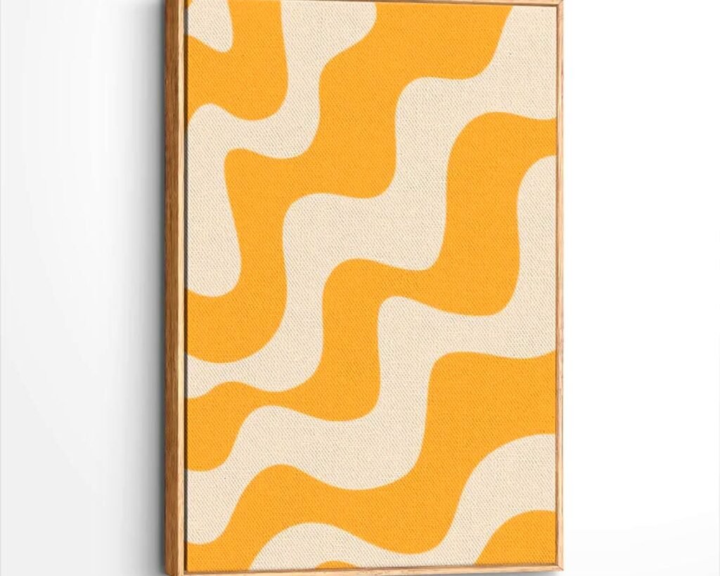
Canvas prints in mustard shades have this textured, laid-back feel that works great in casual spaces. They’re also lighter weight which matters if you’re hanging stuff on drywall without studs. But the colors can sometimes look muddy on canvas if the print quality isn’t good.
Paper prints behind glass or acrylic look crisper and the mustard tones stay more vibrant. The downside is they’re heavier and the glass can create glare depending on your lighting. I use both depending on the room and the specific piece.
Where to Actually Buy This Stuff
Okay so I’ve bought mustard wall art from basically everywhere at this point and here’s what I’ve learned:
Etsy is still my go-to for unique pieces and downloadable prints. You can find really specific styles and a lot of sellers let you customize colors. Just read the reviews because some shops have terrible print quality. I look for shops with at least 500 sales and 5-star ratings.
Society6 has a huge selection and the quality is consistent. Their mustard tones tend to run a bit more golden-orange than true mustard, which I actually prefer. They also do the framing which saves me time.
Minted is pricier but their color accuracy is excellent. When I need a mustard that’s exactly the right shade to match something else in the room, this is where I go.
Target and West Elm have jumped on the mustard trend hard. Target’s stuff is obviously cheaper and trendier, West Elm is more curated but you’re gonna pay for it. I mix and match honestly.
Wait I forgot to mention Desenio – they’re based in Europe but ship to the US and have really affordable prints in tons of mustard-toned designs. Shipping takes forever but the quality is solid for the price.
Making It Work With What You Already Have
Here’s where people get stuck – they love mustard art but don’t know if it’ll work with their existing stuff. So here’s the actual truth about what mustard plays well with:
Gray walls or furniture: Yes absolutely, this is probably the easiest pairing. Any shade of gray from light to charcoal looks great with mustard accents.
Navy or dark blue: Classic combination, very retro-modern. This is what I did in my home office and I’m obsessed with it.
Terracotta and rust tones: Creates this warm, 70s-inspired vibe that feels current again. Just balance it with some neutrals so it doesn’t feel costume-y.
Sage green or olive: Surprisingly good together. Very earthy and botanical feeling.
Blush pink: This one surprised me but it totally works, especially in bedrooms. The warmth of both colors plays nicely together.
Black and white: Mustard adds the perfect pop of warmth to a monochrome scheme without being too bright or energetic.
What doesn’t work great: Mustard with cool-toned purples or bright reds. Also be careful with orange – it can work but easily tips into Halloween territory if you’re not careful.
Lighting Considerations That Nobody Talks About
This is important – mustard art looks completely different depending on your lighting situation. I have some pieces that look gorgeous in natural daylight but kinda muddy under warm incandescent bulbs.
If you have lots of natural light, you can go with deeper, more saturated mustard tones. They’ll look rich and vibrant. If your room is darker or relies on artificial light, stick with lighter, more golden mustards that won’t disappear into shadows.
I installed some picture lights above my mustard pieces in the hallway where there’s no natural light and it made such a difference. The warm glow on the warm tones creates this really inviting atmosphere, especially at night.
DIY Options If You’re Feeling Crafty
Okay so funny story – my client canceled last minute one day so I spent three hours making my own mustard abstract painting and honestly it turned out better than some of the stuff I’ve bought. You don’t need to be artistic at all.
Get a canvas, some acrylic paint in mustard plus maybe cream and a darker gold or brown, and just make organic shapes or geometric patterns. The imperfection actually adds to the handmade charm. I literally used painter’s tape to create clean lines and then filled in sections with different mustard tones.
There’s also those downloadable prints on Etsy where you buy the digital file and print it yourself. If you have access to a good color printer or can use a print shop, this is super affordable. Just make sure you’re printing on quality paper – the cheap stuff makes colors look washed out.
The Gallery Wall Formula I Use
Since people always ask about this – here’s my actual process for creating a gallery wall with mustard pieces:
Start with your largest mustard piece as the anchor, usually slightly off-center. Then add 2-3 smaller pieces in complementary colors or black and white. Mix orientations – some horizontal, some vertical, maybe one square. Keep spacing consistent at about 2-3 inches between frames.
I always lay everything out on the floor first and take a photo to see how it looks. Saves so many unnecessary holes in the wall. Then I use painter’s tape to mark where each piece goes before hammering anything.
The biggest mistake people make is hanging everything in a perfect grid. A little asymmetry makes it feel more collected and intentional rather than matchy-matchy.
Caring for Your Mustard Art
Real talk – keep this stuff out of direct sunlight. Mustard and yellow tones fade faster than other colors. I learned this the hard way with a print that went from rich golden mustard to sad pale yellow after a summer in a south-facing window.
If you have canvas prints, dust them gently with a microfiber cloth every few weeks. For framed pieces under glass, regular glass cleaner works fine but spray it on the cloth, not directly on the glass, so it doesn’t seep under the frame.
Also gonna mention – if you’re hanging anything valuable or sentimental, use proper picture hanging hooks rated for the weight, not just a random nail. I use those OOK hangers and they’ve never failed me, even with heavy framed pieces.
Look, at the end of the day mustard wall art is one of those things that sounds risky but actually isn’t. It’s warm without being cutesy, retro without being dated, and bold without being overwhelming. I’ve used it in modern spaces, traditional rooms, even that weird transitional style that’s everywhere right now, and it works.
Just start with one piece, see how you feel, and build from there. You’re not committing to painting your walls or buying a mustard couch – it’s literally just art that you can swap out whenever you want.