
Wall Art Guide, Wall Art Tutoriels
Nirvana Wall Art: Grunge Band Kurt Cobain Music Icon
Oct
So I’ve been helping clients figure out Nirvana wall art for their spaces for years now, and honestly it’s one of those things that can either look incredible or super college-dorm-poster if you don’t think it through. Let me walk you through what actually works.
Choosing the Right Type of Nirvana Art
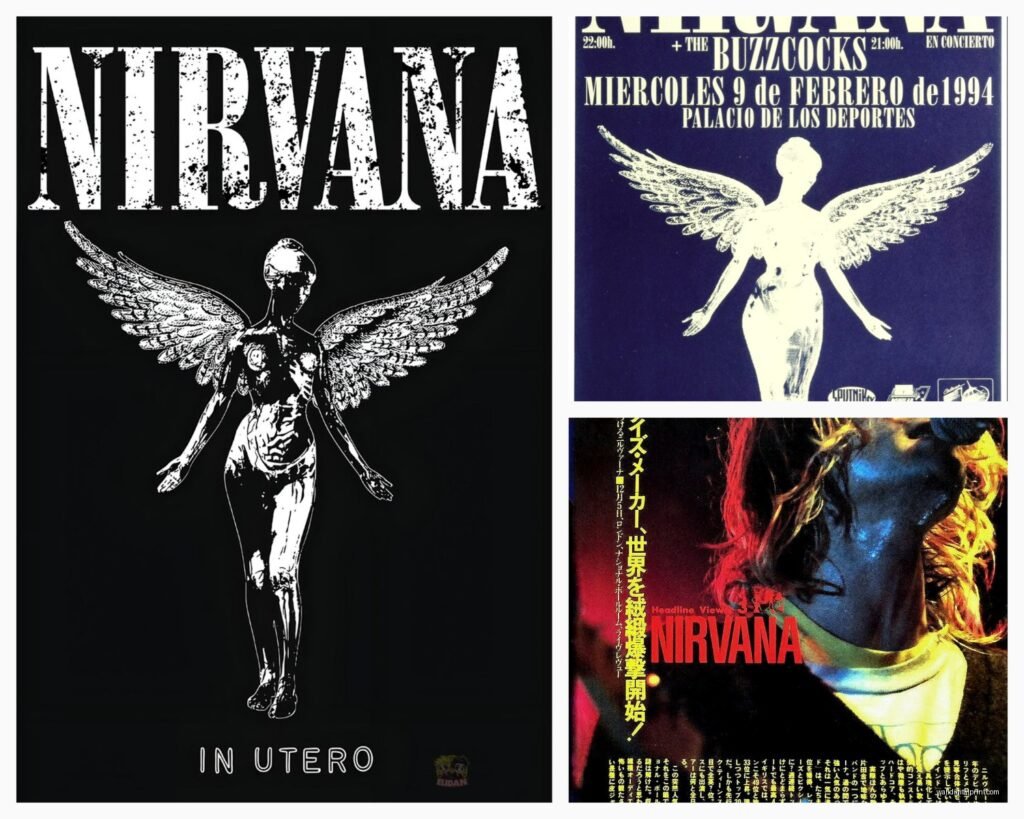
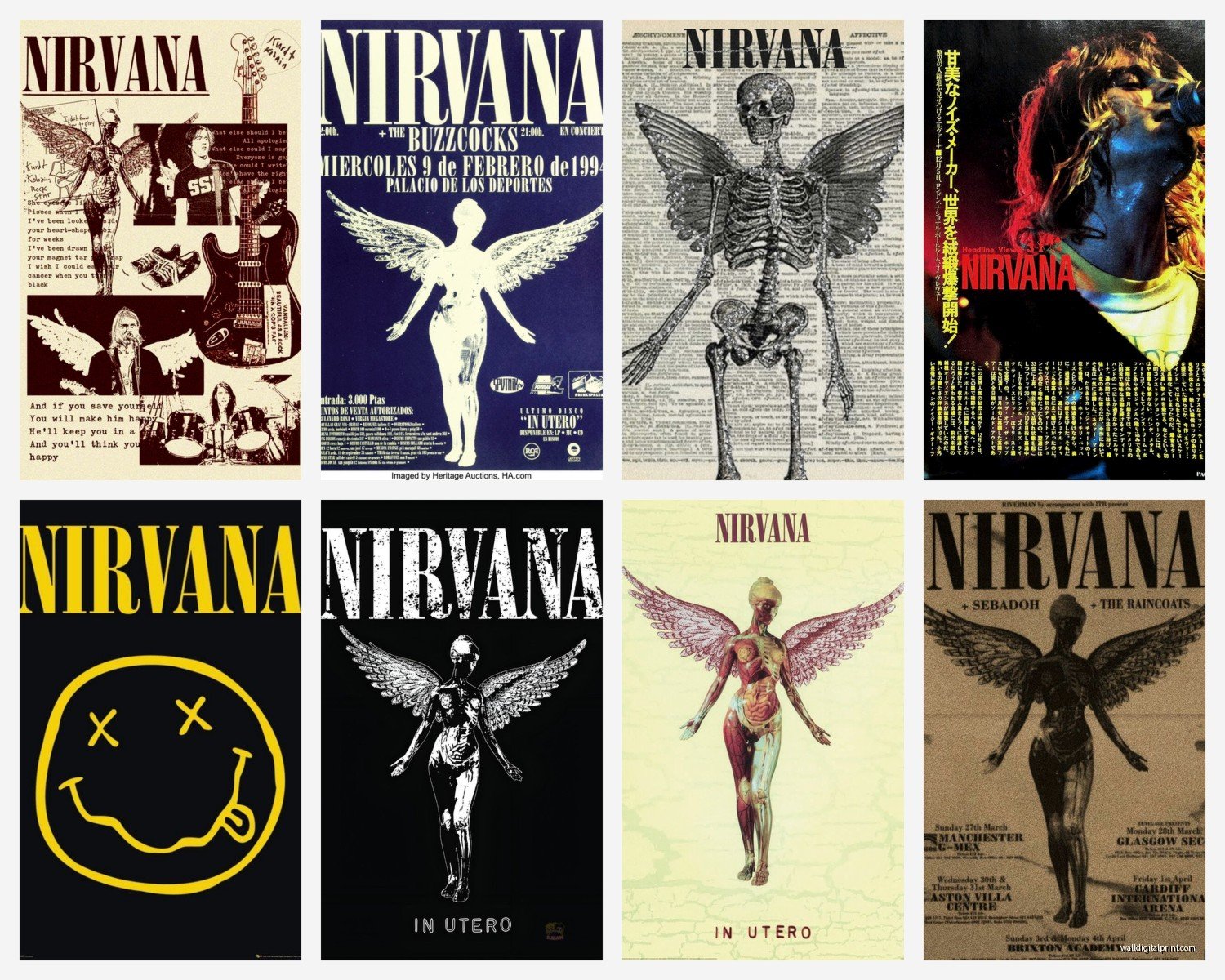
First thing—you gotta decide what kind of Nirvana vibe you’re going for because there’s a massive difference between vintage concert posters, abstract interpretations, and straight-up Kurt photos. I learned this the hard way when a client bought this giant canvas print of Kurt screaming and it just… overwhelmed their entire living room in a way that felt aggressive instead of cool.
Canvas prints are probably the most popular option and they’re everywhere. The quality varies wildly though. I always tell people to check the actual canvas weight—anything under 400gsm is gonna look cheap and you’ll see the texture through the print which is not the look. Museum-quality giclée prints on canvas are worth the extra money if you’re going bigger than like 24×36 inches.
Metal prints have been getting really popular for music art lately and honestly they work surprisingly well for Nirvana stuff, especially black and white photos from live performances. The metallic sheen gives this raw industrial feel that matches the grunge aesthetic. My neighbor got one for his home office and every time I’m over there I’m like yeah that actually works.
Framed Prints vs Canvas Wraps
Okay so this is where people get confused. Canvas wraps (where the image continues around the edges) look modern and you don’t need a frame which saves money. But for iconic Nirvana imagery—like album covers or famous photoshoots—I actually prefer framed prints behind glass. It gives them this preserved, archival quality that feels more intentional and less… I don’t know, less like you just stuck something on the wall.
Black frames work with literally everything Nirvana. White frames can look good too but only if your space is already pretty minimalist and bright. I tried a natural wood frame once with a Nevermind-themed piece and it just felt off—too warm for the vibe.
Sizing and Placement Strategy
This is gonna sound weird but I measure everything twice now because I once hung a massive Nirvana piece above a client’s couch and it was like six inches too wide for the space and we had to return it. The general rule is your art should take up about two-thirds to three-quarters of the furniture width below it.
For Nirvana art specifically, I’ve found these configurations work best:
- Single large statement piece: 40×60 inches or bigger for main living areas
- Gallery wall with multiple smaller prints: mix 11×14, 16×20, and 20×24 sizes
- Diptych or triptych: three connected panels that together span like 60-90 inches
- Corner arrangement: two pieces at different heights creating an L-shape
I did this gallery wall last month for a recording studio and we mixed vintage concert posters with some abstract pieces that just had lyrics from different songs. Looked way more sophisticated than just plastered Kurt faces everywhere.
Where to Actually Buy Quality Pieces
Alright so Etsy is honestly hit or miss. You’ll find amazing independent artists doing really creative interpretations—I bought this watercolor-style Unplugged portrait that’s gorgeous—but you’ll also find a ton of bootleg prints that are just stolen images with terrible resolution.
Check the seller reviews obsessively. Look for photos from actual buyers, not just the five-star ratings. And always always read what the listing actually says about licensing. If they’re selling official band merch reproductions without mentioning licenses, that’s a red flag.
Sites I Actually Use
Redbubble and Society6 have legitimate licensing deals for a lot of music art. The quality is pretty consistent and they offer different formats—posters, canvas, framed, metal, whatever. Prices are reasonable too, like $30-150 depending on size and format.
AllPosters and Art.com have official licensed Nirvana stuff. It’s more mainstream selection but the quality control is solid. I got a beautiful black and white Kurt portrait from Art.com that’s held up perfectly for three years now.
For vintage concert posters or rare prints, eBay can be good but you’re gambling unless the seller has like 99% positive feedback and detailed photos. I’ve found some legitimate gems there but also almost bought a fake twice.
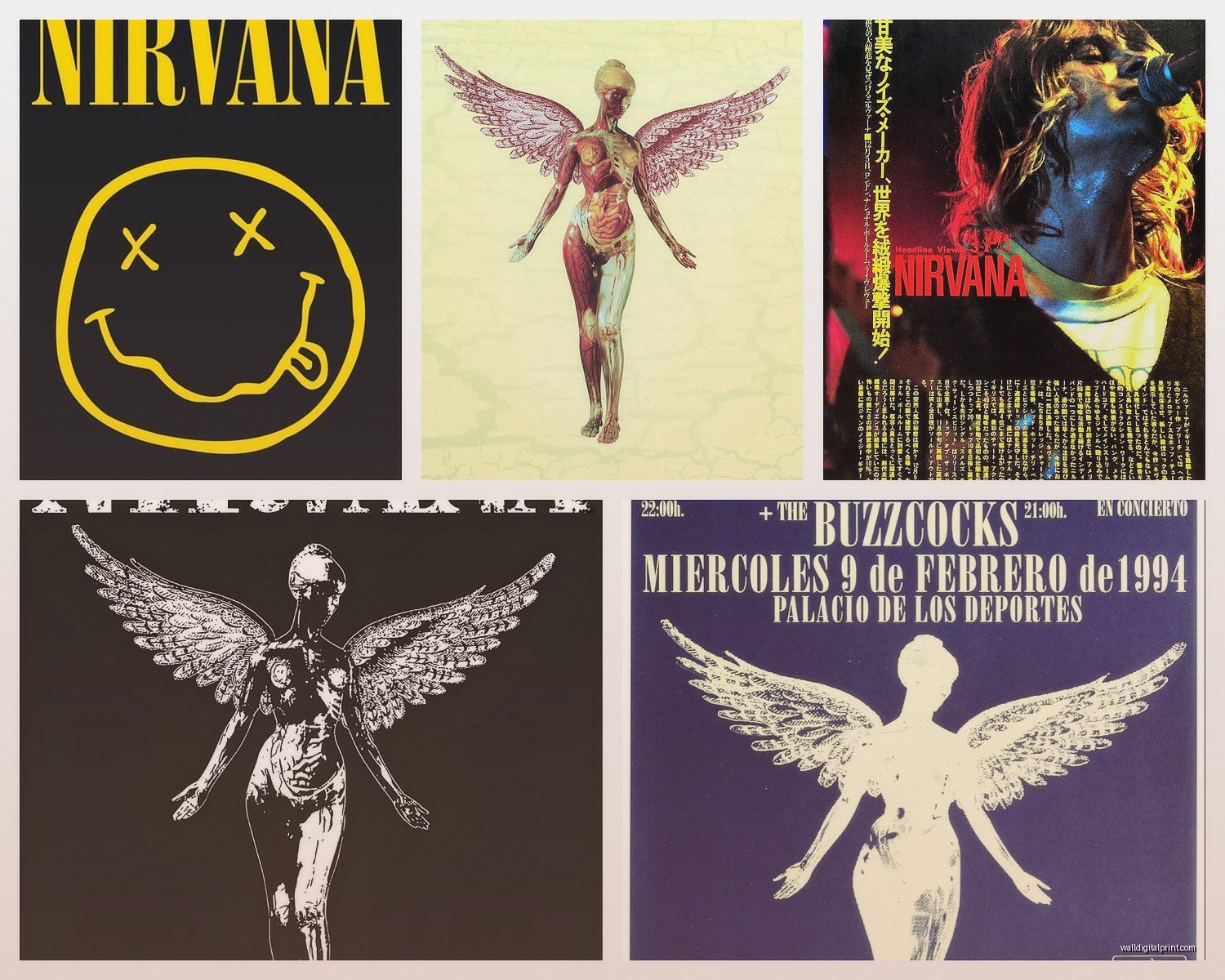
Oh and another thing—local record stores sometimes sell official band posters and limited edition prints. They’re usually priced fair and you can see the actual quality before buying which is huge.
DIY and Custom Options
If you want something unique, commissioning custom art is not as expensive as you’d think. I’ve connected clients with artists on Instagram who do amazing stylized portraits or lyric-based designs for like $150-400 depending on size and complexity.
You can also make your own if you’re crafty. I did this once where I took high-res photos from creative commons sources, edited them in black and white with high contrast, and had them printed at a local print shop on nice paper. Framed them myself. Total cost was maybe $80 for three 16×20 prints and they look professional.
Just make sure if you’re using photos or album art that you’re not selling them or using them commercially because copyright stuff gets messy. For personal home decor you’re generally fine but don’t like, post them on Etsy.
Styling Nirvana Art in Different Rooms
Living room is obvious but the execution matters. If your space is already pretty neutral—grays, whites, blacks—Nirvana art fits right in. But if you’ve got a lot of color happening, it can clash. I worked with someone who had this turquoise accent wall and we had to really carefully choose a print that had some color variation to bridge that gap.
Bedrooms work great for more intimate Nirvana pieces. Acoustic session photos, Unplugged-era stuff, or even just abstract designs with song lyrics. I have this simple print in my own bedroom that’s just the opening lines from “All Apologies” in nice typography and it’s perfect—meaningful but not screaming at you when you’re trying to sleep.
Home Offices and Studios
This is where you can go harder with the grunge aesthetic. Bold colors, intense photos from live performances, mixed media pieces. I set up a music producer’s home studio last year and we did an entire wall with Nirvana tour posters from different eras. Created this timeline effect that was actually really cool storytelling.
Music rooms or dedicated listening spaces are also ideal for collector-quality pieces. If you’re investing in expensive vinyl, might as well invest in quality art too. Frame actual vintage posters behind UV-protective glass, get signed prints authenticated if you’re going that route, treat it like the collection it is.
Color Schemes That Actually Work
Black and white Nirvana art is the safest bet and honestly usually the best looking. The raw photography from the early 90s already has this gritty quality that color sometimes dilutes.
But if you want color, stick with muted tones. Faded yellows, dusty blues, worn reds—think vintage concert poster vibes not bright pop art. I saw someone try to do Nirvana art in like, hot pink and neon green and it just felt disrespectful to the whole grunge thing, you know?
Sepia tones can work for a vintage feel. There’s this amazing sepia-toned print of the band from like 1991 that I used in a client’s basement bar area and it felt appropriately nostalgic without being cheesy.
Mixing Nirvana Art with Other Decor
You don’t want your space to become a shrine unless that’s specifically what you’re going for. Mix Nirvana pieces with other art—abstract pieces, other musicians you love, photography, whatever. Creates visual interest and keeps it from feeling one-note.
I usually do like, 40% music-related art maximum in a space. So if you’ve got five pieces on a wall, maybe two are Nirvana and the others are complementary but different. Keeps the space feeling curated instead of themed.
Texture mixing helps too. If you’ve got a canvas Nirvana print, add some framed photography, maybe a metal piece, some typography art. Different materials and formats make the wall more dynamic.
Lighting Considerations
This is something people forget about—lighting makes or breaks wall art. Nirvana pieces especially since a lot of them are darker images that can get lost in dim lighting.
Picture lights are your friend. Those little LED strips or small fixtures that mount above the frame and shine down. Makes the art pop and creates this gallery feel. I installed them above a client’s Nirvana triptych and the difference was insane.
Avoid direct sunlight though because it’ll fade prints over time. If you’ve got a wall that gets harsh afternoon sun, either choose that wall for different art or invest in UV-protective glass for framing. Learned that lesson when my cat knocked over a plant onto a poster I had near a window and when I cleaned it up I realized the whole thing had faded unevenly from sun exposure over like two years.
Budget-Friendly Options
Look, not everyone can drop $300 on a single piece of wall art and that’s totally fine. Posters are like $15-30 and if you frame them nicely they look way more expensive than they are.
IKEA frames are actually decent quality for the price. Get a $20 poster, put it in a $15 IKEA frame, you’ve got a $150-looking piece for $35. I do this all the time for clients who are budget-conscious.
Thrift stores sometimes have random band posters and frames. It’s hit or miss but I’ve found legitimate vintage Nirvana posters at Goodwill for like $5. Worth checking periodically.
Print-on-demand sites often have sales. I wait for Society6’s sitewide sales and stock up when everything’s like 30-40% off. Patience saves money.
Avoiding Common Mistakes
Don’t buy the first thing you see just because it’s Nirvana-related. I cannot tell you how many times clients have bought impulsive pieces that don’t actually fit their space and then we’re stuck trying to make it work.
Measure your wall space before shopping. Bring a tape measure, use painter’s tape to mark out the size you’re considering. Sounds basic but people skip this step and regret it.
Read product descriptions for the actual print quality and material. “HD print” doesn’t mean anything specific. Look for actual specs—DPI, canvas weight, paper type, whatever applies.
Don’t hang things too high. The center of your art should be at eye level, which is usually around 57-60 inches from the floor. I see Nirvana posters hung way too high all the time and it throws off the whole room.
Preservation and Maintenance
Dust your art regularly with a microfiber cloth. Sounds obvious but dust buildup is real and it dulls the image over time.
For canvas prints, you can very gently vacuum them with a brush attachment if they’re getting dusty. Just be super careful not to snag the canvas.
Framed pieces behind glass—clean the glass with regular glass cleaner but don’t let it seep behind the frame. Spray the cloth, not the glass directly.
If you’ve got valuable or vintage pieces, consider climate control. Extreme temperature changes and humidity can damage prints and posters. Basements and attics are risky unless they’re finished and climate-controlled.
wait I forgot to mention—if you’re renting, use those Command picture hanging strips instead of nails. They hold way more weight than you’d think (check the package rating) and won’t leave holes. I’ve hung 24×36 framed prints with them no problem. Just follow the directions exactly about the waiting period after sticking them up before you hang the art.
Anyway that’s basically everything I’ve learned about Nirvana wall art through trial and error and working with clients who are way more obsessed with the band than I am honestly. It’s really about finding pieces that feel authentic to you and your space rather than just buying whatever’s popular or cheap.
