Wall Art Guide, Wall Art Tutoriels
Peony Wall Art: Pink Flower Romantic Garden Bloom
Aug
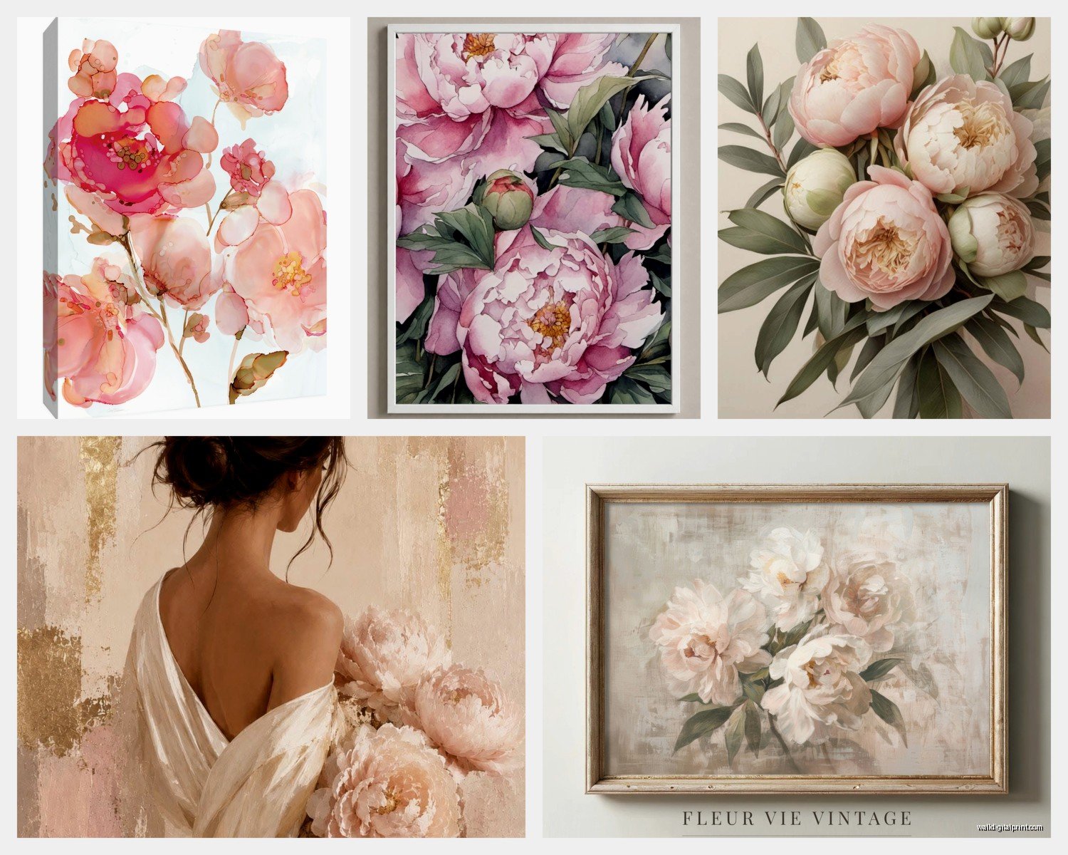
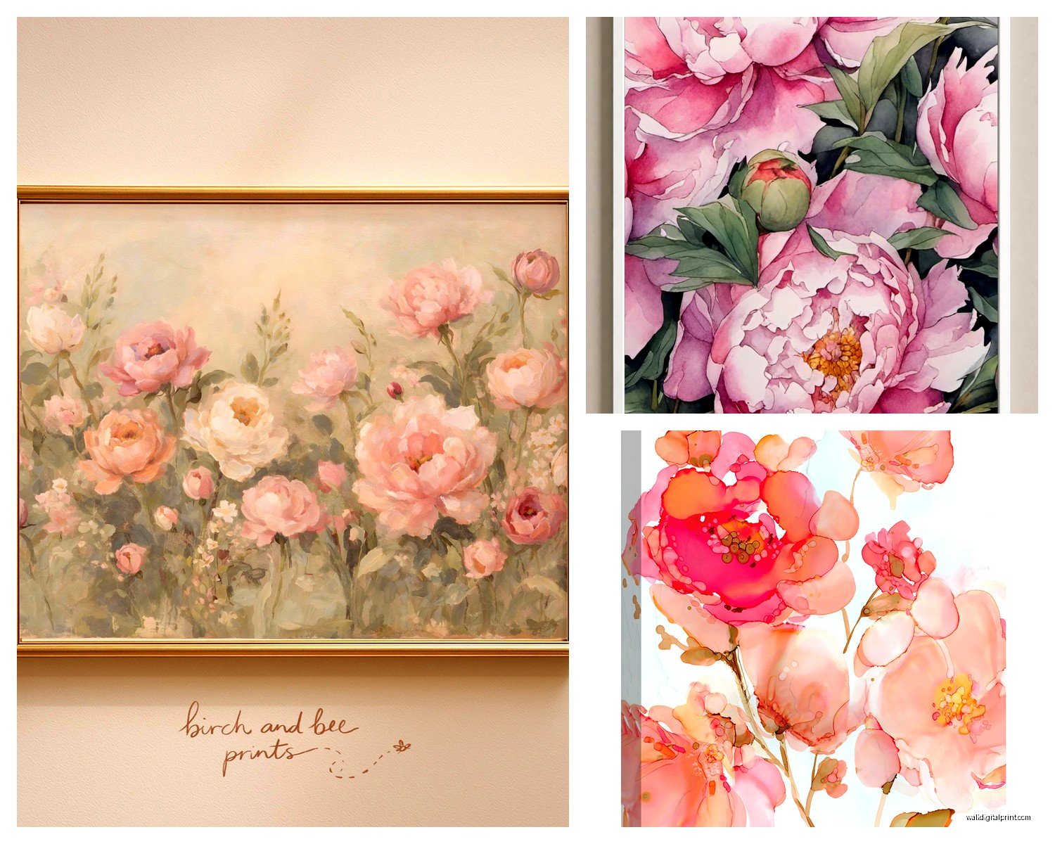
So I’ve been kinda obsessed with peony wall art lately and honestly it started because a client wanted to do this whole romantic bedroom thing but didn’t want it to feel like a grandma’s house, you know? And I went down this rabbit hole of pink flower art that’s been actually useful for like six different projects since then.
Finding the Right Style Without Looking Like a Hotel Lobby
Okay so the biggest thing with peony art is that it can go really wrong really fast. Like there’s this fine line between romantic garden vibes and “I bought this at HomeGoods in 2015” energy. What I’ve learned is you gotta look at the background color first, not the flower itself.
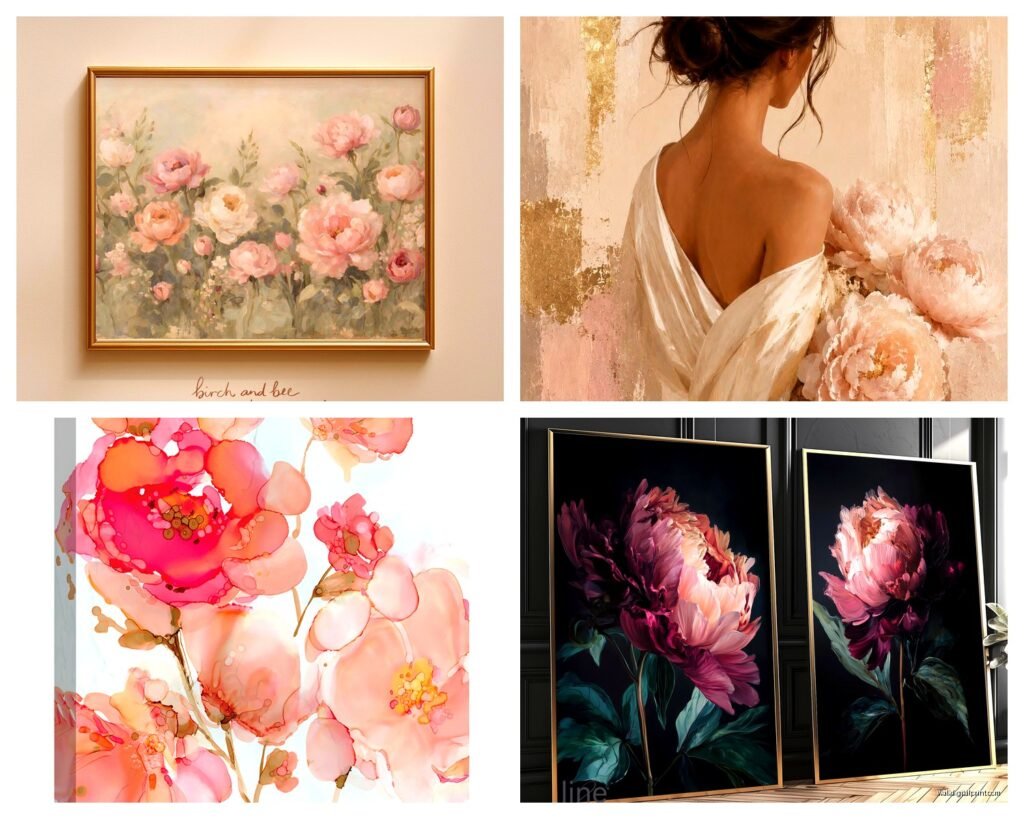
White or cream backgrounds tend to read more traditional. Which is fine if that’s your thing but they can feel a bit… expected? I’ve had better luck with pieces that have either a really dark moody background (like charcoal or navy) or something unexpected like a soft sage green. The contrast makes the pink peonies pop but in a way that feels more curated.
Also the style of the painting matters SO much. Watercolor peonies give you that soft romantic thing but they can wash out on a wall if the colors aren’t saturated enough. I tested this in my own bedroom actually and the watercolor print I got initially just disappeared against my light gray walls. Ended up swapping it for an oil painting style print with more texture and depth.
Size and Scale Nobody Talks About
This is gonna sound weird but I measure everything with painter’s tape now before buying. Like I’ll tape out the dimensions on the wall because our brains are terrible at visualizing size. A 24×36 inch piece sounds big until you put it above a queen bed and it looks like a postage stamp.
For above a bed you want something that’s roughly two-thirds the width of your headboard. If you don’t have a headboard then aim for about 48-60 inches wide either as one piece or a set. I did a three-panel peony set for a client last month where each panel was 16×24 and hung them with like 2 inches between each and it looked SO much better than the single large piece we originally planned.
Living room is different though. You can go bigger or create a gallery wall situation. I’m currently watching this show about art forgers while I write this and it’s making me think about how we perceive value in art but anyway – for living rooms I like mixing peony art with other botanical prints or even abstract pieces that pull the same pink tones.
Frame or No Frame That Is The Question
Ugh okay so I’ve gone back and forth on this forever. Canvas prints without frames give you that modern gallery vibe and they’re obviously cheaper. But here’s what I’ve noticed – they collect dust like crazy on the edges and if you have cats (my cat Pepper literally climbed one once) they can get damaged easier.
Framed prints under glass look more polished but the glass can create glare depending on your lighting. I usually do framed for spaces with lots of natural light where you’re not gonna get that reflection issue. And you can control the vibe with the frame style:
- Thin black frames make it feel contemporary and clean
- Natural wood frames give cottage garden energy
- Gold or brass frames lean more glam romantic
- White frames can work but they need to match your trim exactly or it looks off
Wait I forgot to mention – if you’re doing a gallery wall with peony art, stick to one frame style across all pieces. I see people mix frame colors thinking it’ll look eclectic but it usually just looks chaotic.
Where to Actually Buy This Stuff
So I’ve ordered from basically everywhere at this point because my job is literally testing this. Here’s the real breakdown:
Etsy is great for unique prints and you’re supporting actual artists which feels good. The quality varies wildly though. Always read reviews and look at customer photos not just the listing photos. I got burned once with a print that looked crisp online but arrived grainy and pixelated. Now I message sellers and ask about the DPI resolution – you want at least 300 DPI for anything larger than 8×10.
Society6 and Redbubble have tons of options and the quality is pretty consistent. They print on demand which means you’re not getting like, fine art quality, but for most rooms it’s totally fine. I’ve used them for rental properties where we need something nice but not precious.
Minted is pricier but their printing quality is legit. They also have cool framing options. I did a peony art piece from there for my own dining room and people always ask where it’s from.
For actual original paintings if you have the budget – check out local art fairs and Instagram artists. I found this amazing artist who does these massive peony paintings in oil and her work is incredible but you’re looking at like $800-2000 for an original. Which honestly isn’t bad for original art but it’s not impulse purchase territory.
The Print Quality Thing You Can’t Ignore
Okay so this is boring but important. Paper quality matters more than you think. I’ve learned this the hard way.
Giclée prints on archival paper are worth the extra money if you’re putting this somewhere with sunlight. Regular prints fade SO fast. Like I had a client who bought these beautiful peony prints from Amazon and within six months they’d turned this weird peachy color from the sun exposure.
Canvas prints should be on real cotton canvas not that weird plasticky polyester stuff. You can usually tell by the price point – if a large canvas print is under $40 it’s probably not great quality.
Metal prints are having a moment and I actually really love them for bathrooms or kitchens where you might have humidity. The colors are super vibrant and they’re durable. The vibe is definitely more modern though so if you want traditional romantic it might not work.
Styling It Without Overthinking
Here’s where people get stuck and honestly just… put it on the wall? Like we overcomplicate this. But since you asked for actual advice here’s what works:
Above the bed is classic for peony art because it’s romantic and soft which works in a bedroom. Center it on the wall or the bed, whichever looks more balanced. Hang it so the center of the piece is at eye level when you’re standing – usually around 57-60 inches from the floor to the center of the art.
In a dining room peony art can be really pretty and unexpected. I did this for my own space actually and paired it with brass candlesticks and it gives this garden party vibe that I love.
Living room over a sofa – leave about 6-8 inches between the back of the sofa and the bottom of the frame. This grounds it visually. If there’s more than 12 inches it starts to look like it’s floating away.
Oh and another thing – if you’re doing a gallery wall, lay it out on the floor first. Take a picture. Live with that picture for a day. I know it sounds excessive but I’ve redone so many gallery walls because I rushed the layout.
Color Coordination That Actually Matters
Pink peonies can range from super pale blush to hot pink and this matters for your space. I usually take paint chips or fabric swatches when I’m shopping for art because trying to remember your exact wall color never works.
Pale pink peonies work with basically everything – grays, whites, creams, even darker colors. They’re safe which can be good or boring depending on your perspective.
Brighter pink peonies need more careful coordination. They look amazing with navy, forest green, or charcoal walls. Against beige or tan they can look a bit… cheap? I don’t know how else to say it.
If you have a lot of warm tones in your space (browns, oranges, warm grays) look for peony art that has warm undertones – maybe a peachy pink or coral. Cool-toned rooms (true grays, blues, purples) need cooler pinks.
Mixing Peony Art With Other Stuff
You don’t have to commit to like, all peonies all the time. I usually mix them with:
- Abstract art that pulls similar colors
- Black and white photography for contrast
- Other botanical prints but different flowers
- Landscapes with similar color palettes
The key is having some visual thread connecting everything. Could be the frame style, could be a repeated color, could be the overall vibe.
Lighting Makes or Breaks It
This is something I didn’t understand early in my career but lighting changes everything with art. Peony prints especially because pink can shift a lot under different light.
If you have warm lighting (those yellowish bulbs) pink can look peachy or orange. Cool lighting (bright white LED) makes pink look more true to color but can wash out lighter shades.
I usually recommend picture lights if you’re really investing in a nice piece. They’re not crazy expensive – like $30-80 depending on the style – and they make art look intentional and gallery-like.
Natural light is beautiful but watch for direct sun which will fade prints over time. If your peony art is getting direct afternoon sun maybe put it somewhere else or invest in UV-protective glass.
The Seasonal Thing I Noticed
Okay so funny story – I thought peony art was year-round but I’ve noticed clients are way more interested in spring and summer. Which makes sense because peonies are a spring flower. But I’ve actually started recommending it as winter decor too because it brings that garden freshness when everything outside is dead.
You can swap out accessories seasonally to keep peony art feeling fresh. Spring – pair it with real peonies if you can get them, lighter textiles. Summer – bright pillows, light and airy vibe. Fall – add in deeper colors through accessories, maybe burgundy or plum. Winter – cozy it up with throws and candles but keep the art for that reminder of warmer days.
Budget Breakdown From Someone Who’s Done This Too Many Times
Since you’re probably wondering what this actually costs:
Budget friendly: $20-60 for prints from Etsy, Society6, or even Amazon. Frame yourself from IKEA or Target. Total investment maybe $50-100 for a nice piece.
Mid-range: $100-300 for better quality prints from Minted or Framebridge, professional framing included. This is where most of my clients land.
Investment: $500+ for original paintings, limited edition prints, or really large high-quality pieces. Worth it if you’re gonna be in the space long-term.
I’ve done all three levels and honestly for most rooms the mid-range is the sweet spot. You get good quality that’ll last but you’re not terrified to hang it.
Wait one more thing – sales. Minted has sales constantly. Society6 does too. Sign up for emails and wait for 20-30% off before buying. Most of these sites have sales every few weeks so unless you need it immediately just wait.
The whole peony art thing can seem overwhelming but really you just need to figure out your style, your budget, and your wall space. Everything else is just details that you can figure out as you go. I’m still learning stuff honestly and I’ve been doing this for years.