
Wall Art Guide, Wall Art Tutoriels
Pink and Gold Wall Art: Feminine Metallic Glam Combo
Aug
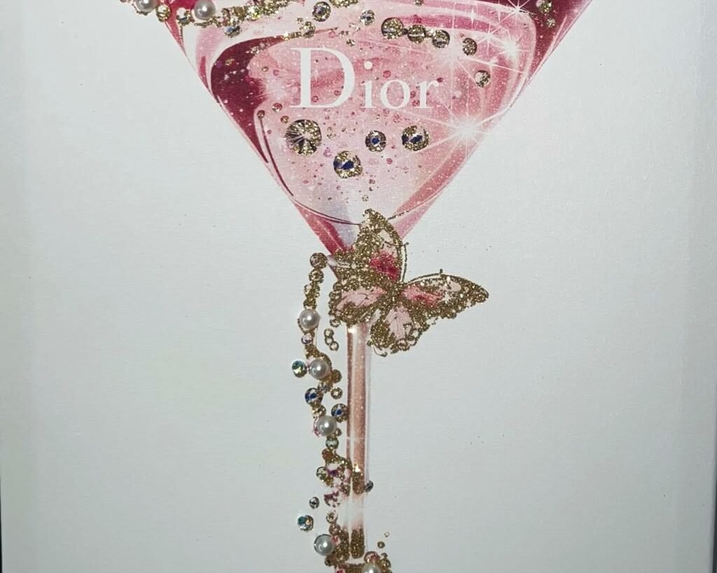
So I’ve been absolutely obsessed with pink and gold wall art lately and honestly it started because a client wanted her home office to feel “powerful but feminine” and I was like okay, challenge accepted. Spent way too much time figuring out what actually works versus what just looks good on Pinterest but falls flat in real life.
The Thing About Pink and Gold Nobody Tells You
First off, not all pinks work with gold. I learned this the hard way when I ordered what I thought was a gorgeous blush pink abstract piece and it arrived looking… peachy? And next to the gold frame it just looked like a weird Creamsicle situation. The pink needs to have either blue undertones (that’s your cooler blush, mauve territory) or go FULL hot pink with zero apologies. The in-between coral-ish pinks? They fight with gold in this really annoying way.
The golds matter too. Rose gold is technically pink-ish gold but mixing it with yellow gold in the same wall arrangement looks confused unless you’re really intentional about it. I usually stick with one gold tone per wall or room. Champagne gold is the most forgiving—it’s that soft, almost-but-not-quite-rose-gold that works with basically every pink shade.
Where to Actually Find This Stuff
Okay so Etsy is obvious but you gotta filter hard because there’s so much digital download stuff that looks incredible online but prints out flat. I always look for sellers who show the actual printed version in different lighting. My go-to search terms are “blush gold leaf art” or “pink abstract metallic” instead of just “pink and gold art” because you get better results.
HomeGoods and TJ Maxx have surprised me multiple times. Like I’ll be there buying storage baskets and boom, there’s a 24×36 pink agate with gold foil for $39.99. The catch is you can’t count on finding it again so if you see it and it works, grab it. My dog knocked over one I loved and I spent three weeks trying to find another one… never did.
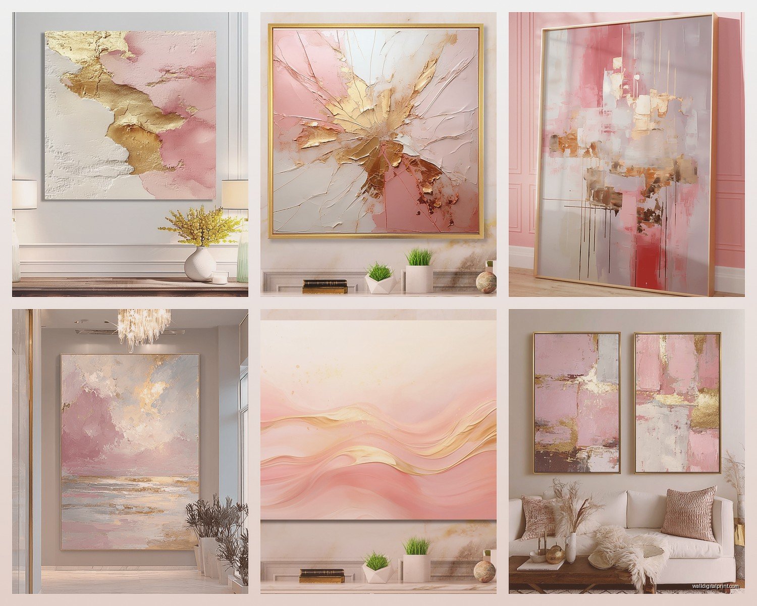
West Elm does a whole glam thing that’s pretty reliable. Their stuff skews more expensive ($200-400 range) but it’s actually good quality and the gold is real gold leaf usually, not just metallic paint. Anthropologie too but honestly they’re so overpriced for what you get.
The Budget Route That Actually Looks Good
Target’s Opalhouse line has gotten way better. They’ve got these printed canvases with gold foil accents for like $30-60 and from across the room you genuinely can’t tell it’s not the fancy version. The trick is buying two or three and creating a gallery wall situation so it looks intentional and curated rather than just one lonely Target print.
Oh and another thing—Amazon has these peel-and-stick gold leaf sheets for like $12. You can buy a basic pink abstract print anywhere (even print your own from a $5 Etsy download) and add gold leaf accents yourself. It takes maybe 20 minutes and suddenly your $15 print looks like a $200 piece. I did this for my client’s daughter’s room and she posted it on TikTok and it got like 40k views which was wild.
Mixing Styles Without Looking Like a Teen’s Bedroom
This is gonna sound weird but the key to making pink and gold feel sophisticated instead of like a 13-year-old’s dream room is texture and restraint. You need matte surfaces mixed with the shiny stuff. So if you’ve got a glossy gold-framed mirror, add in some matte pink watercolor pieces. If everything’s shiny and metallic it reads very Forever 21 dorm decor.
I usually follow this ratio: 60% one finish (usually matte), 30% metallic gold, 10% high-shine or glitter. That 10% is your pop—maybe it’s a small piece with actual glitter resin or a super glossy lacquered frame. It catches light and adds interest without being overwhelming.
Gallery Wall Layouts That Don’t Suck
Okay so funny story, I used to lay everything out on the floor first and take a photo, then try to recreate it on the wall. Took forever and never looked quite right. Now I use paper templates—trace each frame on kraft paper, tape them to the wall with painter’s tape, rearrange until it works, then hang the actual pieces where the templates are.
For pink and gold specifically, I like starting with one large statement piece (biggest pink element) in the center or slightly off-center, then building out with smaller gold-framed pieces and medium pink pieces. The gold frames can have white mats with gold prints, or photos, or even mirrors. Mixing in mirrors with your art is chef’s kiss because they reflect light and make the gold elements shimmer even more.
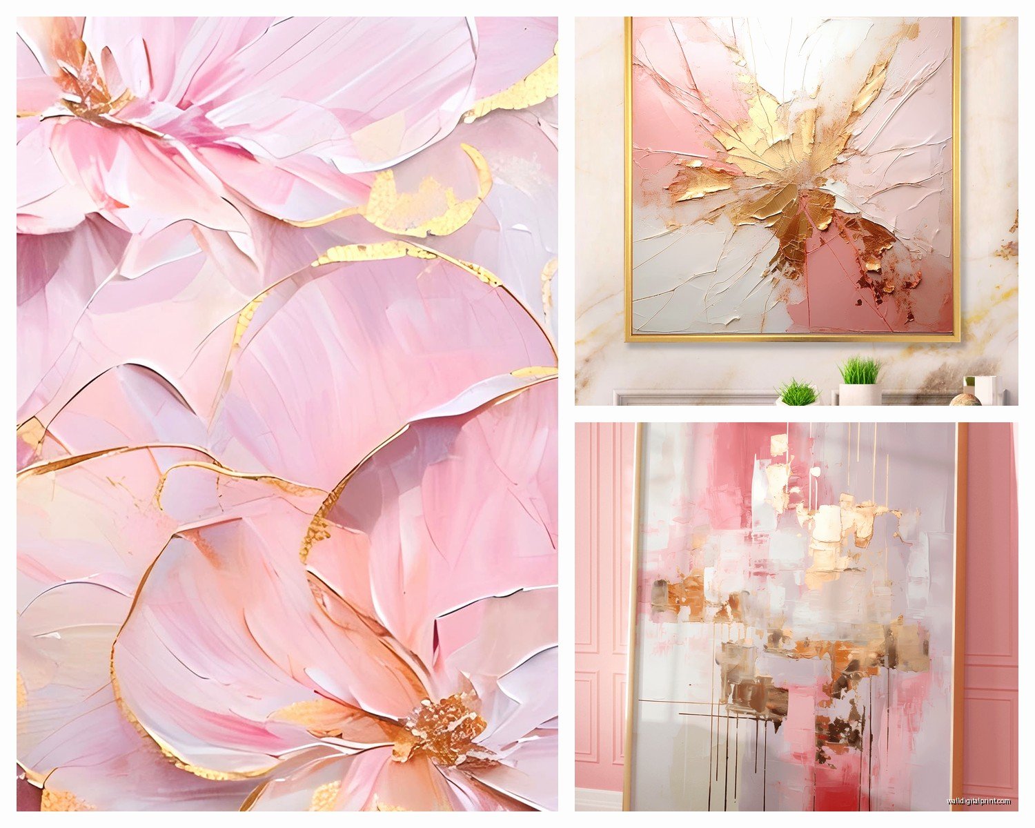
Spacing should be 2-3 inches between frames. Closer than that looks cluttered, farther apart looks disconnected. I measure this by literally holding up two fingers between frames as I’m hanging—very scientific, I know.
DIY Options If You’re Crafty (Or Bored)
I made my own pink and gold abstract piece last winter when I was binge-watching The Crown and honestly it was so easy. Got a canvas from Michael’s (40% off with their app coupon, always wait for the coupon), some pink acrylic paint in three shades, and gold leaf flakes with adhesive.
You just paint abstract shapes—like honestly just smoosh paint around with a palette knife or old credit card, there’s no wrong way to do it. Let it dry completely (this is important, I got impatient once and the gold leaf stuck to wet paint and looked muddy). Then use gold leaf adhesive pen to draw lines or add accents where you want gold, wait 15 minutes until it’s tacky, then press on the gold leaf sheets. Brush off the excess with a soft brush.
The whole thing took maybe an hour plus drying time and cost like $35 total. It’s hanging in my own living room now and people always ask where I bought it.
Resin Art Is Having a Moment
If you’re not into DIY, resin artists on Instagram and Etsy are creating insane pink and gold pieces. Search for “pink geode art” or “rose gold resin art” and prepare to fall down a rabbit hole. These pieces have actual dimension and depth—the gold veins are metallic pigment mixed into resin layers so they catch light differently throughout the day.
They’re pricier, usually $100-300 depending on size, but they’re conversation pieces. I used one as the focal point above a client’s bed and it literally elevated the entire room. The gold veins looked different in morning light versus evening and she texted me photos at different times of day for like a week because she was so obsessed with it.
Framing Decisions That Matter More Than You Think
White mats with gold frames = classic and safe. This is your can’t-go-wrong option. The white gives your eye a rest between the pink and gold so it doesn’t feel like too much.
No mat with gold frame directly around pink art = more modern and bold. Works best with abstract or graphic art rather than photographs.
Pink mat with gold frame = only do this if the pink in the mat exactly matches the pink in the art, otherwise it looks off. I’ve seen this work beautifully with blush pink mats and champagne gold frames, but it’s risky.
Floating frames (the kind where the art appears to float inside the frame with space around it) in gold are really trendy right now and work great with pink canvas pieces. Michael’s and Target both carry these.
Custom Framing Is Worth It Sometimes
I know custom framing is expensive but for your main statement piece, it’s worth getting it done right. I use a local frame shop and yeah it’s like $200-300 to frame one piece, but they help you pick the exact right mat and frame combination. They’ve talked me out of bad choices multiple times.
For everything else? Pre-made frames from HomeGoods, Target, or Ikea’s SILVERHÖJDEN gold frames which are like $15 and look way more expensive than they are.
Lighting Makes or Breaks the Whole Thing
Gold needs proper lighting to actually read as gold instead of just yellow or brown. I always add picture lights or position pieces where natural light hits them during the day. Those little battery-operated picture lights from Amazon (search “wireless picture light”) are like $25 and stick right to the wall above your frame.
Warm white bulbs (2700-3000K) make gold look richer. Cool white bulbs make it look harsh and cheap. This applies to your room’s general lighting too—if you’ve got cool white overhead lights, your beautiful gold-leafed art is gonna look sad.
Oh wait I forgot to mention—avoid hanging pink art in direct sunlight because it fades like crazy. I learned this in my first apartment when my favorite pink watercolor print faded to basically white in six months. Now I use UV-protective glass for anything in a sunny spot, or I just don’t put pink pieces there at all.
Styling the Rest of the Space
Your wall art is gonna look weird floating in space if you don’t tie it into the room. I usually add small pink and gold accents—like a gold tray on the coffee table with a pink candle, or pink velvet throw pillows with gold zipper details. But keep it minimal. The art should be the star.
One trick I love is putting a gold sunburst mirror on the same wall as your pink art but offset to the side. The mirror reflects light onto the art and creates this really cohesive metallic moment without being matchy-matchy.
Plants work surprisingly well with this color combo. The green contrasts with pink in this really pretty way and the gold picks up warm tones in wooden furniture or plant stands. I’ve got a fiddle leaf fig next to my pink and gold gallery wall and it just… works.
What Doesn’t Work
Too much pattern—if your pink art is super busy and detailed and your gold frames are ornate rococo style, it’s visual overload. Pick one element to be detailed and keep everything else simple.
Silver mixed in—just don’t. Silver and gold together with pink looks confused unless you’re going for a specific maximalist look and really know what you’re doing.
Orange-based wood tones—they clash with pink. If you’ve got orange-y oak furniture, this color scheme is gonna be tough. You want cooler wood tones like walnut or gray-washed wood.
Too much white space—pink and gold need some visual weight to feel balanced. If you hang one small pink and gold piece on a huge empty wall it’s gonna look lost. Either go bigger with your art or add more pieces.
My Actual Favorite Pieces I Keep Recommending
There’s this artist on Etsy called InkandDropDesigns who does pink and gold alcohol ink prints that are absolutely stunning. They’re printable downloads so you can size them however you want. I’ve used her designs for like five different clients.
The Gold Leaf Botanical prints trend—pink flowers with gold leaf accents. Oliver Gal has gorgeous ones but they’re expensive. Desenio has similar styles for way less and the quality is honestly comparable.
Abstract lips or female silhouettes in pink with gold accents—these are everywhere right now and they work really well in bedrooms or powder rooms. Just make sure they feel artistic rather than like a poster from a college dorm.
Agate slices—real or printed—in pink with gold edging. These bring in an organic, natural element that keeps the glam from feeling too precious.
The whole pink and gold thing can go really right or really wrong depending on execution. Start with one good piece you love and build from there rather than buying everything at once. I’ve seen people nail it with a $40 Target print and I’ve seen people spend $2000 and have it look cheap because they didn’t think about balance and placement.
Also your pieces don’t all have to be PINK and GOLD—like some can be mostly pink with gold accents, some can be mostly gold with pink touches, some can even be neutral with both colors as accents. That variation actually makes it feel more collected and intentional.
