
Wall Art Guide, Wall Art Tutoriels
Pink and Navy Wall Art: Blush Deep Blue Nautical Combo
Oct
So I’ve been working with pink and navy combinations for like three years now and honestly it’s one of those color schemes that sounds really specific but actually works in way more spaces than you’d think. Let me just dump everything I know because I literally just finished a client project with this exact palette last month.
Why This Combo Actually Works
Okay so the thing about pink and navy is that it reads as both sophisticated and playful at the same time. The navy grounds everything so the pink doesn’t feel too sweet or overwhelming, and the pink keeps the navy from being too serious or masculine. I had this one client who was convinced her husband would hate it but he literally didn’t even notice it was pink at first because the navy balanced it so well.
The nautical angle is kinda obvious but you don’t have to go full anchor-and-rope with it. Like you can do coastal without doing Beach House Chic circa 2015, you know what I mean?
Picking the Right Shades
This is where people mess up the most. Not all pinks work with navy and not all navys work with pink.
For pink you want:
- Blush tones with gray undertones (not peachy or coral)
- Dusty rose if you want something a bit more saturated
- Mauve-y pinks for a more sophisticated vibe
- True millennial pink works but it’s getting dated so maybe avoid
For navy you want:
- Deep navy that leans slightly purple rather than green
- Midnight blue works great
- Avoid anything too bright or royal blue territory
I spent like two hours at the paint store once trying to explain this to someone and finally just took pictures of paint chips in different lighting. The undertones matter SO much.
Where to Actually Find This Art
Okay so funny story, I was watching The Crown one night and got distracted looking at their wall art and ended up on an Etsy rabbit hole until 2am finding pink and navy pieces. Here’s where I actually look:
Etsy is gonna be your best bet for affordable options. Search for “blush navy abstract” or “pink navy coastal” or “dusty rose navy geometric.” You can get digital downloads for like $5-15 and print them at Staples or your local print shop. The quality is honestly fine for most spaces.
Minted has really good quality prints and their color accuracy is excellent which matters when you’re trying to match specific shades. More expensive but the paper quality shows.
Society6 is hit or miss but they have SO many options. I filter by color which helps narrow it down. Their framing is overpriced though so I usually just get the print.
West Elm and CB2 sometimes have pieces in this palette but you’re paying for the name. I only go there when a client has budget and wants that particular aesthetic.
Abstract vs Representational
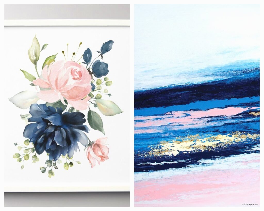
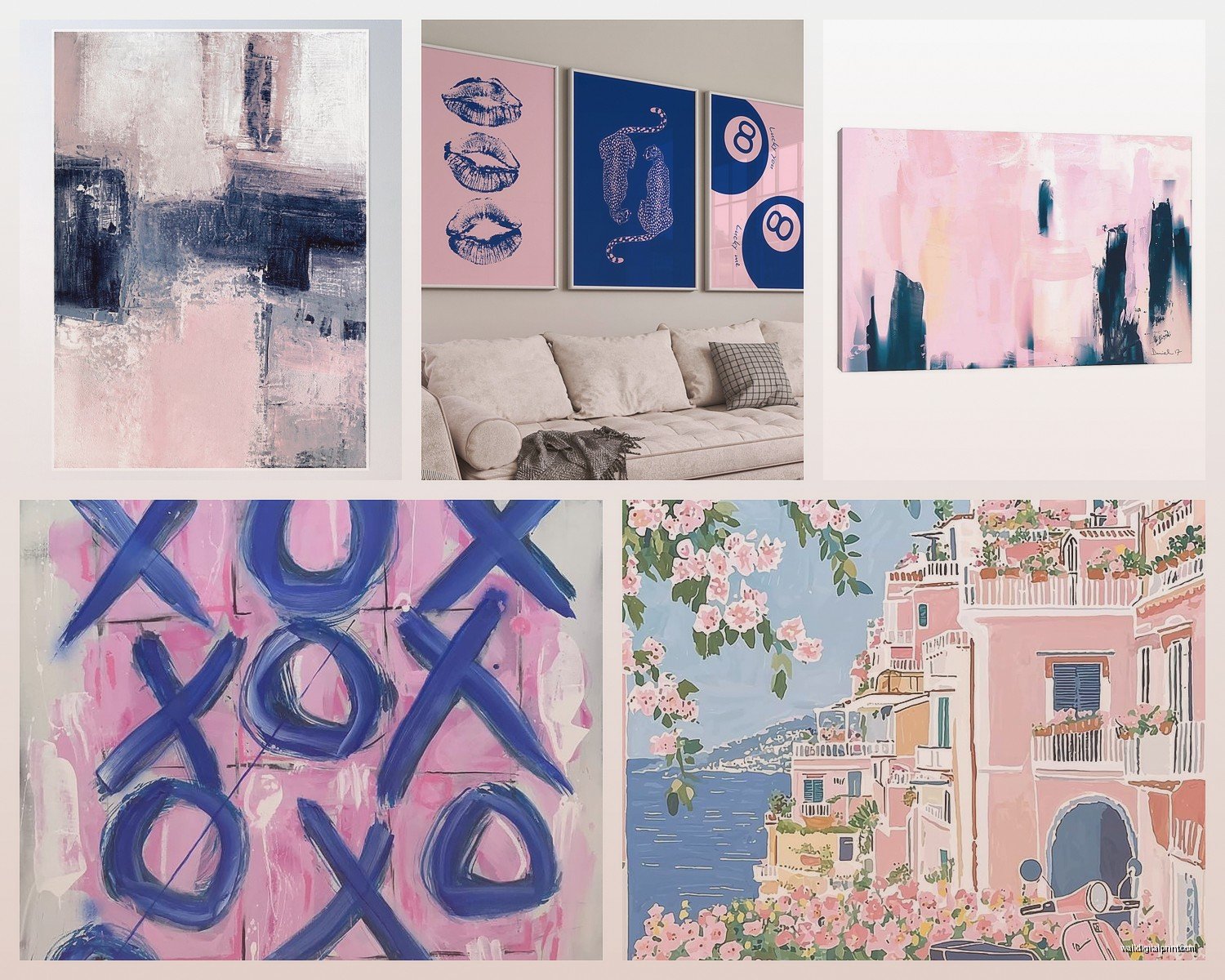
This is really about your space and what else is going on. Abstract pieces in pink and navy are super popular right now – lots of watercolor washes, geometric shapes, that whole thing. They work great in modern spaces or when you want the art to be more about color than subject matter.
But representational stuff can be really cool too. I did a nursery last year with vintage-style botanical prints that had pink flowers on navy backgrounds and it was chef’s kiss. Also coastal landscapes at sunset give you those colors naturally.
How to Arrange Multiple Pieces
So this is where it gets fun but also where people freeze up and just… don’t hang anything for six months. Been there.
The basic rule I follow is you want roughly 60% navy, 30% pink, 10% neutral (white, cream, gray). This keeps it balanced and not too matchy-matchy.
For a gallery wall with like 6-9 pieces:
- Get 3-4 pieces that are primarily navy with pink accents
- Get 2-3 pieces that are primarily pink with navy accents
- Throw in 1-2 pieces that are mostly neutral but tie in the colors somehow
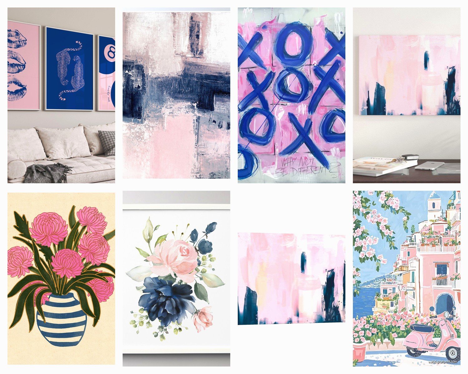
Oh and another thing – vary your art styles. Don’t get all abstract or all photography. Mix it up. I usually do abstract, one or two line drawings, maybe a photo or vintage print, possibly something with text if it fits the vibe.
Frame Choices That Don’t Suck
White frames are the safe choice and honestly they work great with this palette. But I’m gonna tell you what I actually do most of the time: natural wood frames. Like light oak or maple. It warms everything up and keeps the pink and navy from reading too cold or modern.
Black frames can work but they’re tricky. They add a lot of visual weight and can make the navy feel heavier. I only use them in really bright spaces with lots of natural light.
Gold frames are having a moment and I’m not mad about it with pink and navy. Brushed gold or champagne tones especially. But this only works if you’ve got other gold accents in the room otherwise it looks random.
My cat just knocked over my coffee while I’m writing this sorry… okay where was I
Size and Scale Stuff
This is gonna sound obvious but people still mess it up – match your art size to your wall and furniture. I had a client who bought these tiny 8×10 prints for above a king bed and was confused why it looked weird. You need substantial pieces for large walls.
General guidelines I use:
- Above a sofa: one large piece (40-60 inches wide) or a gallery wall that spans 2/3 the width of the sofa
- Above a console or dresser: 24-36 inches wide usually looks right
- In a hallway: multiple smaller pieces in a vertical arrangement works better than one big piece
- Small walls (like between windows): 16×20 or smaller, don’t try to fill all the space
DIY Options If You’re Crafty
Wait I forgot to mention this earlier but you can totally make your own art for this scheme and it’s not that hard. I’ve done it multiple times when budget was tight or we needed specific sizes.
The easiest method is abstract watercolor. Get watercolor paper, navy and pink watercolor paint, and just… make washes and geometric shapes. Let colors bleed into each other. You literally cannot mess this up, the imperfections make it look more expensive somehow.
Another option is to buy navy canvas panels from the craft store and use pink acrylic paint to add abstract shapes or brush strokes. Very trendy right now and takes like 20 minutes.
Or print digital downloads and frame them yourself. IKEA frames are cheap and honestly fine for most situations. I keep a bunch in my car because my clients always need last minute solutions.
Lighting Considerations Nobody Talks About
Okay so this is important – pink and navy look COMPLETELY different in warm vs cool lighting. Navy can look almost black in dim warm lighting, and pink can look either peachy or purple-ish depending on your bulbs.
I always recommend daylight or neutral white bulbs (around 4000K) in rooms with this color scheme. Warm bulbs make navy look muddy and change the pink tones too much.
Also if you’re hanging art opposite a window, be aware that the colors will look more vibrant during the day and darker at night. Not a dealbreaker but something to consider when you’re positioning things.
Mixing Patterns and Textures
This is where you can get really interesting with it. Don’t just stick to flat prints. I like mixing:
- Watercolor abstracts with geometric line drawings
- Matte prints with one glossy or metallic piece as an accent
- Photography with illustrated pieces
- Vintage nautical charts or maps with modern abstract pieces
The variety keeps your eye moving around the wall instead of everything blending together.
Common Mistakes I See All The Time
Hanging everything too high. The center of your art should be at eye level which is usually around 57-60 inches from the floor. People always hang stuff way too high and it looks awkward.
Matching the pink and navy exactly to your throw pillows or rug. This looks really staged and catalog-y. The colors should coordinate but they don’t need to be identical matches.
Going too themed with the nautical thing. Like you don’t need anchors and ships wheels and rope borders. The color combo itself reads coastal, you don’t have to beat people over the head with it.
Buying everything from the same place or same artist. Mix your sources so it looks collected over time rather than bought all at once from a matching set.
Making It Work in Different Rooms
I’ve used this palette in basically every room type at this point so lemme break down what works where:
Living room: Go bigger and bolder here. Large abstracts work great. You can handle more saturated pinks because the room is bigger and you’re not sleeping there. Mix in some white or cream pieces to break it up.
Bedroom: Softer blush tones work better than bright pink. Keep the navy but maybe add some gray or taupe pieces too. You want it calm not energizing. I did a bedroom once with really pale blush and navy photography of waves and beaches and it was perfect.
Bathroom: Small spaces can handle this combo really well actually. One medium piece or a few small ones. Nautical themes make obvious sense here but coastal abstract works too.
Nursery: This is like THE perfect nursery palette right now. Use lighter pinks and you can go more playful with the subjects – animals, clouds, moons, that kind of thing. Just avoid anything too babyish if you want it to grow with the kid.
Office: More navy than pink keeps it professional. Geometric patterns or abstract landscapes work well. I have a client who has pink and navy art in her home office and it’s sophisticated not cutesy.
Budget Breakdown Reality Check
Since someone always asks about cost, here’s what I typically see:
Cheap route (under $100 for a whole wall): Digital downloads printed at Staples or FedEx, IKEA frames. Looks fine, totally acceptable, gotta be okay with simple designs.
Mid-range ($200-400): Mix of Etsy originals, Society6 prints, some framed pieces from Target or HomeGoods. This is where most people land and it looks really good.
Higher end ($500+): Minted art, custom framing, maybe one original piece from a local artist. Gallery quality and you can tell.
I usually tell people to invest in one really good piece and fill in around it with cheaper options. Nobody can tell which is which when they’re arranged together.
Seasonal Flexibility
One thing I really like about pink and navy is you can shift the vibe seasonally pretty easily. In summer it reads coastal and beachy. In fall add some burgundy or rust accents and suddenly it’s richer and cozier. Winter you can play up the pink toward mauve and it feels more jewel-toned. Spring is obvious – it’s already pretty spring-y.
You don’t have to change your art, just adjust your accessories and textiles and the whole thing shifts.
Okay I think that’s everything I can think of right now? Oh wait – one more thing. If you’re trying to sell a house or rent out a space, this color combo is really safe. It appeals to a lot of people without being boring beige but also isn’t too bold or personal. Just keep it more abstract and less specific themed stuff.
Let me know if you end up going with this, I’m curious what you’ll find. And honestly just start with one or two pieces and see how you feel before committing to a whole wall. You can always add more but it’s annoying to return stuff.
