Wall Art Guide, Wall Art Tutoriels
Foo Fighters Wall Art: Rock Band Dave Grohl Music Decor
Oct
So I’ve been down this rabbit hole lately because honestly, decorating with band art is trickier than you’d think, and Foo Fighters stuff specifically has this weird range where some pieces look absolutely killer and others scream “college dorm 2008” if you’re not careful.
Finding Quality Prints That Don’t Look Cheap
Okay first thing – you gotta avoid those super glossy posters that look like they were printed at a mall kiosk. I learned this the hard way when a client wanted Dave Grohl art for their media room and the first batch I ordered looked so flat and lifeless under proper lighting. The trick is looking for either canvas prints or museum-quality paper prints with a matte or semi-gloss finish.
Etsy actually has some incredible sellers doing Foo Fighters minimalist designs. Search for stuff like “Foo Fighters line art” or “Dave Grohl abstract portrait” – you’ll find artists who create these gorgeous geometric interpretations that read as sophisticated art first, band memorabilia second. I’ve used prints from a shop called VintageWallGraphics (not sponsored, just genuinely good) and the quality was shockingly better than expected for like $35.
The licensed stuff from the band’s official store is obviously safe quality-wise but it tends to be very… obvious? Like everyone will immediately know it’s band merch. Which is fine if that’s your vibe, but if you’re trying to integrate it into a more curated space, the official posters can fight with your other decor.
Size and Placement Without Looking Like a Shrine
This is where people mess up constantly. One massive Foo Fighters poster centered on a wall = teenage bedroom energy. What actually works is treating band art like you would any other art collection.
I did this gallery wall in my own office that includes a small Dave Grohl print (black and white, just his profile) mixed with abstract art, a vintage camera print, and some family photos. Nobody even realizes it’s Dave Grohl unless they look closely because it’s styled as part of a cohesive collection, not as the focal point.
Try these size combinations:
- One medium piece (16×20) paired with two smaller complementary prints
- Three same-size frames in a horizontal line – maybe album covers done in a consistent filter or color treatment
- A large canvas (24×36) but in a hallway or unexpected space, not dominating your main living area
Oh and another thing – if you’re gonna go big, black and white is your friend. Color concert photos can look dated really fast, but a black and white action shot of Dave on drums or performing has this timeless quality that ages better.
Framing Makes or Breaks Everything
Cannot stress this enough. An amazing print in a cheap frame looks worse than a mediocre print in a quality frame. I usually go with simple black frames with a white or cream mat. The mat is crucial because it gives the artwork breathing room and makes it feel more intentional.
Target’s Threshold frames are actually decent for the price – I’ve used them in client homes when we’re working with a tighter budget. But if you can swing it, getting custom framing from a local shop or even Framebridge online elevates everything. My cat knocked over one of my framed prints last month and I was so relieved I’d spent the extra money on plexiglass instead of regular glass.
For canvas prints, you can skip the frame entirely if the edges are gallery-wrapped (meaning the image continues around the sides). Just make sure the canvas depth is at least 1.5 inches so it has that substantial look on the wall.
The Frame Color Situation
Black frames work with literally everything and make colors pop. Natural wood frames give you that warmer, more organic feel – really good if your space has a lot of wood tones already or you’re going for modern rustic. White frames can work but they’re finicky… they need the right wall color behind them or they just disappear.
I tested this theory in my dining room with three identical prints in different frame colors and the black frame won every time in terms of visual impact.
Album Cover Art vs Concert Photos vs Portraits
Each type serves a different purpose and honestly works better in different rooms.
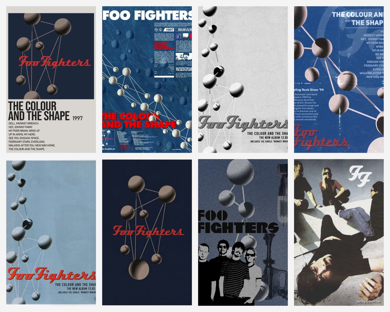
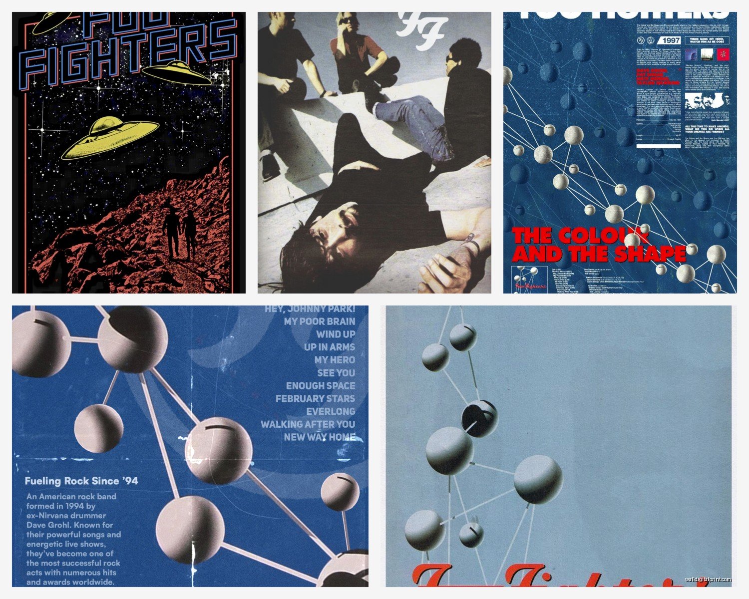
Album covers are the easiest to style because they’re already designed as art. The Foo Fighters have some genuinely cool album artwork – “Wasting Light” and “Sonic Highways” both have strong graphic designs. These work great in multiples, like all their album covers in a grid formation. I’ve seen this done in home studios and music rooms and it looks intentional without being too fanboy.
Concert photos are hit or miss. Action shots can have great energy but they’re harder to integrate into a refined space. If you go this route, look for shots with interesting composition – dramatic lighting, unique angles, maybe a silhouette. Avoid anything that looks like it was taken with a phone camera from the nosebleed section.
Portraits of Dave Grohl specifically… okay so this is gonna sound weird but the key is finding ones where he’s not making direct eye contact with the camera. Sounds random but I’ve noticed that portraits where the subject is looking away or in profile feel more like art and less like a poster from a magazine. There’s this one illustration style portrait of Dave that’s been floating around Redbubble where it’s just his side profile in this ink-style drawing – that’s the sweet spot.
Color Coordination With Your Existing Space
You gotta think about your wall color and existing decor palette. If you have neutral walls (white, gray, beige), you have the most flexibility. You can go bold with colorful prints or keep it monochromatic.
For colored walls, it gets trickier. I have a client with deep blue walls in their den and we chose black and white Foo Fighters prints with silver frames – the contrast was perfect. The silver picked up the cool tones in the blue.
Wait I forgot to mention – if your print has multiple colors, pull one of those colors into your space through other decor. Like if you get a concert photo with red stage lighting, add a red throw pillow or a red-spined book on your shelf nearby. It creates visual cohesion that makes the piece feel integrated rather than slapped on the wall.
Lighting Your Music Art
This makes such a difference and almost nobody thinks about it. Picture lights (those little lights that mount above frames) are overkill for most spaces, but strategic placement near existing light sources matters.
Don’t hang valuable prints in direct sunlight – they’ll fade. But do try to position them where they catch some natural light during the day or where your regular room lighting hits them. I have a Dave Grohl print in my hallway that’s positioned right where the afternoon light hits it and it completely transforms the piece.
If you’re really into it, you can add a small LED strip light to a floating shelf and display your art on the shelf with the backlight. Gives it a gallery vibe without being too extra.
DIY Options That Don’t Look DIY
If you’re crafty or just broke (no judgment, I’ve been there), you can create some really cool stuff yourself. I experimented with this when I was redoing my spare room on basically no budget.
Print lyrics onto nice cardstock or watercolor paper using a quality printer. Choose meaningful lyrics and lay them out in an interesting typographic design. Frame it simply. I did this with lyrics from “Everlong” in a minimalist layout and people always think I bought it from some fancy boutique.
Vinyl record displays are another option – if you have actual Foo Fighters vinyl, there are these frames specifically designed to display records with the album cover visible. It’s functional art and gives you that music lover aesthetic without being too literal.
Oh and you can buy high-res images from certain photography sites and take them to a local print shop. Often cheaper than buying pre-made prints and you have more control over sizing. Just make sure you’re using images that are legally available for personal use – don’t just screenshot stuff from Google Images because the resolution will be trash anyway.
Where Each Type of Art Works Best
Living room: Go sophisticated. Black and white portraits, minimalist designs, or tasteful album cover art. This is your public space so keep it elevated.
Home office or studio: Here you can geek out a little more. Gallery walls mixing band photos with other music memorabilia, multiple album covers, whatever makes you happy when you’re working.
Bedroom: Honestly whatever you want because it’s your private space, but I’d still avoid anything too busy or chaotic that might mess with your sleep vibe. A single calming piece over the bed works better than a collage situation.
Hallways and stairs: Perfect for smaller prints or a vertical arrangement going up the stairs. These transitional spaces can handle more personality.
I would avoid band art in kitchens or bathrooms personally… it just feels off-genre for those spaces? Like you wouldn’t put food art in a bedroom, band art doesn’t belong where you’re cooking dinner.
Mixing Music Art With Other Decor Styles
Modern minimalist: Stick with black and white, clean lines, geometric interpretations of band logos or album art. Less is more here.
Industrial: Concert photos work great, especially with metal frames or exposed hanging hardware. The grittier the photo, the better it fits this aesthetic.
Bohemian/eclectic: You can kinda go wild here. Mix vintage-style band posters with other collected art, use ornate frames, layer different sizes. The “more is more” approach actually works.
Scandinavian: Keep it simple and light. White or light wood frames, lots of negative space in the composition, muted colors if any color at all.
I’m currently watching this design show where they mixed band art into a mid-century modern space and it actually worked because they kept the frames period-appropriate and chose images with that vintage concert poster aesthetic from the 60s and 70s… obviously not Foo Fighters from that era but you get the idea.
Avoiding the Cringe Factor
Real talk – there’s a fine line between “I appreciate this band” and “I’m uncomfortably obsessed.” Here’s how to stay on the right side:
Limit band-specific art to one or maybe two rooms max. Don’t theme your entire house around one band unless you’re opening a themed Airbnb or something.
Mix it with other art. Never let music art be the ONLY art in a space.
Choose quality over quantity. One really good piece beats five mediocre ones.
Skip anything with cheesy quotes or overly literal imagery. “Best of You” written in cursive over a sunset? No. A subtle design element inspired by their music? Yes.
The Maturity Test
Before you buy something, ask yourself: Would I be embarrassed to show this to my boss/date/grandmother? If there’s any hesitation, it’s probably too juvenile. You want pieces that showcase your music taste without making visitors uncomfortable or confused about your design sense.
Budget Breakdown
Since you’re probably wondering what this actually costs:
Budget option ($30-60 total): Etsy print ($15-25) + Target frame ($15-35) = One quality piece
Mid-range ($100-200): Better quality prints or canvas ($40-80) + decent frames ($60-120) = Two to three pieces
Investment ($300+): Licensed photography, custom framing, larger canvases, or original artwork
I usually tell people to start with one really good piece rather than buying multiple cheap ones. You can always add more later, but replacing cheap stuff you bought impulsively is frustrating and wasteful.
Where to Actually Shop
Based on what I’ve tested and used in real projects:
Etsy for unique artistic interpretations and vintage-style posters. Quality varies so check reviews obsessively.
Society6 and Redbubble for print-on-demand stuff with tons of design options. The quality is consistent and they offer different product types like tapestries and framed prints.
Official band merch stores when you want authentic tour posters or limited edition releases. Pricier but guaranteed quality.
eBay for vintage original posters if you’re into that authenticity – just be ready to pay collector prices for anything actually rare.
Local print shops for custom work from your own images or designs.
AllPosters and Art.com sometimes have licensed music photography at reasonable prices with frequent sales.
Hanging Tips Without Destroying Your Walls
Command strips work for lighter frames but don’t trust them with anything heavy or valuable – I learned this when a frame crashed down at 2am and nearly gave me a heart attack.
For proper hanging, use wall anchors if you’re not hitting a stud. The little plastic ones that come with frames are useless in drywall.
The center of your artwork should be at eye level, which is roughly 57-60 inches from the floor. People hang stuff too high constantly and it throws off the whole room.
For gallery walls, lay everything out on the floor first and take a photo. Then recreate that layout on the wall. Use kraft paper templates taped to the wall to plan your layout before putting holes everywhere.
That’s pretty much everything I’ve figured out through trial and error and client projects. The main thing is just to treat it like real art instead of merch and you’ll end up with something that actually enhances your space instead of dating it or making it feel like a teenager’s room, you know?