Wall Art Guide, Wall Art Tutoriels
Pink Bathroom Wall Art: Feminine Rose Bath Space Decor
May
So I’ve been totally obsessed with pink bathroom art lately and honestly it started because my neighbor asked me to help her figure out why her bathroom felt so…blah. Like she’d painted it this gorgeous blush pink but then just stopped and the walls were completely bare and it felt unfinished, you know?
The thing about pink bathroom art is you gotta think about the moisture situation first. I learned this the hard way when I hung this beautiful watercolor print in my own bathroom and three months later it was literally warping at the edges. Not cute. So now I only recommend either framed prints with proper glass (not just acrylic if you can help it) or canvas that’s been sealed, or better yet, metal prints which are honestly amazing for bathrooms.
Metal prints sound weird but they’re basically your image printed directly onto aluminum and they hold up SO well in humid spaces. I found this Etsy shop that does custom rose prints on metal and they look super high-end. The pink tones actually pop more on metal than paper which I wasn’t expecting.
But okay, let’s talk about what actually works style-wise because I’ve seen a lot of pink bathrooms go wrong. If your bathroom is already pink walls, you don’t necessarily want pink art? Or at least not the same shade. I did a client’s bathroom last month where we had millennial pink walls and we went with deeper mauve and burgundy rose prints mixed with some black and white botanical stuff. The contrast made everything feel more sophisticated instead of like…a bottle of Pepto.
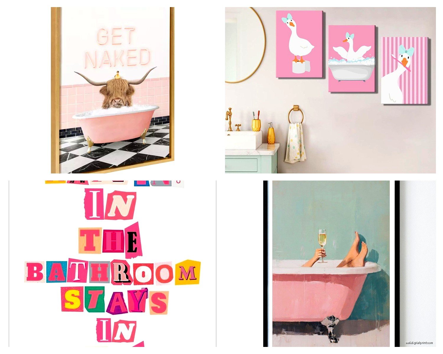
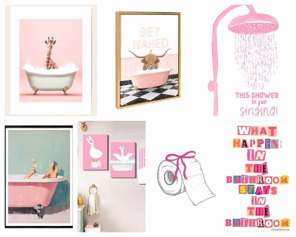
Oh and another thing, size matters way more than people think. I see so many tiny 8×10 prints floating on a big bathroom wall and it’s just sad. You want at least 16×20 if you’re doing a single piece above the toilet or sink. Or do a gallery wall situation but make sure the overall footprint is substantial. I did three 11x14s in a row horizontally above a bathtub and that worked really well.
For rose-specific art, there’s like a million options which is overwhelming. Here’s what I’ve actually tested and liked:
Vintage botanical rose prints are gorgeous and you can find affordable ones on Etsy or even download them from museum databases for free. The New York Public Library has this whole digital collection. I printed three different antique rose illustrations from there, got them framed at a local place with white mats and gold frames, and it cost maybe $200 total for all three. They look like I spent way more.
Abstract rose art is trickier because it can go really cheesy really fast. I’m picky about this. There’s this one artist on Society6 whose watercolor roses are actually good – they’re loose and gestural without being too literal. Her name is something like RosalindMonk? I’d have to check. But most abstract rose stuff online reads very “Live Laugh Love” to me and I just can’t.
Photography of actual roses can be stunning if it’s done right. I’m talking macro shots with really interesting lighting, not just standard rose bouquet pics. There’s a photographer who does these moody dark rose photos with almost black backgrounds and just hints of deep pink and red coming through. Those would be PERFECT for a pink bathroom because they add depth without being matchy-matchy.
Wait I forgot to mention – think about your other bathroom colors too. If you’ve got gold fixtures, warm-toned rose art works better. Chrome or silver fixtures pair nicely with cooler pink tones or even rose art that has blue undertones. My own bathroom has brass everything so I specifically looked for rose prints with peachy-pink rather than bubblegum pink.
This is gonna sound weird but I also really love mixing rose art with other stuff. Like don’t make it ALL roses unless your bathroom is huge. I did a gallery wall recently that was two rose prints, one fern botanical, and one abstract pink geometric print. It felt way more curated and interesting. The roses were the stars but they weren’t the whole show.
For framing, I’m obsessed with thin gold frames right now for feminine bathrooms. Not thick ornate ones, but simple thin brass or gold metal frames. They work with literally any style of rose art. Target actually has decent ones in their Threshold line and they hold up fine in bathrooms. I’ve also used white frames with gold mats which is a nice subtle way to bring in that metallic.
Oh and if you’re renting or just don’t want to put holes in your walls, Command strips have come such a long way. They make ones specifically rated for bathrooms now that handle humidity better. I was skeptical but I’ve had art up with them in my powder room for over a year with zero issues. Just make sure you get the right weight rating – don’t cheap out and get the light duty ones if your frame is heavy.
Let me tell you about layout because this is where people mess up constantly. If you’re hanging art above a toilet, center it on the wall but make sure it’s at least 6-8 inches above the tank. I see people hang stuff too low all the time and then it just looks cramped. Above a sink, you want the center of your art to be roughly at eye level when you’re standing at the sink, which is usually around 60-65 inches from the floor.
For next to mirrors, this gets tricky. I actually prefer putting art on the wall opposite the mirror so you see it reflected, rather than flanking the mirror which can feel crowded in a small bathroom. But if you’ve got a huge bathroom with a separate vanity area, flanking pieces can look amazing. Just keep them proportional – the art shouldn’t be wider than the mirror.
Gallery walls in bathrooms are having a moment and I’m here for it but you gotta plan it out first. I literally lay everything out on the floor in the arrangement before I hang anything. Take a photo of your floor layout so you remember it when you’re up on the ladder. Start with your largest piece first and build around it. For a rose-themed gallery wall, I like mixing different styles – maybe a vintage botanical, a modern line drawing of a rose, a small pressed flower piece, and an abstract pink wash print.
My cat knocked over my coffee while I was planning a bathroom gallery wall last week and the photos got all messed up which was annoying but actually made me realize I’d been overthinking it. Sometimes you just gotta hang stuff and see how it feels.
Materials-wise beyond just metal prints – I really like acrylic blocks for small bathrooms. They’re these clear acrylic rectangles with your image printed inside and they sit on shelves or windowsills. Super modern looking and obviously waterproof. Not traditional but for a contemporary pink bathroom they’re really cool.
Canvas prints are fine if they’re properly sealed but I always spray mine with a clear acrylic sealer even if they claim to be bathroom-ready. Just adds an extra layer of protection. Let it dry outside or in a garage though because the fumes are intense.
This might be obvious but natural light vs artificial light changes how your pink art looks SO much. I always look at prints in both types of light before buying if possible. Some pinks go really orange in warm artificial light which might not be what you want. Cool white LED lighting tends to keep pink tones truer.
Budget-wise, you can totally do this affordably. Printable art from Etsy is like $5-10 per print, then you just need frames. Or if you wanna splurge, original rose watercolors on Etsy range from $50-200 usually for small pieces. I have a mix of both in my house and honestly guests can’t tell which is which when they’re framed nicely.
One thing I’m really into right now is pressed flower art with actual roses. You can DIY this if you’re crafty – press roses between book pages, frame them between two pieces of glass. Or buy them already done on Etsy. They add this romantic vintage vibe that works perfectly in pink bathrooms. Just make sure they’re in a sealed frame because humidity will destroy them otherwise.
For modern spaces, line drawings of roses are everywhere right now. Single line rose prints, continuous line art, that whole aesthetic. It’s very minimalist and works well if your pink is more of an accent color rather than covering all the walls. I paired some black line rose drawings with pale pink walls in a client’s half bath and it was chef’s kiss.
Oh wait, textural stuff too – I’ve used rose-printed fabric in floating frames which adds dimension. Or you can do embroidery hoops with rose-patterned fabric which is very cottagecore but in a good way if that’s your vibe. Not everything has to be a traditional print.
The other day I saw someone had done a whole wall of mismatched vintage rose plates and it actually looked amazing? Not technically wall art but same effect. You’d need to make sure they’re secured really well though because a plate falling in a bathroom would be a disaster.
For small bathrooms, one larger statement piece usually works better than trying to cram in multiple pieces. I did a 24×36 abstract rose canvas in a tiny powder room and it made the space feel bigger somehow because it was bold and intentional rather than fussy.
Color saturation matters too – really saturated hot pink roses can be overwhelming in a small enclosed space. I tend to go for softer, more muted rose tones for actual bathrooms and save the brighter stuff for bedrooms or living areas where you have more space to balance it out.
If you’re gonna do this, just start with one or two pieces and live with them for a bit before committing to a whole gallery wall. I’ve changed my mind on bathroom art so many times after seeing it in different lighting throughout the day. That morning light hits different than evening light and you wanna make sure you still love it at all times of day.
And honestly the best advice I can give is don’t overthink it too much. I’ve spent hours agonizing over the perfect rose print only to end up loving something I grabbed on impulse way more. Your bathroom should make you happy when you’re brushing your teeth in the morning, that’s really all that matters.