Wall Art Guide, Wall Art Tutoriels
Wall Art for Grey Living Room: Neutral Main Space Decor
May
So I’ve been working with grey living rooms for like three years now and honestly the wall art situation is way easier than people think once you stop overthinking it. Had a client last month who kept sending me Pinterest boards at midnight and I’m like… we just need to pick ONE direction and go with it.
The Base Rule Nobody Tells You
Okay so with grey walls you’ve basically got a blank canvas which sounds great but then you stand there staring at the wall for twenty minutes because everything either looks too boring or too chaotic. Here’s what actually works: your art needs to either introduce warmth OR go full monochrome drama. There’s no middle ground that looks intentional.
I learned this the hard way when I tried to do like a “soft pastel” thing in my own living room two years ago and it just looked washed out and sad? My dog would literally avoid that room. Swapped everything for warm terracotta and rust tones and suddenly the space felt like somewhere you’d actually want to sit.
The Warm Tone Direction
If you’re gonna go warm (which I recommend for most grey rooms because they need it), you want:
- Terracotta, rust, burnt orange, warm ochre
- Deep burgundy or wine colors
- Mustard yellow but like the sophisticated kind not the hotdog kind
- Warm browns and tans
I just hung this abstract piece that’s mostly rust and cream in a client’s space last week and it completely transformed the room from “dentist office” to “oh I’d have coffee here.” The grey was Benjamin Moore Chelsea Gray which is pretty neutral, and the warmth just popped against it.
Size Matters More Than You Think
This is where everyone screws up including me the first dozen times. You walk into HomeGoods, see a cute 16×20 print, bring it home, and it looks like a postage stamp on your wall. Grey rooms especially need substantial art because the neutral backdrop doesn’t do any heavy lifting for you.
For over a sofa you want something that’s at least two-thirds the width of the sofa. I usually go with either:
- One large piece 48-60 inches wide
- A diptych or triptych that spans 60-72 inches total
- A gallery wall that fills like 5-6 feet of width
Oh and another thing, hang stuff higher than you think. The center of your art should be at eye level which is like 57-60 inches from the floor. I see SO many living rooms where everything’s hung at 48 inches and it makes the ceilings look low and weird.
What I Actually Buy
So I’m gonna be real with you, most of my art comes from like five places. Etsy for prints that I get custom framed, local artists when I’m feeling bougie, Target’s Threshold collection (don’t judge it’s actually good), West Elm when they’re having a sale, and this random warehouse in my city that does estate sales.
For grey living rooms specifically I keep going back to:
Abstract landscapes – The kind that’s basically just color fields. Warm horizon lines, desert vibes, that sort of thing. There’s this one artist on Etsy who does these minimal desert prints and I’ve literally bought them for four different clients. They’re like $40 for the digital download and then you print at Costco for cheap.
Line drawings – Simple black line art on cream or white backgrounds. Faces, bodies, organic shapes. These work great in grey rooms because they don’t compete, they just add visual interest without introducing new colors. I did a whole wall of mixed line drawings in different sized black frames last month and it looked so clean.
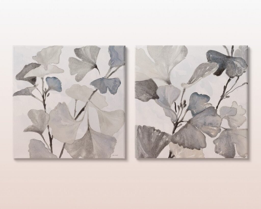
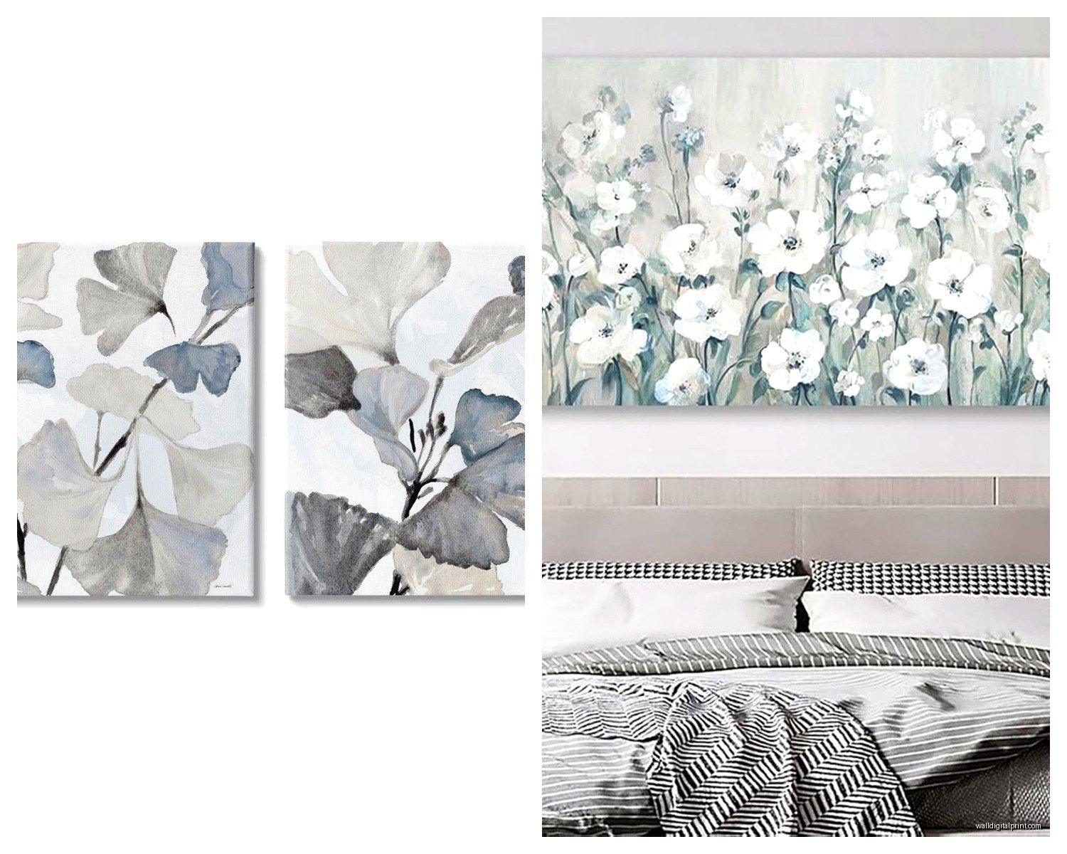
Botanical prints – But not like grandma florals. More like modern botanical illustrations or pressed plant photography. Sage green and terracotta botanicals against grey walls is *chef’s kiss*. Just make sure they’re substantial enough.
The Monochrome Route
Okay so if you’re not into color and want to keep things tonal, you can totally do all black and white and grey art. BUT you need contrast and texture or it’ll look flat. This means:
- Mix photography with graphic prints
- Vary your frame styles – some black, some natural wood, some white
- Include something with actual texture like a woven piece or a print on canvas
- Make sure you have true blacks and true whites, not just fifty shades of grey (sorry I had to)
I did this in a client’s loft last year where everything was cool grey and concrete and we went full monochrome. Used black and white photography, architectural line drawings, and this one textured piece that was like white on white geometric shapes. The trick was the lighting – we added picture lights to three of the pieces and it created all this depth.
Gallery Wall Strategy
Wait I forgot to mention gallery walls because everyone asks about these. They’re great for grey rooms because you can mix temperatures and styles and it reads as intentional collection rather than “I couldn’t decide.”
My formula that actually works:
- Start with your largest piece and hang that first at eye level
- Build around it with smaller pieces
- Mix orientations – some horizontal, some vertical, maybe one square
- Keep frames consistent OR go deliberately eclectic, no in between
- Lay it out on the floor first I’m begging you
For a grey living room I like doing warm-toned gallery walls with black frames. So all your art has terracotta, rust, mustard, warm pink, cream, but it’s unified by the frame color. Gives you visual variety without chaos.
The Spacing Thing
Keep 2-3 inches between frames in a gallery wall. I use painters tape to map it out on the wall before I start drilling holes because I’ve definitely created swiss cheese walls before and it’s not cute. My cat judges me every time I pull out the drill now.
What Doesn’t Work
This is gonna sound weird but I’ve learned more from my mistakes than my successes. Things that look bad in grey living rooms:
Cool pastels – Pale blue, lavender, mint green. They make the grey look dingy and cold. Unless you’re going for like a specific Scandinavian ice palace vibe, skip these.
Tiny art scattered randomly – It’s not curated, it’s just confusing. Either commit to a gallery wall or go big with individual pieces.
Too much going on – If your art has a million colors and your throw pillows have a million colors and your rug has a million colors, the grey walls aren’t helping you, they’re just giving up. Pick like three main colors and stick with them.
Art that matches your walls too closely – I had a client with grey walls who wanted grey abstract art and it literally disappeared. You need contrast even if you’re doing monochrome.
Framing Makes or Breaks It
Okay so funny story, I once spent $300 on this gorgeous print and put it in a $15 frame from Amazon and it looked like dorm room decor. Got it properly framed with a mat for another $150 and suddenly it looked like a gallery piece.
For grey rooms I default to:
- Black frames for modern spaces
- Natural wood frames for warmer, more organic vibes
- White frames when I want things to feel light and airy
- Gold/brass frames when the room needs glamour
The mat matters too. A crisp white mat makes almost anything look more expensive. I usually do 3-4 inch mats for anything smaller than 24×36.
Where to Get Frames That Don’t Suck
Framebridge for custom framing when I’m working with clients who have budget. They’re not cheap but they make it so easy and it looks professional. For my own stuff or budget projects I use IKEA frames (the Ribba line is solid) or Michael’s when they’re doing 70% off which is like every other week.
Oh and if you find vintage frames at estate sales or thrift stores, grab them. Even if they’re the wrong size you can get custom mats cut to make your art fit. I got this amazing ornate gold frame for $12 last year and put a simple line drawing in it and everyone asks where I got it.
Lighting Actually Matters
Something nobody thinks about until I point it out – your art looks completely different depending on your lighting. Grey rooms especially need good lighting because they can read dark and flat.
I always add:
- Picture lights on statement pieces
- Track lighting or directional recessed lights aimed at the walls
- Table lamps that throw light upward toward art
Was watching The Great British Baking Show last week while working on a lighting plan and honestly the way they light those cakes is how you should think about lighting art. You want it highlighted but not harsh.
My Current Favorites
Since you asked what to actually buy, here’s what I’m using right now:
For large statement pieces I love Minted’s oversized prints. They go up to like 54 inches and the quality is solid. Their abstract landscape collection is perfect for grey rooms – lots of warm desert tones and minimal compositions.
For affordable gallery walls I download from Etsy and print at a local print shop. Search for “abstract warm tones printable” or “terracotta line art print” and you’ll find hundreds of options under $10.
For something more unique I hit up local art fairs and student shows. You can get original pieces for way less than you’d think and it supports actual artists. Plus nobody else will have the same thing.
The Three-Piece Rule
If you’re stuck and don’t know where to start, just get three pieces:
- One large abstract with warm tones (48×36 or bigger)
- One medium botanical or line drawing (24x30ish)
- One small textural piece or photography print (16×20)
Arrange them asymmetrically on your main wall and you’re done. This works in like 80% of grey living rooms and takes the decision paralysis out of it.
The key is just starting somewhere instead of waiting for the perfect pieces to materialize. I’ve had blank walls for months because I was overthinking it and honestly just hanging SOMETHING made the room feel more finished even if it wasn’t perfect.
Your grey living room is basically waiting for you to give it personality through your art choices. The walls are neutral on purpose – they’re not supposed to be the star, your art is. So pick things that make you happy when you look at them, make sure they’re big enough to matter, and hang them at the right height. That’s literally it.