Wall Art Guide, Wall Art Tutoriels
Plant Wall Art: Botanical Prints & Green Living Decor
Jun
So I’ve been completely obsessed with botanical prints lately and honestly it started because I needed to fill this massive empty wall in my apartment and didn’t wanna spend like a thousand dollars on original art. Turns out plant wall art is actually the perfect solution if you know what you’re looking for.
The Stuff That Actually Works
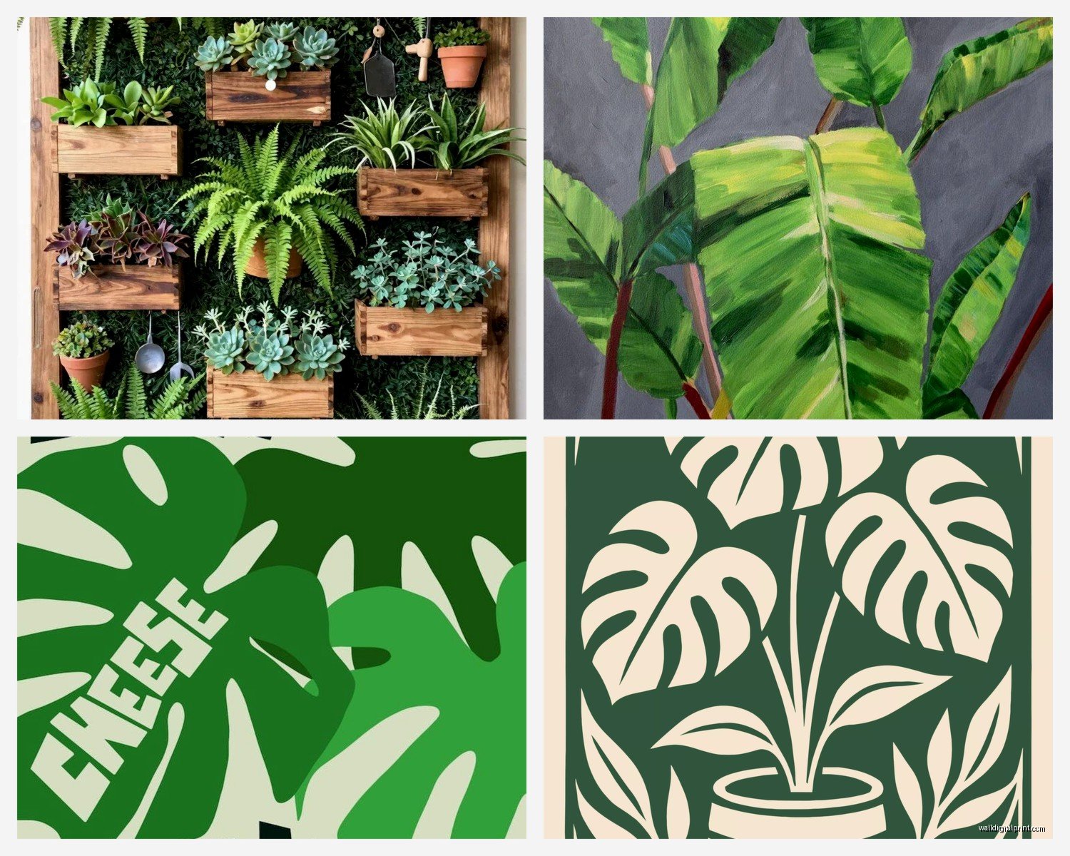
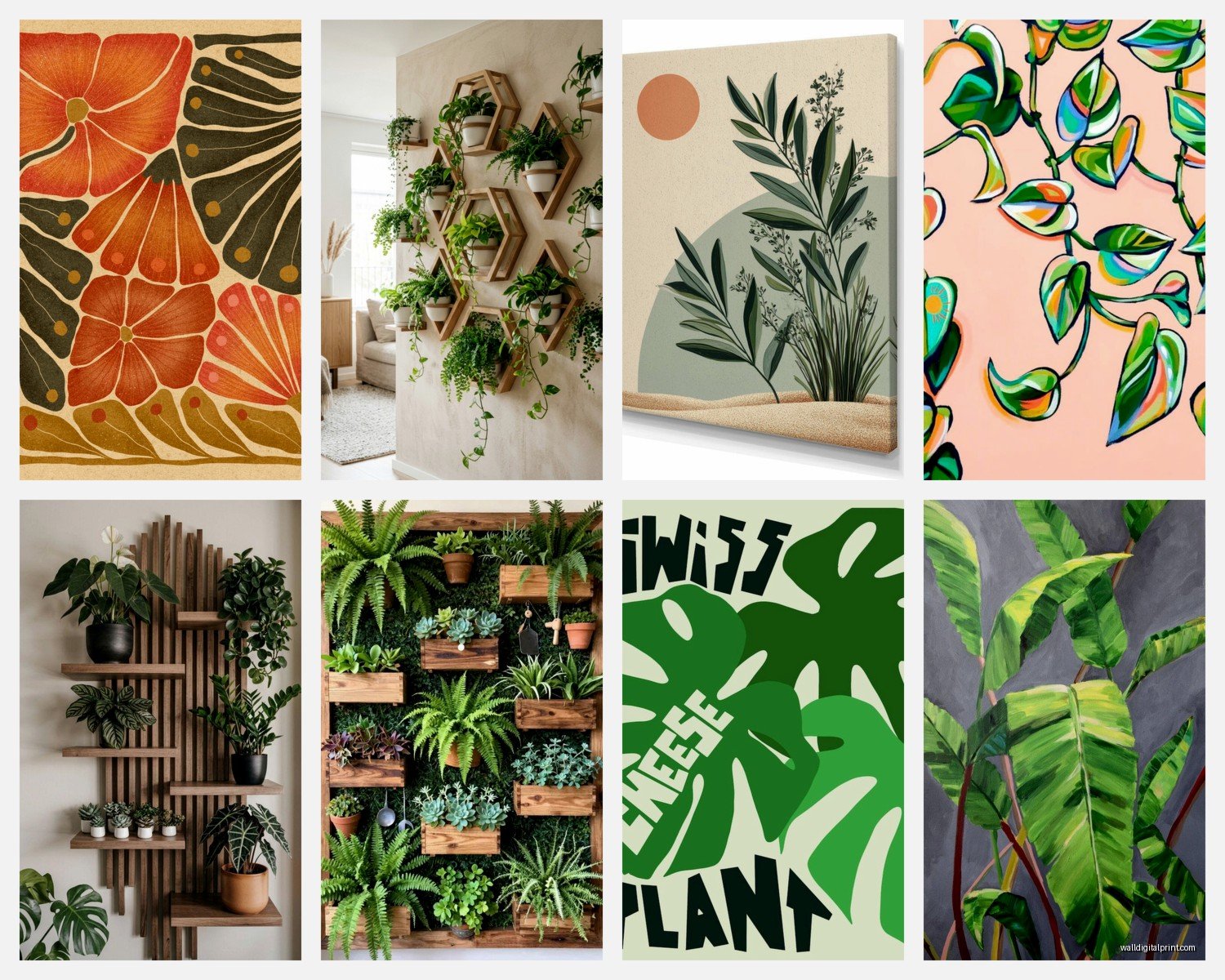
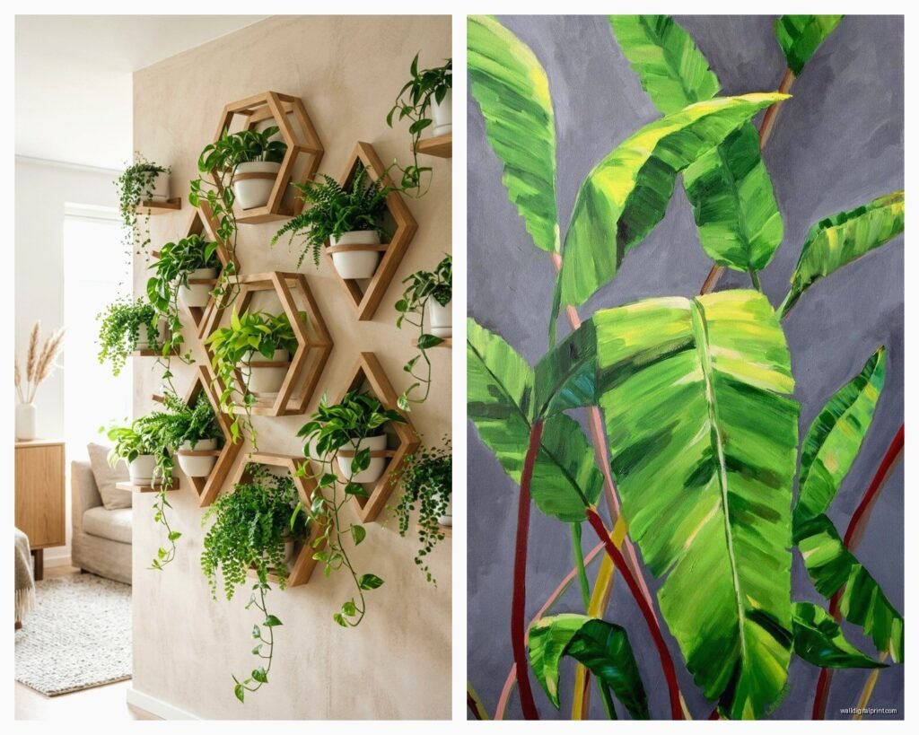
Okay so here’s the thing about botanical prints – there’s a huge difference between the ones that look expensive and the ones that scream “I bought this at a big box store.” The secret is in the detail and the printing quality. I’ve tested probably like 30 different prints over the past year for client projects and my own place, and the ones from Etsy sellers who use archival paper? Those are gonna be your best bet for that high-end look without the high-end price.
The vintage botanical illustrations work really well because they have this natural aged quality that feels intentional. You know those old scientific drawings from like the 1800s? Those. They’re in the public domain so you can find high-res versions and print them yourself if you’re feeling ambitious, but honestly I just buy them already printed because my printer situation is… not great.
Size Actually Matters More Than You Think
This is gonna sound obvious but I see people mess this up constantly – you need to go bigger than you think. A single 8×10 print on a large wall looks lonely and sad. I learned this the hard way when I hung three small prints above my couch and my friend came over and was like “are those temporary?” Ouch.
For a standard sofa or bed, you want your art to take up about two-thirds to three-quarters of the furniture width. So if your couch is 84 inches, you’re looking at around 56-63 inches of art space. You can do this with one large piece or a gallery wall situation.
Gallery Wall Layouts That Don’t Look Chaotic
Okay so gallery walls with botanical prints are my favorite thing right now but they can go wrong really fast. Here’s what I do and it works every single time:
- Pick 2-3 frame colors max – I usually do all black or mix black with natural wood
- Keep your prints in the same family – all vintage botanicals, or all modern line drawings, don’t mix like vintage roses with minimalist monstera leaves
- Use the same mat color throughout – white mats are your friend here
- Plan it on the floor first because drywall damage is real
The grid layout is honestly the easiest if you’re not super confident. Same size frames, equal spacing, boom. It looks intentional and clean. I did this in my bedroom with six 11×14 fern prints and it took maybe 45 minutes including the measuring.
But if you wanna do the organic salon-style layout, here’s the trick – start with your largest piece at eye level (that’s about 57-60 inches from the floor to the center of the frame), then build around it. Keep the spacing between frames consistent, like 2-3 inches apart.
The Frame Situation
Frames are where people either save money or waste it completely. IKEA frames are actually fine for this – the RIBBA and KNOPPANG lines work great for botanical prints. But here’s what I learned after buying like a million frames… measure your actual print before buying the frame because “8×10” doesn’t always mean 8×10.
I also really love the look of floating frames for pressed botanicals or if you’re doing actual dried plants between glass. West Elm has some good ones but they’re pricey. Target’s threshold line does similar ones for way less.
Oh and another thing – if you’re printing your own stuff, go to a local print shop instead of like Staples or whatever. The quality difference is huge and it’s usually only a few dollars more. There’s this place near me that does 11×14 prints on heavy cardstock for $8 and they look incredible.
Where to Actually Source Your Prints
This is probably what you really wanna know right. So I have a whole folder of Etsy shops I use regularly:
TheCuratorsPrints has amazing vintage botanical collections and you can buy digital downloads which is clutch if you need something specific in a weird size. Their fern collection is *chef’s kiss*.
For more modern minimalist stuff, ProjectNord and DesignClaud have good options but they’re more expensive. Sometimes worth it though if you want that really clean Scandinavian vibe.
Honestly though? The Rijksmuseum and New York Public Library have free downloads of botanical illustrations in their digital collections. High resolution, gorgeous, FREE. I spent an entire Saturday going through the NYPL collection when my client canceled and I had nothing else to do. Found this incredible collection of orchid prints from 1897.
DIY Options That Don’t Look DIY
Okay so if you’re really on a budget or you want something super specific, you can absolutely make your own botanical art. I did this for my kitchen and it turned out way better than expected.
Get yourself some decent cardstock or watercolor paper, some clear frames, and actual plant clippings from your yard or whatever. Press them in a heavy book for like two weeks (I use my giant design books for this). Then arrange them on the paper and frame them. It looks expensive and collected and no one needs to know you literally picked the leaves from your backyard.
My dog ate one of my fern fronds while I was doing this which was annoying but also kinda funny.
You can also do the pressed flower thing with flowers from the grocery store. Those eucalyptus bunches from Trader Joe’s? Perfect for this. Let them dry out, arrange them, frame them.
Color Schemes That Work
This is where people get stuck because botanical art comes in so many different styles and colors. Here’s my breakdown:
For a really traditional look, go with vintage prints that have those aged paper backgrounds – the cream and brown tones. These work in literally any room and with any decor style. I have a set above my fireplace and they tie together my kinda eclectic mix of furniture.
If you want modern and fresh, look for prints with white or light gray backgrounds and green-only illustrations. The monochromatic green thing is really popular right now and it’s popular for a reason – it’s calming and it works.
The colored botanical prints (like those old rose illustrations with pinks and yellows) can be tricky. They work best if you pull one of those accent colors into your room through pillows or something. Otherwise they can feel disconnected.
Mixing Botanical Prints with Other Art
You don’t have to go full botanical everywhere. Actually please don’t because that can feel like a lot. I mix my plant prints with black and white photography and abstract stuff.
The key is to keep some visual element consistent – same frame color, same mat style, or same general color palette. My living room has botanical prints mixed with some abstract watercolors and vintage maps and it works because everything’s in black frames with white mats.
Specific Room Recommendations
Wait I forgot to mention – different rooms need different approaches with this stuff.
Bathrooms: Small vintage herb prints or fern prints work great here. Get them properly framed though because humidity is real. I learned this when a non-glass frame got all warped in my bathroom. Now I only use sealed frames in there.
Bedrooms: Go bigger and calmer. Large-scale leaf prints or soft florals. This isn’t the place for a chaotic gallery wall unless you’re into that. I have one huge monstera leaf print above my bed and it’s perfect.
Kitchen: Herb prints! Vintage vegetable illustrations! This is where you can have fun with it. I did a whole wall of vintage herb prints in my kitchen and get so many compliments on it. They’re from like 1890s seed catalogs and they’re amazing.
Living room: This is where you can do your big statement gallery wall or one really large piece. I’m currently working on a client project with a 40×60 inch custom botanical print and it’s gonna be stunning.
The Lighting Thing Nobody Talks About
Okay this is gonna sound weird but lighting makes such a huge difference with botanical prints. If you have them in a dark corner, they just disappear. You want either natural light or some picture lights.
I installed those battery-operated LED picture lights above my gallery wall and it completely changed how they look at night. They’re like $15 on Amazon and you just stick them up there. No wiring, no electrician.
Also don’t hang your prints in direct sunlight if they’re actual photographs or prints on regular paper because they’ll fade. Learned this the hard way with some prints in my old apartment.
The Maintenance Situation
This is pretty low-key honestly. Dust the frames every once in a while. If you did the pressed plant thing, they’re gonna brown over time and that’s fine – it actually looks better in a way, more vintage.
Glass can get fingerprints if you have kids or if you’re like me and touch everything. Just wipe it down with glass cleaner occasionally.
If you notice fading, you might need to move the piece or get UV-protective glass. It’s more expensive but worth it for pieces you really love.
Budget Breakdown
Since you’re probably wondering what this actually costs:
Super budget option: Print your own from free sources, IKEA frames = $5-15 per piece
Mid-range: Etsy digital downloads, nicer frames from Target or Amazon = $25-50 per piece
Splurge: Custom framing, original vintage prints, professional printing = $100+ per piece
I usually mix all three levels in a room honestly. Some IKEA frames with free prints, some nicer pieces I invested in.
Things I Wish I’d Known Earlier
Command strips are your friend for renters but make sure you get the right weight rating. I had a frame fall at 3am once and it scared the crap outta me and my cat.
Mat size changes everything – a small print in a large mat looks way more expensive than the same print in a tight frame.
You don’t need to fill every wall. Sometimes one really good gallery wall is better than botanical prints scattered everywhere.
Black frames show dust more than wood frames. Just something to consider if you’re lazy about dusting like I am.
The trend right now is leaning toward larger, simpler botanical prints rather than tons of small busy ones. But honestly do what you like.
Oh and if you’re hanging stuff yourself, get a level. A real one. The app on your phone is not accurate enough and you’ll end up with crooked frames that drive you insane every time you look at them.