Wall Art Guide, Wall Art Tutoriels
Poppy Wall Art: Red Flower Memorial Remembrance Symbol
Aug
So I’ve been working with poppy wall art for the last few years and honestly it’s one of those things that seems straightforward until you actually start trying to pick pieces or figure out where to hang them. My sister asked me about this last November because she wanted something for Remembrance Day but also didn’t want it to feel too… I dunno, heavy? Like she wanted to honor the symbolism without making her living room feel like a memorial hall.
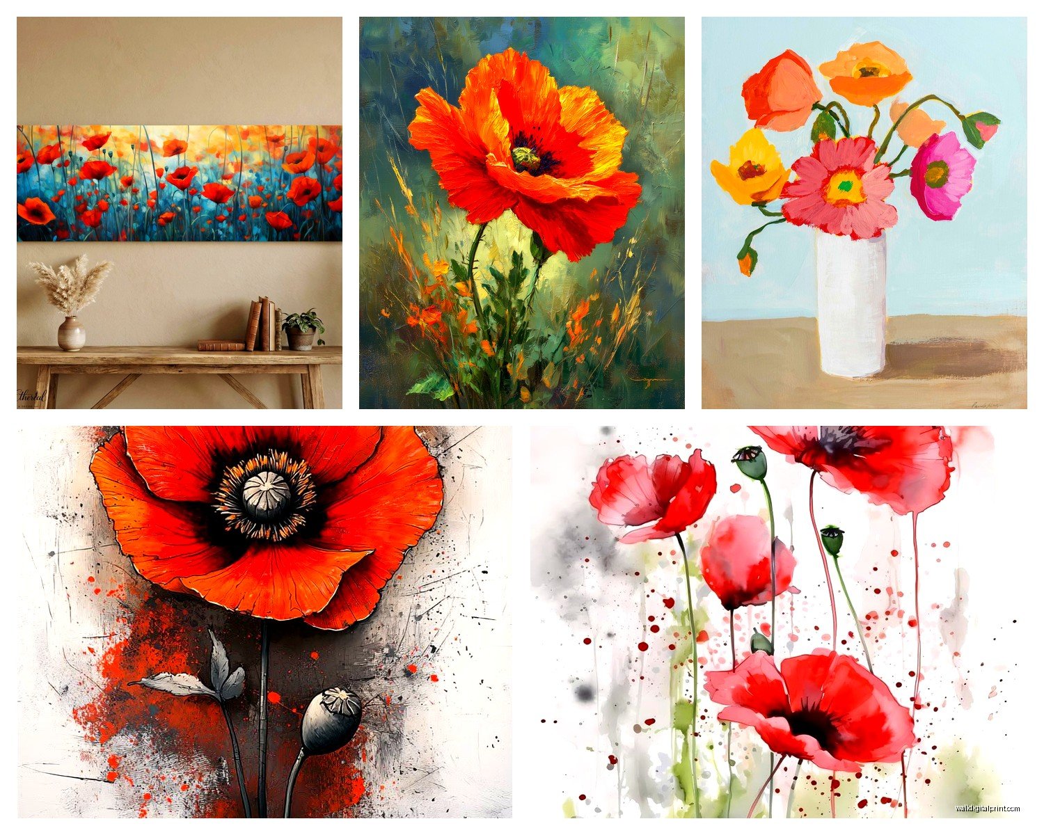
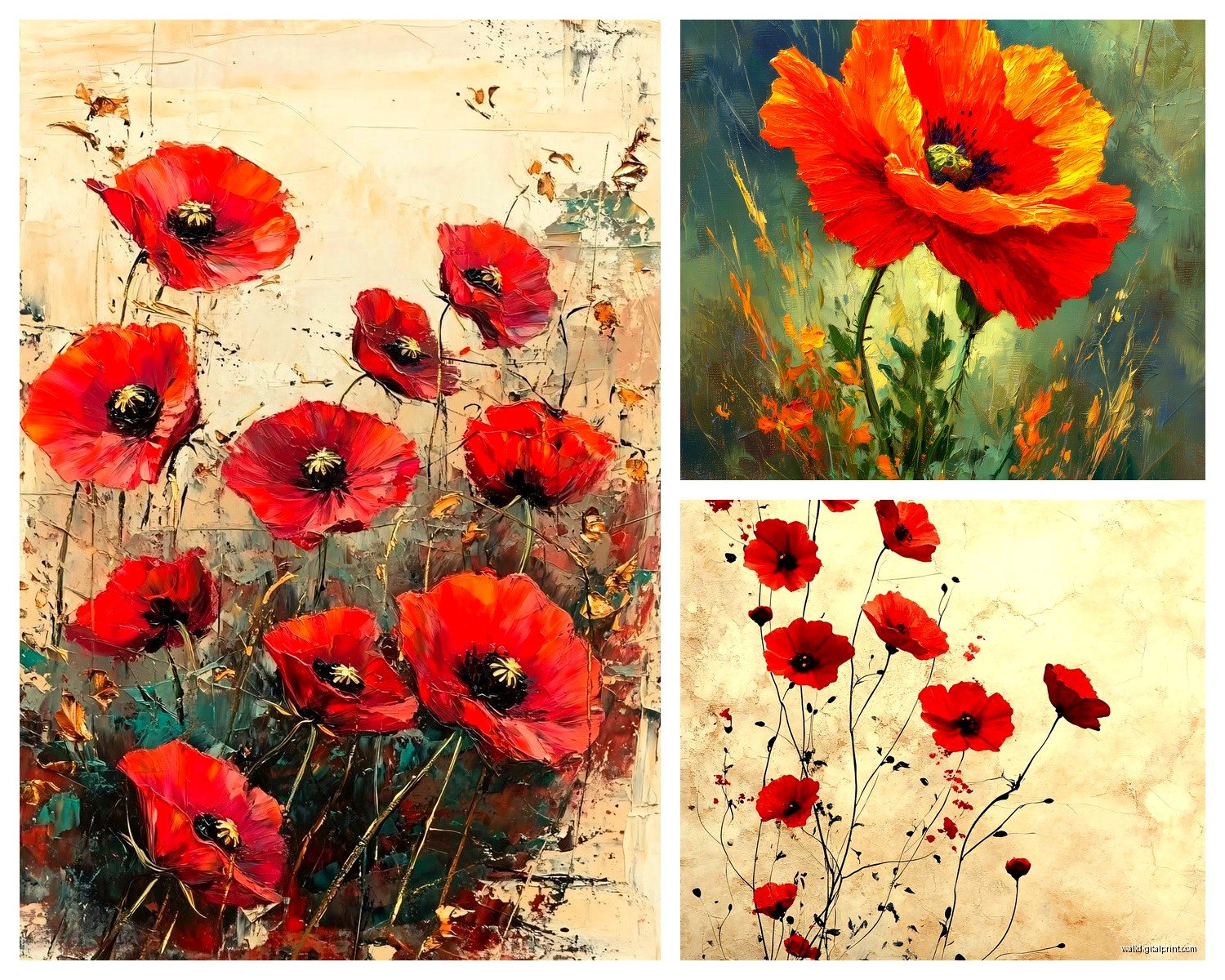
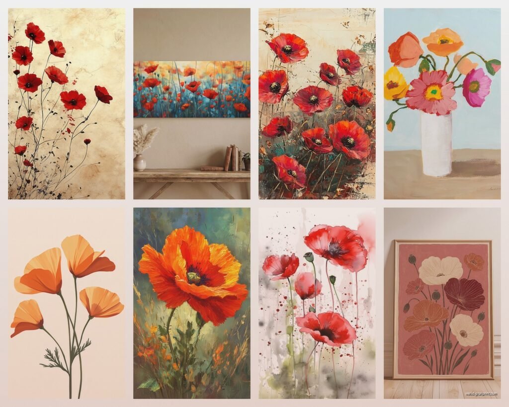
First thing you gotta know is that poppy art comes in wildly different styles and the vibe changes completely depending on what you choose. I’ve got a client who has this massive abstract poppy canvas that’s mostly black with just hints of red and it reads totally modern. Then my neighbor has a vintage-style botanical print that looks like it came from a 1940s textbook and it’s got this whole different energy. Both are poppies, completely different rooms.
Figuring Out What Style Actually Works For Your Space
Okay so when you’re scrolling Etsy or whatever at 11pm trying to decide, here’s what I look at first. The color palette beyond just the red. Some poppy art is ONLY red and black which is super dramatic and works amazing in minimalist spaces or modern offices. I put a piece like that in a law office last year and it was perfect because it had gravitas but wasn’t distracting.
But then you’ve got the watercolor-style poppies with soft pinks and corals mixed in with the traditional red, and those are way more versatile for homes. They work in bedrooms, they work above a dining table, they don’t overwhelm a space. I have one in my own hallway actually and my cat keeps trying to jump at it because the stems kinda dangle down in the painting and she’s… not smart.
Abstract vs Realistic
Abstract poppy art is where you get those big sweeping brush strokes and the flowers are more suggested than detailed. These are great if you want the symbolism but you’re decorating a contemporary space. I used a set of three abstract poppy panels for a loft apartment and they bridged this gap between honoring the memorial aspect and fitting with the client’s mid-century modern furniture.
Realistic or photographic poppy prints are different. They show every petal, every stamen, sometimes even the texture of the paper-thin petals. These work better in traditional spaces or if you’re specifically creating a memorial corner or remembrance area. They’re more literal about the symbolism which some people really want.
Size Matters Way More Than You Think
I made this mistake early on where I ordered a poppy print for above my couch and it arrived and it was like… greeting card sized. The listing said 16×20 which I thought was inches but apparently the seller meant centimeters and I didn’t catch it because I was watching Succession and not paying attention.
For a living room wall, you generally want something at least 24×36 inches if it’s a single piece. I actually prefer going bigger, like 36×48 or even 40×60 if you’ve got the wall space. Poppies have these delicate stems and petals so if the piece is too small, you lose all that detail from across the room and it just reads as a red blob.
If you’re doing a gallery wall situation, you can mix smaller pieces but I’d keep them all at least 11×14 minimum. I did a staircase gallery wall with poppy prints ranging from 11×14 to 16×20 and it worked because you’re viewing them up close as you walk up the stairs.
Multi-Panel vs Single Canvas
Oh and another thing, those triptych or multi-panel poppy pieces. You know where it’s one image split across three or five canvases? Those are having a moment and I get asked about them constantly. They work really well for wide walls like above a king bed or a long sofa. The split creates visual interest even though it’s one continuous image.
But here’s the catch – you gotta hang them properly. I’ve seen so many DIY installations where people space them too far apart and it just looks weird. Keep the gap between panels around 2-3 inches max. I use 2 inches for most installations. Any wider and your eye doesn’t connect them as one piece.
The Remembrance Day Timing Question
So my sister’s original question was whether poppy art is only appropriate around Remembrance Day or Veterans Day. And honestly this is personal but I think the symbolism is meaningful year-round. The poppy represents sacrifice and memory, and those aren’t seasonal concepts.
That said, if you want something that feels appropriate for everyday display, I’d avoid pieces that include specific dates or military imagery alongside the poppies. Just the flowers themselves carry the meaning without being too literal about it. I have clients who are veterans or have family members who served and they display poppy art year-round as a subtle ongoing tribute.
Combining With Other Decor
Wait I forgot to mention how to style around poppy art because that’s where people get stuck. The red is obviously the dominant color so you gotta decide if you’re gonna echo it in the room or let it stand alone as an accent.
I usually go the accent route. Let the red poppies be the main pop of color and keep surrounding decor more neutral. Grays, whites, blacks, natural wood tones. Maybe bring in some brass or gold frames if you want warmth. But adding more red throughout the room can make it feel too themed, like you’re REALLY into poppies specifically rather than just having a beautiful piece of art.
One exception – I did a dining room where we had red poppy art and then used deep burgundy velvet dining chairs and it was gorgeous. But that’s because burgundy and true red are different enough that they don’t compete.
Frame or No Frame That Is The Question
Canvas prints of poppies can go frameless with those gallery-wrapped edges. That’s where the image continues around the sides of the canvas. It’s clean and modern and you just hang it straight on the wall. I do this probably 60% of the time with poppy art because it keeps the focus on the flowers and doesn’t add extra visual weight.
But frames absolutely have their place. Black frames make poppy art more formal and contained – good for offices or traditional homes. Natural wood frames warm it up and work great in farmhouse or cottagecore type spaces. White frames keep it light and are good if your walls are darker colored.
This is gonna sound weird but I’ve also used thin gold frames on poppy watercolors and it elevated them like crazy. There’s something about the delicate gold with the soft red watercolor that feels really refined. Did this for a powder room and people always comment on it.
Matting Considerations
If you’re framing a print rather than a canvas, consider matting. A white or cream mat creates breathing room around the image and makes it feel more valuable somehow. I use mats that are at least 3 inches wide, sometimes 4 inches if it’s a smaller print that needs more presence.
Black mats are dramatic with poppy art but can be too heavy if your space is already dark. I used black mats in a room with floor-to-ceiling windows and tons of natural light and it worked because the light balanced the darkness. But in a typical room with standard lighting, stick with lighter mats.
Where To Actually Buy Quality Poppy Art
Okay so real talk about shopping for this stuff. Etsy has a million options but quality varies wildly. I’ve ordered from sellers who shipped gorgeous thick paper prints with rich colors, and I’ve gotten garbage that looked like someone’s inkjet printer was running out of ink.
Look for sellers who specify the paper weight – you want at least 200gsm for prints, ideally 300gsm. Check reviews with photos because those show what actually arrives. And honestly if a listing has no reviews or photos, I skip it unless the seller has tons of positive reviews on other items.
For canvas pieces, places like Society6 and Redbubble have poppy designs from independent artists and the quality is pretty consistent. It’s print-on-demand so it takes longer to ship but I’ve had good experiences. The canvases come ready to hang which is convenient.
If you want something more upscale, art galleries and museum shops often have poppy prints, especially around November. The Imperial War Museum has some stunning historical poppy artwork reproductions if you want something with authentic connection to WWI history.
Original Art vs Prints
Original poppy paintings are obviously more expensive but if you’ve got the budget, they’re incredible. I worked with a local artist who does oil paintings of poppies and we commissioned a piece for a client’s entryway and it’s literally the first thing everyone talks about when they visit. The texture and depth you get with real paint… prints can’t replicate that.
But good prints are totally valid. Most people can’t tell the difference from a few feet away, especially if it’s well-framed. I’ve mixed original art with high-quality prints in the same room and nobody notices which is which.
Installation Tips That Actually Matter
Hanging height trips people up constantly. The center of your artwork should be at eye level, which is usually around 57-60 inches from the floor. But that’s standing eye level. If you’re hanging art in a dining room where people sit, you can go slightly lower.
For poppy art specifically, I sometimes cheat this rule because poppies grow upward on stems. Having them hung slightly higher can actually reinforce that natural growth direction and feel more intentional. I’ve hung poppy pieces with the center at 62-63 inches and it worked because it emphasized the upward reach of the stems.
Use proper hanging hardware please. Those little sawtooth hangers that come attached to cheap frames are terrible. I replace them with D-rings and picture wire for anything over 5 pounds. For canvas pieces, I use heavy-duty picture hangers rated for the weight. My client’s massive poppy canvas fell off the wall at 3am once because she used inadequate hardware and we both learned that lesson.
Lighting Considerations
This is something I didn’t think about early in my career but lighting changes everything with poppy art. Direct sunlight will fade red pigments over time, so avoid hanging valuable pieces where afternoon sun hits them directly. I’ve seen beautiful poppy prints get washed out and pinkish after a year in a south-facing window.
If you want to spotlight your poppy art, picture lights or track lighting work great. The warm light makes the reds even more vibrant. I installed a simple LED picture light above a client’s poppy triptych and it transformed the whole wall into a focal point at night.
Mixing Poppy Art With Other Florals
You can totally mix poppy art with other botanical prints but you gotta be thoughtful about it. I generally keep poppies as the dominant flower and add more subtle florals around them. Like if you’re doing a gallery wall, maybe one large poppy piece with smaller prints of ferns or eucalyptus or simple line drawings of other flowers.
Mixing poppies with roses can work if the styles match – like if they’re both watercolors or both vintage botanical illustrations. But mixing a modern abstract poppy with a traditional rose painting usually looks confused.
Oh and funny story, I had a client who wanted to mix poppy art with sunflower art because those were her two favorite flowers and I talked her out of it because red and bright yellow compete for attention too much. We compromised with poppies in the living room and sunflowers in the kitchen and she’s way happier with that separation.
Creating A Dedicated Memorial Space
If you specifically want to create a remembrance corner or memorial area with poppy art, there are ways to do this that feel respectful without being somber. I helped a veteran client design a small wall area in his study with a beautiful realistic poppy print, a shelf below with a folded flag and some photos, and a small reading light.
The key is intention and simplicity. You don’t need a lot of stuff. The poppy art as the centerpiece, maybe a meaningful object or two, and space to reflect. Keep the surrounding walls clear so the area feels set apart.
Some people add a small plaque or nameplate with names or dates. Others prefer keeping it more general as a symbol of collective sacrifice. Both approaches are meaningful and it really depends on your personal connection to the symbolism.
Seasonal Displays vs Permanent Installation
I get asked whether people should swap out poppy art seasonally and honestly I think permanent display is fine if you love the piece. But if you want to rotate art, poppies can be particularly meaningful from late October through November for Remembrance Day, then you could switch to something else for winter holidays.
I have a few clients who do keep poppy art specifically for November and store it the rest of the year. They treat it like seasonal decor similar to how some people rotate autumn and spring artwork. There’s no wrong answer here, it’s about what feels right for your space and your relationship to the symbolism.
The practical advantage of permanent display is you don’t need storage space and you don’t risk damaging pieces by moving them around. The advantage of seasonal rotation is it keeps things fresh and makes the November display feel more intentional when it goes up.
Okay so that’s basically everything I’ve learned from working with poppy wall art over the years. The symbolism is powerful but the actual design part is flexible, you can make it work in pretty much any style home if you’re thoughtful about selection and placement.