Wall Art Guide, Wall Art Tutoriels
Printable Chanel Wall Art: Free Designer Fashion Downloads
Sep
So I’ve been downloading and printing Chanel wall art for like three years now and honestly it’s become this weird hobby where I probably have way too many saved on my laptop but whatever, let me tell you what actually works because I’ve wasted so much printer ink figuring this out.
Where to Actually Find Good Free Chanel Prints
Okay so Pinterest is where everyone starts but here’s the thing – you gotta reverse image search basically everything because half those “free printables” just link to spam sites or make you sign up for seventeen newsletters. I learned this the hard way when I downloaded what I thought was a gorgeous Chanel No. 5 bottle print and it was like 72 dpi which is absolutely useless for printing anything bigger than a postage stamp.
The places I actually use now: Etsy has free downloads but you have to specifically search “free printable Chanel” and filter by price (free). Some sellers offer freebies to get you into their shop and honestly? Those are usually better quality than random Google finds because they want to impress you enough to buy their paid stuff.
Unsplash and Pexels won’t have official Chanel logo stuff obviously because copyright, but they’ve got really beautiful perfume bottles, fashion photography, and that whole luxury aesthetic that works just as well. I found this amazing black and white photo of pearls and a vintage perfume bottle that everyone thinks is Chanel even though it’s not technically branded.
The Copyright Thing Nobody Talks About
Look, I’m gonna be real with you – downloading Chanel logos and printing them for your home is technically in this gray area. For personal use in your own space? Generally fine. Selling prints with their logo or using them in a business? That’s where you get into trouble. I had a client once who wanted Chanel prints for her boutique and I had to explain why we needed to go with inspired-by designs instead of actual logos.
My rule is: if it’s for my house or I’m styling a room for photos, I use whatever looks good. If it’s for a client’s commercial space, we find alternatives or commission custom work that captures the vibe without the trademark issues.
File Quality Stuff You Actually Need to Know
This is where I see people mess up constantly. You need at least 300 dpi for printing. I cannot stress this enough. That cute little Chanel quote graphic you found? If it’s not high resolution, it’s gonna look pixelated and terrible on your wall no matter how expensive your frame is.
When you download something, check the file size – if it’s under like 500 KB, it’s probably too small unless you’re printing something tiny. I aim for files that are at least 2-3 MB for an 8×10 print. For anything bigger like 16×20, you want even larger files.
PDF files are usually better than JPEGs for text-based prints because they maintain quality better. Oh and another thing, if you’re downloading from Canva (they have templates you can customize), make sure you download as PDF print, not PNG for social media. I made that mistake with this beautiful Coco Chanel quote print and had to redo the whole thing.
Printing Options That Don’t Suck
Your home printer is fine for smaller prints if you invest in good paper. I use HP Premium Plus Photo Paper and it makes such a difference compared to regular printer paper. The colors are richer and it actually feels substantial when you frame it.
But here’s what I actually do most of the time now – I upload my files to Staples or FedEx Office and have them print on their nice printers. It costs like $3-7 depending on size and the quality is so much better than what I can do at home. Plus I’m not going through my own expensive ink cartridges which somehow always run out at the worst time.
For really special pieces, I use Printique or Nations Photo Lab online. You upload your file, they print on actual photo paper, and mail it to you. Takes a few days but the quality is legitimately professional. I did a whole gallery wall this way and people assume I bought expensive prints from a boutique.
Paper Types Matter More Than You Think
Matte vs glossy is a whole debate but for Chanel stuff I usually go matte because it looks more sophisticated and you don’t get that glare when light hits it. Glossy can look cheap unless it’s a photograph where you want those deep blacks and vibrant colors.
Cardstock is good if you’re printing at home and want something sturdier than regular paper but not as fancy as photo paper. I use 110 lb cardstock for quote prints and it works perfectly.
Linen paper is gorgeous for text-heavy prints – there’s this subtle texture that makes even a simple Coco Chanel quote look expensive. A bit harder to find but Michaels usually has some in their scrapbooking section.
Sizing and Layout Tips
So this is gonna sound weird but I keep a notes app on my phone with all my frame sizes because I’m constantly finding prints I want and then forgetting what size frames I actually own. Standard sizes are your friend: 5×7, 8×10, 11×14, 16×20. Don’t get creative with weird dimensions unless you want to pay a fortune for custom framing.
When you’re resizing files, maintain the aspect ratio or everything gets stretched and wonky. Most editing programs have a little lock icon you can click to keep proportions right. I use Canva for this even with images I didn’t create in Canva because it’s just easier than figuring out Photoshop dimensions.
Gallery walls are where printable Chanel art really shines. I did one in my bedroom with like nine different prints – mix of quotes, fashion illustrations, perfume bottles, that famous interlocking C logo. The trick is printing them all in the same color scheme even if they’re different styles. I went full black and white with gold frames and it looks way more cohesive than my first attempt which was just… chaos.
Editing and Customizing Downloads
Okay so funny story, my cat knocked over my coffee onto a stack of prints I’d just picked up from Staples and I had to reprint everything, but it made me realize I should probably laminate anything going in the bathroom or kitchen.
Anyway, even with “free” downloads, you can usually customize them a bit. Canva lets you upload images and add text, change colors, whatever. I take basic Chanel logo prints and add my own quotes or change the background color to match my room.
PicMonkey is another option if you want to get fancier with filters and effects. I don’t use it much anymore since Canva got better, but it’s there if you need it.
For quote prints, make sure you’re using good fonts. The Chanel vibe is usually classic serif fonts like Didot or Bodoni. Avoid anything too cutesy or modern unless you’re specifically going for a contemporary twist. I keep a folder of “Chanel-appropriate” fonts that I’ve downloaded from DaFont and Font Squirrel.
Frame and Display Ideas
Ikea frames are honestly fine for most of this stuff. Their Ribba frames come in all the standard sizes and they’re like $5-15 depending on size. I have probably thirty of them throughout my house and various staging projects. The black ones are my go-to for Chanel prints because they just work.
But if you wanna elevate it, gold frames make everything look more luxe. Michaels has good sales where frames are like 50% off and I stock up then. Their gallery frames in gold are chef’s kiss for Chanel art.
Floating frames are cool for this aesthetic too – where the print appears to float between two pieces of glass. A bit more expensive but really modern and clean looking.
Oh wait I forgot to mention – mat boards make a huge difference. Even a cheap print in a cheap frame looks better with a mat. You can buy pre-cut mats at any craft store or if you’re feeling ambitious, cut your own. I tried that once and it was… not great, but some people are better at straight lines than me.
My Actual Favorite Free Designs to Look For
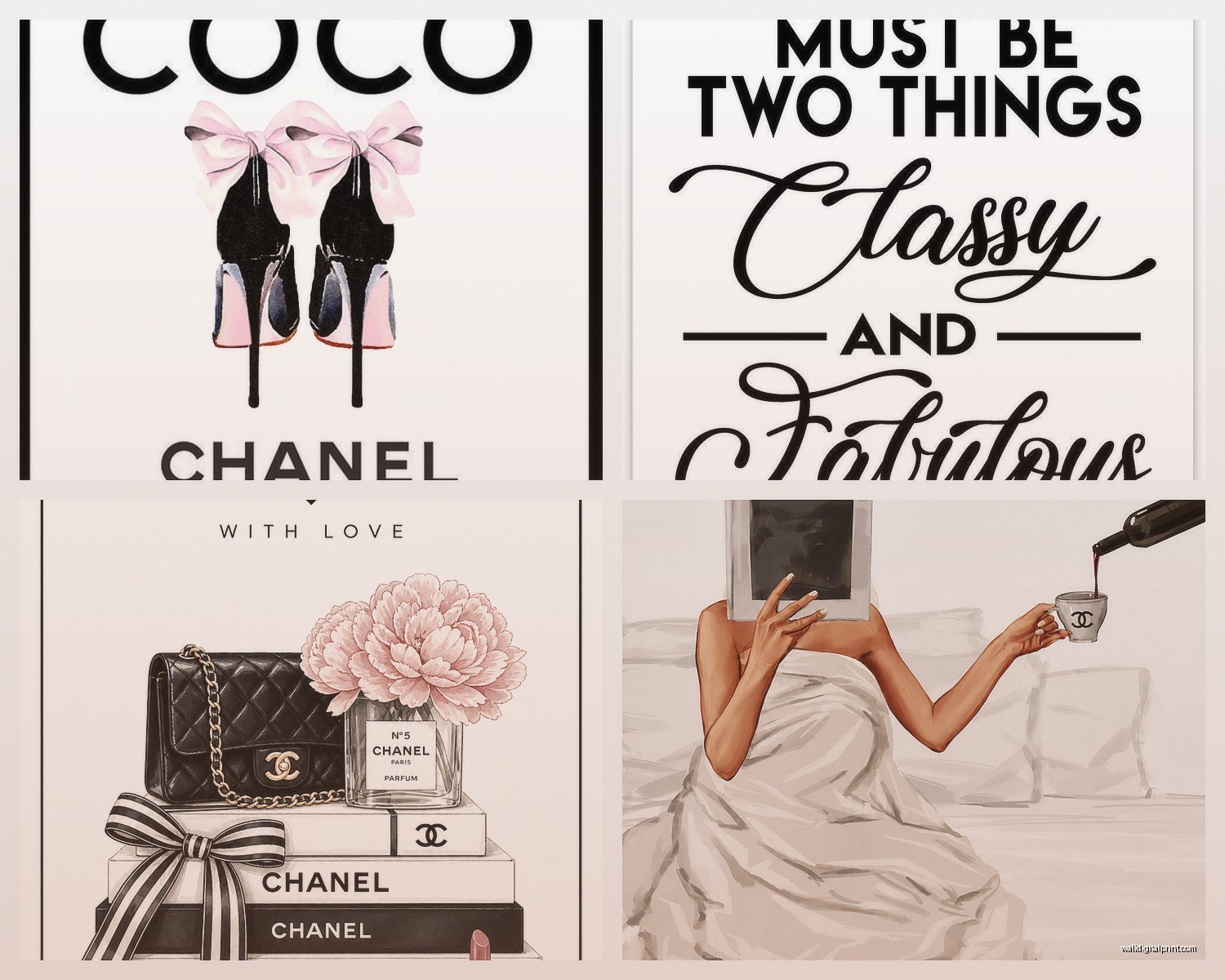
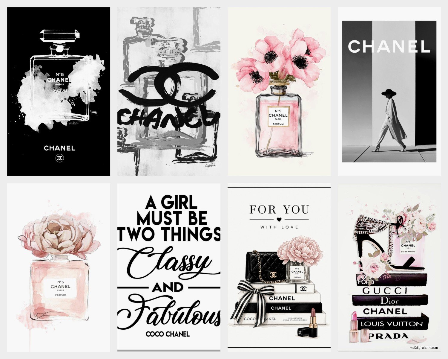
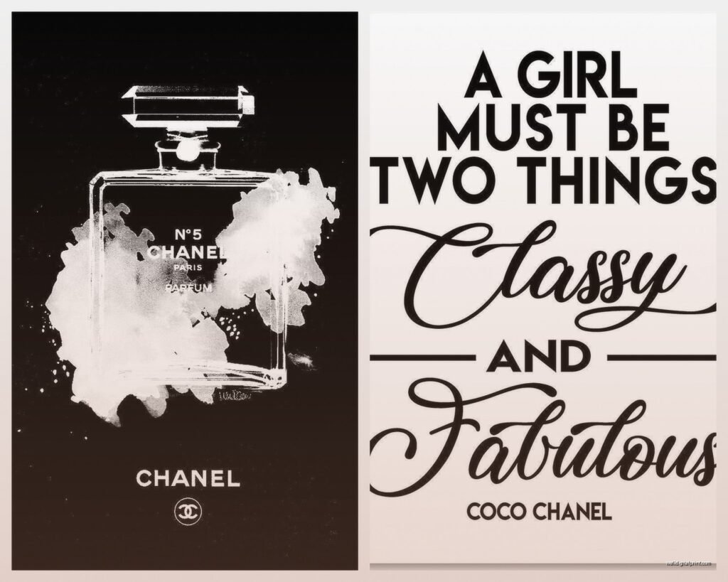
The Coco Chanel quote prints are everywhere and for good reason – “A girl should be two things: classy and fabulous” or “In order to be irreplaceable one must always be different.” These are easy to find in good quality because so many people make versions of them.
Chanel No. 5 bottle illustrations – try to find vector style ones or watercolor versions. The photorealistic ones are harder to find in free high-res formats.
Fashion illustrations of Chanel suits and bags work great in a closet or dressing area. There’s this one artist whose work pops up everywhere with the quilted bag illustrations that are just perfect.
The interlocking CC logo in different styles – minimalist line art, floral filled, marble textured. I have like fifteen variations saved because they’re so versatile.
Lipstick and makeup illustrations with that Chanel aesthetic even if they’re not officially branded. Red lipstick prints just inherently feel Chanel-ish you know?
Color Schemes That Work
Black and white is classic and you can’t go wrong. This is my default for Chanel stuff because it matches everything and always looks elegant.
Black white and gold adds that luxury touch without being too much. Gold foil prints are having a moment but you can fake it with gold ink on your home printer or just gold frames.
Blush pink and black is softer and more feminine while still being sophisticated. Works really well for bedrooms or feminine office spaces.
All black with different textures and finishes creates this moody dramatic vibe that I’m kind of obsessed with lately. Matte black frames, glossy black prints, black and white photos – it’s a whole thing.
Common Problems and Fixes
If your print looks washed out, you probably need to adjust the brightness and contrast before printing. I usually bump up the contrast by like 10-15% in Canva before sending to print.
Blurry prints mean your file wasn’t high enough resolution. Nothing fixes this except finding a better quality file. Don’t try to sharpen it in editing software because it just makes it worse in a different way.
Colors looking different than on your screen is super common. Monitors display in RGB but printers use CMYK so there’s always gonna be some variation. Blues and purples especially tend to print differently. I’ve learned to expect prints to be slightly less vibrant than they appear on screen.
If your printer is leaving marks or streaks, clean the print heads. I have to do this like once a month or everything comes out with these annoying lines through it.
Paper jamming constantly usually means you’re using paper that’s too thick for your printer or you need to adjust the paper settings. Check your printer manual for the paper weight limits.
Organizing Your Digital Collection
I have a whole folder system on my computer now because I downloaded so many random files I could never find anything. Main folder called “Printable Art” then subfolders for “Chanel,” “Fashion Quotes,” “Perfume Bottles,” etc.
Name your files something searchable, not just “IMG_0847.jpg” – I go with descriptions like “chanel-quote-classy-fabulous-bw.pdf” so I can actually find stuff later.
Keep a separate folder for files you’ve already printed with notes about what size you printed and where you put it. Sounds excessive but I’ve definitely printed the same thing twice by accident and that’s just wasteful.
Pinterest boards are also good for saving inspiration even if you don’t download the file yet. I have a private board called “To Print Eventually” that’s got like 400 pins at this point which is probably too many but I’m gonna get through them eventually.
The whole thing is honestly such an affordable way to get that designer look without spending hundreds on official Chanel boutique items, and you can change them out whenever you want which I do way too often but that’s just my interior stylist brain never being satisfied with anything for more than three months.