Wall Art Guide, Wall Art Tutoriels
Turquoise Wall Art: Aqua Blue Green Ocean Tropical Color
Sep
So I’ve been obsessing over turquoise wall art lately because honestly, it’s like the one color that can completely transform a space without making it feel themed to death, you know? Like, you put up some tropical artwork and suddenly everyone thinks you’re running a tiki bar, but turquoise is different.
Why Turquoise Actually Works When Other Colors Don’t
Okay so here’s the thing about turquoise that took me forever to figure out. It’s technically blue-green but it reads differently depending on what time of day it is and what other colors are near it. I had this client last month who was adamant she wanted “ocean colors” but when I showed her straight-up blue art, she hated it. Too cold. Then we tried turquoise and suddenly it clicked because turquoise has warmth in it that pure blue just doesn’t have.
The aqua-blue-green spectrum is massive though. You’ve got everything from that really pale Robin’s egg blue (which honestly reads more pastel than tropical) all the way to deep teal that’s almost green. For actual wall art, I usually tell people to aim for the middle range because it photographs well and doesn’t disappear on your wall.
What Actually Looks Good vs What Looks Like A Hotel Lobby
This is gonna sound weird but I keep a Pinterest board just of bad turquoise art so I remember what NOT to buy. The biggest mistake is getting those really literal ocean paintings with like, a sunset and palm trees and maybe a dolphin. Unless you’re decorating a beach rental, skip it.
What actually works:
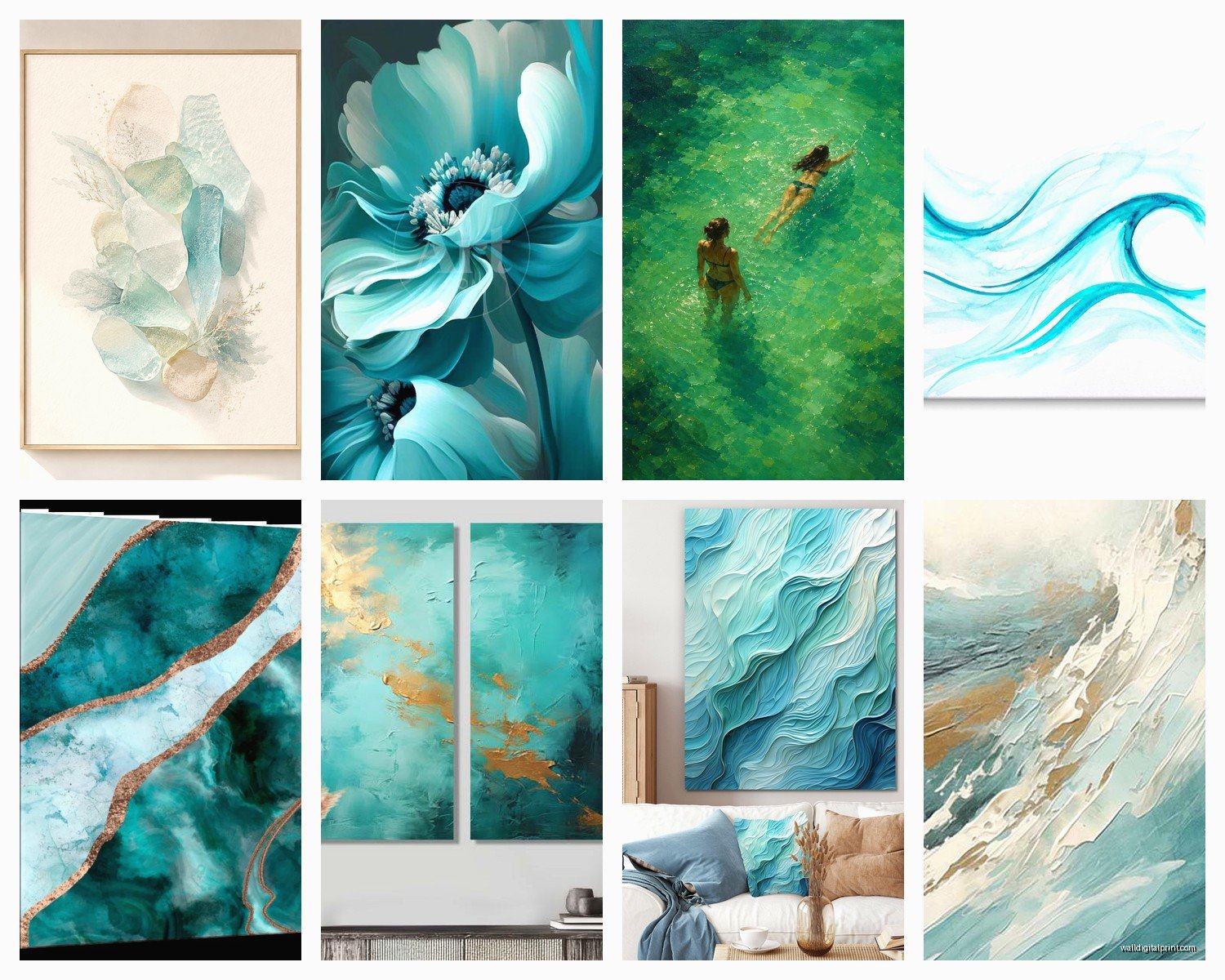
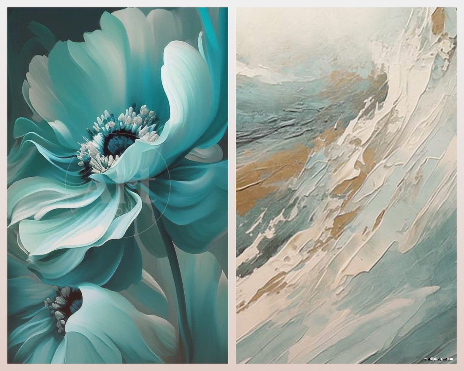
- Abstract pieces with turquoise as the dominant color but with white, gold, or coral accents
- Minimalist line drawings or geometric patterns in turquoise on white backgrounds
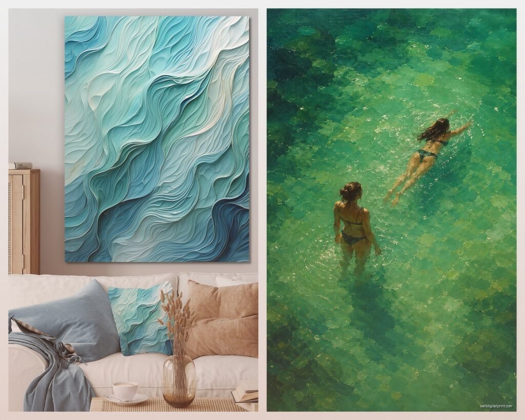
- Photography of actual water but shot in an artistic way, not a postcard way
- Watercolor-style pieces that have that bleed effect where turquoise fades into other colors
- Resin art or agate slice prints because the turquoise looks natural and organic
I bought this massive abstract piece from Etsy last year, it was like 40×60 inches, mostly turquoise with gold leaf accents. Cost me about $350 which honestly isn’t bad for that size if it’s an original or limited print. The artist did this thing where the turquoise went from really saturated at the bottom to almost white at the top and it legitimately looks like looking up through ocean water.
Size Matters Way More Than You Think
Everyone undersizes their wall art. I’m guilty of it too. You think “oh I don’t want it to overwhelm the space” and then you hang up a 16×20 print on a massive wall and it looks like a postage stamp.
For turquoise specifically, bigger is better because the color needs room to breathe. If you’ve got a piece that’s too small, the turquoise just becomes a blob of color from across the room instead of making an actual statement.
My rule (which I totally stole from an interior designer I worked with): your art should take up about 2/3 to 3/4 of the wall space width-wise. So if you’ve got a couch that’s 84 inches wide, you want art that’s roughly 56-63 inches wide. You can do this with one large piece or a gallery wall, but you gotta commit to the scale.
The Whole Gallery Wall Thing With Turquoise
Oh and another thing, if you’re doing a gallery wall with turquoise pieces, don’t make them all turquoise. That’s too matchy and it’ll look like you bought a set from HomeGoods (no shade to HomeGoods but you know what I mean).
What I do is use turquoise as the anchor color and then pull in:
- White or cream matting on everything for cohesion
- Maybe one piece that’s coral or blush pink
- Black and white photography to ground it
- Natural wood frames or thin gold frames, never thick black frames with turquoise because it’s too harsh
I spent like three hours yesterday arranging a gallery wall for my own bedroom and my cat kept jumping up and knocking the paper templates down. But anyway, the key is to lay everything out on the floor first. Take a picture from above with your phone. Live with it for a day. Then commit.
Where To Actually Buy This Stuff
Okay so funny story, I used to only look at expensive galleries and custom art, but honestly some of the best turquoise pieces I’ve found have been from:
Etsy – hands down the best for original work and prints from actual artists. Search for “abstract turquoise art” or “ocean resin art” and filter by your size. Read the reviews though because some sellers use really inaccurate photos and the colors are way off in person.
Society6 and Redbubble – good for prints if you’re on a budget. They do print-on-demand so you can get the same design in different sizes. Quality is decent but not amazing. The turquoise can sometimes print a little more blue than you expect.
Minted – pricier but the quality is really good and they have that preview tool where you can see the art on a wall in different room styles. Their turquoise photography collection is actually stunning.
Local art fairs – I got this incredible textured piece with actual sand and turquoise pigment embedded in it from an artist at a street fair. Cost me $200 and it’s a conversation starter every single time.
Wait I forgot to mention, if you’re buying online, ALWAYS check the return policy because turquoise is one of those colors that can look completely different on your screen versus in your space. I’ve returned probably 30% of the art I’ve ordered online and I do this for a living.
The Frame Situation
Frames can make or break turquoise art. I learned this the hard way when I put a really vibrant turquoise abstract in a chunky dark wood frame and it just died. The frame was competing with the art.
Best frame options:
- Thin gold or brass frames for a sophisticated look
- Natural light wood (maple or ash) for a coastal vibe without being too beachy
- White or cream frames if the art has a lot of white space already
- Floating frames if it’s a canvas because it adds dimension
No frame at all works too if it’s a gallery-wrapped canvas, but make sure the edges are painted or finished nicely. Nothing worse than seeing staples on the sides.
Mixing Turquoise With Other Colors
This is where people get nervous but honestly turquoise is stupidly versatile. I’ve paired it with:
Coral and blush pink – this is the obvious tropical combo but it works if you keep it subtle. Don’t go full Miami Vice.
Navy and gold – makes turquoise feel more sophisticated and less beach house
Gray and white – super modern and clean, the turquoise becomes the only pop of color
Terracotta and cream – this is my favorite lately because it’s unexpected but the warmth of the terracotta makes the turquoise feel richer
Black and white – dramatic but really architectural, good for modern spaces
The trick is to let turquoise be the star. If you’re adding other colors in your art or decor, they should be supporting players, not competing for attention.
Lighting Makes Or Breaks Everything
Okay this is crucial and nobody talks about it enough. Turquoise art needs good lighting or it just looks muddy and dark. I made this mistake in my own dining room where I hung this gorgeous turquoise piece but the lighting was all warm Edison bulbs and it made the art look greenish-brown. Awful.
What you need:
- Natural light is best, obviously, but if your art is across from a window (not directly in sunlight which will fade it), that’s ideal
- If you’re using artificial light, go for daylight bulbs (5000K-6500K) or at least bright white (3500K-4100K)
- Picture lights are worth it for larger pieces, the ones that mount above the frame
- Avoid warm yellow lighting unless the turquoise has a lot of green in it already
I installed some track lighting in my studio space last month and it completely changed how all my turquoise pieces looked. Colors that seemed dull suddenly popped.
The Whole Original vs Print Debate
Look, I love original art and I think supporting artists is important, but let’s be real about budgets. A large original turquoise painting can run you $800-$3000 depending on the artist. A quality print of the same size might be $150-$400.
For most people, prints are fine. Get them professionally printed on good paper or canvas, frame them well, and 90% of people won’t know the difference from across the room. Save your money for one really good original statement piece if you want, and fill in the rest with prints.
What I do tell people to avoid is those mass-produced canvas prints from big box stores where the turquoise looks flat and digital. You can tell. There’s no texture, no depth. If you’re gonna do prints, at least get giclee prints which have better color depth and longevity.
Placement Tips That Actually Matter
Where you put turquoise art changes how it reads in the space. I’ve noticed:
Above a sofa – classic but make sure it’s centered and the right size. Turquoise here makes your seating area feel like a destination.
In a dining room – turquoise is actually great for dining spaces because it’s calming but not boring. Pair it with white or natural wood furniture.
Bedroom – this is where I’m using a lot of turquoise lately. It’s calming without being cold like gray or blue can be. Hang it across from your bed so it’s the first thing you see when you wake up.
Bathroom – obvious choice but make sure the art is sealed or under glass because humidity will wreck it otherwise. I’ve ruined two pieces by not thinking this through.
Entryway – turquoise makes a great first impression without being aggressive like red or orange can be.
Hang art at eye level, which is generally 57-60 inches from the floor to the center of the piece. Unless you’re hanging it above furniture, then leave 6-8 inches between the furniture and the bottom of the frame.
DIY Turquoise Art If You’re Feeling Brave
Wait I forgot to mention, you can totally make your own turquoise art and it’s not as hard as you think. I did this for a client’s kid’s room because we needed like six pieces and buying that many would’ve been insane.
Get:
- Large canvases from a craft store (they’re always on sale)
- Acrylic paint in various shades of turquoise, plus white and maybe gold
- A palette knife or old credit card for texture
- Maybe some resin if you want to get fancy
Just layer colors, scrape them around, let some show through others. The beauty of abstract turquoise art is that it’s supposed to look organic and imperfect. I’ve seen people create stuff that looks like $500 pieces for about $40 in materials.
There’s this thing I learned watching YouTube at like midnight where you mix turquoise with a pouring medium and just let it flow across the canvas. It creates these natural ocean-like patterns that are actually stunning. My dog walked through one while it was drying and honestly the paw prints kinda made it better.
Maintenance Nobody Thinks About
Turquoise art fades faster than other colors if it’s in direct sunlight. I learned this the hard way with a piece in my old apartment. The turquoise turned into this sad pale blue-gray after like eight months.
Use UV-protective glass if the art is going anywhere near windows. It costs more but it’s worth it. Also dust your art regularly because dust dulls the color. Just use a soft dry cloth, don’t spray anything on it.
If it’s a canvas, you can use a barely damp cloth but test it on a corner first. Some cheaper prints will smear.
What To Avoid
Things I’ve bought that were mistakes:
- Anything with glitter or metallic turquoise that wasn’t actual metal leaf – looks cheap immediately
- 3D turquoise art with like, starfish glued to it – just no
- Prints on metal that were too shiny and reflected everything
- Super tiny prints in huge frames thinking the mat would make them look bigger – it didn’t
- Matching sets of three where all the turquoise was the exact same shade – too matchy
Also skip anything that says “tropical paradise” or “beach vibes” in the description because it’s probably gonna be too literal and themed.
The best turquoise art doesn’t scream “I’m ocean themed!” It just happens to use those beautiful blue-green tones in a way that feels sophisticated and intentional. That’s what you’re going for.