Wall Art Guide, Wall Art Tutoriels
Wall Art for Men’s Bedroom: Masculine Sleep Space Decor

Nov
So I’ve been working with a lot of guys lately who have absolutely no idea what to put on their bedroom walls, and honestly it’s kinda fascinating because most of them just… leave them blank? Like they’ll spend thousands on a bed frame but then the walls are just beige nothingness.
Let me tell you what actually works because I’ve tested this in probably fifteen different bedrooms at this point.
Start With Scale Because Everyone Gets This Wrong
Okay so the biggest mistake I see is guys buying art that’s way too small. You know those little 8×10 prints from Target? They look lost on a big wall. What you actually want is something that takes up about two-thirds to three-quarters of the space above your bed or dresser.
For above a king bed, I usually go with something around 60 inches wide minimum. Could be one large piece or a grouping, but that total width matters. My brother ignored this advice and hung this tiny framed poster above his California king and it looked like a postage stamp. Had to redo the whole thing.
What Actually Looks Good in a Guy’s Bedroom
Here’s what I’ve found works really well without feeling like you’re trying too hard:
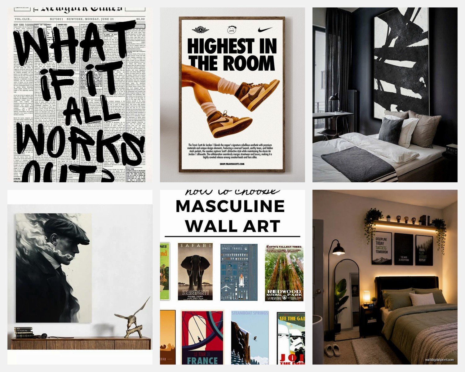
Black and white photography – this is probably the easiest route. Architectural shots, landscapes, urban scenes. I had a client do this massive black and white print of a mountain range and it completely transformed his room from college dorm vibes to actual adult space.
Abstract geometric stuff – think clean lines, maybe some texture. Not the super colorful crazy abstracts, more like neutral tones with interesting shapes. There’s this artist I follow who does these minimalist line drawings that are basically just black lines on cream canvas and they look expensive even though they’re pretty affordable prints.
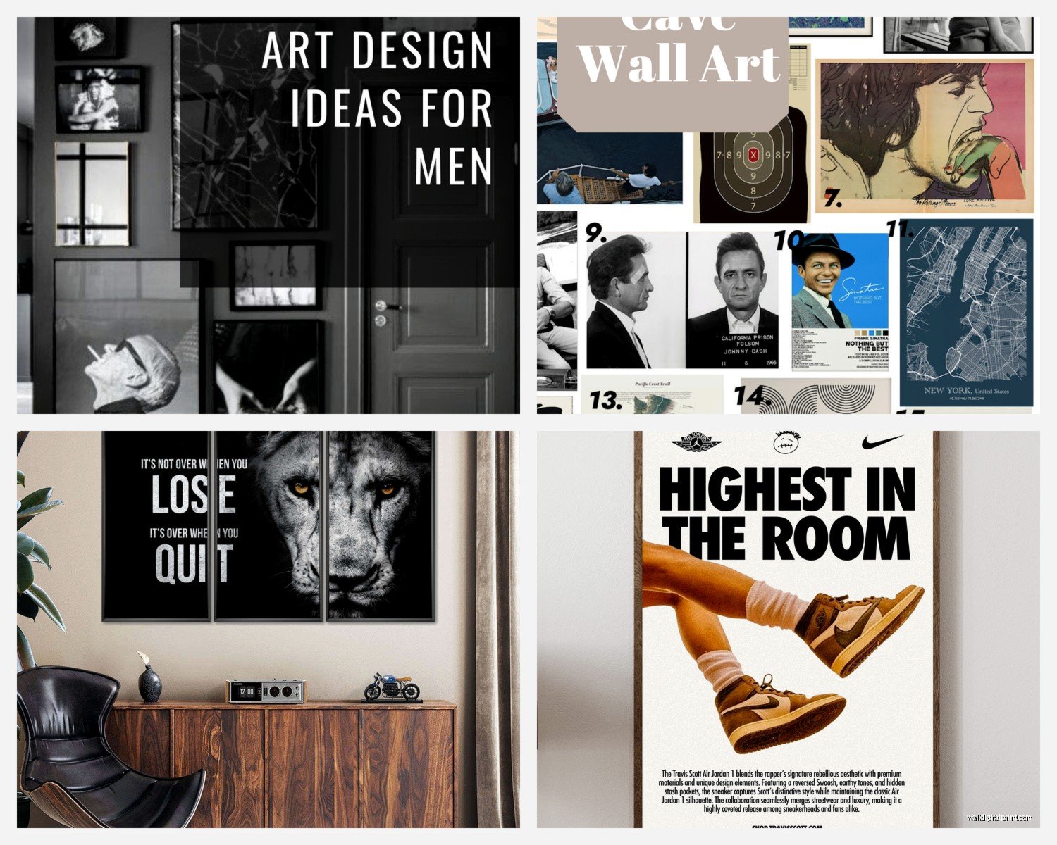
Maps and blueprints – vintage maps are having a moment and they work really well in masculine spaces. Old city maps, topographical maps, even vintage car blueprints if you’re into that.
Wait I forgot to mention industrial art – like those metal wall sculptures or mixed media pieces with wood and metal. They add dimension which is huge because flat walls are boring.
The Color Situation
Most guys gravitate toward neutral walls which is totally fine, but that means your art needs to either complement that or provide contrast. If your walls are gray or white, you can go a few directions:
- All black and white art for a cohesive monochrome look
- Deep blues and greens that feel masculine but add some color
- Warm browns and tans if your room has wood furniture
- One bold piece with color as a focal point
I had this one client who had all gray everything – gray walls, gray bedding, gray rug. We added this one large canvas with deep navy and burnt orange and suddenly the room had personality. Just that one piece changed everything.
Where to Actually Buy This Stuff
Okay so you’re probably wondering where to find art that doesn’t look like every other guy’s apartment. Here’s my actual tested list:
Society6 – tons of independent artists, you can get the same design as a framed print, canvas, or even a tapestry. Prices are reasonable and the quality is pretty decent for what you pay.
Etsy – this is gonna sound obvious but the vintage map and blueprint selection on Etsy is insane. Also lots of printable art if you wanna save money and frame it yourself.
Local art fairs and markets – I know this requires leaving your house but you can find really unique pieces and actually talk to the artist. Plus negotiating in person is way easier than online.
Framebridge or Simply Framed – if you have photos or prints you wanna frame properly. Custom framing is expensive but these online services are like half the price of going to a physical frame shop.
Oh and another thing, thrift stores and estate sales can be gold mines. I found this amazing vintage ski poster at an estate sale for like twenty bucks that would’ve cost hundreds online.
The Grouping vs Single Piece Debate
So there’s two main approaches here. Either one large statement piece or a gallery wall situation.
Single large piece: easier to hang, makes a bold statement, less decision-making required. This is what I recommend if you’re not super confident about design stuff. Just get one thing you really like that’s the right size and call it done.
Gallery wall: more visual interest, lets you incorporate different elements, but also way more complicated. You gotta plan the layout, make sure the spacing is right, and it’s a whole thing.
If you’re gonna do a gallery wall, here’s what actually works – stick to a consistent color palette and frame style. Like all black frames with black and white photos, or all natural wood frames with warm-toned prints. Mixing too many styles looks chaotic.
I use this trick where I lay everything out on the floor first and take a photo from above to see how it looks before putting holes in the wall. Saved me so many times.
Framing Matters More Than You Think
A good print in a cheap frame looks cheap. A decent print in a nice frame looks expensive. That’s just how it works.
For masculine spaces, I usually recommend:
- Black frames – classic, clean, works with everything
- Natural wood frames – adds warmth, especially good with black and white photos
- Metal frames – industrial vibe, very modern
- No frame canvas – works for abstract or modern pieces
Stay away from ornate gold frames unless you’re going for like a vintage maximalist thing, which can work but is harder to pull off.
Placement Rules That Actually Matter
Okay so there are some actual rules here that make a difference:
Above the bed: center it on the bed, hang it about 6-8 inches above the headboard. If you don’t have a headboard, the bottom of the frame should be about 8-10 inches above your mattress.
Above a dresser: leave about 4-6 inches between the furniture and the bottom of the frame.
On a blank wall: the center of the piece should be at eye level, which is usually around 57-60 inches from the floor.
My cat literally just knocked over my coffee while I’m writing this but anyway –
The eye level thing is important because I see people hang stuff way too high all the time. It shouldn’t feel like you’re looking up at museum walls.
Unexpected Ideas That Work Really Well
Textile wall hangings: like woven tapestries or even vintage rugs hung on the wall. Adds texture and warmth, especially good if your room feels cold or echo-y.
Floating shelves with objects: technically not wall art but works the same way. Put some books, a small plant, maybe a vintage camera or something you collect.
Neon signs: controversial but I’ve seen these look incredible in the right space. Keep it simple – maybe just your initials or a single word. Not like a beer sign unless that’s genuinely your vibe.
Large-scale prints of your own photography: if you travel or take decent photos on your phone, printing one really large can look amazing and it’s personal without being weird.
This is gonna sound weird but one of my favorite bedroom installations was this guy who framed vintage concert posters from shows he’d actually been to. It told a story and looked cohesive because they were all from the same era.
DIY Options If You’re On a Budget
Look, not everyone wants to drop hundreds on wall art. Here’s what you can do:
Print your own stuff from sites like Printful or even just download high-res images (make sure they’re free to use) and print them at Staples or FedEx. An engineer print is super cheap for large sizes.
Frame fabric or wallpaper samples – sounds random but geometric fabric in a simple frame looks intentional and costs like fifteen dollars.
Make your own abstract art – get a canvas and some acrylic paint and just make something with neutral colors. Honestly if you keep it simple with like three colors max, it’s hard to mess up.
What to Avoid
Okay real talk, some things just don’t work:
- Motivational quote prints – unless it’s ironic and you’re really committing to that
- Posters without frames – we’re adults now
- Anything too feminine or generic hotel art
- Super bright colors unless your whole room is designed around them
- Too many small pieces scattered randomly
Also those like “home” or “dream” word art things. Just no.
Mixing Art Styles
You can totally mix different types of art but you need some kind of thread connecting them. Maybe it’s the color palette, maybe it’s all the same frame style, maybe it’s the subject matter.
I did a bedroom where we mixed vintage botanical prints with modern abstract pieces and it worked because everything was in black and white with the same black frames. The consistency in color and framing made the different styles work together.
Lighting Your Art
Oh man I almost forgot about lighting. If you have a piece you really love, consider adding a picture light or even just positioning a floor lamp so it highlights the art. Makes such a difference at night and adds ambiance to the whole room.
Track lighting or wall sconces can work too if you’re willing to do some electrical work or hire someone.
The Actual Installation Part
Use proper hardware. Seriously. A 3M strip isn’t gonna hold a heavy framed piece and you’ll wake up to broken glass everywhere.
For anything over 15 pounds, use wall anchors or find a stud. Get a stud finder, they’re like fifteen bucks and worth it. I use a level app on my phone which works fine but a real level is better if you have one.
Measure twice, drill once. Mark where you want the nail with a pencil first.
If you’re doing multiple pieces, make a template with paper cut to size and tape it up first to see how it looks. This saves so many mistakes.
Anyway that’s basically everything I’ve learned from doing this way too many times. The main thing is just pick something you actually like looking at because you’re gonna see it every day. Don’t overthink it too much but also don’t just grab whatever’s cheapest at HomeGoods, ya know?
Start with one good piece and build from there if you want. Your bedroom doesn’t need to be an art gallery but it shouldn’t feel like a hotel room either.