
Wall Art Guide, Wall Art Tutoriels
Wine Wall Art: Vineyard Grapes Bar Tasting Room Decor
Aug
So I’ve been working with wine-themed wall art for like, forever now, and honestly it’s one of those things that can go either really right or really wrong super fast. Let me just dump everything I know because I literally just finished styling a tasting room last month and I’m still recovering.
Figuring Out Your Actual Space First
Okay so before you even think about buying anything, you gotta measure your wall. I know, I know, everyone says this but I had a client who ordered this massive vineyard canvas and it was literally bigger than her entire bar wall. We had to return it and the shipping cost more than… anyway.
Stand back from the wall like 10 feet if you can. Take a photo with your phone. This sounds dumb but it actually shows you the proportions way better than just staring at it. I learned this from my photographer friend and it’s been a game changer.
Wall Space Math That Actually Works
The general rule is your art should take up about two-thirds to three-quarters of the furniture width below it. So if you’ve got a 6-foot bar cart, you’re looking at roughly 4 to 4.5 feet of art width. But honestly? Sometimes breaking this rule looks amazing. I did a narrow vertical grape vine piece above a wide bar once and everyone loved it.
Choosing the Right Style Without Overthinking It
Wine art comes in basically these categories and I’m gonna be real with you about each one:
Vintage Wine Labels and Posters
These are everywhere right now. The French chateau style with the aged paper look. They work great if your space has that rustic or traditional vibe. I use them a lot in home bars that have dark wood. The thing is, they can read really busy if you have a lot of bottles already visible, so like… maybe not the best choice if your bar is already cluttered with wine bottles and glasses and stuff.
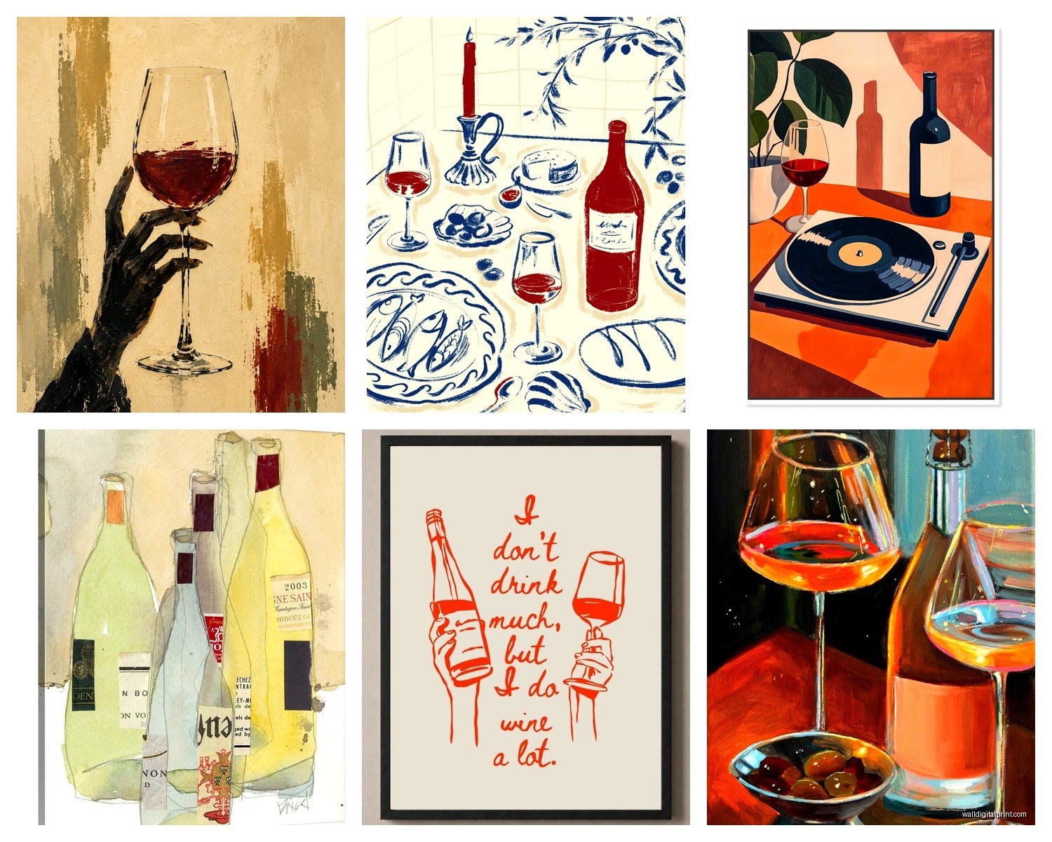
Pro tip: Get them in frames with actual matting. The cheap ones without mats look exactly that – cheap.
Abstract Wine Imagery
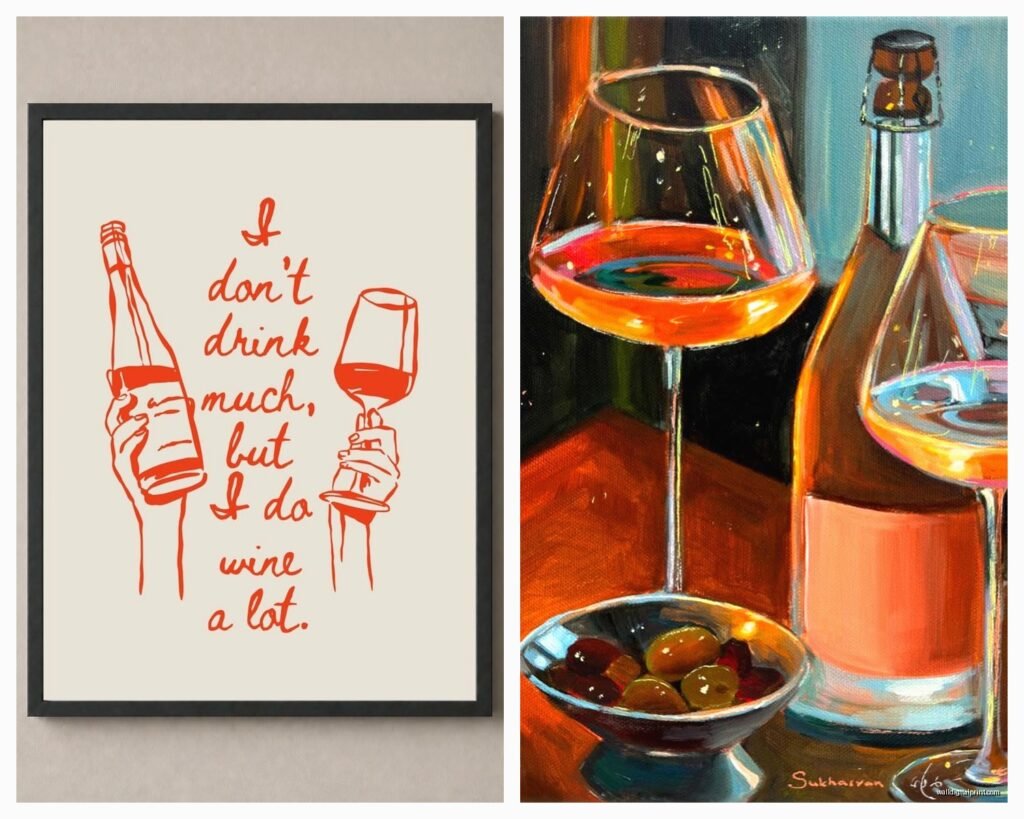
This is the splash of wine in a glass, the bold brushstrokes, the purple and burgundy explosions. My dog literally knocked over my wine while I was writing this which is ironic. Anyway, these work amazing in modern spaces or if you want something that feels more artsy than literal. They’re conversation starters but won’t make your space feel like a themed restaurant.
I’ve found these look best as either one large statement piece or a diptych. Three panels can work but starts feeling very 2010 if you know what I mean.
Vineyard Photography
Actual photos of Napa, Tuscany, Bordeaux, whatever. These are my go-to for tasting rooms because they create that immediate connection to the winemaking process. The rolling hills, the rows of vines, that golden hour lighting.
But here’s what nobody tells you – black and white vineyard photos almost always look more sophisticated than color ones. Color can go really touristy really fast unless the photography is actually good. I spent an hour last week comparing color vs black and white prints for a client’s home bar and the black and white just had more… I dunno, gravitas?
Grape Cluster Close-Ups
The macro shots of grapes with the dew drops and the leaves. These are pretty but can feel a bit generic? I use them more as secondary pieces or in groupings. Like three small square frames of different grape varieties can look really cool on a narrow wall.
Size and Layout Configurations
Okay so funny story, I once hung a triptych completely wrong and had to redo it at like 9pm before the client came home. Here’s what I’ve learned through painful trial and error:
Single Large Statement Piece
Go for 40×30 inches or bigger for a main wall. Anything smaller looks tentative unless your space is genuinely tiny. I did a 60×40 inch vineyard landscape in a tasting room and it completely transformed the space. Center it at eye level, which is usually 57-60 inches from the floor to the center of the artwork.
Gallery Wall Approach
This is trickier with wine art because you don’t want it to feel too theme-park-ish. What works: mixing wine imagery with other stuff. I’ll do like, two wine-related pieces, one abstract that pulls the same colors, and maybe some vintage bar tools or a mirror.
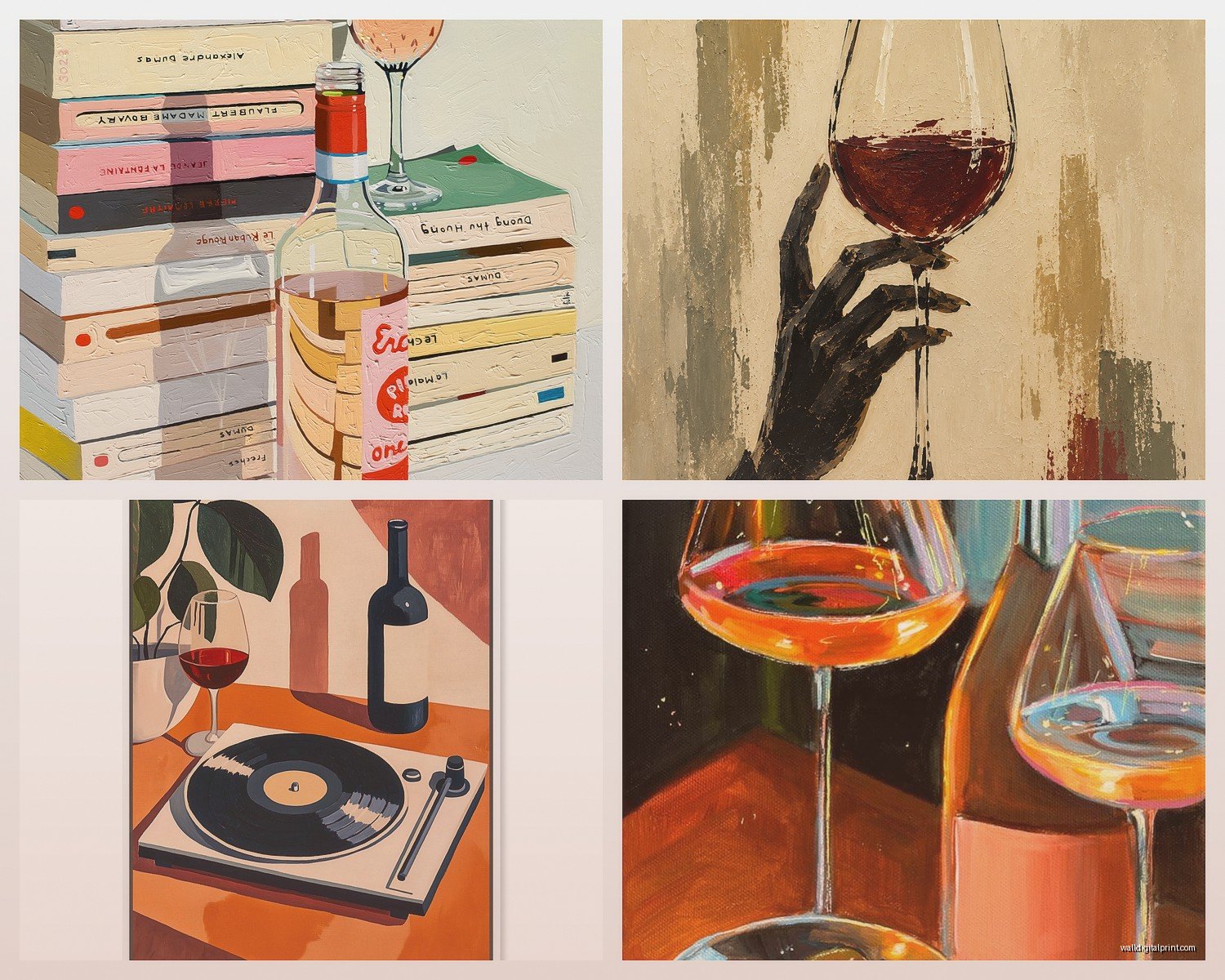
Layout them on the floor first. Seriously, use painters tape on the wall to map it out. I cannot stress this enough because redoing picture holes is the worst.
Horizontal Diptych or Triptych
Three panels spanning 6-8 feet total looks really good above long bars or console tables. Keep the spacing between panels at 2-4 inches. Closer than that feels cramped, wider feels disconnected.
Materials and Quality Stuff You Should Know
Not all wine art is created equal and you can usually tell immediately when something’s cheap.
Canvas vs Framed Prints
Canvas wraps are great for casual spaces – they’re lightweight, you don’t need glass, and they have that gallery vibe. But the quality varies wildly. Look for gallery-wrapped canvas that’s at least 1.5 inches deep. The thin ones look flat and sad.
Framed prints under glass feel more formal and protected. Better for actual tasting rooms where there’s humidity from people, spills, whatever. I always recommend UV-protective glass if you’re spending real money on the art.
Metal Prints
These are having a moment and honestly? They’re perfect for modern wine bars. The colors pop like crazy, they’re durable, and they clean easily. Wine and food environments need wipeable surfaces. I just used metal prints in a bistro and they still look perfect six months later despite being near the bar area.
Wood-Mounted Prints
Really trendy right now for rustic wine cellars or farmhouse-style bars. They add texture and warmth. The downside is they can warp in humid environments, so maybe not ideal if you’re in a basement tasting room or somewhere with temperature fluctuations.
Color Coordination That Actually Makes Sense
This is where people get stuck and honestly it’s not that complicated once you know the trick.
Pull colors from your existing space first. If you’ve got a lot of dark wood, brass fixtures, and leather – you want wine art with warmer tones. Deep reds, golds, amber, those sunset vineyard shots.
If your space is more modern with gray, white, black – go for black and white photography or abstract pieces with just pops of wine color. A black and white vineyard with just the grapes in color can be really striking.
Oh and another thing, don’t feel like you need red wine imagery just because it’s wine art. White wine imagery with greens and golds can be way more interesting and less expected. I did an entire bar wall with Sauvignon Blanc-themed art – light greens, crisp whites, sunny vineyard shots – and it felt so fresh compared to the usual burgundy everything.
Lighting Your Wine Art Properly
Nobody talks about this enough but lighting makes or breaks wine art. That deep burgundy print that looked amazing in the store? It’ll disappear on your wall if the lighting’s wrong.
Picture lights are your friend. The small LED ones that mount above the frame. They create drama and make the colors pop. I use them on almost every wine art installation now.
If you can’t do picture lights, make sure you have good ambient lighting. Wine art needs more light than you think because those deep colors absorb light.
Avoid direct sunlight though. It’ll fade any print over time, doesn’t matter how good the quality is.
Where to Actually Buy Good Wine Wall Art
I’ve ordered from everywhere at this point and here’s my honest take:
Etsy is great for unique stuff and supporting actual artists. You can find really specific things like “1920s French wine label reproduction” or “watercolor Merlot grapes.” Quality varies so read reviews carefully and look at the shop’s other work.
Society6 and Redbubble have tons of options and the quality is consistently decent. Not amazing, but decent. Good for if you want something affordable and you’re not super picky.
For actual tasting rooms or if you’re spending real money, go to art galleries or photography sites. Fine Art America has legit photographers selling vineyard landscapes. The prices are higher but you’re getting actual art, not just decorative prints.
Local art shows and wine festivals often have artists selling wine-themed work. I’ve found some of my favorite pieces this way and you can see them in person before buying.
Installation Tips From Someone Who’s Made Every Mistake
Use proper hanging hardware for the weight. Canvas wraps are lighter than framed pieces but still need decent hooks. I use D-rings and wire for anything over 5 pounds.
Level is non-negotiable. Get a real level, not the app on your phone. My cat walked across my level once while I was hanging something and I didn’t notice and… yeah. Just use a real level.
For gallery walls, cut paper templates the exact size of each frame and tape them up first. Rearrange until it looks right, then hang. This saved me so much time and so many extra holes in walls.
If you’re hanging above a bar or anywhere near where drinks are served, hang it slightly higher than you think. Nothing worse than someone bumping art while reaching for a bottle.
Common Mistakes I See All The Time
Going too literal with the wine theme. You don’t need wine bottles AND grapes AND vineyards AND glasses all in one space. Pick one theme and go with it. Restraint is your friend.
Hanging art too high. I see this constantly. The center of your art should be at eye level when standing, which is around 57-60 inches from the floor. Not at the ceiling, not where you have to crane your neck.
Ignoring scale. Tiny art on a huge wall looks lost. Big art in a tiny space feels overwhelming. When in doubt, go bigger than you think for main pieces.
Forgetting about the three-dimensional space. If you have wine racks or shelves jutting out, your art needs to work around that. I learned this the hard way when a beautiful canvas was basically hidden behind a wine rack that stuck out 12 inches.
Making It Feel Curated Not Themed
The difference between a nice wine bar and a cheesy one often comes down to restraint. Mix your wine art with other elements. A vintage mirror, some greenery, maybe some abstract pieces that just happen to share the color palette.
I always tell clients to add something unexpected. Like I did a wine bar with mostly traditional vineyard art but added one piece of geometric abstract art in the same color family and it elevated the whole thing.
Books about wine and winemaking can sit on shelves near your art. Actual wine bottles displayed nicely become part of the overall aesthetic. Think of the art as part of a larger composition, not the whole show.
Budget Considerations Real Talk
You can absolutely do this on a budget. I’ve styled beautiful wine bars with mostly printable art from Etsy that cost like $10-20 per print, then put them in nice frames from Target or IKEA.
Where to spend money: frames and printing quality. A good frame makes cheap art look expensive. Bad framing makes expensive art look cheap.
Where you can save: go for prints over original paintings, use canvas wraps instead of custom framing, buy during sales.
Wait I forgot to mention – if you’re doing a tasting room for an actual winery, invest in custom photography of YOUR vineyard. It’s more expensive upfront but it’s authentic and creates a real connection with visitors. Generic vineyard photos are fine for home bars but for commercial spaces, authentic imagery matters.
Anyway that’s basically everything I know about wine wall art from years of doing this. The main thing is just to start with good measurements, don’t overthink the theme, and make sure your lighting is decent. And maybe don’t let your pets near your wine while you’re planning because apparently that’s a thing that happens.
