Wall Art Guide, Wall Art Tutoriels
3 Panel Wall Art for Living Room: Triptych Main Space Sets
Oct
So I’ve been getting asked about triptych wall art constantly lately and honestly it’s because I made the mistake of posting that ocean panorama set in my own living room last month and now everyone wants to know how to pull it off without making their space look like a hotel lobby.
First thing you gotta understand is that three panel art isn’t just about buying three matching pieces and calling it a day. The spacing is where most people absolutely mess it up and I see it every single time I walk into someone’s home for the first time. They’ll have gorgeous panels but they’re either crammed together or so far apart they look like three separate pieces that accidentally ended up on the same wall.
Getting the Spacing Right Before You Even Think About Drilling
Okay so the rule I use is 2 to 4 inches between panels. That’s it. I know you’ll see some designer on Instagram doing like 6 inches but trust me that only works if you have a massive wall and the panels themselves are huge. For a standard living room where you’re working with maybe an 8 to 10 foot wall, stick with 3 inches between each panel.
Here’s what I actually do and this is gonna sound weird but I use painters tape on the wall first. Cut pieces the exact size of your panels, tape them up with the spacing you’re considering, then sit on your couch for like twenty minutes. Watch TV, scroll your phone, whatever. Your eye will tell you if something’s off way better than any measuring tape will.
My cat knocked over my coffee during this process last week and I was so annoyed but actually the break made me realize I had the middle panel too high, so maybe chaos has its benefits.
Size Ratios That Actually Work
The most common size I recommend for living rooms is three 16×24 inch panels or three 20×30 inch panels depending on your wall size. But here’s where people get confused because they think bigger is always better.
If your couch is standard sized like 84 inches, you want your total triptych width to be somewhere between 50 to 70 inches including the spacing. So let’s say you go with 20 inch wide panels with 3 inches between them that’s 20 plus 3 plus 20 plus 3 plus 20 which equals 66 inches total. Perfect.
I had this client last year who insisted on going bigger and we ended up with panels that extended past the couch on both sides and it just looked unbalanced. We had to return them and start over which was a whole thing because she’d already punched holes in the wall.
What If Your Ceiling Height Is Weird
Standard 8 foot ceilings you want the center of your triptych to be at eye level when standing which is roughly 57 to 60 inches from the floor. But if you’ve got those trendy 10 or 12 foot ceilings it gets trickier.
Higher ceilings you can go a bit higher with placement maybe 62 to 65 inches at center but you also need to size up your panels or the whole thing looks like a postage stamp on the wall. I learned this the hard way in my first apartment where I hung everything at the height I read in a book and it all looked miniature because the ceilings were 11 feet.
Themes and Styles That Won’t Make You Cringe in Six Months
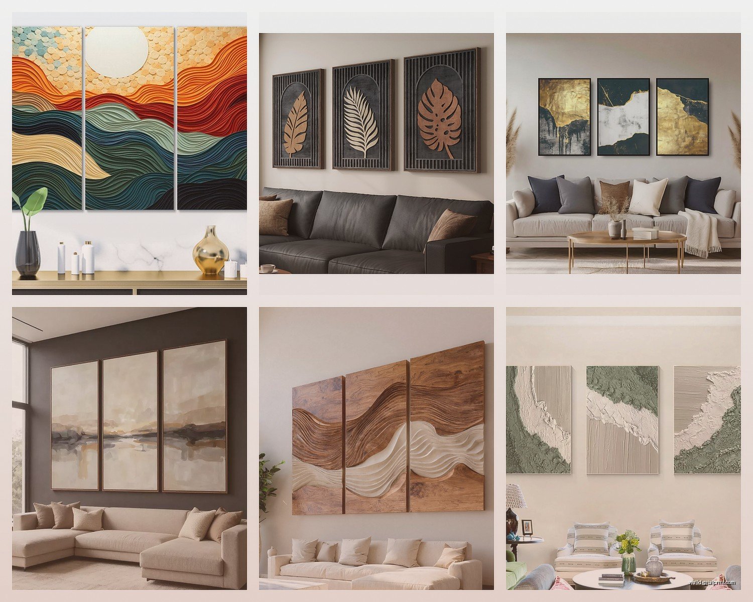
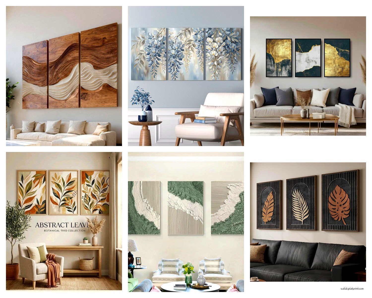
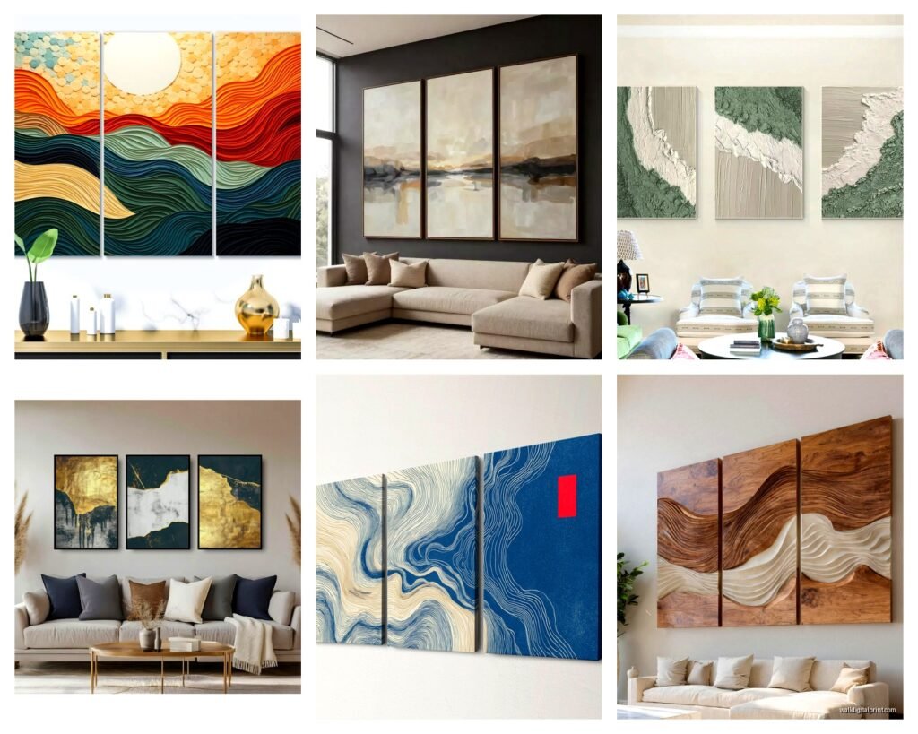
Abstract landscapes are my go-to recommendation because they’re neutral enough to work with changing decor but still have visual interest. I’m currently obsessed with those misty mountain ranges or desert scenes that fade across the three panels.
Oh and another thing about themes avoid anything too literal. Like I had someone show me a triptych of three separate beach scenes and it just looked busy. You want one cohesive image that flows across all three panels not three different compositions fighting for attention.
Color Coordination Without Overthinking
Pull colors from what you already have in the room but here’s my trick don’t try to match exactly. If you’ve got navy pillows look for art that has navy as an accent color not the dominant color. This creates cohesion without being matchy-matchy which always feels dated.
Neutral bases with one pop color work best. Think black and white photography with a single red element or beige abstract with touches of emerald green. I’ve been seeing a lot of terracotta and sage combinations lately and honestly it’s not as trendy-looking as you’d think if you keep the rest subtle.
Frame vs Frameless and Why It Actually Matters
Frameless gallery wrapped canvas is easier for most people because you don’t have to worry about frame styles clashing with your furniture. The image wraps around the edges so it looks finished from any angle.
But if you’re going with frames keep them simple. Black floating frames or natural wood nothing ornate. And this is critical all three frames need to be identical. I’ve seen people mix frame styles thinking it looks eclectic and it just looks like they couldn’t make a decision.
The depth matters too. Standard canvas depth is like 0.75 inches but I prefer 1.5 inch depth for living rooms because it has more presence on the wall. Sounds small but you notice it.
Mounting Methods That Won’t Destroy Your Walls
Okay so funny story I once used those sticky strip hangers for a triptych and two panels stayed up fine but the middle one crashed down at 3am and I thought someone was breaking in. Turns out the adhesive doesn’t love textured walls.
For three panel sets I always use proper hardware now:
- D-rings or sawtooth hangers on the back of each panel
- Wall anchors if you’re not hitting studs which you probably won’t be
- A level and measuring tape because eyeballing it is how you end up with crooked art
- Pencil marks that you’ll cover with the panels anyway so don’t stress about erasing
Here’s my actual process I measure and mark where the center of the middle panel should go first. Then I mark the outer panels based on that center point plus your spacing. Use the level to make sure all your marks are at the same height before drilling anything.
The Paper Template Trick
I mentioned painters tape earlier but another method is taping up paper cut to size. You can even print out the actual image scaled down and tape those up to see if you like the vibe. Takes an extra hour but saves you from hanging something you’ll hate.
What to Actually Look For When Shopping
Print quality matters more than you think. If you’re buying online look for terms like giclée printing or archival inks. Cheap prints fade fast especially if you have windows nearby.
I usually recommend spending at least 150 to 300 dollars for a decent quality triptych set for a living room. Yes you can find cheaper options but the canvas quality is usually terrible and the colors look washed out in person.
Wait I forgot to mention some places sell the panels separately versus as a set. If they’re separate make sure the image actually continues across all three panels in the right order. Sounds obvious but I’ve seen mix-ups.
Where I Actually Shop
I’ve had good luck with Etsy sellers who do custom sizing, especially for abstract pieces. You can often request color modifications too. West Elm has some solid options if you want to see them in person first. Wayfair is hit or miss you really gotta read the reviews because photos lie.
Society6 and Minted are good for more artistic contemporary stuff. Amazon has a huge selection but quality varies wildly so I filter by highly rated only.
Lighting Your Triptych
This is where things go from good to great honestly. If you have recessed lighting aim one or two fixtures at the wall art. If not picture lights are having a moment again those brass ones especially.
Natural light is tricky because direct sunlight will fade your art over time. If your living room gets harsh afternoon sun maybe position the triptych on a perpendicular wall or invest in UV protective glass if you’re using frames.
I have a floor lamp that I angle toward my ocean triptych in the evenings and the way it highlights the texture of the canvas is chef’s kiss.
Common Mistakes I See All the Time
Hanging it too high is number one. People think it needs to be centered on the wall from floor to ceiling but then it floats awkwardly above the furniture.
Choosing art that’s too small for the space. A tiny triptych on a huge wall just emphasizes the empty space around it.
Not considering the viewing distance. If you’re gonna be looking at it from 12 feet away while sitting on your couch you need bolder imagery. Delicate details get lost.
Mixing orientation like two horizontal panels and one vertical. Don’t do this. Just don’t.
The Furniture Relationship
Your triptych should relate to the furniture below it usually a sofa or console table. Leave about 6 to 8 inches between the furniture top and the bottom edge of your art. This creates breathing room without disconnection.
If you’ve got a really low-profile modern couch you might go up to 10 inches but more than that and it starts floating.
Switching Things Up Later
One thing I love about triptychs is you can rotate them seasonally if you’re into that. I have a client who swaps between a bright floral set in spring and summer and a moody forest scene in fall and winter. The holes are already in the wall so it’s easy.
You can also play with arrangement technically. Like instead of the standard horizontal line some people do a slight step pattern or even a vertical stack if you have a narrow tall wall. I’m not huge on non-traditional layouts for living rooms though because it can read as trying too hard.
Budget-Friendly Alternatives
If you’re not ready to invest in a permanent piece yet try printable digital downloads. You download the files, get them printed at a local print shop for cheap, and frame them yourself. Total cost can be under a hundred bucks.
Thrift stores sometimes have individual pieces you can group together to create your own triptych vibe. They won’t be a flowing image but three coordinating abstract pieces can work if they share a color palette.
I did this in my first apartment with three different botanical prints all in matching black frames and honestly it looked intentional enough that people asked where I bought the set.
Making It Feel Personal
The biggest thing is choosing imagery that actually means something to you or at least doesn’t bore you. I had someone pick a triptych just because it matched their throw pillows and they ended up replacing it six months later because they never connected with it.
Think about what draws your eye naturally. Are you constantly saving ocean photos on your phone? Do you pause when you see geometric patterns? That’s your clue.
Custom triptychs of your own photography are also an option now. Lots of online services will take your images and create a split panel effect. Did this with a sunset photo from a trip to Joshua Tree and it’s probably my favorite piece I own.
The whole point is creating a focal point in your living room that feels intentional and pulls the space together. Once you get the technical stuff right the spacing the sizing the height the rest is just about trusting your gut on what you actually want to look at every day.
Anyway that’s basically everything I’ve learned from doing this professionally and messing it up in my own home multiple times. Let me know what you end up going with I’m always curious to see how people interpret this stuff.