Wall Art Guide, Wall Art Tutoriels
Nautical Wall Art for Living Room: Maritime Main Space Decor
Oct
So I’ve been obsessing over nautical wall art lately because honestly, it’s one of those things that can either look incredibly sophisticated or like you raided a tourist shop in Cape Cod, and there’s really no in between.
The first thing you gotta know is that nautical doesn’t mean anchors everywhere. I made this mistake in my own living room like five years ago and my friend walked in and asked if I was opening a seafood restaurant. Not the vibe. Real maritime decor is more about the feeling of being near water – the colors, the textures, the sense of calm mixed with adventure.
Finding the Right Style Direction
Okay so there are basically three camps of nautical art that actually work in a main living space. You’ve got your vintage maritime maps and charts, your abstract ocean-inspired pieces, and then photography or paintings of actual coastal scenes. I usually tell people to pick ONE direction and commit because mixing all three gets chaotic fast.
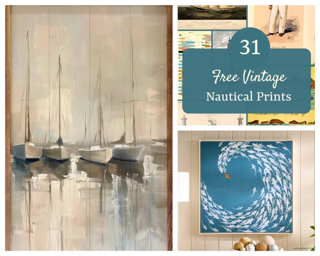
The vintage map route is probably my favorite for traditional or transitional spaces. I’m talking about those old nautical charts with the depth markings and compass roses. You can find reproductions on Etsy for like $30-80, but here’s the thing – get them properly framed. A cheap poster frame makes even expensive art look terrible. I learned this the hard way when I spent $200 on this gorgeous 1800s reproduction of a Boston Harbor chart and put it in a $15 frame from Target. Looked like dorm room decor.
For framing vintage maps, go with a thin black or dark wood frame, none of that chunky distressed white stuff unless your whole room is already coastal cottage (which is a different aesthetic entirely). The mat board matters too – I usually do a simple white or cream mat, maybe 2-3 inches wide. My framer charges about $120 for a good quality frame job on a 24×36 piece, which sounds like a lot but it lasts forever.
The Color Palette Thing Everyone Gets Wrong
Here’s where people mess up constantly. They think nautical means navy blue and white stripes with red accents. That’s…fine, but it’s very literal and kinda dated honestly. The ocean has way more colors than that.
I’ve been pushing clients toward this more nuanced palette – think deep teals, weathered grays, sandy beiges, bits of seafoam green, maybe some warm coral tones. When you’re choosing wall art, look for pieces that pull from these colors rather than the primary color nautical cliché.
There’s this artist I found on Saatchi Art who does these incredible abstract pieces inspired by tide pools, lots of blues and greens with unexpected pops of ochre and rust. They’re pricey (like $800-1200 for a large canvas) but they completely elevated my client’s living room from “beach house” to “collected and sophisticated.” The name is escaping me right now but if you search “abstract ocean contemporary” you’ll find similar stuff.
Size and Scale Matters More Than You Think
Biggest mistake I see is people buying art that’s too small. Your living room wall can handle bigger pieces than you think. I have this whole formula I use – for the main wall (usually above the sofa), you want your art or gallery wall to take up roughly 2/3 to 3/4 of the sofa width. So if you’ve got an 84-inch sofa, you’re looking at art that’s 56-63 inches wide total.
You can do this with one large piece, which is the easiest and most modern approach. I’m talking like a 48×60 canvas or even bigger. Or you can do a gallery wall arrangement, but that’s trickier with nautical themes because it can get cluttered-looking fast.
Oh and another thing – hang your art at the right height. The center of the piece should be at about 57-60 inches from the floor, which is average eye level. I see so many living rooms where the art is hung way too high, like up near the ceiling, and it just floats there awkwardly. My dog literally knocked over my tape measure last week while I was trying to mark the right height for a client installation, so now I just use the tried-and-true method of holding it up and eyeballing it, which honestly works just as well.
Specific Pieces That Actually Work
Let me get specific because vague advice is useless. For a large statement piece, I’ve had really good luck with those oversized vintage boat photography prints. There’s a seller on Minted that does beautiful black and white sailboat photos printed on textured paper – they run about $200-300 for a 40×50 with the frame. The black and white keeps it from feeling too themed.
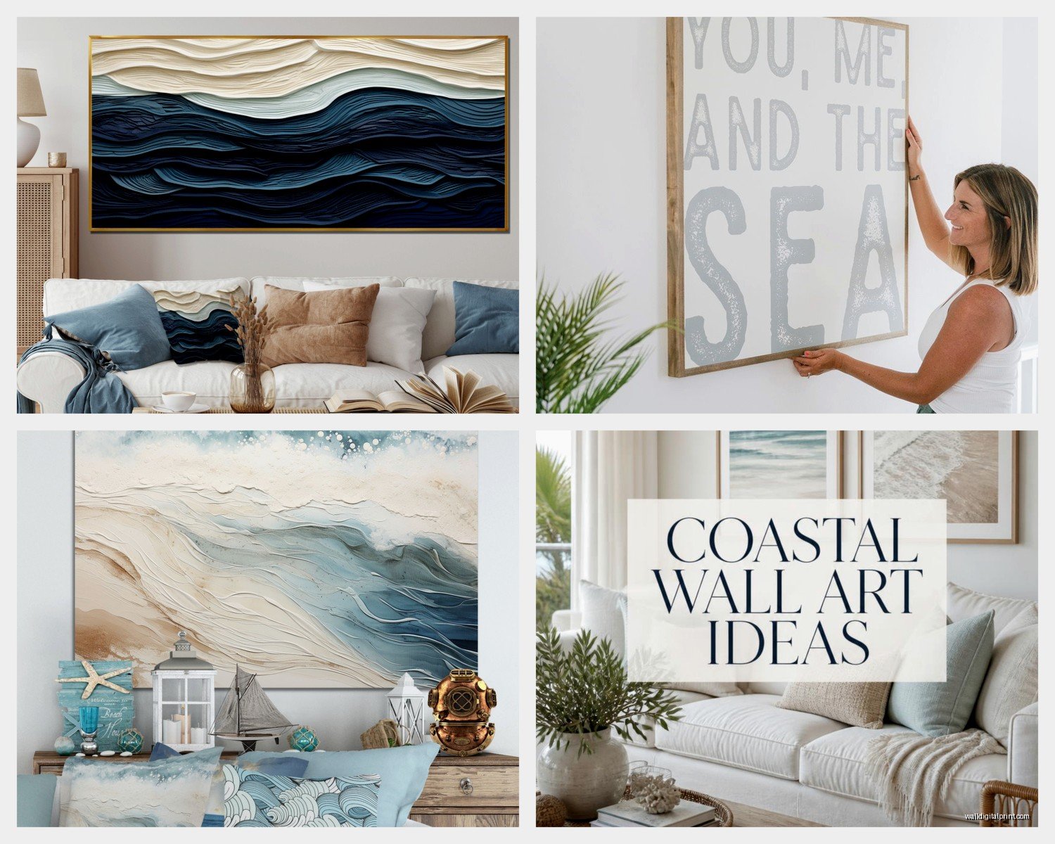
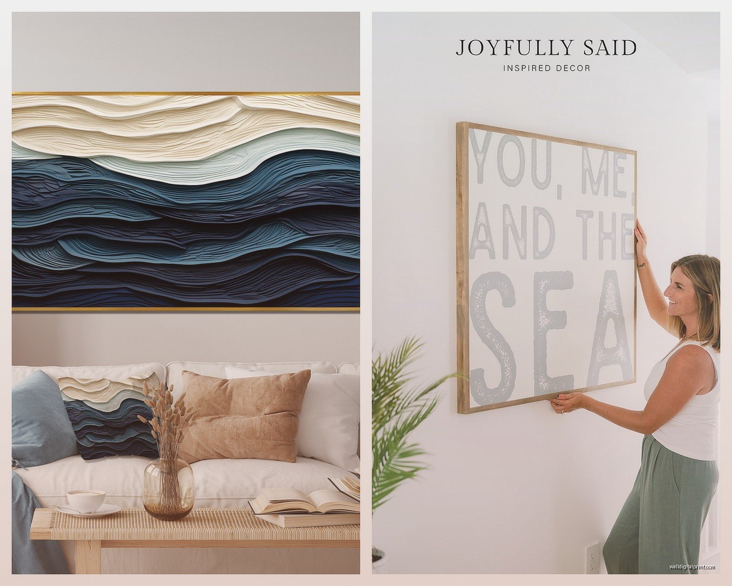
If you want something with more color, look for abstract ocean paintings rather than literal seascapes. Literal seascapes – like paintings of beaches with umbrellas or whatever – tend to read as vacation rental art. But an abstract piece that captures the movement and color of water? That’s sophisticated. I got one from an artist in Maine (found her on Instagram actually) that’s all layers of blue and gray with this amazing texture, cost about $600 for a 36×48 original. Worth every penny because it’s a conversation piece.
For the gallery wall approach, I did this in my own living room and it took me three tries to get it right, not gonna lie. Here’s what finally worked: I used a mix of vintage nautical flags (the actual signal flags, each one means something different), a couple of small botanical prints of seaweed and coral, and one vintage photograph of a lighthouse. All in matching simple black frames, various sizes but nothing smaller than 8×10. The key was keeping everything in the same color family – lots of navy, white, cream, bits of that vintage red.
Where to Actually Buy This Stuff
Okay so Etsy is obvious but overwhelming. When I’m searching there I use really specific terms like “vintage nautical chart reproduction” or “abstract ocean painting canvas” rather than just “nautical art” which gives you a million anchor prints. Filter by price and honestly, read the reviews carefully. I’ve been burned by prints that looked amazing online but arrived looking pixelated and cheap.
For original art, I mentioned Saatchi Art already but also check out Artfinder and even Instagram. Lots of emerging artists sell directly through Instagram now and you can often get better prices than through galleries. I found this woman who does these incredible watercolor paintings of waves, super loose and gestural, sells them for $300-500 unframed. Her handle is something like @coastalwatercolors but there are tons of artists doing similar work.
If you’re on a tighter budget, Society6 and Minted both have good options. The quality is pretty decent for the price point, especially if you go with their framing options. I’ve ordered from both and Society6’s quality is slightly better in my experience, though their framing is more expensive. For like $150-200 you can get a nice 30×40 framed print.
Anthropologie does some interesting nautical-ish art too, though it skews more whimsical. They had this beautiful piece last season that was a vintage-style illustration of different types of boats, very detailed and technical-looking. It was like $400 framed, which isn’t terrible for the size.
The Gallery Wall Layout Process
Wait I forgot to mention – if you’re doing a gallery wall, do NOT just start hammering nails into the wall. I learned this lesson the hard way and ended up with 47 holes to spackle (yes I counted).
Here’s what actually works: trace all your frames on kraft paper or newspaper, cut them out, and tape them to the wall with painter’s tape. Move them around until the arrangement looks right. Take a photo, step back, look at the photo because it gives you better perspective than just staring at the wall. I usually play around with arrangements for like an hour while watching TV (just rewatched The Crown, highly recommend).
The arrangement should be tighter than you think – like 2-3 inches between frames, not 6 inches. Tighter groupings look more intentional and collected. And try to keep the whole thing roughly rectangular or square-ish in overall shape, even if the individual pieces are different sizes.
Mixing Nautical Art With Other Stuff
Your living room doesn’t have to be ALL nautical art. Actually it probably shouldn’t be. I like to mix in one or two maritime pieces with other art that complements the vibe. Like I’ve got clients who have a beautiful vintage sailboat painting as their main piece, and then on adjacent walls they have abstract art in complementary colors and a couple of family photos.
The key is the color palette – if you’re going with those ocean-inspired colors I mentioned earlier, other art in those same tones will tie everything together. You don’t want someone to walk in and feel like they’re in a themed restaurant.
Texture and Dimension Beyond Flat Art
This is gonna sound weird but some of the best “nautical wall art” isn’t actually art in the traditional sense. I’ve used vintage oars, antique ship wheels (though these can get cheesy fast so be careful), shadow boxes with shells or coral, even old wooden boat models mounted on the wall.
There’s this place called Chairish where you can find actual vintage maritime stuff. I got an old wooden half-hull boat model for a client for about $250 and it’s stunning on the wall, way more interesting than a painting. The three-dimensional aspect adds so much.
Woven rope wall hangings are having a moment too, very organic and textural. Not the macramé stuff (though I guess if that’s your thing, go for it), but like sculptural rope pieces that reference maritime life without being literal. There’s an artist on Etsy who does these for around $150-300 depending on size.
Lighting Your Nautical Art
Nobody thinks about this but lighting makes such a huge difference. If you’ve invested in good art, light it properly. Picture lights are okay but I prefer recessed ceiling lights or track lighting that you can aim at the art. Warm white bulbs, not cool white – the warm tones make everything look more inviting and less sterile.
I installed some simple LED picture lights above my vintage map prints and it completely transformed how they look, especially in the evening. You can get battery-operated ones on Amazon for like $30 each if you don’t want to deal with hardwiring.
The Frame Material Question
Metal frames in brass or black metal are really popular right now and they work great with nautical art, especially maps and photography. They’re more modern than wood frames and keep things from looking too traditional or cottage-y.
That said, natural wood frames in walnut or oak can be gorgeous with the right pieces. I used chunky oak frames for a series of black and white coastal photographs and they added this organic warmth that metal wouldn’t have provided.
Avoid the distressed painted frames unless you’re fully committing to a coastal cottage look. And those rope-wrapped frames? Just don’t. Too literal, too 2010.
Seasonal Switching and Flexibility
One thing I do in my own space is switch out smaller pieces seasonally. I know that sounds like a lot of work but hear me out – in summer I lean heavier into the coastal vibe with brighter ocean-inspired pieces, and in winter I swap in some of the moodier, stormier seascapes. It keeps the room feeling fresh.
This only works if you plan for it though. I use a lot of pieces in standard frame sizes (16×20, 20×24, etc.) so I can swap the art without changing frames. The frames stay on the wall, I just pop new art in. Takes like 10 minutes twice a year.
You could also just have one really good piece that works year-round and call it done. Not everything needs to be complicated. My client with that expensive abstract ocean piece I mentioned? That’s her only nautical element and it’s perfect, doesn’t need anything else.
Okay so I think that covers most of what I’ve learned through trial and error with this stuff. The main thing is don’t overthink it but also don’t under-think it – there’s a sweet spot where the nautical theme feels intentional and elevated rather than accidental or too themed. Start with one really good piece that speaks to you, make sure it’s properly sized and hung, and build from there if you want to add more.