Wall Art Guide, Wall Art Tutoriels
Blue and Yellow Wall Art: Complementary Contrast Combo
Mar
So I’ve been obsessing over blue and yellow wall art combos lately because honestly, when you get it right it’s like… chef’s kiss. But when you get it wrong it looks like a kindergarten classroom and not in a cute way.
The thing about blue and yellow is they sit opposite each other on the color wheel which means they’re complementary colors. That’s design speak for “they make each other pop” but also it means you gotta be careful because too much contrast can be exhausting to look at. I learned this the hard way when I put this bright sunflower yellow print next to a cobalt blue piece in my own living room and my sister literally said it hurt her eyes.
Start With Your Shade Intensity
Okay so the first thing you need to figure out is what kind of blue and yellow you’re actually working with. Because navy and mustard is a completely different vibe than sky blue and lemon yellow, you know?
Here’s what I do with clients. I make them pick their dominant color first. Usually it’s blue because most people are scared of yellow taking over a room. And they’re right to be scared because yellow is aggressive. It advances toward you visually while blue recedes. That’s why a little yellow goes a long way.
If you’re going blue-dominant, think like 70% blue tones in your art and 30% yellow accents. This works really well with abstract pieces where you’ve got deep navy or prussian blue with little pops of golden yellow or ochre. I just hung a piece like this in a client’s home office last week and it feels sophisticated instead of chaotic.
But if you’re feeling brave and want yellow as your main event, you gotta balance it with deeper blues. Not bright blues. Think indigo, midnight blue, or even blue-grey tones. The yellow can be brighter when the blue is more subdued.
Matching Undertones Is Everything
This is gonna sound technical but stay with me because it matters. Blues and yellows both have undertones and they need to play nice together.
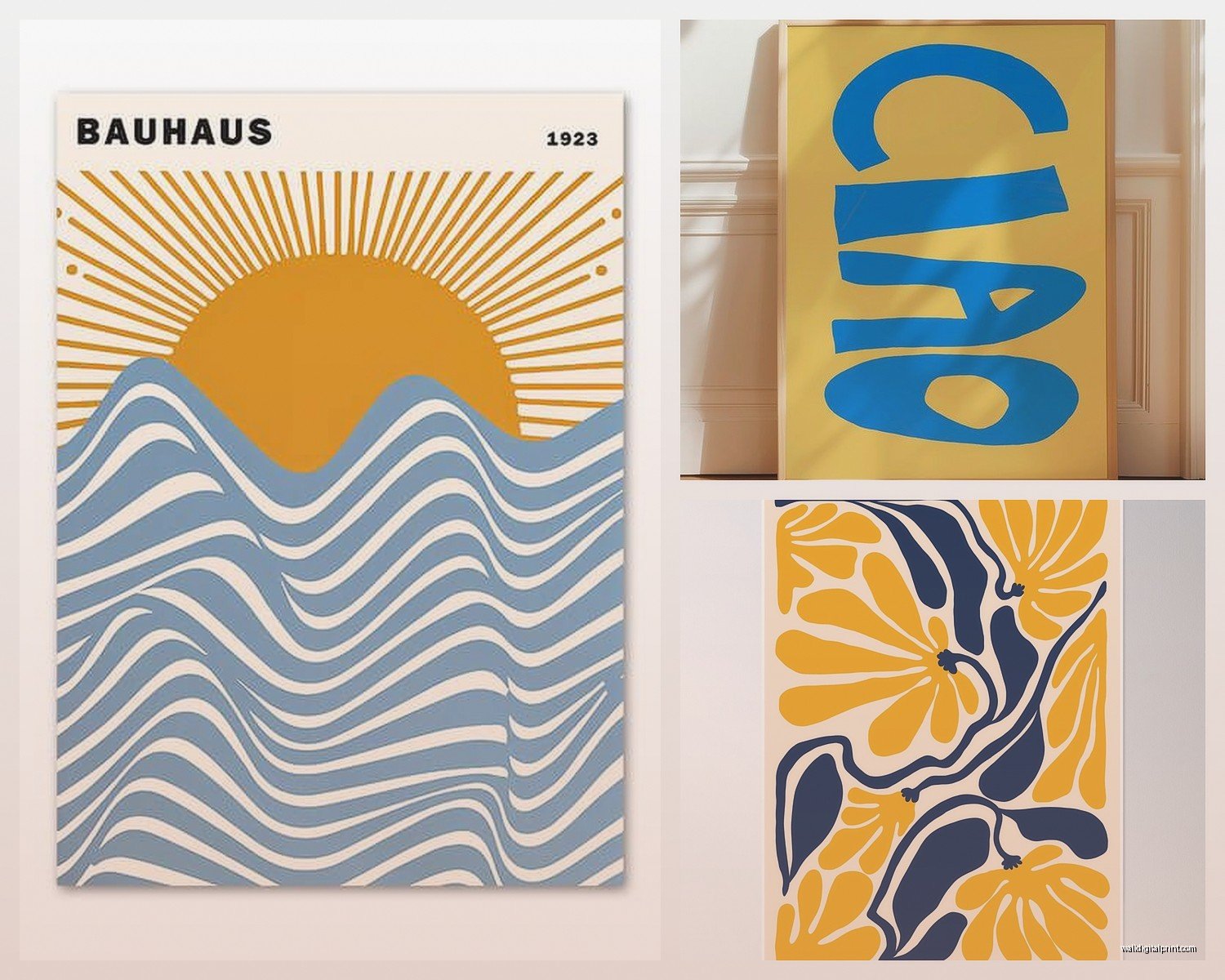
Warm yellows (the ones that lean orange or golden) pair best with warm blues (the ones with a bit of green or grey in them). Think teal, turquoise, or even a greenish navy. I have this vintage poster in my bedroom that’s got this buttery yellow with a kind of dusty teal and it just works.
Cool yellows (the ones that are more lemony and bright) need cool blues. Royal blue, cobalt, bright cerulean. These combos feel more energetic and modern.
Where people mess up is mixing warm and cool within the same piece or gallery wall. Like putting a greenish-blue next to a neon yellow. It creates this weird tension that’s not the good kind of contrast. Your eye doesn’t know where to rest.
Testing This In Real Life
I literally take paint swatches from the hardware store and hold them up next to art prints before I buy anything. My cat knocked over my whole collection last month and I’m still finding little paint chips behind furniture but whatever, it’s worth it.
Get a blue swatch and a yellow swatch that you think might work. Put them next to each other in the actual room where the art will hang. Look at them in morning light, afternoon light, and with your lamps on at night. If they still look good together in all three scenarios, you’re probably safe.
Scale and Proportion Stuff
The size of your blue versus yellow elements really matters for how intense the contrast feels.
Large blocks of both colors next to each other? That’s maximum drama. Good for a statement wall in a dining room or above a sofa where you want people to literally stop and look. I did this in a gallery wall once with a huge blue abstract and a smaller yellow geometric print and it was the first thing everyone commented on.
But for bedrooms or spaces where you want things calmer, you want one color in large areas and the other in smaller doses. Big blue landscape with a tiny yellow sun. Or a mostly yellow piece with blue line work. This gives you the complementary contrast benefits without the visual shouting match.
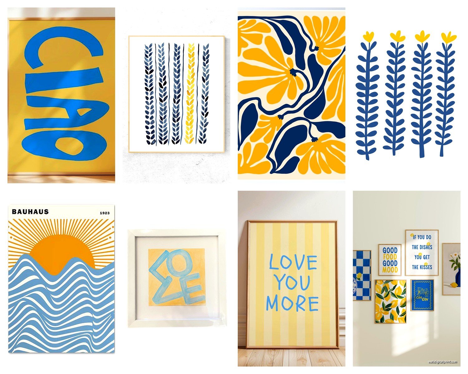
Oh and another thing, if you’re doing a gallery wall with multiple pieces, you don’t need blue AND yellow in every single piece. Actually that usually looks too matchy. I like to do maybe three pieces with both colors, two that are just blue, and one that’s just yellow. Creates rhythm without being repetitive.
The White Space Question
Okay so funny story, I used to think more color = more impact but that’s not how complementary colors work. They actually need breathing room.
Art pieces that have blue and yellow but also lots of white, cream, or grey space? Those are easier to live with long-term. The neutral areas give your eyes somewhere to rest between the color intensity. I’m looking at a piece right now in my studio that’s got these navy brushstrokes and mustard dots on a cream background and it’s been on my wall for three years and I’m not tired of it yet.
Compare that to a piece where it’s ALL blue and yellow with no breaks and… I mean it’s exciting but it’s a lot. Better for a powder room or hallway than somewhere you spend hours.
Style Combinations That Actually Work
Modern abstract is probably the easiest style to pull off with blue and yellow. You can get really painterly with it and the colors can just be about emotion and composition rather than representing anything specific.
But I’ve also seen gorgeous vintage botanical prints where there’s blue delphinium or whatever with yellow flowers and they work because they’re naturalistic. Your brain accepts those colors together because they exist together in nature.
Geometric and mid-century modern styles also nail this combo. Think Scandinavian patterns or 1960s style sunburst designs. The structured shapes somehow contain the color contrast and make it feel intentional rather than random.
Where it gets tricky is with photography. Blue and yellow photos can look amazing but they can also look weirdly dated if they’re too saturated. I’d stick with more muted or vintage-filtered photography if you’re going this route.
Mixing Different Art Styles Together
Wait I forgot to mention that you can totally mix an abstract blue piece with a yellow illustrated piece or whatever. They don’t all have to be the same art style. Actually it’s more interesting when they’re not.
I just finished a gallery wall where we had a blue watercolor landscape, a yellow line drawing of a face, and a geometric piece with both colors. Three totally different styles but the color connection made it cohesive. The trick is keeping your frames similar so there’s SOME unifying element.
Saturation Levels Need Strategy
This is where people really mess up. Saturation is basically how intense or bright the color is.
Highly saturated blue + highly saturated yellow = overwhelming unless you’re going for that primary color pop art vibe. Which is fine if you are! But most living spaces can’t handle it.
What works better for most homes is pairing saturated blue with a more muted yellow (ochre, mustard, gold) or vice versa. Or making both colors a bit desaturated so you get like a slate blue with a pale butter yellow situation.
My client canceled last week so I spent an hour comparing different saturation combos on my iPad and honestly the medium saturation versions of both colors were the sweet spot. Not too boring, not too intense.
Texture and Finish Considerations
Something I don’t see talked about enough is that the physical texture of your art affects how the colors interact.
Matte finishes absorb light so they make colors feel a bit softer and more sophisticated. Good for deeper blues and golden yellows.
Glossy or glazed finishes reflect light which intensifies colors. Better for when you want that bright contrast to really sing. But be careful with glare depending on where windows are.
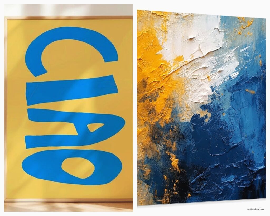
And textured pieces like oil paintings or mixed media where you can see brushstrokes? The texture creates tiny shadows that add depth and make bold color combos more interesting to look at over time. I have this textured piece with thick yellow paint and it catches light differently throughout the day which keeps it from feeling static.
Room-Specific Advice Because Context Matters
Living room: you can go bolder here because you’re not staring at the wall from two feet away usually. A large statement piece with strong blue-yellow contrast works great above a sofa.
Bedroom: I’d lean toward the more muted versions. Soft denim blue with pale yellow or navy with gold. You don’t want stimulating colors right before sleep.
Kitchen: actually blue and yellow is classic for kitchens but keep it cheerful rather than intense. Think French countryside vibes with cerulean and sunflower yellow.
Home office: depends on what work you do but I find blue-dominant with yellow accents helps with focus. The blue is calming but the yellow keeps you alert.
Bathroom: this is where you can get weird with it honestly. Powder rooms especially can handle really bold saturated combos because you’re only in there briefly.
Lighting Changes Everything
Okay this is gonna sound obvious but the lighting in your room will completely change how your blue and yellow art looks together.
Natural daylight makes colors truest to what you see in the store. But warm artificial light (like regular incandescent bulbs) will make yellows more orange and blues more green. Cool LED lighting makes yellows look more lemony and blues more true.
I always recommend looking at art in the actual room lighting before committing. Take it home if the store lets you, or at least use your phone flashlight with warm vs cool settings to simulate.
Also consider where the art hangs relative to windows. Direct sunlight will fade most prints over time but especially yellows. And backlighting can wash out colors. You want enough light to see the piece clearly but not so much that it’s competing with glare.
The Time of Day Thing
Morning light is cooler and bluer which can make your yellow art really pop. Evening light is warmer which makes blues look richer and yellows more golden. If you’re working from home and staring at your walls all day, think about which times you’re in that room most.
Framing Choices That Help or Hurt
White frames keep things light and modern, they don’t compete with the blue-yellow contrast. Black frames add drama and make the colors feel more gallery-like. Wood frames in natural tones can warm everything up which is nice if your blues are on the cooler side.
What I don’t love is colored frames that try to match one of the colors. Like a blue frame on blue and yellow art feels redundant. Let the art provide the color and keep frames neutral.
Mat boards are similar. White or cream mats give breathing room. But you could do a thin mat in a complementary neutral like grey or beige to bridge the color contrast if it feels too stark.
When to Add a Third Color
Sometimes blue and yellow alone feels like something’s missing and that’s when you bring in a third player.
White or cream is the obvious choice and makes everything feel lighter and more spacious. Grey can sophisticate the whole thing. Black adds edge and makes it more graphic.
Or you can pull in a color that’s between blue and yellow on the color wheel which is green. A piece with blue, yellow, AND green creates a more natural flowing palette. I’m watching this gardening show right now and all the colors are basically this combo and it’s so easy on the eyes.
Small amounts of orange or red can work too but be careful because then you’re adding another complementary pair and it can get chaotic fast.
Budget-Friendly Ways to Test This
Before you spend a bunch of money on original art, test the combo with cheaper options. Print out digital art from Etsy, get posters, use pages from art books or magazines in clip frames. Live with it for a week or two.
I did this in my own place and realized I actually wanted more yellow than I thought. Ended up completely changing my gallery wall plan but at least I figured it out before spending hundreds on the wrong pieces.
Thrift stores and estate sales often have blue or yellow art separately that you can mix together for way less than buying coordinated sets. Sometimes the slight mismatch in styles makes it more interesting anyway.