Wall Art Guide, Wall Art Tutoriels
Pink and Gray Wall Art: Feminine Neutral Elegant Combo
Mar
So I’ve been working with pink and gray wall art for like three years now and honestly it’s one of those combos that sounds basic on paper but can go SO many directions depending on what you’re actually trying to do. Let me just dump everything I know because I literally just finished a client’s bedroom yesterday with this exact scheme.
The Ratio Thing Nobody Talks About
Okay so here’s what I figured out the hard way – the ratio of pink to gray matters WAY more than anyone tells you. If you go 50/50 you end up with this weird nursery vibe even if you’re trying to do sophisticated. What actually works is like 70% gray with 30% pink accents, or if you want it more feminine, flip it but add in whites and creams so it doesn’t read too sweet.
I had this whole gallery wall fail in my own living room where I tried equal amounts and my sister walked in and asked if I was redecorating for a baby. I wasn’t. That’s when I started really paying attention to the balance and honestly now I always skew heavier on one color.
Which Gray Though
This is gonna sound annoying but the gray you pick changes everything. Cool grays with blue undertones make the pink look more modern and crisp – think contemporary art gallery vibes. Warm grays that lean slightly taupe or greige make pink feel cozier and more accessible.
I usually test this by holding paint swatches next to the art I’m considering. My dog knocked over my entire swatch collection last week so I’ve been using this trick where I just pull up images on my iPad and hold them next to each other. Not perfect but it works when you’re browsing online at 11pm.
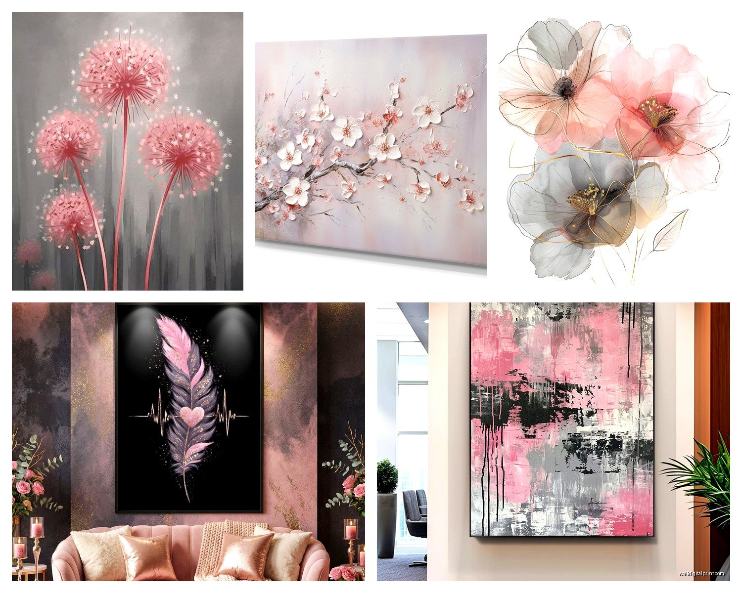
Art Styles That Actually Work
Abstract is obviously the easy route and yeah it works great. But I’m gonna tell you what else I’ve tested that people don’t think about:
Line drawings – especially feminine figure sketches or botanical line art. When you do these in pink lines on gray backgrounds or vice versa, it’s so elegant. I found this Etsy shop once at like 2am while watching that baking show (you know the British one) and bought like six prints of minimal face line drawings. Pink lines, gray background. Framed them in thin black frames and honestly they look way more expensive than they were.
Geometric patterns – triangles, hexagons, that whole thing. The pink and gray combo makes geometric art feel less cold and more approachable. Just make sure the lines are clean because muddy geometry reads cheap fast.
Watercolor – but here’s the trick, it needs to be mostly translucent washes, not heavy pigment. Heavy watercolor in these colors can look like a kindergarten project. The wispy, barely-there watercolor stuff though? Chef’s kiss.
Typography prints – controversial maybe but I love a good quote print in this color scheme for bedrooms or offices. Keep the font modern though, nothing too swirly or it tips into the cutesy zone you’re probably trying to avoid.
What Doesn’t Work
Realistic photography rarely works in this scheme unless it’s black and white with pink/gray mats. I tried adding a pink sunset photo once and it just looked… off. Like the colors were fighting. Also stay away from anything too busy or detailed because the colors themselves create enough visual interest.
Size and Placement Strategy
Okay so this is where I see people mess up constantly. They buy art that’s too small. For pink and gray to read as elegant instead of juvenile, you need scale.
For over a bed: minimum 24×36 inches for the main piece, or a set of three 16x20s. Anything smaller gets lost and makes the whole room feel tentative.
For a living room: go bigger or go home. I’m talking 30×40 or larger for a statement piece. Or do a gallery wall but make sure the overall footprint takes up like 2/3 of the wall width.
The Gallery Wall Formula I Use
I’ve done this probably 30 times now so here’s my actual process:
Start with one large piece (24×36 or bigger) as your anchor. This should be your most gray-dominant piece. Then add 4-6 smaller pieces around it, varying between:
- Pink-dominant pieces
- Gray-dominant pieces
- One or two that are mostly white/cream with just hints of both colors
Mix orientations – don’t do all horizontal or all vertical. And this is gonna sound weird but I always include one piece that’s slightly different, like maybe it has a tiny bit of gold leaf or a thin gold frame. Breaks up the sweetness.
Space them 2-3 inches apart. I use painters tape on the wall to map it out first because I’m not repatching nail holes multiple times. Been there.
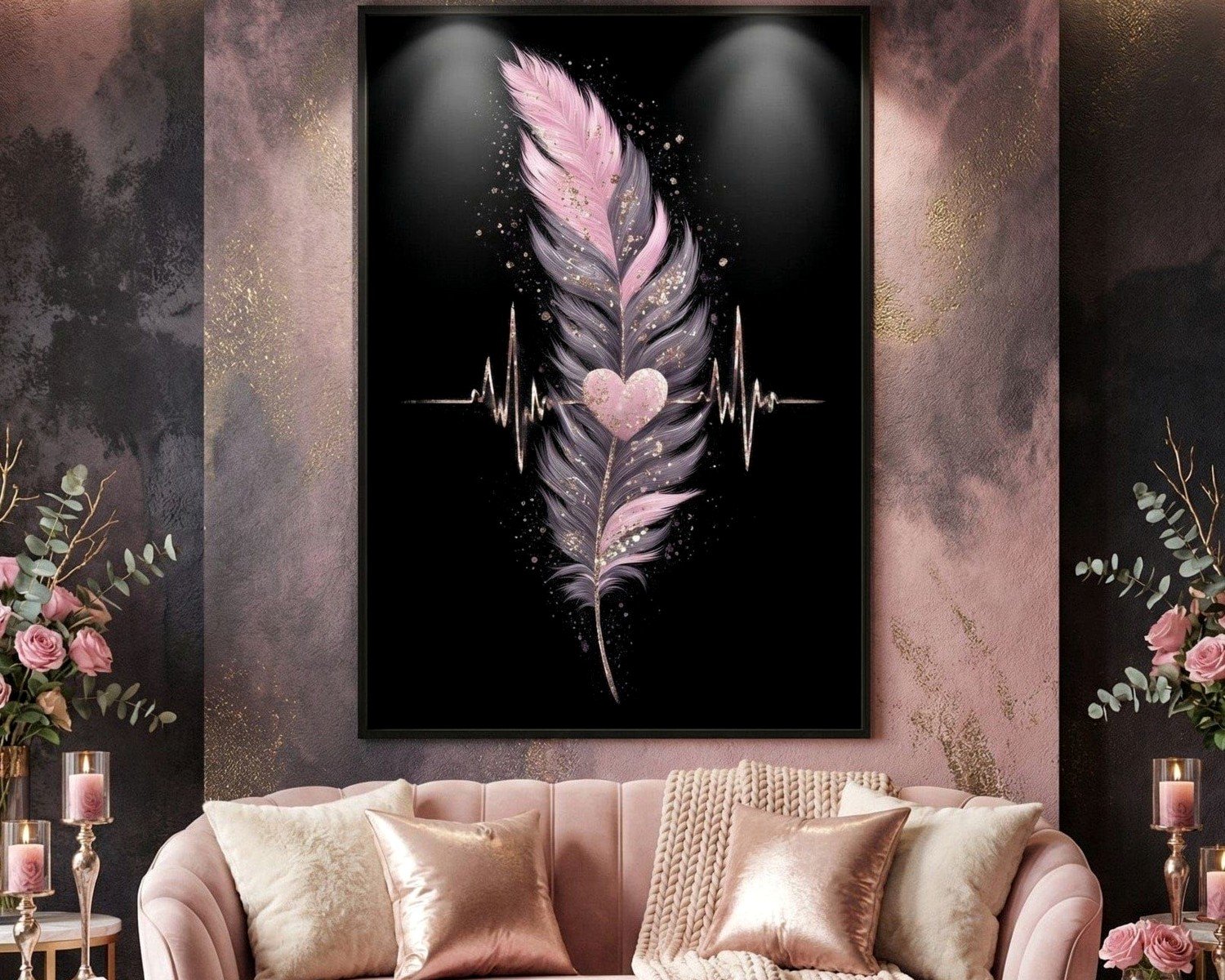
Frame Colors That Don’t Screw It Up
Black frames are my default for this color scheme. They ground everything and add that modern edge that keeps it from being too soft. White frames work too but they need to be crisp white, not cream, or everything mushes together.
Natural wood – maybe. Light oak or maple can work if you’re going for Scandinavian vibes. Dark walnut feels too heavy usually.
Pink or gray frames? No. Just no. I tried pink frames once because a client insisted and it was too matchy. The art needs to pop against the frame, not blend.
Oh and another thing – metal frames in silver or brushed nickel look really elevated with this combo. More expensive but worth it if you’re doing a main statement piece.
Mat Situation
White mats are standard and safe. Gray mats can work but make sure they’re lighter than the darkest gray in your art. Pink mats… I’ve done it successfully exactly twice. It’s risky. Usually I’d say skip it unless you’re doing a really minimal piece where the mat becomes part of the design.
Double mats with gray outer and white inner can look really professional though. Adds depth.
Specific Pieces I’ve Used Successfully
I can’t link stuff here but I’ll describe what to look for:
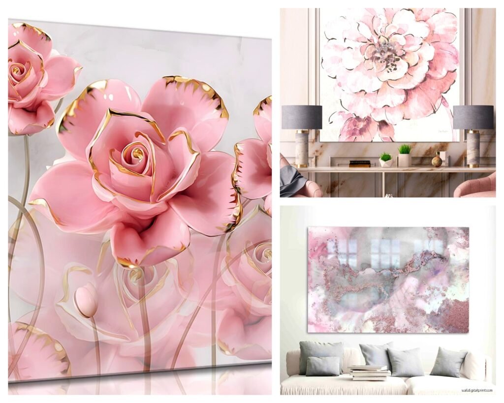
There’s this whole category of “blush and gray abstract” on basically every art site. Look for ones with texture – brushstrokes you can see, or mixed media with different finishes. Flat digital prints can feel cheap in this color scheme.
Marble prints with pink veining on gray stone – these are having a moment and honestly they work. Modern and organic at the same time.
Scandinavian-style prints with simple shapes – circles, arcs, that minimalist thing. In pink and gray these feel current without being trendy.
Floral prints but ONLY if they’re stylized or abstract. Realistic flowers in pink and gray veer into grandma territory fast. Unless that’s your vibe, then cool, but I’m assuming you want elegant based on your question.
Layering With Other Decor
The art doesn’t exist in a vacuum obviously. Here’s what I pair it with:
Metallics: Gold warm it up, silver keeps it cool. I usually add gold if the room has warm grays, silver if it’s cool grays. Brass is my favorite actually – splits the difference.
Textures: Velvet pillows in either pink or gray. Chunky knit throws in cream or white. Smooth ceramic vases. The art can be flat color-wise so you need texture everywhere else.
Wood tones: Light woods only unless you’re doing a really specific moody thing. Dark furniture with pink and gray art needs careful balancing or it feels heavy.
Other colors: White and cream obviously. Navy can work as a grounding accent. Sage green is actually really pretty with this combo – discovered that by accident when a client had existing green curtains. Blush pink, gray, and sage is *chef’s kiss*.
What to Avoid Pairing
Bright colors fight with the softness. Yellow, orange, bright red – they overpower the subtlety. Black furniture is fine but black accessories can be too harsh unless you’re specifically going for high contrast.
Lighting Makes or Breaks This
Okay so something I learned kinda late – pink looks totally different in warm vs cool light. If you have warm yellow bulbs, pink can look peachy or even orange-ish. Cool daylight bulbs make pink look more true but can make gray look blue.
I always recommend 3000K bulbs (warm white) for rooms with pink and gray art. It’s neutral enough that colors read true but still feels cozy.
And add picture lights or track lighting to highlight the art if you can. Pink and gray both can fade into walls in low light, especially if your walls are also neutral.
Common Mistakes I See
Going too light on everything – pale pink and pale gray just disappears on the wall. You need some contrast, either darker grays or more saturated pinks or both.
Mixing too many pink tones – hot pink, blush, mauve, rose… pick one or two max. Otherwise it looks confused.
Forgetting about the rest of the room – if everything is pink and gray it becomes a theme instead of a color scheme. You need breaks – whites, creams, textures, wood.
Buying everything from one place – this is personal preference but I think mixing sources (Etsy, Target, local artists, vintage finds) makes it feel more collected and less catalog.
Budget Approaches
If You’re Broke
Printable art from Etsy – like $5-15 per print. Print at Staples or FedEx on nice paper. Frame from Ikea. Honestly looks fine if you choose good designs.
DIY abstract art – get pink and gray paint, canvas, and just… make something. Abstract is forgiving. I’ve done this for staging homes and people always ask where I bought the art.
Thrift store frames + new prints. Old frames are everywhere at thrift stores. Spray paint them black if needed, add your printed art.
Mid-Range
Society6, Minted, Artfully Walls – they have sales constantly. Wait for 20-30% off and stock up. Quality is solid, lots of artist options.
Framebridge or similar for framing. More than DIY but less than custom framing and it looks professional.
Investment Pieces
Original art from local artists or online galleries. I follow artists on Instagram and buy directly sometimes. A few hundred bucks but you have something unique.
Custom commissioned pieces if you have a specific vision. I’ve connected clients with artists for like $300-800 depending on size and that becomes the whole room’s focal point.
Seasonal Switching
One thing I do in my own space – I have “sets” of art I rotate. Spring/summer I go pinker and lighter. Fall/winter I swap in pieces with more gray and deeper tones. You don’t have to do this but it keeps things fresh without redecorating.
I store the off-season prints flat under my bed. My cat likes to sleep on them which is annoying but whatever.
Testing Before Committing
Here’s my process when I’m unsure: I order prints, tape them to the wall with painters tape, and live with them for a few days. Look at them in morning light, evening light, when you’re tired. If something bugs you, it’ll keep bugging you. Return and try something else.
Most online art retailers have good return policies. Use them. I’ve returned probably 30% of art I’ve ordered over the years because it just didn’t work in the actual space.
Also take photos of your wall with the art up and look at the photos. Sometimes what works in person photographs weird or vice versa. If you’re sharing the space on social media or whatever, this matters.
Wait I forgot to mention – scale mockups. Most art sites let you enter your wall dimensions and see the art to scale. Actually use this feature because everyone thinks they want bigger art until they see it’s actually too big, or more commonly, they think something will be fine and it’s way too small.
Alright I think that’s everything I’ve learned from doing this constantly. The pink and gray thing really does work when you get the balance right, just don’t overthink it too much or you’ll second-guess yourself into paralysis.