Wall Art Guide, Wall Art Tutoriels
Wall Art Sets for Living Room: Coordinated Multi-Piece Collections
Apr
So I’ve been setting up living rooms with wall art sets for like six years now and honestly the coordinated multi-piece thing is trickier than people think. Just last week I had a client who bought this gorgeous 5-piece set online and when it arrived the scale was completely wrong for their wall and we had to start over.
The Material Thing Everyone Gets Wrong
Okay so the first thing you gotta know is that the material affects literally everything – how it looks in different lighting, how much it weighs, whether you can even hang it yourself. Canvas is what most people default to because it’s everywhere and relatively cheap, but here’s what I’ve learned actually using these in real spaces.
Canvas prints are stretched over wooden frames usually, and they’re lightweight which is great if you’re hanging like a 3-piece set above your couch. The texture gives it this sort of authentic art feel even though it’s a print. But – and this is important – cheap canvas looks cheap. The fabric gets these weird ripples or the print quality is grainy. I always tell people if you’re going canvas, spend at least $150-200 for a decent 3-piece set. Anything less and you’re gonna see the corners start to sag after like six months.
Metal prints are having this huge moment right now and I’m actually obsessed with them for modern spaces. The colors are SO vibrant, almost unnaturally so, and they have this sleek finish that catches light in interesting ways. They’re more expensive though, like you’re looking at $300+ for a good set. The weight is the issue – my assistant nearly dropped one on her foot last month and it would’ve been bad. You need proper wall anchors, not just those little nails that come in the package.
Framed Prints vs Frameless
This is where people get decision paralysis. Framed sets give you that gallery wall vibe automatically, and if you get matching frames the coordination is built in. I did a living room in March with three framed botanical prints and the black frames just made everything feel intentional, you know? But frames add bulk and weight and cost.
Frameless options like canvas or acrylic or metal give you this floating contemporary look. Less traditional, cleaner lines. Works better in minimalist spaces or if you’ve already got a lot going on in the room with furniture and patterns.
Acrylic is this thing I’ve been experimenting with more – it’s like the image is printed and mounted behind clear acrylic glass. Super modern, super reflective, makes colors pop like crazy. Had it in my own apartment for a while but my cat kept seeing her reflection and attacking it at 3am so… there are considerations.
Size Configurations That Actually Work
Oh and another thing – the way the pieces relate to each other size-wise matters more than the total size sometimes. You’ll see these configurations:
- Three equal squares or rectangles in a row – classic, safe, works over sofas
- One large center piece with smaller flanking pieces – good for asymmetrical walls
- Five pieces in a gallery arrangement – needs more wall space, looks impressive when done right
- Vertical triptychs – great for narrow walls or beside doorways
The biggest mistake I see is people buying a set without measuring their wall space first. Your set should take up roughly two-thirds to three-quarters of the furniture width below it. So if your sofa is 90 inches, you want your art arrangement to span about 60-70 inches total. Otherwise it looks like a postage stamp or it overwhelms everything.
I measured wrong once in my first year doing this and hung a massive 5-piece set that was like 8 feet wide total above a loveseat and it looked absolutely ridiculous. Client was nice about it but I had to redo the whole thing.
Spacing Between Pieces
This is gonna sound weirdly specific but the spacing between individual pieces in your set should be between 2-4 inches. I usually go with 3 inches because it’s easy to measure and looks balanced in most rooms. Less than 2 inches and they start looking like one weird mega-piece. More than 4 inches and they lose their relationship to each other, stop reading as a set.
You can buy these sets that come with a hanging template which honestly is a lifesaver. It’s like a paper guide you tape to the wall and it shows you exactly where each nail goes. Without one you’re gonna be there with a level and measuring tape for like an hour, moving things around, putting extra holes in your wall.
Material Durability in Real Living Rooms
Okay so in actual use, because I follow up with clients and also have this stuff in my own place:
Canvas holds up pretty well but fades if you have direct sunlight hitting it. I had a set in a west-facing living room and after two years the colors were noticeably lighter. You can get UV protective coating but that adds cost.
Metal prints are basically indestructible. Spill wine on it, wipe it off. Kids throw something at it, it’s fine. The coating protects against fading too. Only issue is if you dent it somehow, you’re kinda screwed – it’s not like you can fix a dent in metal.
Framed prints under glass – the glass can break obviously, but the print itself is protected from everything. Dust, moisture, curious toddlers. I recommend these for homes with kids or pets, or if you’re hanging near a kitchen area where cooking moisture might be an issue.
Wood prints are this trendy thing where the image is printed directly on wood planks. Super rustic, very farmhouse-chic. They’re lighter than you’d think but the wood grain shows through the image which is either charming or annoying depending on your taste. Had a client return a set because she didn’t realize the wood texture would be so prominent.
Color Coordination Tricks
Wait I forgot to mention – when you’re choosing a set, pull colors from what’s already in your room. This sounds obvious but people buy art they like without considering their navy blue sofa and cream walls.
I use this method: take a photo of your living room, then when you’re shopping online, pull up the photo on your phone next to the art listing. Does the color palette work together? Are you adding a new accent color or complementing existing ones?
Some sets are monochromatic which is safe – like three black and white photos or all blue abstract pieces. These are harder to mess up. Multi-colored sets are riskier but more interesting when they work. I did a room last fall with a 3-piece set that had coral, navy, and gold tones and it pulled together colors from the rug, throw pillows, and a blanket. Looked intentional even though the client had bought all those things separately over time.
Installation Reality Check
Most sets come with hanging hardware but it’s usually the bare minimum. For canvas, you’re getting those sawtooth hangers or wire on the back. For heavier pieces, D-rings.
Here’s what I actually use: for anything over 10 pounds, I’m using wall anchors rated for at least double the weight. Drywall is not strong enough on its own. Those plastic anchors that expand behind the drywall work great. If you hit a stud, even better, use a wood screw directly into that.
My partner was watching me hang a 5-piece metal set last weekend and was like “isn’t that overkill” about the anchors I was using and then when we hung the pieces he was like “oh yeah okay these are heavy.” Better safe than having $400 worth of art crash down at 2am.
For the actual layout, I put painters tape on the wall first to mark where each piece goes. Move it around until it looks right. Step back, look from the couch, look from the doorway. Then mark your nail holes through the tape. This saves so many mistakes.
Style Categories That Are Actually Popular
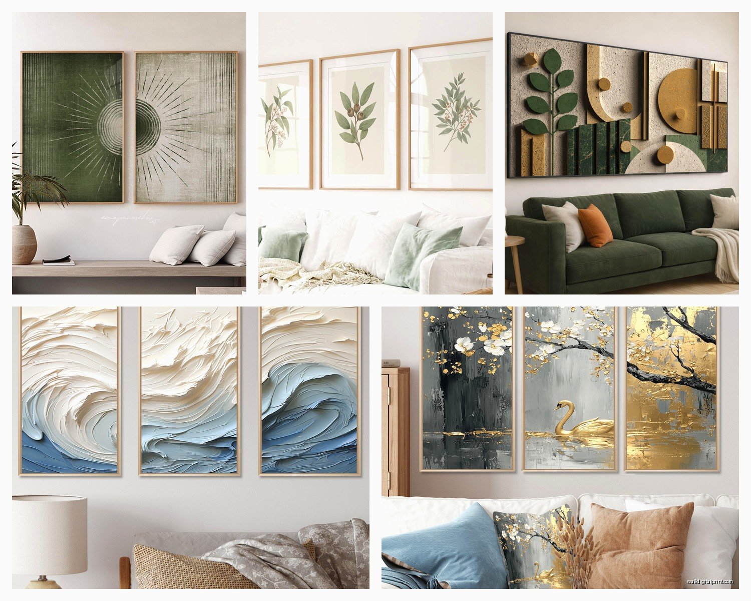
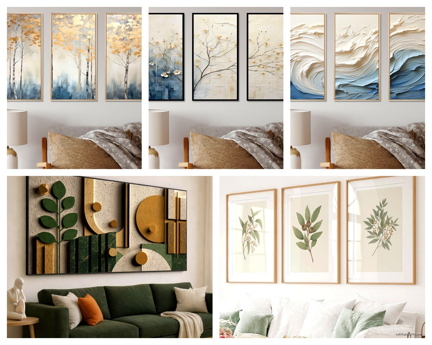
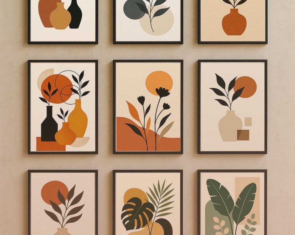
Abstract geometric sets are everywhere right now – circles, lines, shapes in coordinated colors. Easy to match with modern furniture, not too specific theme-wise.
Botanical prints in sets of 3 or 5 never go out of style. Ferns, leaves, flowers in matching frames. Very safe choice, works in traditional or contemporary rooms.
Landscape photography sets – like beach scenes or mountain ranges or forests split across multiple panels. These work well in calm, neutral spaces. Can feel a bit hotel-lobby if you’re not careful though.
Typography and quote sets… I’m gonna be honest, these are divisive. Some people love having “Home” or inspirational quotes on their wall, other people find it cheesy. Totally personal preference but consider if you’ll still like reading that phrase every single day for years.
Mixed media gallery sets where you get different styles that coordinate through color – like one abstract, one photograph, one illustration. These are harder to pull off but look really curated when done right.
Budget Breakdown
You can find sets for like $50 on Amazon but they’re usually printed-on-demand quality and the colors might look totally different than online. Fine for a temporary solution or a rental.
$100-200 range is where quality starts getting decent. Better printing, sturdier materials, more accurate colors. This is my minimum recommendation for something you actually wanna keep.
$200-400 gets you good quality canvas, nice frames, or entry-level metal prints. Most of my clients end up in this range.
Over $400 you’re looking at larger sizes, premium materials, artist collaborations, or original photography. Worth it if the living room is your showpiece space.
I spent $280 on a 3-piece abstract set for my own living room two years ago and it still looks exactly the same as day one. Meanwhile a $65 set I tried in my bedroom faded within six months so… you get what you pay for.
Common Problems I’ve Fixed
Sets arriving with pieces in different color tones – this happens with cheap printing. If you notice this, return it immediately. They should match exactly.
Hanging them level – use an actual level, not your eye. I thought I could eyeball it when I started out and nope.
Sets that look great online but are tiny in person – always check dimensions. A “large” 3-piece set might only be 36 inches total width which is not large.
One piece getting damaged in shipping – most companies will send a replacement for just that piece, you don’t have to return the whole set.
The style not matching your room once it’s up – this is why I always recommend buying from places with good return policies. Sometimes it just doesn’t work and that’s okay.
Oh and this is gonna sound weird but lighting makes such a difference. I installed a beautiful 5-piece ocean scene set and the client texted me that evening saying it looked completely different at night with lamps on versus daytime. We ended up adjusting their lighting setup because they loved the art but it was getting weird shadows. Something to think about.
Anyway that’s pretty much everything I’ve learned from doing this too many times to count. The main thing is measure your space, consider your existing colors, don’t cheap out too much on materials, and use proper hanging hardware. And maybe don’t let your cat see her reflection in acrylic prints if you value sleep.