Wall Art Guide, Wall Art Tutoriels
Green Gold Wall Art: Nature Metallic Luxury Forest Combo
Mar
So I’ve been obsessing over this green and gold combo lately and honestly it started because a client brought me this forest painting with gold leaf accents and I was like…okay how do we make this work without looking like a luxury hotel lobby from 2009, you know?
The Basic Color Thing You Need to Know First
Green and gold is tricky because there are like seventeen different greens and they all act completely different with metallics. I learned this the hard way when I paired this gorgeous emerald piece with warm gold and it looked…expensive but also kinda dated? The trick is matching your green’s temperature to your gold’s temperature.
Cool greens (sage, eucalyptus, forest green with blue undertones) work best with champagne gold or rose gold. Warm greens (olive, moss, hunter green with yellow undertones) need that rich buttery gold or even bronze. I keep swatches in my phone now because I got tired of making return trips to galleries.
What Actually Works on Your Wall
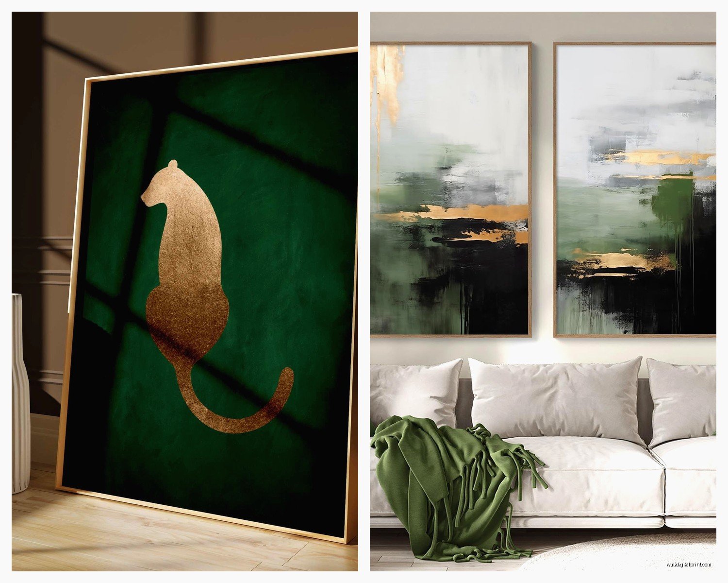
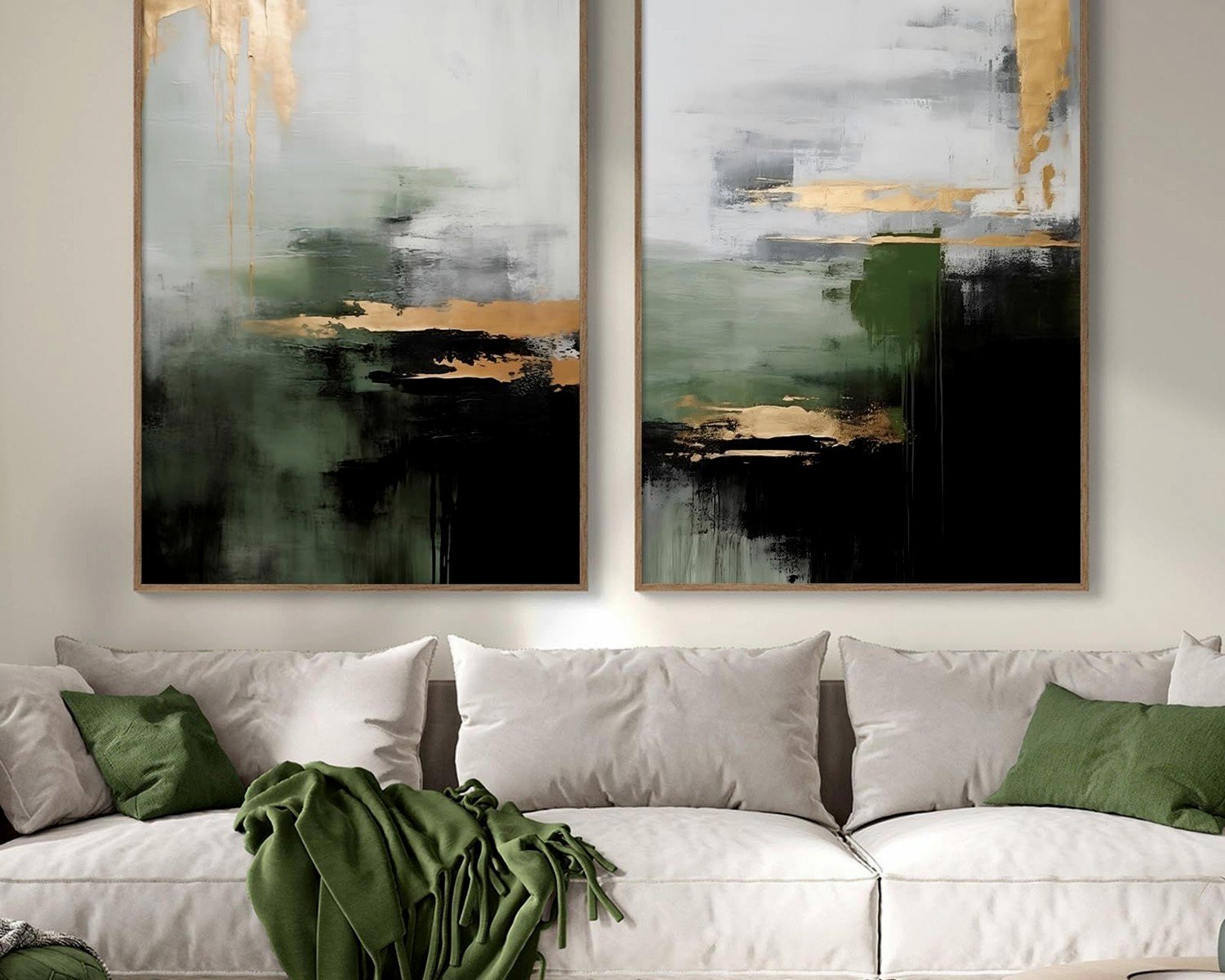
Okay so if you’re going for that nature-meets-metallic vibe, the scale matters SO much. I had this tiny 12×12 piece with gold foil leaves and it just disappeared on a large wall. You need either one statement piece that’s at least 30×40 inches OR a gallery wall situation with multiple smaller pieces.
The forest combo thing works best when you layer different shades of green. Like I did this whole wall last month with:
- Deep emerald abstract piece as the anchor
- Lighter sage botanical prints on either side
- Gold metallic frames tying everything together
- One piece with actual gold leaf details as the focal point
The gold doesn’t have to be IN every piece of art. Sometimes it’s just the frames or matting, which actually looks more sophisticated anyway.
The Lighting Issue Nobody Talks About
This is gonna sound weird but I literally bought three different pieces before figuring out that metallic art is SUPER sensitive to lighting. That gold leafing that looked amazing in the gallery? Looked flat and dull under my client’s cool LED bulbs.
You want warm white bulbs (2700-3000K) to make gold pop. I use those Philips warm glow LEDs and they’re like $8 for a 4-pack. Also picture lights are your friend here…the ones that mount above the frame. They create this whole ambiance thing and the gold catches the light at different angles throughout the day.
Natural light is obviously ideal but watch out for direct sun on actual gold leaf because it can fade over time. I learned that one from my art curator friend after I hung a $600 piece right by a west-facing window and yeah.
Mixing Finishes Without It Looking Chaotic
So metallic finishes are where people usually mess up. You’ve got glossy gold, matte gold, brushed gold, rose gold, champagne, bronze…it’s a lot. My rule is pick TWO finishes max for one wall or room.
I usually do:
- Matte or brushed gold in the frames
- High shine gold leaf or metallic paint in the actual artwork
The contrast between finishes adds depth but keeping it to two prevents that “I raided a craft store” look. Oh and another thing, if your room has other metals (like brass light fixtures or copper accents), try to pull those into your art too. I did a green forest piece with copper and gold together and it tied in perfectly with the client’s pendant lights.
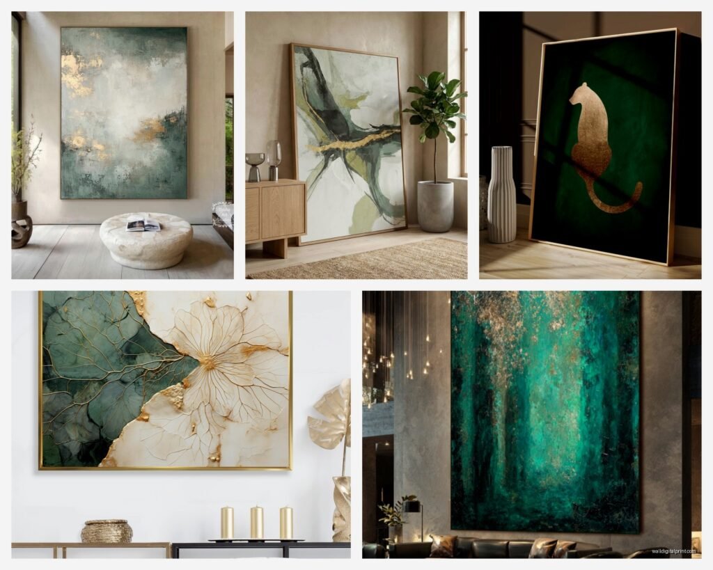
Actual Art Styles That Work
I’ve tested this combo across different styles because my clients have wildly different tastes and here’s what actually delivers:
Abstract organic shapes – Think flowing green forms with gold accents. Not too geometric, more like natural movement. These work in modern and transitional spaces.
Botanical prints with gold details – Ferns, monstera leaves, eucalyptus branches. When the gold is used as an outline or highlighting, chef’s kiss. Just avoid the super literal stuff that looks like clip art.
Landscape paintings with gold leaf sky or accents – I found this artist on Etsy (my dog was barking at the mailman and I was stress shopping) who does forest scenes with gold leaf integrated into the tree canopy. The gold reads as sunlight filtering through leaves and it’s just…yeah that’s the vibe you want.
Agate or geode art – The natural green stones with gold veining or resin? So good. They bring in that luxury element without being too literal about the forest theme.
Minimalist line art – Simple gold line drawings on dark green backgrounds. Very elegant, works in smaller spaces where a busy forest scene would overwhelm.
Size and Placement Strategy
I’m gonna give you the actual measurements I use because eyeballing it never works:
For above a sofa or bed, your art should be 2/3 to 3/4 the width of the furniture. So a 90-inch sofa needs art that’s around 60 inches wide minimum. You can achieve this with one large piece or a gallery wall arrangement.
Hang art so the center is at eye level, which is usually 57-60 inches from the floor. But honestly I cheat this rule all the time depending on ceiling height and furniture placement.
Gallery walls with the green-gold combo…I map them out on the floor first with painter’s tape marking the frames. Sounds tedious but I’ve patched too many nail holes to skip this step now.
The Actually Affordable Options
Okay so real gold leaf art is expensive. Like properly expensive. But there are workarounds that still look high-end:
Gold foil prints instead of actual leaf – Most people can’t tell the difference from a few feet away. I get these from Minted and Juniper Print Shop. They’re like $50-150 versus $500+ for real gold leaf.
DIY gold paint accents – I’ve added gold metallic paint to existing green art and it works if you have a steady hand. Use artist-quality metallic acrylics, not craft paint. Golden brand makes good ones.
Digital prints in gold frames – Download forest photography or botanical illustrations, print them large format at a print shop, put them in gold frames from Target or Amazon. Whole thing costs under $100 and looks way more expensive.
Thrift store art with gold added – Found a green landscape painting for $12, added gold leaf accents to the sky, reframed it. Total cost $45, looks like a $300 piece.
What Colors to Pair With This Combo
Green and gold can feel heavy if you don’t balance it right. Here’s what I add to keep it from feeling too intense:
Cream or warm white walls – This is non-negotiable for me. The art pops but the space still feels open. Bright white makes the green look muddy.
Navy or charcoal accents – In throw pillows, rugs, or other art pieces. Adds depth and makes the gold feel more intentional.
Natural wood tones – Medium to dark woods echo the forest theme and warm up the space. Light woods can work but they compete with gold sometimes.
Terracotta or rust – Small doses. Like in a vase or small accent piece. It bridges the warm gold and cooler greens.
Blush or dusty rose – If you’re using rose gold instead of yellow gold, adding actual pink tones ties everything together. I did this in a bedroom and it was chef’s kiss.
Colors to avoid: Orange (fights with gold), bright yellow (too much warm), purple (just trust me on this), and too much black (makes it feel formal and cold).
Texture Layering
Flat art on a flat wall is boring even with great colors. I always add texture through:
- 3D elements in the art itself – like raised gold leafing or impasto paint techniques
- Textured mats in the framing – linen mats under glass add subtle dimension
- Mixing framed art with canvas wraps
- Adding a floating frame to canvas pieces for that gallery look
- Sculptural elements near the art – like a gold sunburst mirror or brass wall sconce
I’m watching this documentary about forests right now actually and it’s making me think about how nature itself is all about texture…the rough bark, smooth leaves, etc. Your art should echo that variety.
Common Mistakes I See All The Time
Too much gold – If everything is gold-framed with gold accents IN the art plus gold decor around it, it’s overwhelming. Pick your spots.
Wrong green shade for the room’s light – North-facing rooms need warmer greens to compensate for cool natural light. South-facing can handle cooler greens.
Ignoring the room’s existing undertones – If your space has pink or red undertones in the flooring or furniture, cool greens will clash. Warm greens are your friend there.
Hanging everything too high – I see this constantly. People hang art way above eye level and it floats disconnected from the furniture.
Matching everything exactly – All the same shade of green, same gold finish, same frame style…it looks like a hotel. Vary it slightly.
Seasonal Flexibility
One thing I love about this combo is you can shift the vibe seasonally without changing the art. In spring/summer I add lighter green accents and more brass/warm gold tones in decor. Fall/winter I bring in deeper emeralds and darker gold or bronze elements.
The art stays the same but the supporting cast changes. Way more practical than swapping out actual wall art every few months.
Where to Actually Buy This Stuff
Since you’re probably gonna ask where I source things:
Etsy – Best for original art and custom pieces. Search “green gold leaf art” or “forest metallic painting.” Read reviews obsessively.
Minted – Their foil-pressed art is gorgeous and they have sales constantly. Sign up for emails.
Anthropologie – Overpriced but they have unique pieces you won’t see everywhere. Wait for 30% off sales.
Society6 and Redbubble – Digital art printed on demand. Quality varies but prices are good for testing out a look.
Local art fairs and galleries – You can negotiate prices and see the gold leafing in person which matters.
West Elm – Their abstract green and gold pieces are solid, though kinda safe. Good if you want something that’ll work for sure.
Framebridge – For custom framing with gold frames. Not cheap but quality is consistent.
wait I forgot to mention, check Facebook Marketplace and estate sales for vintage pieces. I found an amazing mid-century forest painting with original gold leafing for $40 last month. Just needed a frame cleaning.
Making It Work in Different Room Styles
Modern minimalist – One large-scale piece, simple gold frame or no frame, lots of white space around it. Keep the green muted like sage or eucalyptus.
Bohemian – Layer multiple pieces, mix gold with brass and copper, add macrame or woven elements nearby. Warmer greens work better here.
Traditional – Ornate gold frames, classical landscape paintings, symmetrical arrangements. Hunter green and rich gold.
Scandinavian – Light sage greens, brushed gold or brass, simple frames, pair with lots of natural wood and white.
Industrial – Bronze or antique gold finishes, mount art on wood boards instead of traditional frames, pair with darker greens like forest or emerald.
The green-gold combo is actually super versatile once you figure out which specific shades match your existing style. It’s not just one look.
Testing Before Committing
Okay so here’s what I actually do before buying expensive art. I print out a scaled version on regular paper, tape it where the art would go, and live with it for a few days. Sounds crazy but it’s saved me from so many returns.
You can also order samples of gold frames from sites like Framebridge or just buy cheap gold frames from HomeGoods to test the finish against your wall color and lighting.
For the actual art, some sites let you preview it on your wall through their app using AR. It’s not perfect but gives you a better sense of scale than just looking at it online.
The whole green and gold thing really comes down to getting the balance right between nature-inspired and luxe without tipping too far either direction. Too much nature and it feels like a cabin, too much gold and it’s a jewelry store. But when you nail that middle ground it’s just…yeah it works.