Wall Art Guide, Wall Art Tutoriels
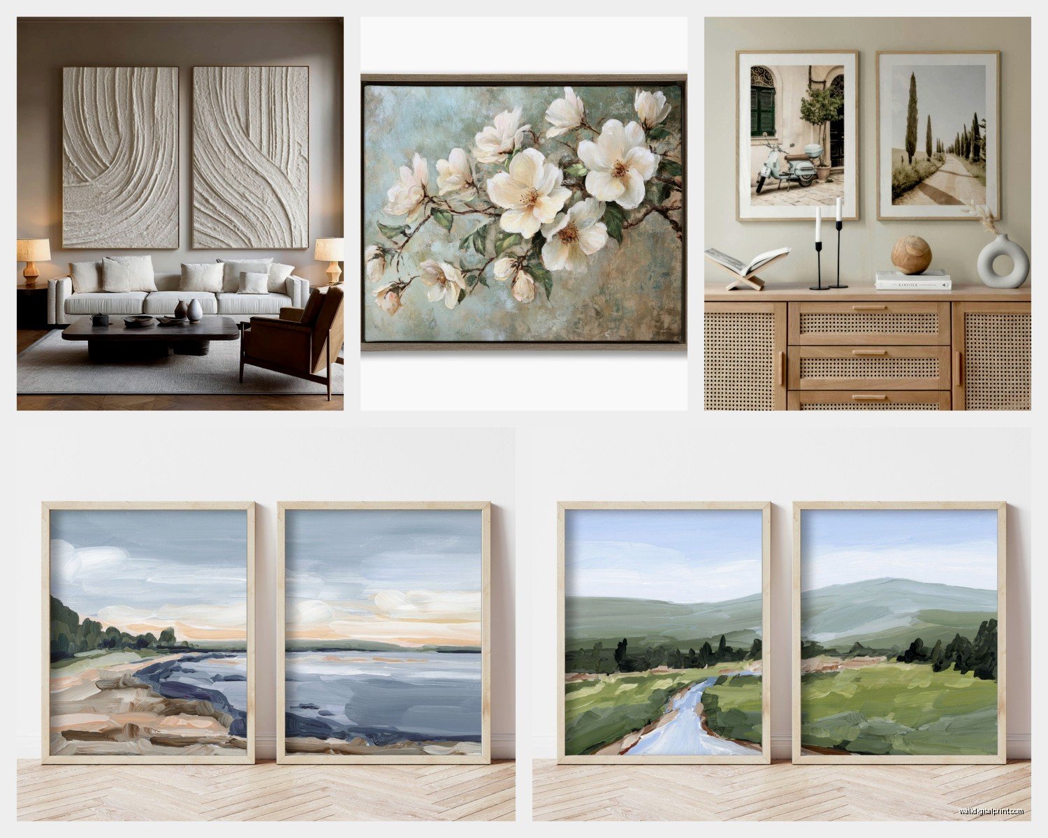
Set of Two Wall Art: Coordinating Pair Designs

Mar
So I’ve been hanging these coordinating pair sets for like three years now and honestly it’s way less complicated than Pinterest makes it look but there ARE some things that’ll save you from putting 47 holes in your wall like I did at my first apartment.
First thing – and I cannot stress this enough – measure the wall space BEFORE you fall in love with a set. I learned this the hard way when I bought these gorgeous abstract prints that were each 30×40 inches and my client’s wall was only 72 inches wide total. The math didn’t math. You need at least 4-6 inches of breathing room on each side of your arrangement, so if you’ve got a 96-inch wall, you’re realistically working with like 84-86 inches max for the actual art plus the space between them.
The spacing between the two pieces is where everyone gets tripped up. The standard rule is 2-4 inches apart for smaller pieces (anything under 16×20) and 4-8 inches for larger ones. But here’s what I actually do – I hold up my fist between where the frames would go. If it looks cramped, go wider. I know that sounds ridiculous but it works every single time. My fist is about 4 inches and it’s just easier than holding a tape measure while also trying to visualize.
Horizontal vs Vertical Orientation
Okay so this is gonna sound obvious but you’d be surprised how many people don’t think about it – check if your pair is meant to hang horizontally side by side or vertically stacked. Most sets are designed for horizontal hanging because that’s what works above sofas and beds, but some abstract or botanical prints actually look better stacked vertically in narrow spaces like hallways or between windows.
I had this whole thing last month where someone bought a set thinking they’d stack them in their entryway and the designs just… didn’t flow that way? Like the color gradients were clearly meant to read left to right, not top to bottom. The product photos showed them horizontal but she didn’t scroll through all the images. Always look at ALL the listing photos.
For horizontal arrangements above furniture, the total width of both pieces plus the gap should be roughly 2/3 to 3/4 the width of the furniture below. So if your sofa is 84 inches, you want your total arrangement to be around 56-63 inches wide. This is more guideline than rule though – I’ve definitely gone wider when the pieces demanded it.
Height Placement That Actually Works
The whole “hang at eye level” thing is technically 57-60 inches to the center of the artwork but lemme tell you what I actually do because rooms are different and people are different heights and also who’s walking around measuring to the CENTER of art.
If it’s going over a sofa or console table, measure 6-8 inches up from the furniture top. That’s your bottom edge of the frame. This creates enough visual separation without the art floating away into the ceiling. I use 8 inches for larger pieces and 6 for smaller ones.
For wall space with no furniture below (like a hallway), I hang so the bottom edge is around 54-56 inches from the floor. This puts the middle of standard-sized art right around that 60-inch center point without me having to do weird math.
Oh and another thing – if you’re hanging in a room where people are usually sitting (dining room, living room), go slightly lower than you think. Like maybe 55 inches to center instead of 60. When you’re seated on a cofa looking at art, that higher “standing eye level” placement can feel too elevated.
The Template Method Nobody Talks About
This is gonna sound extra but it saves SO much time. Trace your frames on kraft paper or newspaper (I use the paper that comes in Amazon boxes because I’m fancy like that). Cut out the templates, tape them to the wall with painter’s tape, and arrange them until it looks right. You can step back, live with it for a day, move them around. My cat knocked down my paper templates twice while I was doing this yesterday but it’s still worth it.
Once you like the placement, mark your nail holes RIGHT THROUGH the paper. If you’ve got sawtooth hangers, mark the center top. If you’ve got wire hanging systems (more on that in a sec), measure down from the top of the frame to where the wire pulls taut when stretched up, then mark that distance down from the top of your paper template.
I literally write the measurements on the paper template itself so I don’t forget what I’m doing halfway through.
Matching vs Complementary Designs
So there’s basically three types of coordinating pairs and which one you get kinda determines how you hang them:
Diptych sets – these are two pieces that form one continuous image when hung together. These HAVE to be perfectly level with each other and the spacing has to be consistent. Use a level. Like actually use it. I eyeballed a beach scene diptych once and the horizon line was off by half an inch and it haunted me for three months until I fixed it.
Matching pairs – same design, same colors, maybe mirrored or slightly varied. These can be more forgiving with spacing but they still need to be at the exact same height. The top edges or bottom edges should align perfectly.
Complementary pairs – different but coordinated through color, style, or theme. These have the most flexibility. You can even do them at slightly different heights if the composition calls for it, though I usually keep them level anyway because it’s easier.
Frame Considerations You Gotta Think About
If your set comes framed (most do), check the frame depth. Frames that stick out 2+ inches from the wall create shadows and look more substantial, which means you might want more space between them – like 6-8 inches instead of 4. Thin frames or canvas prints can sit closer together.
Also some frames come with sawtooth hangers and some have wire. Sawtooth is easier for keeping things level but harder to adjust once the nail is in. Wire gives you more adjustability but can shift if you don’t secure it properly. For coordinating pairs, I actually prefer sawtooth because I want them to STAY put once I’ve got them level with each other.
Wait I forgot to mention – if you’re hanging on drywall, use proper picture hanging hooks rated for the weight. Those Command strips work for lighter pieces under 5 pounds but anything substantial needs a real anchor or a hook that angles into the wall. I use the OOK brand hangers with the pin nails for most medium-weight frames.
Color and Style Matching With Your Space
This isn’t really about the hanging mechanics but it matters for which set you choose. I see people buying beautiful coordinating pairs that just… don’t work with their room and then they blame the art.
Pull colors from your existing space. If you’ve got a grey sofa with navy and cream pillows, look for pairs that incorporate those colors. The art doesn’t have to match exactly – actually it’s better if it doesn’t – but it should share at least one or two colors with your room.
For style, keep it consistent with your vibe. Modern minimal rooms need clean-lined abstract or geometric pairs. Traditional spaces can handle more ornate frames and classical subjects. Boho eclectic can basically do whatever but look for pairs with some texture or organic elements.
I was watching this show last night about tiny homes and they had three different sets of wall art pairs in like 400 square feet and it actually worked because they kept the frame style consistent even though the art subjects were different. That’s a trick right there – if you’re using multiple pairs in connected spaces, same frame finish helps tie it together.
Creating Balance Without Symmetry
So here’s something I do that interior design rules say you shouldn’t but whatever – I don’t always center the pair on the wall or furniture. Sometimes if there’s a floor lamp on one side or a large plant, I’ll shift the pair slightly to balance the VISUAL weight of the whole vignette rather than just centering the art.
Like if you’ve got a sofa with a side table and lamp on the right side, shifting your art pair slightly left can actually make the whole wall feel more balanced. Your eye reads the entire composition, not just the art in isolation.
But if you’re doing this, only shift like 2-4 inches. More than that and it just looks like you measured wrong.
Lighting That Makes Your Pair Pop
This is optional but it makes SUCH a difference. If you can add picture lights or even just position a floor lamp to cast light on your pair, it elevates the whole thing. I have these battery-operated LED picture lights that stick to the frame top or wall above – they’re like $25 on Amazon and they make art look three times more expensive.
For larger pairs, you can also use track lighting or adjustable can lights if you’ve got them. Position the light at a 30-degree angle to avoid glare on glass.
Natural light is free obviously but watch for direct sunlight that’ll fade your prints over time. If your pair is going on a wall that gets direct sun for hours daily, consider UV-protective glass or acrylic, or just accept that you might need to replace them in a few years. Prints fade. It happens.
Common Mistakes I See Literally All The Time
Hanging them too high. I swear this is 80% of bad art placement. When in doubt, go lower than you think.
Making the gap too wide. More than 8 inches between pieces and they start reading as separate artworks instead of a coordinated pair. Unless they’re huge – like 40×60 each – then you can go up to 10-12 inches.
Not using a level. Seriously just buy a small level. They’re like $7. Your phone’s level app works too but holding your phone up while also holding a frame is awkward.
Forgetting about light switches and outlets. Measure where those are and make sure your frames won’t cover them. I’ve had to shift SO many arrangements because someone didn’t account for the thermostat.
Buying pairs that are too small for the wall. This makes rooms feel empty and unfinished. If your wall is big, get bigger art or create a gallery wall instead of trying to make a tiny pair work.
What to Do When Things Go Wrong
You’re gonna put a nail in the wrong spot. It’s fine. Spackle exists. I keep a little container of it and a putty knife in my art-hanging kit along with touch-up paint in the common wall colors I work with.
If one piece is crooked after hanging, don’t just eyeball the adjustment – measure how much you need to move it and actually do the math. Otherwise you’ll chase the crookedness around the wall forever (speaking from experience here).
For wire hangers that won’t stay centered, you can tie the wire at the center point with a zip tie or wire to create a fixed hanging point. This keeps the wire from sliding to one side.
If your pair just doesn’t look right after hanging, sometimes it’s not the hanging – it’s the placement. Try a different wall. I’ve moved pieces three times before finding where they actually wanted to live.
The thing about coordinating pairs is they’re designed to make decorating easier because someone already did the hard work of making two pieces work together. You just gotta hang them at the same height, space them reasonably, and not overthink it. Most of the “rules” are really just guidelines that you can bend once you understand why they exist in the first place.