Wall Art Guide, Wall Art Tutoriels
3 Piece Wall Art Vertical: Portrait Triptych Sets
Mar
So I’ve been completely obsessed with vertical triptychs lately and honestly they’re way trickier than horizontal ones but also SO much more interesting when you get them right. Last week I was hanging a set in my friend’s entryway and her cat kept trying to climb the ladder which was… not helpful.
Why Vertical Actually Changes Everything
Okay so here’s the thing nobody tells you about portrait orientation wall art. Your eye moves differently. With horizontal pieces you scan left to right naturally because that’s how we read, but vertical makes you look UP and down which totally changes the energy of a space. I’ve got this three-piece botanical set in my hallway that’s like 36 inches tall and only 12 inches wide per panel and it makes my 8-foot ceilings look way higher than they actually are.
The proportions are gonna feel weird at first if you’re used to landscape art. Most vertical triptychs I work with are either 12×36, 16×48, or 20×60 per panel. That’s per panel, not total width. So you’re looking at adding 36-60 inches of horizontal space when you factor in gaps.
Spacing That Actually Works
This is where everyone messes up including me the first dozen times. The gap between panels matters SO much more with vertical pieces because…okay think about it. If your panels are 48 inches tall and you put them 6 inches apart, those vertical gaps become these really prominent dark lines that cut through your composition. I learned this the hard way with a beach scene triptych where the spacing made it look like the ocean had prison bars.
For vertical triptychs I usually go with:
- 2-3 inches apart for panels that are part of one continuous image
- 4-5 inches apart for related but separate images
- 6+ inches apart if each panel is truly standalone
The narrower your individual panels, the closer you can push them together. My 12-inch wide panels look great at just 2 inches apart but my 20-inch panels need at least 4 inches or they feel crowded.
The Math Nobody Wants to Do But You Gotta
Let’s say you’re buying three 16×48 panels. That’s 16 inches wide per panel. Three panels = 48 inches. Add two gaps at 3 inches each = 6 inches. Total wall width needed = 54 inches minimum. I keep a notes app thing on my phone with these calculations because I’m definitely not doing that math in my head at the art store.
Height Placement Is Completely Different
So everyone knows that gallery standard thing where you hang art so the center is at 57-60 inches right? Well that’s for normal proportioned art. With tall vertical pieces this gets weird.
If you’ve got 48-inch tall panels and you center them at 57 inches, the bottom edge is gonna be at 33 inches off the ground which feels…low. Like really low. I usually cheat the center point up to about 62-65 inches for vertical triptychs especially in rooms with taller ceilings.
But also it depends on your furniture. If you’re hanging above a console table that’s 30 inches high, you want the bottom of your artwork to start about 6-8 inches above the table surface. So a 48-inch panel would have its center at around 58-60 inches which actually works out to that gallery standard.
I hung a set above my client’s sofa last month and we had to go way higher than felt natural because the sofa back was 36 inches and she had throw pillows adding another 6 inches. The bottom panel edge ended up at 48 inches off the floor which sounds insane but looked perfect.
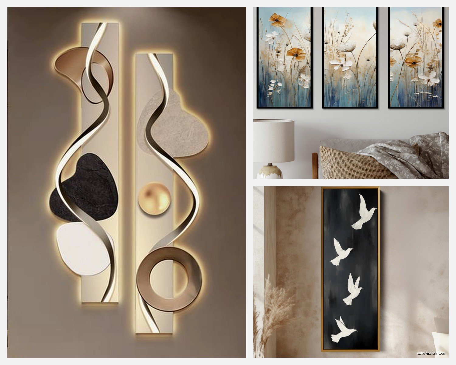
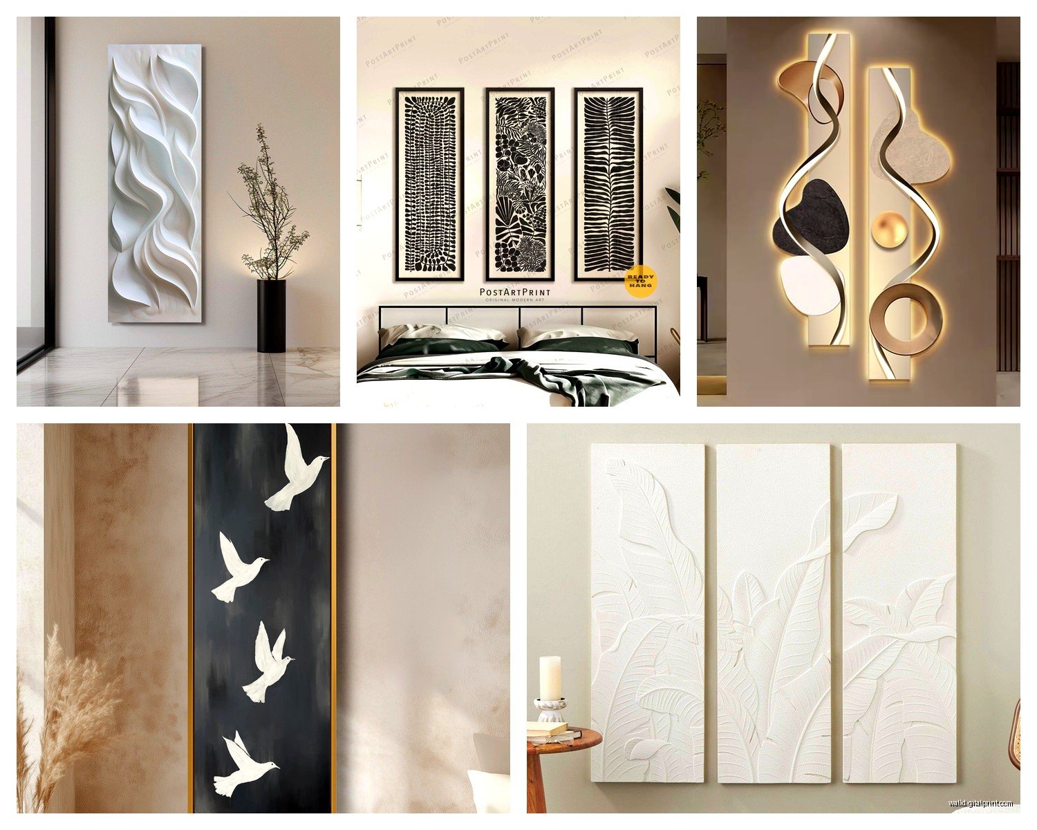
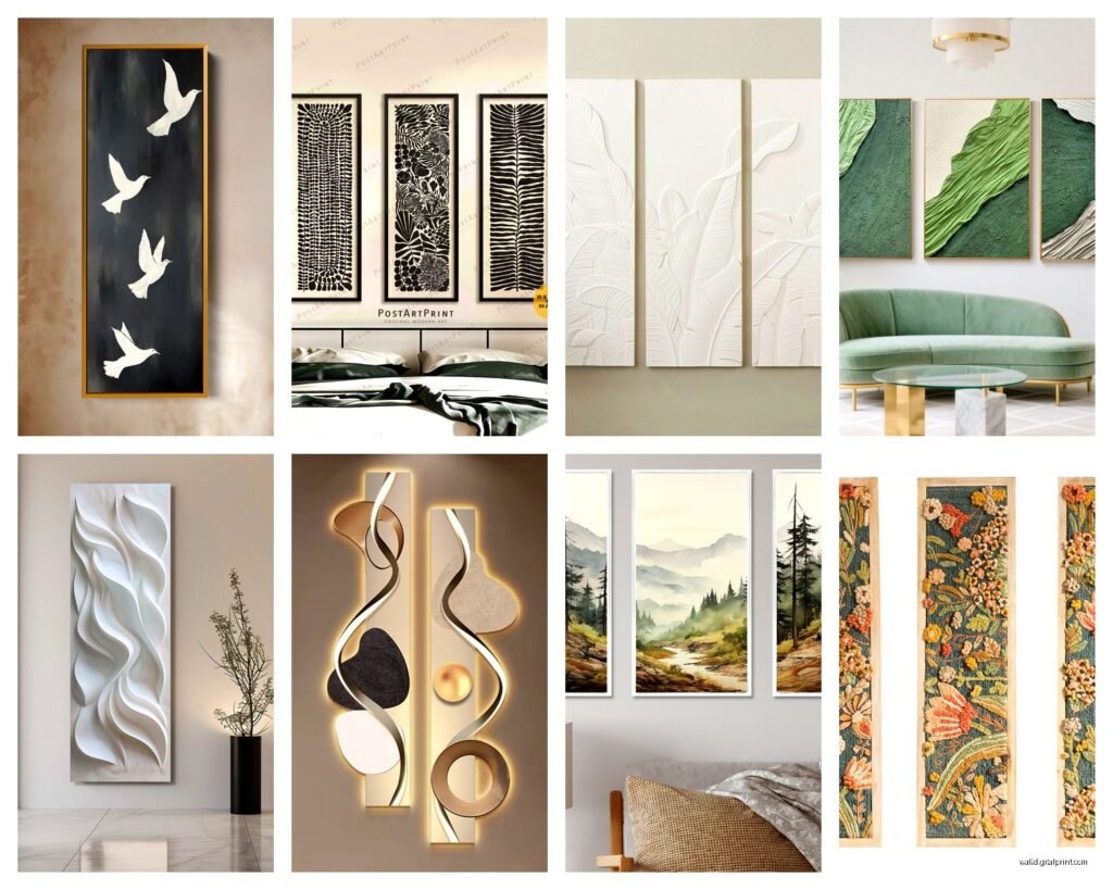
Image Types That Work Best
Not every image translates well to vertical triptych format and this took me forever to figure out. Landscapes are obviously awkward unless you’re doing like a waterfall or a forest where vertical makes sense compositionally.
What actually works:
- Botanical prints especially stems and branches
- Abstract art with vertical flow or drips
- City skylines shot looking up
- Waterfalls or cascading elements
- Fashion photography
- Architectural details
- Vertical panoramas split into three
I have this three-panel bamboo forest set in my bedroom that’s probably my favorite thing I own. Each panel is 20×60 and they’re spaced 3 inches apart and the vertical lines of the bamboo stalks just…work with the vertical format in this way that wouldn’t happen with horizontal panels.
Continuous vs Separate Images
You’ve got two approaches here. Either your image flows across all three panels as one continuous picture, or each panel is its own complete image that relates to the others thematically.
Continuous images are more dramatic but way harder to hang correctly. If your spacing is off by even half an inch the image looks broken. I hung a waterfall triptych where the water was supposed to flow across all three panels and I had to remount it twice because the alignment was off.
Separate but related images are more forgiving. Like three different botanical specimens or three abstract pieces in the same color palette. You can fudge the spacing and height a bit and it still looks intentional.
Room-Specific Stuff
Okay so funny story, I thought vertical triptychs would work everywhere and then I tried putting one in my living room above the TV and it was a disaster. The proportions competed with the TV’s horizontal shape and everything looked wrong.
Where they actually work great:
Entryways and hallways: This is like their natural habitat. Narrow walls need vertical art and the triptych format fills more wall space without overwhelming a tight area. My hallway is only 42 inches wide and I’ve got three 10×30 panels that fit perfectly with 4-inch gaps.
Beside tall furniture: Next to a bookshelf or armoire or anything else that’s vertical. The proportions echo each other. I put a set next to my client’s 7-foot bookcase and it looked like we planned it that way even though we totally didn’t.
Dining rooms: Especially on the wall perpendicular to the table. The vertical orientation doesn’t compete with the horizontal expanse of the dining table.
Bedrooms above dressers: Most dressers are like 30-36 inches tall and 60 inches wide. Three 16×40 panels spaced 4 inches apart give you 56 inches of width which is perfect proportions.
Where they DON’T work: Above sofas wider than 84 inches. The vertical panels look stubby and lost. Also not great in rooms with low ceilings under 8 feet because they emphasize the lack of height.
Material and Frame Choices
This is gonna sound weird but frameless vertical pieces often look better than framed ones? I think it’s because frames add visual weight and vertical art already has so much height that adding a 2-inch frame all around makes it feel heavy.
I’ve been using a lot of canvas prints stretched on wooden frames with the image wrapping around the sides. No frame needed and it keeps the look clean. For three panels you really don’t want busy ornate frames because you’re multiplying that business by three.
If you do want frames, go thin. Like 0.5 to 1 inch maximum. Black or white or natural wood. I used these thin black metal frames on a botanical triptych and they were perfect because they defined each panel without adding bulk.
Canvas vs Print vs Metal
Canvas is most forgiving because it’s lightweight and easy to hang. I use those velcro command strips for canvas panels under 24 inches tall. Over that you need actual picture hanging hardware.
Paper prints need glass which adds weight fast. Three 16×48 framed prints with glass can weigh like 40 pounds total and you need serious wall anchors.
Metal prints are having a moment and they look amazing for modern spaces but they’re expensive. I priced out a custom vertical triptych in metal and it was $800 which…no. But if you’ve got the budget they’re stunning and you don’t need frames.
The Actual Hanging Process
Okay so you need a level, a pencil, painter’s tape, and a patient friend. Or a very tolerant partner. My husband has hung so many triptychs with me at this point that he just sighs when I bring out the level.
Start by finding your center point on the wall. Measure the total width your triptych will take up including gaps. Divide by two. Measure that distance left and right from your center mark. That’s where your outer edges will end up.
Use painter’s tape to mark where each panel will go. Seriously just tape three rectangles on the wall in the right positions. Step back. Look at it from your couch or wherever you’ll actually see it from. Adjust the height if needed. I’ve moved my tape rectangles up and down like 8 times before committing.
For the actual hanging:
- Start with the center panel first and get it perfectly level
- Then hang the left panel matching the top edge to the center panel
- Then the right panel matching both
- Use a long level across all three to make sure the tops align
If your panels have D-rings or wire, measure from the top edge to where the hanging hardware sits when pulled taut. You need to account for this distance when marking your wall hooks.
Wait I forgot to mention, use proper wall anchors if you’re not hitting studs. Each panel might only weigh 3-5 pounds but you want them secure. I use those self-drilling drywall anchors rated for 50 pounds and they’ve never failed me.
Common Mistakes I’ve Made So You Don’t Have To
Buying panels that are too wide for the space. Three 20-inch panels need like 72 inches of wall space minimum and I did not account for that when I bought this gorgeous abstract set. It’s now in storage waiting for me to move somewhere with bigger walls.
Hanging them too low because I was following the regular gallery height rule. They looked squat and weird until I moved everything up 6 inches.
Not accounting for light switches and outlets. I almost hung a beautiful botanical set right over a light switch which would’ve been…not great. Always map out your wall obstacles first.
Mixing vertical and horizontal art on the same wall. I thought I could put a vertical triptych next to a horizontal piece and create this cool gallery wall but it just looked chaotic. Vertical art needs its own space to breathe.
Where to Actually Buy Them
I’ve tried a bunch of sources and honestly the quality varies wildly. Etsy has tons of options and you can find custom sizes but shipping three separate panels can get expensive. I’ve had good luck with sellers who ship them rolled in tubes which is cheaper but then you need to get them mounted on stretcher bars.
Amazon has pre-stretched canvas sets that are surprisingly decent for like $80-150. The printing quality isn’t gallery-level but for a bedroom or hallway they’re totally fine. I bought a set of blue abstract panels for my guest room and they’ve held up great.
If you want to go custom, Society6 and Redbubble let you upload your own images and they’ll print them as triptychs. The pricing is reasonable and the quality is solid. I did a custom set of my own photography this way.
Art.com and AllModern have curated collections that are pricier but the quality shows. I’ve bought from both for client projects and never been disappointed.
For really budget-friendly options, Ikea sometimes has vertical print sets that you can mix and match. They’re not technically triptychs but you can create your own grouping for under $50.
Color Coordination Without Making It Boring
This is where vertical triptychs can either look really sophisticated or really matchy-matchy and boring. I try to pull 2-3 colors from the room but not match them exactly. Like if you’ve got a navy sofa and cream walls, look for art that has navy and cream but also adds in like rust or sage or something unexpected.
Monochromatic sets are safe but they can disappear into the wall. I have an all-white botanical set that looks amazing against a charcoal gray wall but would totally vanish on a white wall.
My favorite approach is to choose art with one dominant color that contrasts with your wall and then accent colors that tie into your decor. So like a teal-dominant abstract piece on a beige wall where the secondary colors pick up the rust in your throw pillows and the gray in your rug.
Okay I think that’s everything I’ve learned from hanging way too many vertical triptychs in the past year. My cat is yelling at me for dinner so I gotta go but hopefully this helps you figure out what’ll actually work in your space.