Wall Art Guide, Wall Art Tutoriels
Wall Art Sets: Matching Multi-Piece Collections
Mar
So I just finished hanging three different wall art sets this week and honestly my back is killing me but I learned some things that might actually help you figure this out.
The Spacing Thing Nobody Tells You About
Okay so the biggest mistake I see everyone make is they buy these gorgeous matching sets and then hang them like… way too far apart or weirdly close together. Here’s what actually works – for a three-piece horizontal set, you want about 2-4 inches between each piece. I know that sounds tight but trust me. When they’re spaced wider than that, your eye reads them as separate pieces instead of one cohesive thing, which defeats the whole point of buying a set.
I had this client last month who insisted on 8 inches between each panel and it looked like three random pieces that happened to be near each other. We redid it at 3 inches and suddenly it was like oh THAT’S what the artist intended.
For vertical stacks or grid arrangements, same rule applies. Keep it tight. 2-3 inches max between pieces.
Measuring Before You Buy (I Know, Boring But Important)
Look, I’m gonna be real with you – I’ve ordered sets that looked perfect online and then they arrived and were either massive or weirdly small for the wall space. Now I always measure the wall first and actually map it out with painter’s tape before ordering anything.
Here’s my random rule that works: your art set should take up about 2/3 to 3/4 of the wall width. So if you’ve got a couch that’s 84 inches wide, you’re looking at art that spans roughly 56-63 inches total (including the spaces between pieces).
For above a bed, I go a bit wider – sometimes up to 3/4 of the mattress width because beds are just… different proportionally? I can’t explain the math but it looks better.
The Height Thing
Everyone says hang art at eye level but like, whose eye level? I’m 5’6″ and my partner is 6’2″ and those are very different situations. What actually works – center the middle piece (or the center point of your whole set) at about 57-60 inches from the floor. This is the standard gallery height and it just works in most rooms.
Exception: if you’re hanging above furniture, you want the bottom of your lowest piece to be 6-8 inches above the furniture. So like above a sofa or console table, measure up from there instead of using the floor measurement.
Types of Sets That Actually Look Good Together
Okay so there are basically a few categories of multi-piece sets and some are WAY easier to work with than others.
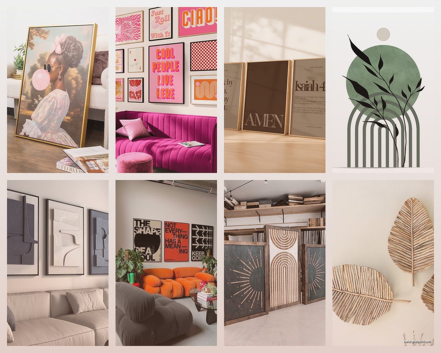
Triptychs – these are the three-panel sets where one image is split across three canvases. Super popular right now. The thing with these is you HAVE to get the spacing right or the image looks broken. I usually go with 2 inches between panels for these, sometimes even 1.5 inches if it’s a really detailed image that needs continuity.
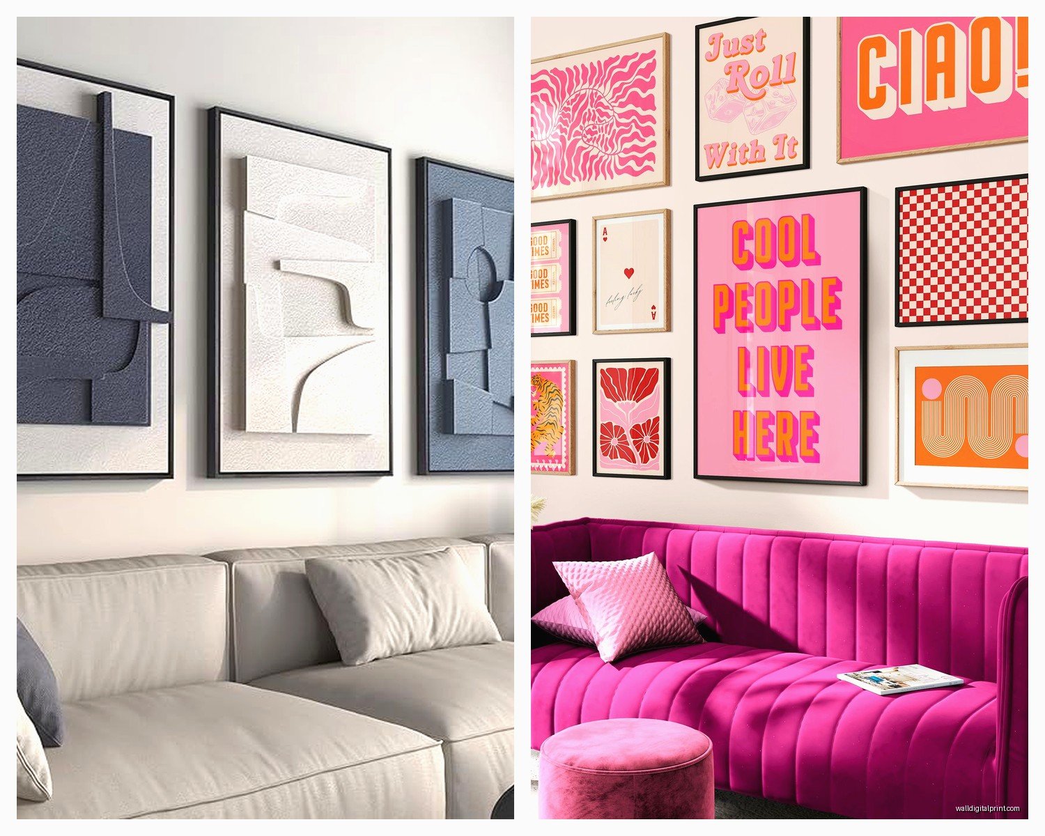
Matching but separate – like three botanical prints in matching frames, or abstract pieces in the same color palette. These are more forgiving because each piece stands alone but they coordinate. You can space these a bit wider, like 3-4 inches, and they still read as a collection.
Gallery grids – sets of 4, 6, or 9 pieces meant to be hung in a grid pattern. I’m obsessed with these for smaller pieces. A set of six 8×10 prints in a 2×3 grid can fill a wall space better than one large piece sometimes, and they’re usually cheaper.
What I Actually Buy
I’m gonna sound like a broken record but I keep going back to canvas sets for most clients because they’re lightweight and don’t need glass which keeps costs down. The stretched canvas ones that are like 1.5 inches deep look expensive even when they’re not.
For my own place though? I’ve been collecting framed print sets. They feel more curated and less… I dunno, like everyone else’s house? But they’re heavier and harder to hang so there’s that tradeoff.
Oh and another thing – if you’re buying online, check if they come with hanging hardware. Some sets include everything (hooks, level, even the nails) and others show up and you’re standing there like cool now I need to go to the hardware store.
The Actual Hanging Process
Okay so you’ve got your set, you’ve measured, now you gotta actually put holes in your wall which is always the scary part.
What you actually need:
- Pencil
- Measuring tape
- Level (or just use your phone’s level app honestly)
- Painter’s tape
- Hammer or drill depending on your wall type
- Appropriate hooks or anchors
Here’s my process that works every time:
First, I make a template. Sounds fancy but it’s just tracing each piece onto paper (or using the packaging paper if it’s big enough) and taping those papers to the wall where I want the art to go. This lets you see the actual layout before making any holes.
Then I mark the hanging points through the paper. Like I’ll measure where the hanger is on the back of each piece, mark it on my paper template, then poke through with a pencil.
Remove the paper, make your holes, hang your pieces.
The level is crucial between pieces. I check after hanging each one because if the first piece is slightly off, it compounds across the whole set and then everything looks drunk.
Wall Type Matters More Than You Think
Drywall – standard picture hangers work fine for lightweight pieces. For heavier stuff (like large canvas sets), you need anchors. The plastic ribbed anchors are fine for medium weight, but for anything heavy I use toggle bolts.
Plaster – this is trickier because it can crack. I pre-drill small pilot holes and use plastic anchors. Go slow.
Brick or concrete – you need a masonry bit and concrete anchors. Or just lean them on a shelf because drilling into brick is honestly a pain and I avoid it when possible.
Color Coordination Without Making It Boring
So you want pieces that match but not in that matchy-matchy way that feels like you bought everything in one shopping trip at HomeGoods (no shade to HomeGoods, I’m there weekly).
What actually works – pick sets that share 2-3 colors with your room but introduce at least one unexpected accent. Like if your room is gray and white, maybe get a set that’s gray, white, and has touches of terracotta or navy. That bit of unexpected color makes it look intentional instead of default.
I’ve also been mixing metallic frames with colored artwork lately. Like gold frames with blue abstract art, or black frames with warm-toned photography. The frame becomes part of the color story.
Wait I forgot to mention – black and white photo sets are the easiest cheat code for looking pulled together. They work with literally every color scheme and never look dated. I have a three-piece black and white architecture set in my bedroom that I bought six years ago and it still feels current.
Mixing Different Sized Pieces in One Set
This is where it gets fun but also where people mess up the most. If you’re buying a set that has different sizes – like one large center piece with two smaller flanking pieces – the layout matters SO much.
The standard approach is symmetry – large piece in the middle, smaller matching pieces on each side, all center-aligned horizontally. This works and looks intentional.
But you can also do asymmetric layouts if the pieces are designed for it. Some sets are specifically made to be hung at different heights in a staggered pattern. The key is that the set itself should suggest the layout – don’t try to force a symmetric set into an asymmetric arrangement or vice versa.
I saw this set last week that was four pieces – one large square, two medium rectangles, and one small square – and they were designed to be hung in this specific asymmetric cluster. It came with a diagram which honestly every set should do because guessing is stressful.
The Template Trick for Complex Arrangements
For anything more complicated than a straight horizontal row, I take photos of different arrangements before committing. Like I’ll lay all the pieces on the floor, arrange them different ways, take pictures, and then look at the photos because somehow seeing it through the camera makes it clearer which layout works.
My cat kept walking across them while I was doing this last weekend which was super helpful, obviously.
Where to Actually Buy These Things
Online is honestly where most of my clients are buying now because you can filter by exact dimensions and color. But the gamble is that colors look different in person and you can’t feel the quality.
Things I check before buying online:
- Return policy – is it free returns or are you stuck with it?
- Actual customer photos in the reviews (not the staged ones)
- Whether it ships assembled or if you’re putting it together
- What the backing looks like if it’s canvas – stapled edges vs gallery wrap makes a difference
For gallery walls or important spaces, I still think going to actual galleries or art fairs is worth it. You’re paying more but you’re getting original pieces or limited prints that won’t be in every other house on your street.
The Frame Situation
If your set doesn’t come framed, you gotta decide – frame them or leave them unframed?
Canvas sets usually look fine unframed if they’re gallery wrapped (where the image continues around the edges). If they’re just stapled on the back, frame them because that looks unfinished.
Paper prints absolutely need frames unless you’re going for a very specific casual vibe with clips or tape.
For a cohesive look across a set, all frames should match exactly – same color, same width, same style. This isn’t the place to mix metals or styles. The artwork is providing the variety; the frames should be consistent.
I usually go with simple frames for sets because ornate frames compete with each other visually when you have multiple pieces together. Simple black, white, natural wood, or metallic frames let the art be the focus.
Oh and mat boards – if you’re framing prints, mats make everything look more expensive and professional. Standard is a 2-3 inch mat border around the print. You can go wider for smaller prints to fill a larger frame.
Lighting Makes or Breaks the Whole Thing
You can hang the perfect set with perfect spacing and it’ll still look mediocre if the lighting is wrong. Natural light is obviously ideal but you gotta watch for glare if there’s glass.
For dedicated art lighting, picture lights are classic but they’re kinda old-fashioned looking? I’ve been using adjustable track lighting or even just a well-placed floor lamp that angles toward the wall. The goal is to eliminate shadows while not creating glare.
If your set is above a sofa or console, a table lamp on that furniture can actually provide enough uplighting to highlight the art without installing anything.
Common Mistakes I See Literally All The Time
Hanging everything too high – seriously this is the most common one. If you’re standing back and feeling like you’re looking UP at your art, it’s too high.
Buying a set that’s too small for the space – when in doubt, go bigger. Small art on a big wall looks lost and tentative.
Not considering the furniture below – your art set and your furniture should have some visual relationship. They don’t have to match but they shouldn’t fight each other either.
Mixing too many styles in one room – if you have a modern geometric set in the living room, maybe don’t do a traditional landscape set on the adjacent wall. There should be some cohesion in the overall vibe.
Forgetting about the negative space – the empty wall around your art set is part of the composition. You need enough blank space for the eye to rest.
Okay I think that’s everything I learned this week while my arms got tired from holding a level against the wall for what felt like hours. The main thing is just measure twice, use painter’s tape to preview, and don’t be afraid to adjust after you hang it if something feels off.