Wall Art Guide, Wall Art Tutoriels
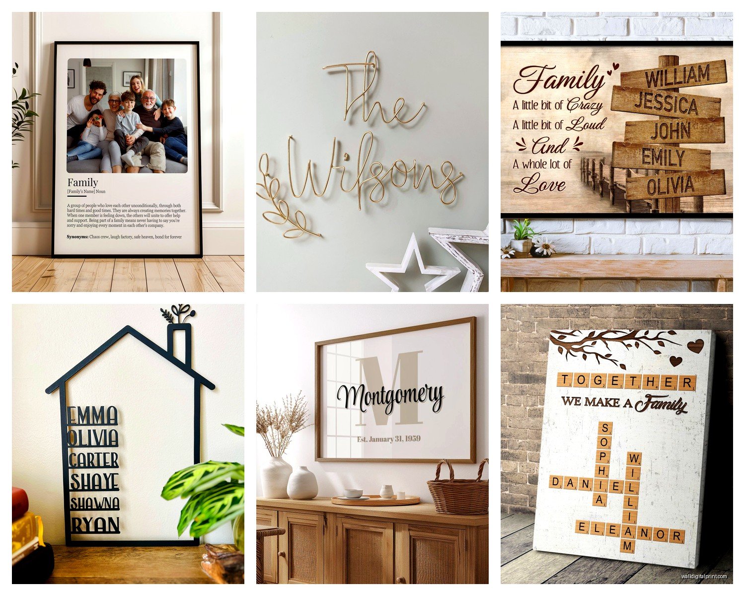
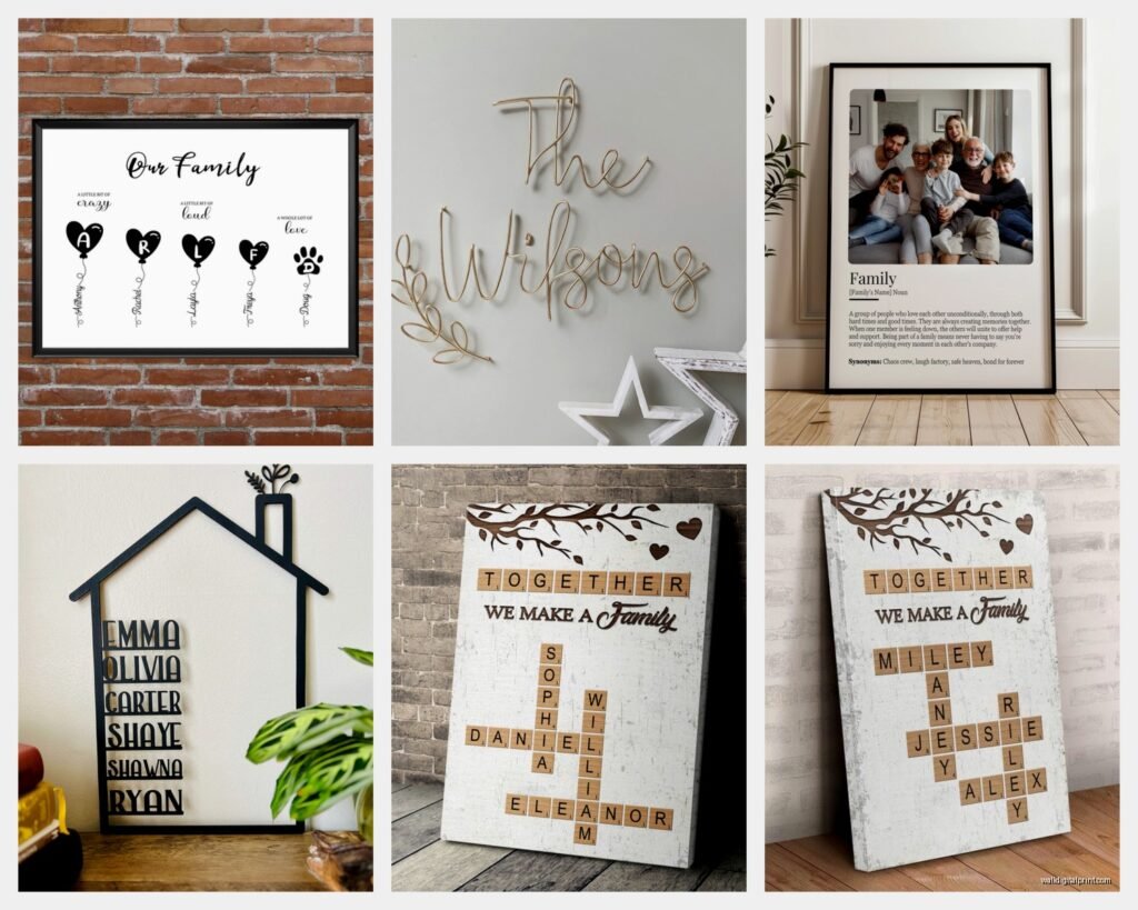
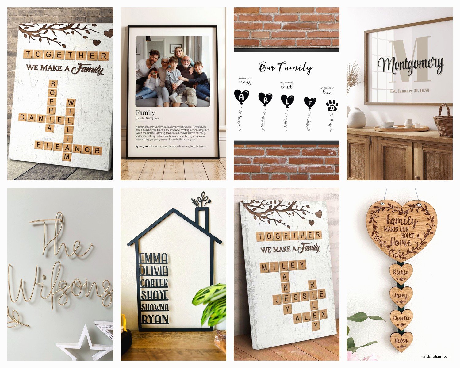
Personalised Family Wall Art: Custom Name & Photo Gifts
Mar
So I’ve been deep in this personalised family wall art rabbit hole for like the past month because three different clients asked about it and honestly? It’s way more complicated than just uploading a photo and calling it done.
First thing – and I cannot stress this enough – the material you pick literally makes or breaks the whole thing. I learned this the hard way when I ordered this gorgeous canvas print with all my nephew’s names and it arrived looking like someone printed it on a dishcloth. The resolution was terrible and the canvas was so thin you could see the wooden frame through it.
Canvas Prints: What Actually Works
Okay so canvas is probably what most people think of first. The thick cotton ones are where you wanna be – like 400gsm minimum. Anything less and you’re getting that see-through situation I mentioned. I usually go with gallery-wrapped edges because then you don’t need a frame which saves money but also looks cleaner? The image wraps around the sides so there’s no awkward white borders.
The poly-cotton blend is actually better than 100% cotton for photo prints because it holds the ink differently. Pure cotton can look a bit flat with photographs, whereas names and graphic designs look amazing on it. This is gonna sound weird but I literally keep samples of both in my studio and make clients feel them because the texture difference is real.
Coating matters more than you’d think
UV protective coating is non-negotiable if the art is going anywhere near a window. My sister didn’t get this and her beautiful family photo wall faded to like orange-pink within eight months. So depressing. The matte coating hides fingerprints better if you’ve got kids who touch everything, but glossy makes colors pop more for photos. I usually suggest matte for name art and glossy for photographs but that’s just like my preference.
Acrylic and Metal Prints
Wait I forgot to mention – if you want something that looks super modern and expensive, acrylic is insane. It’s literally a photo printed on paper then mounted behind clear acrylic glass. The depth it creates is chef’s kiss. But here’s the thing nobody tells you: they’re HEAVY. Like you need proper wall anchors, not just those little nails. I almost pulled a chunk of drywall out of my own living room trying to hang one with regular picture hooks.
Metal prints are having a moment right now and I’m kind of obsessed? They print directly onto aluminum sheets and the colors are so vibrant it’s almost unreal. Perfect for contemporary spaces. They work amazingly for black and white family photos with names – that contrast against the metallic finish is stunning. But they show every fingerprint and smudge so maybe not for high-traffic areas or homes with toddlers who have perpetually sticky hands.
The mounting situation
Acrylic usually comes with standoff mounts which look really gallery-like, floating off the wall about an inch. Metal prints often have a float mount system too. Both give you that expensive installation vibe without actually spending gallery money.
Oh and another thing – some companies do acrylic blocks which are smaller chunky pieces that sit on shelves. Those are great for names or single photos and you don’t have to worry about hanging anything.
Wood Prints Are Underrated
Okay so funny story – I was watching this home renovation show while working on a mood board and they featured these wood prints and I became lowkey obsessed. The image gets printed directly onto birch or maple planks and you can see the wood grain through it which gives this rustic but also sophisticated look?
They’re perfect for family names especially if you’re going for that farmhouse-modern thing everyone’s still doing. The natural wood edges mean no frame needed. I used one in a client’s entryway with their family name and established date and it’s held up beautifully for two years now.
Types of wood to choose
Birch is lighter in color and has a smoother grain – better for photos where you don’t want too much texture competing. Maple has more pronounced grain which I love for text-based designs. Some places offer reclaimed wood but honestly those can be hit or miss with quality and the rustic look isn’t for everyone.
The thickness matters – half-inch minimum or it looks cheap and flimsy. Three-quarter inch or one inch looks substantial and high-end.
Photo Paper and Framing
If you’re gonna go the traditional route with photo paper in a frame, at least get the good stuff. Lustre or pearl finish is way better than glossy for family photos because it doesn’t create that glare situation. Matte is beautiful but shows fingerprints like crazy.
Archival quality paper is what you want if this is meant to last. It’s acid-free so it won’t yellow over time. I’ve seen so many vintage family photos that have that gross yellow tinge because they were printed on regular paper decades ago.
Frame materials that don’t suck
Real wood frames are obviously the nicest but expensive. The MDF frames with wood veneer are actually pretty decent if you’re on a budget – just make sure the veneer is thick enough that it won’t peel. Metal frames look super clean and modern, perfect for black and white family photos or minimalist name designs.
For personalised pieces with multiple photos or names, I love the large format frames with multiple openings. You can do like a family tree layout with names under each photo. Just make sure the mat board is acid-free too or it’ll damage your photos over time.
The Design Side of Things
This is where people mess up constantly. You cannot just slap any photo onto any material and expect it to look good. Resolution is EVERYTHING. For canvas or large prints you need at least 300 DPI. Those photos from your phone? Probably fine for an 8×10 but they’ll look pixelated on anything bigger.
I always tell people to test their image – zoom in to like 300% on your computer. If it looks blurry or grainy, it’s gonna look worse printed large. Some companies have preview tools that’ll tell you if your resolution is too low but not all of them.
Color profiles and why they matter
My cat just knocked over my coffee but anyway – RGB versus CMYK is a whole thing. Most online tools use RGB which is fine but colors can shift when printed. This is especially noticeable with reds and blues. If color accuracy is super important, some companies let you order a proof first which I always recommend for expensive pieces.
For black and white family photos going on metal or acrylic, make sure the black levels are actually black not dark gray. Adjust the contrast before uploading or it’ll look washed out.
Text and Font Choices
When you’re doing family names or quotes, font choice is make-or-break. Script fonts look elegant but can be hard to read from a distance. Sans-serif is clean and modern, good readability. Serif fonts feel more traditional and formal.
Here’s what I’ve learned: don’t go smaller than like 2 inches for text height if you want it readable from across a room. Letter spacing matters too – too tight and it’s cramped, too loose and it doesn’t feel cohesive. Most design tools let you adjust this but the default isn’t always right.
Layout considerations
For multiple names or photos, odd numbers look better than even – groups of three or five just feel more balanced visually. The rule of thirds applies here too. Don’t center everything unless you’re going for a very formal symmetrical look.
White space is your friend. Don’t cram everything together just to fill the canvas. Let the design breathe. I see so many personalised pieces that are just cluttered with too many elements and it looks chaotic.
What to Actually Look for When Ordering
Okay so when you’re comparing companies – and you gotta compare because prices are all over the place – check what’s included. Some places charge extra for hanging hardware, coating, or even just basic color correction. Read the fine print.
Turnaround time varies wildly. I’ve seen everything from 2 days to 6 weeks. If you need it for a specific occasion, order way earlier than you think necessary because shipping delays are real.
Return policies are crucial. Some places won’t take returns on personalised items which I kinda get but also what if it arrives damaged or the colors are completely wrong? Look for companies that at least offer reprints if there’s a quality issue.
Proof approval is worth it
Pay the extra five bucks or whatever for proof approval if it’s offered. You get to see exactly what it’ll look like before they print it. I’ve caught so many spelling errors and layout issues this way. Once had a client almost approve their family name spelled wrong because autocorrect got them.
Installation Tips Nobody Mentions
The hanging part is where people panic but it’s not that hard. For heavy pieces like acrylic or large canvas, you need wall anchors rated for the weight. The package should tell you how much it weighs. Drywall anchors are your friend – toggle bolts for anything over 20 pounds.
Use a level. Seriously just buy a cheap level. Nothing looks worse than crooked wall art and you can’t eyeball it no matter how much you think you can. I’ve rehung so many pieces for clients who swore they had it straight.
Gallery wall layouts
If you’re doing multiple personalised pieces as a gallery wall, lay them out on the floor first. Take a photo so you remember the arrangement. Use painter’s tape on the wall to mark where each piece goes before you start making holes. Spacing should be consistent – usually 2-3 inches between pieces looks good.
Start from the center and work outward. The middle piece should be roughly at eye level which is about 57-60 inches from the floor to the center of the art.
Maintenance and Longevity
Canvas needs dusting regularly with a soft brush or microfiber cloth. Don’t use cleaning products on it unless you want to ruin the coating. For acrylic and metal, you can use glass cleaner but spray it on the cloth not directly on the piece.
Wood prints can be wiped down with a barely damp cloth but don’t soak them or the wood will warp. If they’re sealed properly they should be pretty durable though.
Keep everything out of direct sunlight if possible. Even UV-protected pieces will fade eventually with constant sun exposure. I learned this living in a south-facing apartment where literally everything faded within a year.
The personalised family wall art world is honestly overwhelming with options but once you know what to look for it gets easier. Material choice depends on your space vibe and budget, but don’t cheap out so much that you end up with something that looks bad or falls apart. These pieces are meant to last and celebrate your family so they’re worth investing in properly.