Wall Art Guide, Wall Art Tutoriels
Blue and Gray Wall Art for Living Room: Cool Neutral Combo
Apr
So I’ve been obsessing over blue and gray wall art combinations lately because honestly, it’s like the easiest way to make a living room look put-together without trying too hard. My cat knocked over my coffee this morning while I was rearranging a client’s gallery wall and I had this whole revelation about why this color combo just works.
Why Blue and Gray Actually Makes Sense
Okay so here’s the thing – blue and gray are both cool tones, which means they naturally play nice together. You’re not fighting warm against cool like you would with say, orange and gray. The gray acts as this perfect anchor that keeps the blue from feeling too nautical or too… I dunno, bathroom-y? And the blue gives the gray enough personality so your living room doesn’t look like a corporate office.
I tested this theory in my own space last year and then in probably fifteen client homes since then. The combination reads as sophisticated but not stuffy, calm but not boring. It’s that sweet spot where guests notice something feels really cohesive but can’t quite pinpoint why.
Picking Your Blue Shade
This is where people mess up the most. Not all blues work the same with gray.
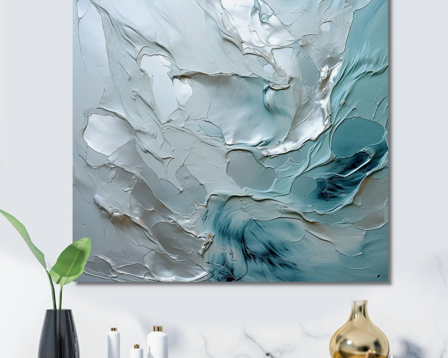
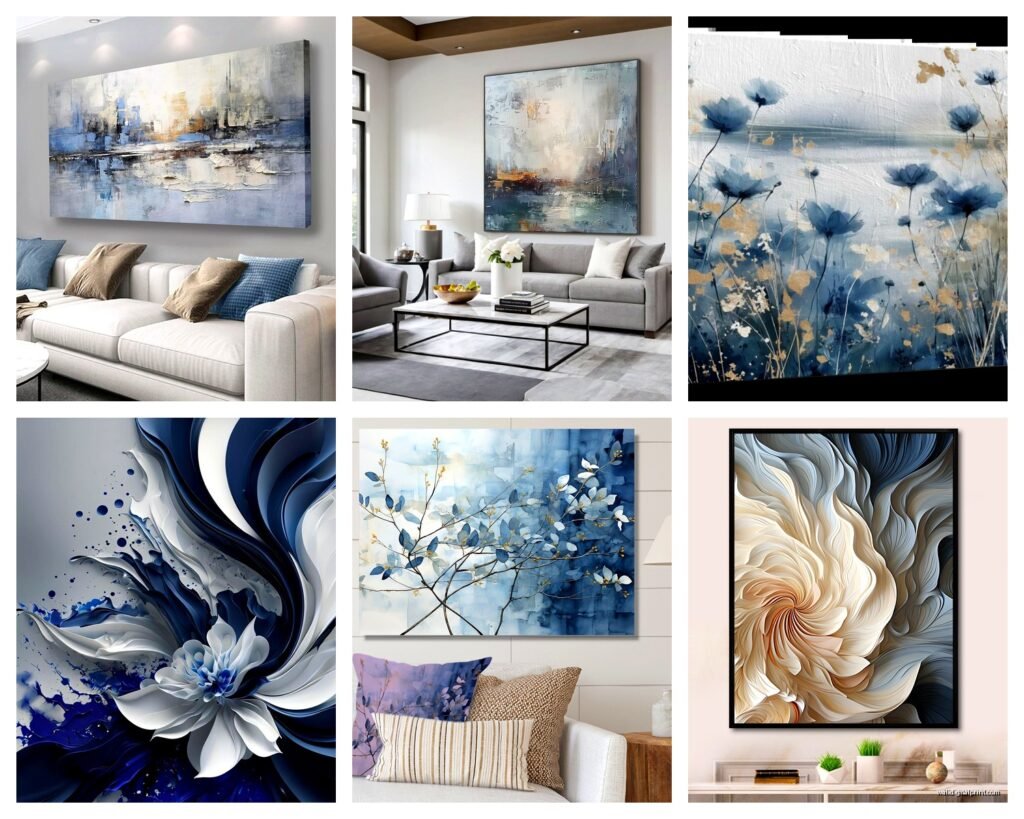
Navy blue – This is gonna be your most dramatic option. Works best with lighter grays, like that dove gray or silver tone. I have this massive navy abstract piece above my couch paired with charcoal gray geometric prints and it’s *chef’s kiss*. But you gotta have enough natural light or it can feel heavy.
Powder blue or sky blue – Super soft, almost pastel-ish. Pairs beautifully with medium to dark grays. I used this combo in a client’s north-facing living room and it actually made the space feel brighter. The light blue reflects whatever natural light you’ve got while the gray grounds it.
Teal or blue-green – Okay this is technically cheating because teal has green in it, but if you go with a gray that has subtle blue undertones, it works. More modern feeling, a bit unexpected.
Slate blue – This dusty, muted blue is probably my favorite right now. It’s already halfway to gray anyway, so they blend together seamlessly. Less contrast, more tonal and layered.
Gray Variations That Actually Matter
I spent an embarrassing amount of time at an art supply store once comparing gray frames because the undertones were driving me crazy.
Warm grays have beige or brown undertones – these can work but you need to be careful they don’t clash with cool blues. I’d avoid unless you’re specifically going for that warmer vibe.
Cool grays have blue or purple undertones – these are your best friends here. They literally have blue in them already so the transition is smooth.
Charcoal – almost black but not quite. Super grounding, makes blues pop like crazy. Good for creating contrast.
Silver or light gray – these fade into the background more, let the blue be the star. Good if you want subtle.
Types of Art That Work
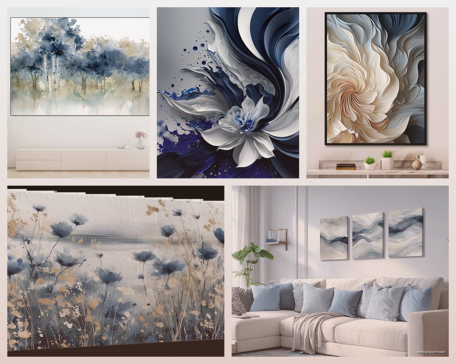
Abstract Prints
Honestly this is the easiest route. You can find abstract art with blue and gray swirls, brushstrokes, geometric shapes, whatever. The beauty is that abstract doesn’t need to match your furniture exactly – it just needs to pull the colors through.
I bought three canvas prints from this online shop (was watching some terrible reality show at 11pm and impulse purchased) that had navy, gray, and white abstract designs. Hung them in a horizontal row above the sofa and boom, instant cohesion. Cost like $150 total for all three.
Photography
Landscape photography in blue and gray is *everywhere* and for good reason. Ocean scenes, misty mountains, foggy cityscapes, storm clouds. These bring in that natural element without being too literal or matchy-matchy.
One client wanted something more personal so we printed some of her own travel photos from Iceland – all these amazing gray rocks and blue glaciers – and it became this whole conversation piece.
Line Drawings and Minimalist Art
Simple line art in navy or slate blue on a light gray background, or vice versa. Super trendy right now but also kind of timeless? These work especially well in modern or Scandinavian-style living rooms.
I have a set of botanical line drawings in my hallway – navy lines on gray paper – and they cost like $30 from an Etsy shop. Framed them in simple black frames and they look way more expensive than they were.
Textured or Mixed Media
This is where you can get fancy. Think pieces that have actual texture – raised canvas, metallic elements, layered paper. The texture adds depth when you’re working with a limited color palette.
Saw this amazing piece at a local gallery that was gray concrete texture with blue resin poured over it. Way out of my budget but it’s stuck in my head as the ideal of what this combo can do.
How to Actually Arrange This Stuff
The Single Statement Piece
One large piece above the sofa – like 40×60 inches or bigger. This is your anchor. Go with something that has both blue and gray in it, maybe with white or cream as an accent color. Everything else in the room just needs to echo these colors.
I did this in a small living room where we didn’t have wall space for multiple pieces. One massive abstract with navy and gray brushstrokes, and then we pulled those colors into throw pillows and a gray rug. Simple but effective.
Gallery Wall Approach
Mix different sizes and styles but keep the color palette consistent. Maybe three blue pieces, two gray, one that combines both. Vary the tones – some dark navy, some light blue, different shades of gray.
The trick is to lay everything out on the floor first. I know everyone says this but seriously, DO IT. I’ve redone so many gallery walls because I eyeballed it and then stepped back and hated the spacing.
Start with your largest piece slightly off-center, then build around it. Keep roughly equal spacing between frames – like 2-3 inches. And here’s something I learned the hard way: the overall shape of your gallery wall matters. Rectangular arrangements feel more traditional, asymmetrical feels more modern.
Triptych or Diptych
Three or two matching pieces hung in a row. Super clean, very intentional looking. You can find sets specifically designed this way, or you can create your own by choosing three pieces with similar styles.
I love this for above a console table or credenza. The horizontal line of the furniture echoes the horizontal line of the art.
Framing Considerations
oh and another thing – frames actually matter more than I thought they would.
Black frames – Modern, clean, creates strong contrast. Works with literally any shade of blue and gray. This is my go-to when I’m unsure.
White frames – Softer, more casual. Better with lighter blues and grays. Can make darker pieces feel more approachable.
Natural wood frames – Adds warmth to an otherwise cool palette. I use these when a room is feeling too cold or sterile. Light oak or maple work better than dark walnut.
Gray or silver frames – Obviously on-theme. Can be gorgeous but also risks blending too much. Works best when the frame is a different shade than the gray in the artwork.
No frame/canvas wraps – Contemporary vibe. The art wraps around the edges of the canvas. Good for abstract pieces, less good for photography or prints that need that finished edge.
Where to Actually Buy This Stuff
Gonna be real with you, I’ve bought from all over and the quality varies wildly.
Budget-Friendly
Etsy – Hit or miss but you can find downloadable prints for like $5-15 that you print yourself at a local print shop. I’ve gotten some amazing abstract blue and gray designs this way. The shipping on physical items can be expensive though.
Society6 – Tons of independent artists, reasonable prices, frequent sales. Quality is decent. I’ve ordered probably twenty pieces from here over the years.
Target/West Elm/CB2 – Their art selection has gotten so much better. You can actually see them in person which is huge. Colors look different in person than online always.
Mid-Range
Minted – Better quality prints, more curated selection. Pricier but the framing options are good and it comes ready to hang.
Framebridge – If you have your own prints or photos, they do custom framing at reasonable prices. Their matting options are great for creating that gallery feel.
Local art fairs and markets – I’ve found some of my favorite pieces this way. You’re supporting actual artists and can sometimes negotiate prices.
Investment Pieces
Saatchi Art – Original artwork from emerging artists. Pricey but you’re getting one-of-a-kind pieces.
Local galleries – Same deal. Original art, real investment, but if you’re gonna drop serious money on wall art, at least it’s unique.
Styling Around Your Blue and Gray Art
The art is just the starting point – you gotta carry those colors through the room or it’ll look random.
Textiles – Throw pillows are the obvious answer. Mix patterns – maybe a solid navy pillow, a gray and white geometric, a blue and gray stripe. Throws in chunky knit gray or soft blue linen.
Rugs – A gray rug grounds everything. Or go bold with a blue rug if your art is more gray-dominant. I have a client who did a navy and gray patterned rug that literally ties the whole room together.
Furniture accents – Gray sofa is classic but also kinda safe. Navy accent chair? Now we’re talking. Even just a gray or blue ottoman or side table.
Accessories – Vases, books, candles. This is where you can be more playful. Stack some gray and blue coffee table books, add a ceramic blue vase, whatever.
Common Mistakes I See (and Have Made)
Too much gray – The room ends up feeling flat and sad. You need enough blue to actually register as a color, not just an undertone.
Wrong blue undertones – Mixing a warm blue (one with purple or red undertones) with cool gray looks off. Stick with true blues or cool blues.
Everything the same value – Value means how light or dark something is. If all your blues and grays are the same lightness/darkness, there’s no visual interest. You need contrast – pair light with dark.
Forgetting about your wall color – Your art needs to work with your wall color. Blue and gray art on beige walls? Meh. On white or light gray walls? Perfect. On navy walls? Could be amazing or could disappear.
Art too small for the space – I see this constantly. Tiny art on a huge wall. General rule: your art should take up about 2/3 to 3/4 of the width of the furniture below it. Over a sofa, you want something substantial.
Mixing in Other Colors
wait I forgot to mention – you don’t have to be super strict about ONLY blue and gray.
White or cream as a third color keeps things from feeling too heavy. Most of my favorite pieces have a white background anyway.
Metallics work beautifully – gold, brass, copper add warmth. Silver or chrome keep things cool and modern.
Black in small doses creates definition. Black frames, black accents in the art itself.
A tiny pop of another color can be cool – like a blue and gray abstract with just a touch of blush pink or mustard yellow. But keep it minimal or you lose that cohesive cool neutral vibe.
I have this one piece that’s mostly gray and slate blue but has these tiny copper leaf details and it’s become my favorite thing in my living room. The copper catches the light and makes the whole thing feel more dynamic.
Lighting Your Art
This is gonna sound weird but proper lighting makes such a difference. I installed picture lights above two pieces in my living room and they went from nice to like, gallery-worthy.
Track lighting aimed at your art works too. Even just making sure you have good ambient lighting in the room – a floor lamp near your gallery wall, whatever.
Natural light changes how colors look throughout the day. That navy might look almost black at night but bright blue during the day. Test your art placement at different times if you can before committing to holes in the wall.
Okay so I think that covers most of what I’ve learned through way too much trial and error. The blue and gray combo really is forgiving once you understand the basics – cool tones together, vary your values, don’t be scared of contrast. Start with one piece you love and build from there instead of trying to plan the whole thing at once.