Wall Art Guide, Wall Art Tutoriels
Horizontal Wall Art for Living Room: Wide Landscape Pieces
Apr
So I’ve been setting up living rooms with horizontal art for like 6 years now and honestly it’s one of those things that sounds simple but everyone messes up the proportions. Let me just dump everything I know because I literally just finished hanging a 72-inch landscape piece in my client’s loft yesterday and my arms are still sore.
Why Wide Pieces Actually Work
Okay so the thing about horizontal art is it literally changes the entire shape of your room. Like your eye follows horizontal lines and makes spaces feel wider, which is why every designer will tell you to use them above sofas. But here’s what nobody mentions – they only work if you get the scale right, and I see people buying these tiny 24-inch pieces for massive walls and wondering why it looks weird.
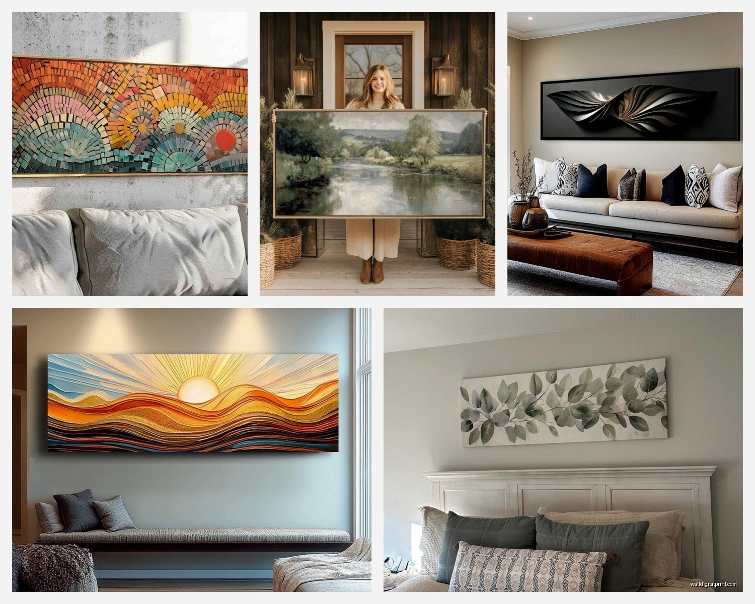
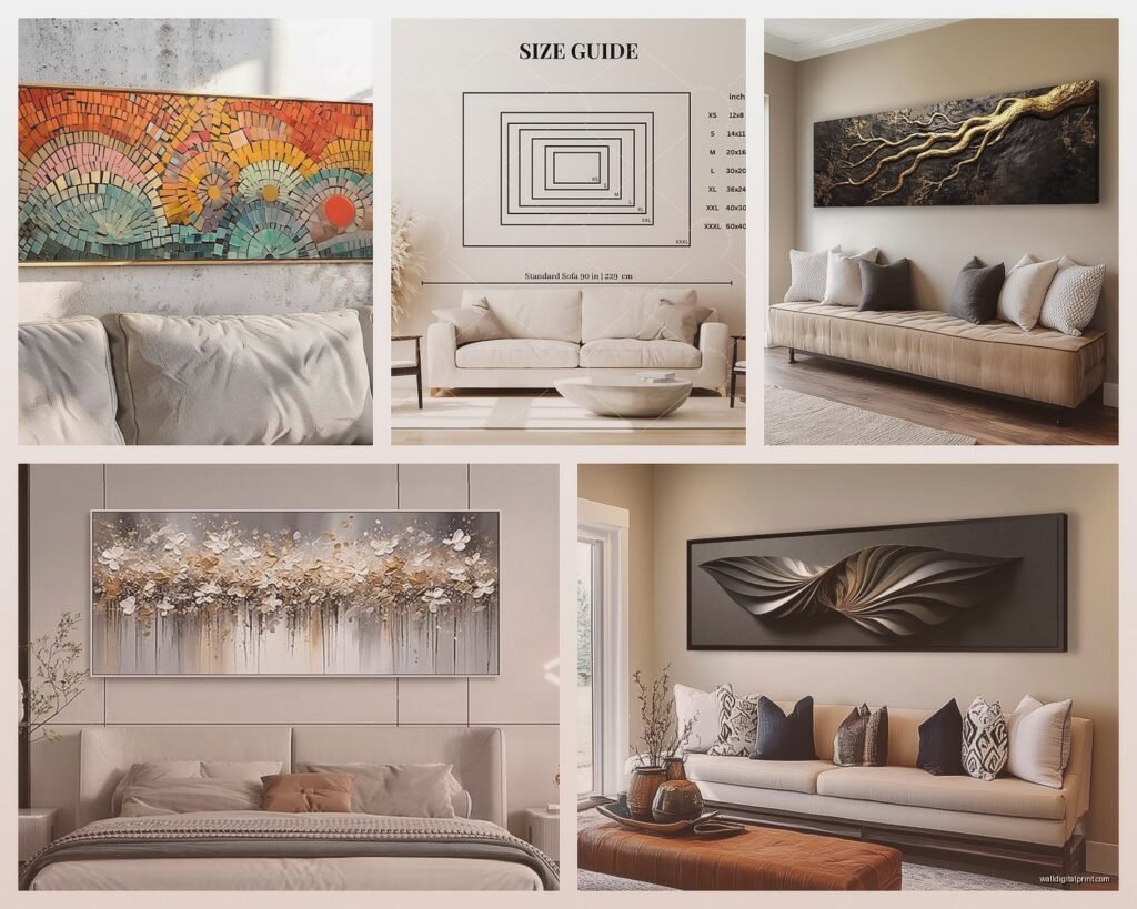
The basic rule I follow: your art should be roughly 2/3 to 3/4 the width of your sofa. So if you’ve got a standard 84-inch sofa, you’re looking at something between 56-63 inches wide. I usually go bigger rather than smaller because you can always balance a large piece with side tables or lamps, but a too-small piece just looks… lost.
Material Breakdown That Actually Matters
Canvas Prints
These are gonna be your most affordable option and honestly they’ve come a long way. I used to avoid them completely but now I recommend them for like 60% of my projects. The stretched canvas ones (where it wraps around wooden frames) are way better than the ones that need framing because you get that gallery-wrapped edge.
What to look for:
- Minimum 1.5-inch depth on the frame – anything thinner looks cheap from the side
- Giclee printing if you can afford it (the colors just last longer)
- Check if they coat it with UV protective stuff because sunlight will fade cheaper canvas in like a year
I’ve used stuff from CanvasOnDemand and iCanvas and they’re pretty solid. The iCanvas ones come ready to hang which saves you the hassle of adding hanging wire yourself. They run between $150-400 for the large horizontal sizes.
Framed Prints and Photographs
This is where things get expensive fast but also where you can find really unique pieces. Metal frames are having a moment right now – super thin black or brass frames that don’t compete with the artwork.
For actual photographs, I’m obsessed with landscape photography printed on metallic paper. There’s this one print I used of the Oregon coast at sunset, printed on aluminum, and it literally glows when light hits it. Cost like $600 but worth every penny for the right space.
Acrylic frames (where the print is sandwiched between acrylic sheets) are also gorgeous but heavy as hell. I learned this the hard way when one fell off the wall at 2am and scared my dog so bad she wouldn’t go near that wall for weeks. You need serious anchors for these – I’m talking toggle bolts rated for at least 50 pounds.
Wood Art and Natural Materials
Okay this is gonna sound weird but carved wood panels or printed wood art is perfect if you’re going for that organic modern vibe. The grain shows through the image which adds texture you can’t get with canvas.
I found this Etsy shop that does mountain landscapes on reclaimed barn wood and they’re stunning. Each piece is different because the wood grain is different. They’re lighter than you’d think, maybe 15-20 pounds for a 60-inch piece.
Watch out for warping though – solid wood pieces need to be sealed properly on both sides or humidity will mess them up. Ask about this before buying.
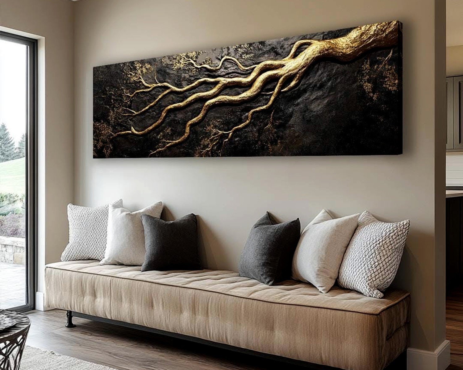
Metal Prints
These are my secret weapon for modern spaces. The image gets infused directly onto aluminum sheets so the colors are insanely vibrant. They’re waterproof, scratch-resistant, and have this slight sheen that makes them pop.
Downside is they’re not cheap. A 60×20 inch metal print usually runs $300-500. But they last forever and they’re super easy to hang because they’re rigid – you just mount them flush to the wall with a floating mount system.
Size and Placement Because This Is Where Everyone Screws Up
The 57-inch rule (center of art at 57 inches from the floor) is fine for galleries but in living rooms you gotta adjust based on your furniture.
For above-sofa placement:
- Leave 6-8 inches between the top of your sofa and the bottom of the frame
- The art should not extend past the edges of the sofa by more than a few inches on each side
- If you have high ceilings (over 9 feet), you might need to go slightly higher to avoid that awkward gap
I literally measure everything three times before drilling because moving those holes is a pain. My process is: measure the sofa width, multiply by 0.7 to get ideal art width, then find the center point of the wall space and mark where the hanging hardware will go.
Oh and another thing – if you’re doing a gallery wall with a horizontal anchor piece, that piece should be the largest and positioned in the middle-lower section. I see people put it at the top and then everything below looks bottom-heavy.
What Actually Looks Good Subject-Wise
After hanging probably 200+ horizontal pieces, here’s what works:
Landscape photography is obvious but it works for a reason. Mountains, beaches, forests – they naturally fit the horizontal format. I tend to go for either dramatic (stormy skies, sunset colors) or super minimal (foggy mountains, misty forests).
Abstract art in horizontal formats can be amazing if you pick the right movement. Think flowing brushstrokes that move left to right, or color field paintings with horizontal bands. Mark Rothko style stuff works great.
Cityscapes and skylines are perfect for modern spaces. There’s something about a panoramic city view that just works above a sofa. I used a black and white NYC skyline in a client’s apartment last month and it tied together their entire gray and white color scheme.
Botanical prints – but wait, these need to be done right. Not the vintage encyclopedia style (those are better vertical). I mean like a single branch of cherry blossoms stretching across the canvas, or a horizontal slice of a garden. More contemporary.
What doesn’t work: portraits in horizontal format (unless it’s a group), busy patterns that don’t have directional flow, anything too literal or cheesy (like those “Live Laugh Love” word art things).
Where to Actually Buy This Stuff
I’m gonna be real with you – I source from all over depending on budget.
Budget-friendly (under $200):
- Target’s Project 62 line has surprisingly decent horizontal abstracts
- Minted for prints – they have huge sales constantly
- Society6 for artist prints on various materials
- IKEA’s art actually doesn’t suck anymore, especially their photography pieces
Mid-range ($200-600):
- Anthropologie for unique pieces with interesting frames
- West Elm – their oversized art section is solid
- Etsy for custom and handmade stuff (search “large horizontal landscape art”)
- Saatchi Art for original works from emerging artists
Investment pieces (over $600):
- Local galleries – I always check these first for clients with bigger budgets
- 1stDibs for vintage and antique landscape paintings
- Artsy for contemporary artists
- Direct from artists’ websites when you find someone whose style you love
Hanging Hardware That Won’t Fail You
This is so important and people just use whatever came in the box. Don’t do that.
For canvas (under 30 lbs): regular picture hanging hooks are fine, but I prefer the monkey hooks that don’t need anchors. They hold up to 50 lbs and you just push them into drywall.
For anything 30-50 lbs: Get proper wall anchors. The plastic ones are garbage. I use metal toggle bolts or molly bolts depending on the wall type. If you hit a stud, obviously use that but horizontal pieces rarely line up perfectly with studs.
For heavy stuff (50+ lbs): French cleats all the way. It’s a two-part hanging system where one piece mounts to the wall and one to the back of the art, and they interlock. Super secure and you can slide the art left or right to adjust positioning.
Actually funny story – I once tried to hang a 65-pound metal print with regular picture wire and those cheap hooks and it literally pulled out of the wall while I was standing there admiring it. Missed my client’s coffee table by inches. Now I over-engineer everything.
Mixing Materials and Creating Collections
Sometimes one horizontal piece isn’t enough and you wanna layer in more interest. Here’s what I do:
Two horizontal pieces stacked vertically can work if they’re slightly different sizes and there’s a clear visual connection (same color palette or theme). Leave like 2-4 inches between them.
One large horizontal piece with two smaller square or vertical pieces flanking it creates balance. The horizontal should be at least twice as wide as the side pieces.
Three horizontal pieces in a row works for really long walls (like behind a sectional). Keep them the same height but they can be different widths. This is tricky though – you need at least 12 feet of wall space or it looks cramped.
Color Coordination Without Being Matchy-Matchy
Your art doesn’t need to match your throw pillows exactly (please don’t do this), but it should have some relationship to your room’s color story.
I usually pull 2-3 colors from the art and echo them elsewhere in the room. So if you’ve got a landscape with blues and oranges, maybe you’ve got blue in your rug and orange in an accent chair. That’s enough.
Or go completely neutral with the art – black and white photography or sepia-toned landscapes work with literally everything and won’t look dated when you change your decor.
The mistake I see is people buying art to match their current sofa, then they get a new sofa and suddenly the art doesn’t work. Buy art you actually love looking at, then build around it.
Lighting Makes or Breaks It
You can have the most gorgeous horizontal landscape piece but if the lighting sucks, nobody will notice it. I always add picture lights or track lighting aimed at the art.
Picture lights mount directly above the frame – get LED ones so they don’t heat up the art. They need to extend out far enough to wash light down the entire piece.
Track lighting is more flexible but requires more planning. You want the light at a 30-degree angle to avoid glare.
Natural light is great but watch out for direct sunlight because it’ll fade prints over time. UV-protective glass or acrylic helps with this.
Oh wait I forgot to mention – if you’re hanging art on a dark wall, you might need more lumens to make it visible. I learned this after hanging a moody forest scene on charcoal gray walls and realizing you could barely see it without additional lighting.
Quick Fixes for Common Problems
Art looks too small: Add a frame mat or get a larger floating frame. Or flank it with tall plants or sconces to fill the negative space.
Art looks too big: Actually this is rare but if it happens, the fix is usually adjusting what’s around it. Remove clutter from the console table below, simplify the area.
Colors feel off: Try changing the frame color. I’ve saved pieces by switching from a warm wood frame to black metal.
Multiple pieces feel chaotic: Unify them with identical frames, even if the art inside is different styles.
Anyway that’s basically everything I know about horizontal wall art after years of doing this professionally and making every possible mistake in my own house first. The main thing is don’t overthink it – get something you actually wanna look at every day, make sure it’s properly sized and secured, and adjust from there.