Wall Art Guide, Wall Art Tutoriels
African American Wall Art for Bedroom: Black Culture Decor
Apr
So I’ve been diving deep into African American wall art lately because honestly, three of my clients this month asked for the same thing and I was like, okay universe I hear you. Let me tell you what actually works versus what looks good on Instagram but is terrible in real life.
Canvas Prints vs. Framed Art – The Stuff Nobody Tells You
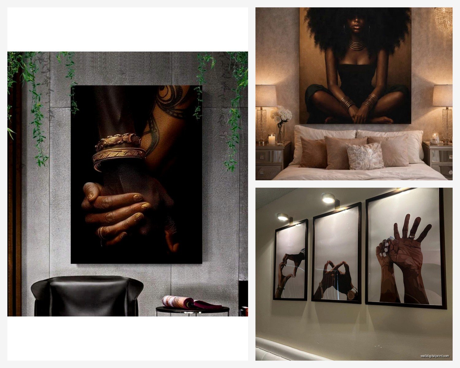
Okay so canvas prints are everywhere right now. You’ll see those gorgeous portraits of Black women with afros, headwraps, the gold leaf accents… they’re stunning. But here’s the thing – quality matters SO much more than I thought it would. I ordered this beautiful piece from one of those print-on-demand sites for like $45 and when it arrived the colors were so washed out it looked like someone printed it at a library in 2003.
What actually worked: I found this shop on Etsy (gonna find the name hold on) that does giclée prints on actual thick canvas. The difference is insane. The blacks are actually black, not grayish. For bedroom art especially, you want that depth because your lighting is usually softer than living rooms.
Framed prints though – if you’re going this route, don’t cheap out on the frame. I learned this the hard way when a client’s frame literally fell apart after two months. Look for frames that are at least 1.5 inches deep if you want that gallery look. The thin frames make even expensive art look cheap.
Size and Placement Because Everyone Gets This Wrong
Your bed is probably a queen or king right? You need art that’s at least 2/3 the width of your headboard. I see so many bedrooms with these tiny 16×20 prints above a king bed and it just looks… lost. Like when my dog tries to sleep in my bed and looks absolutely ridiculous because he’s so small.
For above the bed:
- King bed: go for 48-60 inches wide (or a gallery wall that spans that)
- Queen bed: 40-50 inches works
- Full bed: 30-40 inches is your sweet spot
And hang it about 6-8 inches above your headboard. Not higher. I know some design blogs say different but trust me on this – I’ve installed probably 50 pieces this year and that spacing just looks right.
The Gallery Wall Thing
Okay so gallery walls are tricky with cultural art because you don’t want it to look like… I don’t know how to say this without sounding weird but you don’t want it to look like a history project? You want it to feel personal and curated.
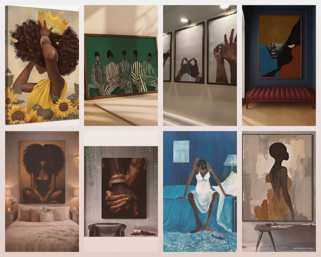
What I’ve been doing: mixing different art styles but keeping a consistent color palette. So like a vintage jazz poster, a contemporary portrait, maybe some abstract art by Black artists, and a photograph. Frame them all in black or all in natural wood – don’t mix frame colors unless you really know what you’re doing.
Space them 2-3 inches apart. I use blue painter’s tape on the wall first to map everything out because I’m not remeasuring and re-drilling holes at 11pm again.
Subject Matter That Actually Works in Bedrooms
Living rooms can handle bold political statements or really intense imagery, but bedrooms are different. You’re waking up to this art every morning.
What’s been popular with my clients:
- Black women in peaceful poses – reading, relaxing, in nature
- Abstract art by African American artists (Alma Thomas vibes)
- Jazz musicians but the artistic interpretations not just straight photographs
- African patterns and textiles as art prints
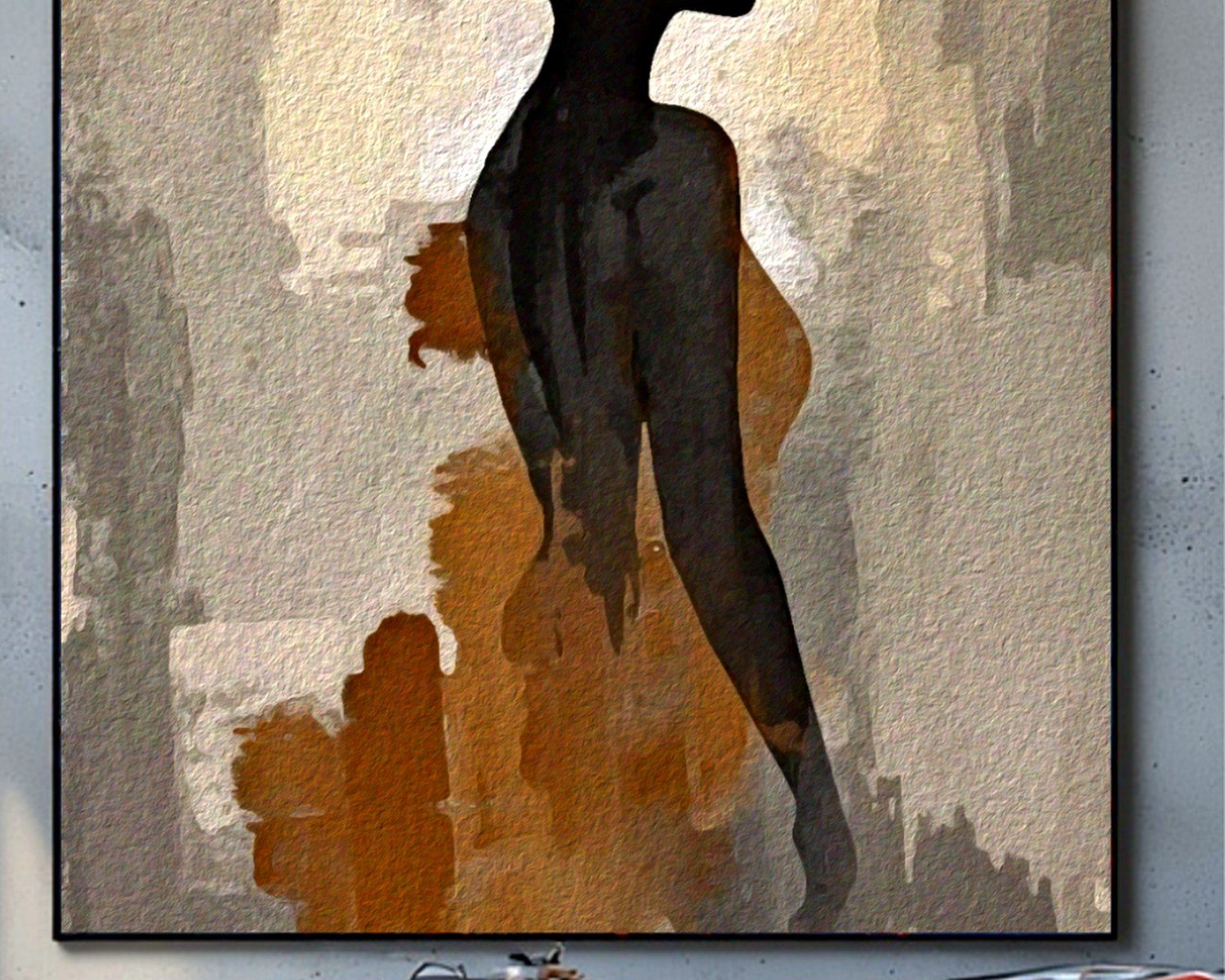
- Afrofuturism pieces that are more dreamy than intense
- Vintage Harlem Renaissance poster reproductions
One client wanted Malcolm X in her bedroom and I was like… maybe let’s put that in your office? We compromised with a beautiful abstract piece by a Black artist that had the colors of the Pan-African flag worked in subtly. She loved it.
Where to Actually Buy This Stuff
I’m gonna be real with you – Amazon has some options but it’s a lot of the same mass-produced stuff. You’ll see the same gold-and-black woman with afro print in everyone’s house.
Etsy is honestly your best bet for unique pieces. Search for specific artists, not just “Black art.” You’ll find people who do custom work, original paintings, and really high-quality prints. I’ve worked with sellers who’ll even adjust colors to match your bedroom palette.
Society6 and Redbubble have independent Black artists but the quality can be hit or miss. Read reviews obsessively. If people are complaining about thin canvas or bad printing, believe them.
For original art – if your budget allows it – check local galleries, art fairs, and Instagram. So many talented artists are on Instagram and you can commission custom work for less than you’d think. I got a client a custom 36×48 acrylic pour piece from a Chicago artist for $800 which sounds like a lot but compared to what galleries charge, it was actually reasonable.
The Print Quality Thing I Keep Harping On
Look for these terms:
- Giclée printing (it’s just fancy inkjet but actually good)
- Archival inks (won’t fade in sunlight)
- Museum-quality canvas
- 300 DPI or higher resolution
If the listing doesn’t mention any of this, ask. If they can’t answer, that’s your answer.
Color Coordination Without Being Matchy-Matchy
Your art doesn’t need to perfectly match your bedding but it should work with your room. I’m currently watching someone on HGTV make this exact mistake actually – they’re putting orange art in a blue room and it’s… a choice.
Pull 1-2 colors from your existing bedroom. If you have gray walls and white bedding with navy accents, look for art that incorporates those tones. It can have other colors too – like a portrait with a navy dress against a neutral background with pops of gold.
Oh and another thing – if your bedroom is already colorful, consider black and white photography or art. I did this in a client’s bedroom that had a really bold teal accent wall and the black and white portraits of jazz musicians looked incredible. Gave the room somewhere for your eye to rest.
Mixing Cultural Art with Other Styles
This is gonna sound weird but some of the best bedrooms I’ve styled mix African American art with completely different styles. Like you can have a beautiful portrait of a Black woman next to abstract geometric art next to a landscape. The connection is the color palette and frame style, not the subject matter.
I had one client who was worried about mixing a vintage Josephine Baker poster with modern abstract pieces and I was like no that’s literally perfect. The vintage piece gives it history and story, the modern pieces keep it from feeling like a museum.
What to Avoid Unless You Really Want It
Okay so personal opinion time but I’ve seen these mistakes enough that I gotta mention them:
Those super glossy metallic prints – they look cool in photos but in person they’re hard to see from certain angles because of glare. Bedrooms usually have lamps and overhead lights and you’ll just see reflection.
Canvas prints that wrap around the edges with part of the image – this only works if the image was designed for it. I’ve seen so many portraits where half of someone’s face disappears around the side and it looks unfinished.
Anything that says “African American” in the product title but is clearly just stock photos with filters – you can tell. We can all tell.
Word art that’s trying too hard – like those ones that say “Black Excellence” in 47 different fonts. If you want text art, find something with good typography from an actual designer.
Lighting Makes or Breaks Everything
I cannot stress this enough – you need to light your art properly or what’s even the point. Picture lights are expensive but worth it for larger pieces. Those battery-operated LED ones work fine if you don’t want to deal with wiring.
Or just make sure your bedroom lighting is warm toned (2700-3000K bulbs) because it makes skin tones in portraits look natural and rich. Cool white light makes everything look washed out and sad.
My Current Favorite Finds
So I’ve been keeping a list on my phone of pieces that multiple clients have asked about:
Those Bisa Butler quilted portraits – you can get prints of her work and they’re stunning. The texture and color are insane even in print form.
Anything by Varnette Honeywood if you can find it – her style is so joyful and warm, perfect for bedrooms.
Modern portrait artists on Etsy who do the gold leaf accent thing but actually well – there’s this one seller who does custom portraits and I’ve ordered from her twice now. The gold is real gold leaf, not just printed.
Abstract pieces that incorporate African textile patterns – these work in literally any style bedroom.
wait I forgot to mention – if you’re renting, get the Command picture hanging strips rated for your frame weight. They actually work now (they didn’t used to) and you won’t lose your deposit over nail holes.
Budget Real Talk
You can do this at any budget honestly:
Under $100: High-quality prints from Etsy, framed yourself from Target or Michaels (use those 50% off coupons). You can create a whole gallery wall for under $100 if you’re patient and wait for sales.
$100-$300: Larger framed prints, maybe one really nice piece as a focal point. This is where I tell most people to spend if they can.
$300-$500: You can get original art from emerging artists at this price point, or really large high-quality prints in custom frames.
Over $500: Original paintings, commissioned work, investment pieces from established artists.
I had a client who spent $50 total on three Etsy prints and $40 on frames from Target and her bedroom looks like it should be in a magazine. It’s not about spending a lot, it’s about choosing thoughtfully.
The main thing is just making sure the art actually speaks to you and fits your space. I’ve seen $2000 pieces that look wrong in a room and $35 prints that look perfect. Scale matters more than price honestly, and making sure the quality is there so it doesn’t look cheap.
My cat just knocked over my coffee so I gotta go but hopefully this helps – feel free to send me pics of what you’re considering and I can tell you if the sizing would work.