Wall Art Guide, Wall Art Tutoriels
White Wall Art for Living Room: Clean Neutral Minimalism
Apr
So I’ve been deep in the white wall art rabbit hole lately and honestly it’s way more complicated than you’d think, like who knew there were seventeen different shades of “white” canvas art that all look completely different depending on your lighting?
Okay first thing – and I learned this the hard way after a client returned three pieces – you gotta figure out if you want warm white or cool white. Sounds simple but it’s not. Warm whites have like cream or beige undertones, cool whites lean gray or blue. I was staging this loft in Brooklyn last month and put up these gorgeous textured white pieces that looked AMAZING in the gallery but in the apartment they looked dingy because the walls were a cool white and the art was warm. Total disaster.
The easiest way to test this is honestly just hold up a piece of printer paper next to your wall. If your wall makes the paper look yellow, you have cool walls. If the paper looks blue-ish, warm walls. Match your art temperature to your walls or everything looks off.
Material Breakdown Because It Actually Matters
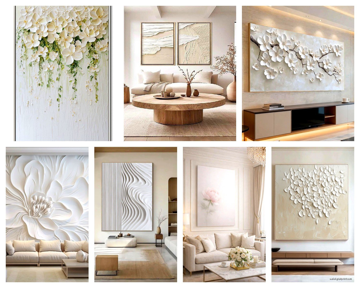
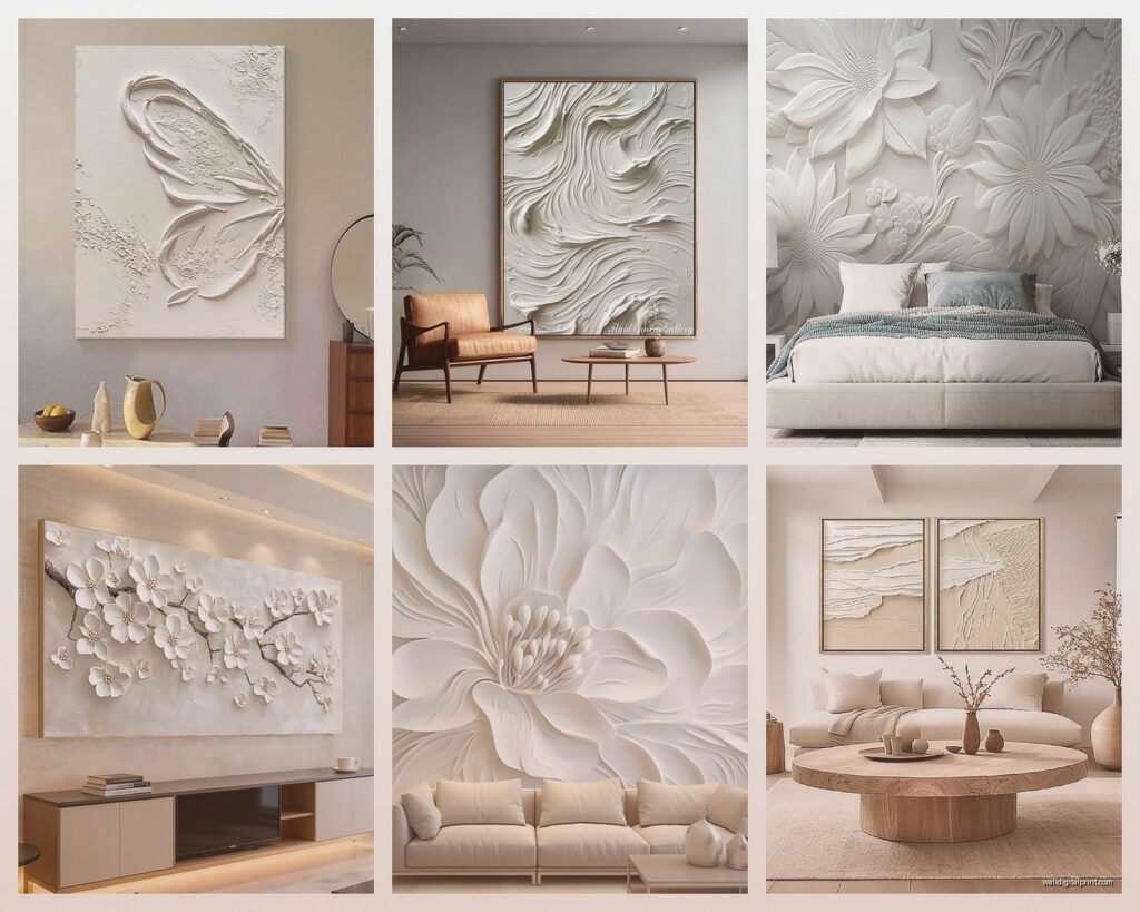
Canvas is gonna be your most common option and it’s… fine. I use a lot of Uttermost pieces for clients because they’re not crazy expensive and they hold up. The stretched canvas ones are better than the ones mounted on board, trust me. You want that little bit of texture and dimension. The completely flat ones just look like posters trying too hard.
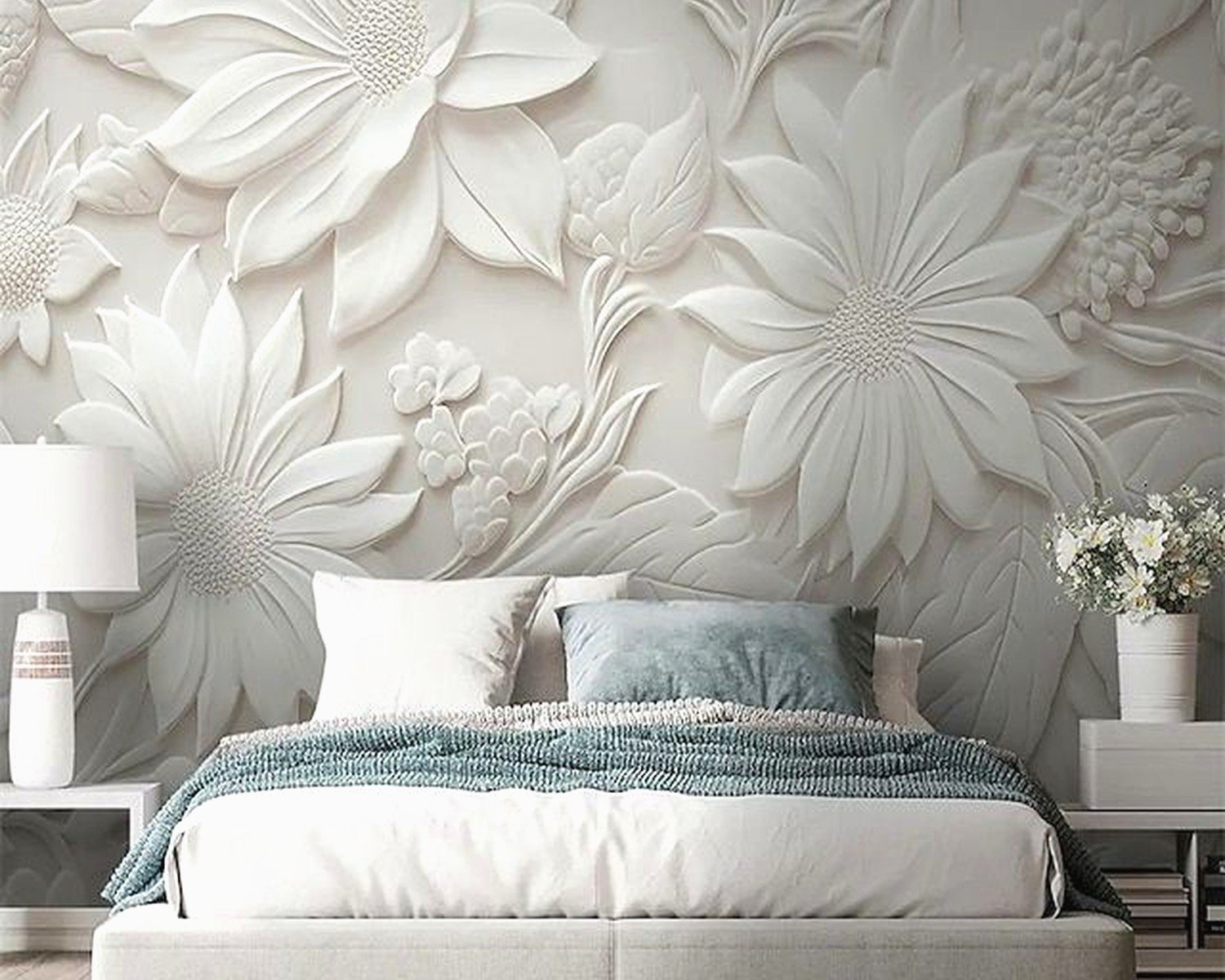
But here’s what I’ve been obsessing over lately – textured plaster or gesso pieces. There’s this artist I found on Etsy (gonna sound weird but I found her because my dog stepped on my laptop and somehow I ended up on her page?) who does these minimalist white-on-white abstract pieces with actual dimension. Like you can see the palette knife strokes. They’re around $200-400 depending on size and they make such a difference compared to flat canvas prints.
Oh and another thing, if you’re going the DIY route or buying from smaller artists, ask about the substrate. MDF board is cheap and works but it’s heavy as hell. Cradled wood panels are lighter and they don’t warp. I learned this when I nearly pulled a client’s drywall off the wall because we used the wrong hanging hardware for a massive MDF piece.
The Whole Texture Situation
This is where white art either works or looks like you forgot to decorate. You NEED texture or variation or it just reads as blank wall. Some options that actually work:
- Woven fiber art – macrame is kinda over but woven cotton or linen pieces are still good, especially the grid patterns
- 3D geometric pieces – like those cube shadow boxes or the layered wood ones
- Mixed media with subtle metallics – just a hint of gold or silver leaf catches light without being shiny
- Embossed or carved pieces – I’m obsessed with these minimalist carved wood panels from West Elm right now
- Layered paper art – surprisingly sophisticated if done right, avoid the ones that look crafty
I just finished a project where we used five different white pieces in the same room and they all had different textures – one canvas, one plaster, one woven, one carved wood, one ceramic tile arrangement. Sounds like too much but because they’re all the same color family it actually creates this really calm but interesting space.
Size and Scale Because Everyone Gets This Wrong
Okay so funny story, I used to think bigger was always better but then I did this living room with a massive 60×80 white abstract piece and it just… absorbed all the energy from the room? Like it was TOO much white in one spot.
Here’s what actually works: if you’re doing one statement piece above a sofa, go for about two-thirds the width of your sofa. So like if your sofa is 90 inches, your art should be around 60 inches wide. But honestly I prefer doing groupings of smaller pieces instead of one big one.
For gallery walls with white art, mix your sizes but keep an odd number – 3, 5, or 7 pieces. Even numbers look too symmetrical and formal which kinda defeats the minimalist casual vibe. I usually do one larger piece (like 24×36) and then fill in with smaller ones (16×20, 12×16).
Wait I forgot to mention – leave like 3-4 inches between pieces in a gallery wall. Closer than that and they compete, farther apart and they don’t feel connected.
Where to Actually Buy This Stuff
I’ve tested a ridiculous amount of sources at this point. My client canceled yesterday so I literally spent an hour comparing white abstracts from different retailers which is definitely a normal thing to do…
Budget friendly (under $200):
Target’s Project 62 line has some surprisingly decent textured white pieces. The quality isn’t heirloom level but they look good from 5 feet away which is all that matters. West Elm’s sale section – set up alerts because their white textured art goes on sale constantly and you can get 40-50% off.
Mid-range ($200-600):
Etsy but you gotta be selective. Search for “original white abstract art” not prints. Look for artists who show detail shots so you can see actual texture. I’ve found amazing pieces from artists in Portugal and Australia for like $300 including shipping.
CB2 has good stuff but it’s hit or miss. Their plaster pieces are great, their canvas prints are just okay.
Splurge (over $600):
Honestly if you’re spending this much, work with a local artist or go to actual galleries. I have a few artists I work with regularly who do commission pieces and you can get exactly what you want. Plus supporting actual artists feels better than buying mass-produced stuff.
One artist I love does these white resin pieces with embedded objects – like tiny shells or paper fragments – that you can only see up close. They’re around $800-1200 but they’re conversation starters.
The Lighting Thing Nobody Talks About
This is gonna sound obvious but white art is SUPER affected by lighting. Like more than any other color. I’ve had pieces look completely different between morning and evening in the same room.
If you have warm lighting (regular incandescent or warm LED bulbs), cool white art can look gray or even slightly blue. If you have cool daylight bulbs, warm white art looks cream or beige. You gotta match your bulb temperature to your art temperature or at least be aware of how it’s gonna shift.
Picture lights are actually worth it for white textured pieces because they create shadows that emphasize the dimension. I use simple LED picture lights from Ikea (like $30) and they make a huge difference. Just angle them at about 30 degrees from the wall.
Natural light is tricky because it changes throughout the day. If your living room gets a lot of direct sunlight, avoid pure white pieces because they’ll create glare. Go for off-white or textured pieces that absorb some light instead of reflecting it all.
Framing Decisions
Most white art looks better without frames honestly. The whole point is that clean minimal look and frames add visual weight. But if you’re doing works on paper or you want to protect something, here’s what works:
Floating frames in light wood or white – keeps the minimal vibe
Simple metal frames in brass or matte black – adds just enough contrast
No frame but mounted on a slightly larger white mat board – creates a subtle border
Skip ornate frames, colored frames, or anything with visible texture on the frame itself. It competes with the art.
Hanging Height and Placement
Center of the artwork should be at 57-60 inches from the floor, which is standard gallery height. But in living rooms I actually go slightly lower, especially if people will mostly see it while sitting down. Like 54-56 inches feels more natural.
Above a sofa, leave 6-10 inches between the top of the sofa back and the bottom of the frame. More than that and it looks disconnected, less and it feels crowded.
Oh and this is important – if you have high ceilings (over 9 feet), you might need to adjust higher or use larger pieces. I did a room with 11-foot ceilings and we had to use 48-inch tall pieces to not look dinky.
Mixing White Art with Other Stuff
All white art can work but it’s easier if you mix it with other elements. Some combinations I use all the time:
White art + black and white photography – creates rhythm without adding color
White art + natural wood sculptures or objects – the wood tones warm it up
White art + black frames on some pieces – adds definition
White art + plants – greenery prevents the all-white from feeling sterile
I’m working on a project right now where we’re doing white textured art on three walls and then one wall has black and white photography. The contrast makes both feel more intentional.
Maintenance and Cleaning
Nobody tells you this but white art gets dirty, especially textured pieces. Dust settles in all those crevices and suddenly your minimalist art looks dingy.
For canvas and smooth surfaces, use a microfiber cloth slightly dampened with water. Don’t use cleaning products unless the artist specifically says it’s okay.
For textured plaster or gesso pieces, use a soft brush (like a clean makeup brush) to dust gently. Don’t press hard or you’ll damage the texture.
For woven or fiber art, vacuum with the brush attachment on low power from like 6 inches away. Gets the dust out without pulling fibers.
I clean my clients’ white art every 3-4 months as part of maintenance and it makes a huge difference. Dirty white art is worse than no art.
Common Mistakes to Avoid
Buying prints of white paintings instead of actual textured pieces – the whole point is dimension and you lose that with prints
Going too matchy-matchy – all the same size, same frame, same style looks more corporate than minimal
Forgetting about your trim color – if you have cream trim and cool white art, it’ll clash
Hanging everything at exactly the same height in a gallery wall – vary by a few inches for a more organic feel
Choosing art that’s too small for the space – better to go slightly bigger than smaller with white art
Oh wait, one more thing – if you have pets that shed, maybe reconsider deeply textured white art. I have a client with two huskies and we had to switch from a white shag fiber piece to smooth canvas because the dog hair situation was unmanageable. Just being realistic here.
The whole white art thing works best when you think of it as adding texture and dimension rather than adding color. It’s about shadows, light, materials, and subtle variations rather than bold statements. Takes some experimenting to get right but when it works it really does create that clean calm minimal vibe everyone’s going for.