Wall Art Guide, Wall Art Tutoriels
Colorful Wall Art for Living Room: Vibrant Multi-Color Pieces
Apr
So I’ve been looking at colorful wall art for living rooms basically non-stop for the past three weeks because my client wanted something “vibrant but sophisticated” which is… such a vague brief honestly. But I figured out some stuff that actually works and some materials that are gonna make your life easier or harder depending on what you pick.
Canvas Prints Are Your Safe Bet But Here’s What Nobody Tells You
Canvas is like the default everyone goes to and yeah there’s a reason. The texture hides imperfections in the printing which is great if you’re not spending a fortune. I got this massive abstract piece from an Etsy seller last month, like 40×60 inches, and the canvas weave basically disguised some color banding that would’ve been super obvious on paper or acrylic.
The thing with canvas though is you gotta check if it’s gallery wrapped. That means the image continues around the edges so you don’t need a frame. Saves you like $200-300 on framing for larger pieces. My dog knocked over one of my framed pieces last year and the frame shattered everywhere so now I’m all about frameless when possible.
Stretched canvas comes in different depths too—usually 0.75 inches or 1.5 inches. The deeper ones (1.5″) look more substantial and modern, but if you’re hanging multiple pieces together the thinner profile actually works better because it doesn’t create weird shadows between pieces.
Quality Differences Actually Matter
Museum-grade canvas vs regular canvas is a real thing. Museum grade is usually cotton or linen and it won’t yellow over time. The cheap polyester canvas I bought for my first apartment literally started looking dingy after two years even though it wasn’t in direct sunlight. Cotton canvas runs about $150-400 for a decent sized multi-color piece, polyester is more like $50-150 but you’re replacing it sooner.
Acrylic Prints Are Having a Moment and They’re Kinda Amazing
Okay so funny story, I was watching this restoration show on Netflix and they had acrylic protective layers on artwork and I went down this whole rabbit hole about acrylic prints. They’re basically your image printed on paper or directly onto the back of acrylic glass panels. The colors are SO vibrant it’s almost aggressive? In a good way for colorful pieces.
The depth is insane. You get this glossy, almost 3D effect because light penetrates the acrylic and reflects back through the colors. I put a multi-colored geometric piece in my client’s living room last month and every time the light changes throughout the day it looks completely different. Sunset hits it and suddenly the oranges and pinks just pop out at you.
The Downsides Because There Always Are Some
Acrylic shows every fingerprint and smudge. You’re gonna be wiping it down with microfiber cloths constantly if you have kids or if you’re like me and touch everything. Also they’re HEAVY. Like surprisingly heavy. I needed to use proper wall anchors rated for 50+ pounds for a 30×40 inch piece. Regular picture hanging hooks aren’t gonna cut it.
Cost-wise you’re looking at $200-600 for quality acrylic prints depending on size. There’s cheaper options on Amazon but I tried one once and the print quality was so pixelated it looked like a screenshot from 2005.
Metal Prints for That Modern Industrial Vibe
Metal prints are aluminum panels with your image infused directly into the surface. The colors have this luminescent quality that’s really different from canvas or paper. I used a vibrant sunset abstract piece printed on metal for a loft space and it fit perfectly with the exposed brick and concrete.
The aluminum base makes colors appear more saturated and slightly cooler in tone. So if you’re getting something with lots of warm reds and oranges, they might shift slightly more toward true red and orange rather than having those warm peachy undertones. Not necessarily bad just something to know.
Maintenance is Basically Zero
You can literally spray these with glass cleaner and wipe them down. They don’t fade, they don’t warp, moisture doesn’t affect them. I have one in my bathroom actually which sounds weird but the humidity hasn’t done anything to it in three years.
They come with a floating mount system usually where the print sits about half an inch off the wall. Creates this cool shadow effect that makes the colors seem even more vibrant because there’s literal space between the art and the wall. Prices range from $150-500 depending on size and whether you want glossy or matte finish.
Framed Paper Prints When You Want Gallery Quality
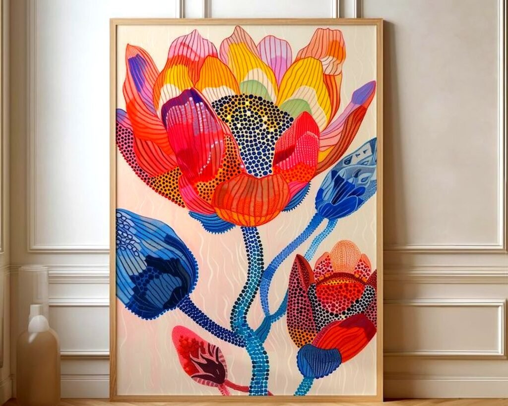
Fine art paper prints under glass are traditional for a reason. Giclée prints on cotton rag paper or watercolor paper have texture that adds another dimension to colorful pieces. The paper texture interacts with the colors in ways that smooth surfaces don’t.
I’m obsessed with Hahnemühle Photo Rag paper right now. It’s a cotton-based paper that’s stupid expensive but the color accuracy is perfect. For multi-color pieces where you want the exact color relationships the artist intended, paper is your best bet. Canvas and metal both shift colors slightly, paper doesn’t if it’s printed properly.
The Framing Situation Gets Complicated
You need UV protective glass or acrylic glazing otherwise your colors will fade. Regular glass doesn’t cut it. Museum glass is like $300+ just for the glass on a large piece but it’s basically invisible with zero glare and blocks 99% of UV. I use Tru Vue Museum Glass when clients have budget and it’s worth every penny.
Alternatively, UV acrylic glazing is lighter and won’t shatter if it falls but it scratches easier. There’s always a tradeoff isn’t there. For vibrant multi-color pieces I usually go with acrylic because you’re probably not hanging it in direct sunlight anyway so the scratch resistance matters more than the absolute best clarity.
Matting adds cost but also makes colors pop. White mats make vibrant colors appear even more saturated, cream or off-white mats warm everything up, and colored mats can either complement or clash spectacularly. I saw someone use a teal mat with a multi-colored abstract that had teal in it and it looked intentional and expensive.
Wood Prints Are Underrated Honestly
Wait I forgot to mention wood prints earlier. These are having this weird renaissance right now. Your image is printed directly onto birch panels or cedar. The wood grain shows through which sounds like it would be distracting but with colorful abstract pieces it actually adds texture that feels organic.
The colors are more muted than acrylic or metal because the wood absorbs some of the ink, but that muted quality makes really vibrant multi-color pieces more livable? Like that super bright rainbow geometric that might be overwhelming on glossy acrylic becomes sophisticated and artistic on wood.
They’re lightweight compared to acrylic, usually ready to hang with a keyhole mount on the back, and they run about $100-350. The wood smell is real though—my office smelled like a lumberyard for a week after I got one. Some people love it, my cat kept trying to scratch it thinking it was a tree or something.
Textured Wall Sculptures That Are Technically Art But Also Dimensional
Okay this is gonna sound weird but textured resin pieces or layered wood constructions that are multi-colored are technically wall art and they work amazing in living rooms. I found this artist on Saatchi Art who does these layered resin pours in like twelve different colors and the shadows and depth make it look different from every angle.
The material is usually resin, wood, metal, or a combination. They stick out from the wall anywhere from 2-6 inches so you need to consider clearance if you’re hanging above a sofa. I learned this the hard way when my client kept hitting their head standing up from their couch.
Pricing is all over the place, anywhere from $300 for small pieces to literally thousands for large commissioned work. But the impact in person is so much more than a flat print. Light hits all those surfaces and the colors just activate the whole wall.
Tapestries and Fabric Art for Renters
If you can’t put holes in walls or want something temporary, woven tapestries or fabric art panels are actually really good. The textile quality softens the look which can be good or bad depending on your aesthetic. I use them for clients who are renting and can’t make permanent changes.
The colors in woven pieces have this richness because the dye is in the threads themselves rather than sitting on a surface. A multi-colored woven tapestry catches light differently than a print—it’s softer, warmer, more forgiving in different lighting conditions.
You can hang them with a curtain rod, clipboards, or even just pushpins in the corners. They’re lightweight, you can literally fold them up and take them with you when you move. Prices range from like $40 for mass-produced stuff to $500+ for artist-made woven pieces.
Washing is Possible But Scary
Most tapestries can be hand washed or dry cleaned but I’m always nervous about colors bleeding. I spot clean only unless it’s really necessary. The fabric also absorbs odors so if you cook a lot or have pets, just know that’s a thing.
What Actually Works in Living Rooms Specifically
Oh and another thing—living rooms have specific challenges. The lighting is usually mixed (natural light plus lamps plus maybe overhead), people sit and look at the art for extended periods unlike hallways where you just walk past, and the art needs to work with furniture which is usually neutral these days.
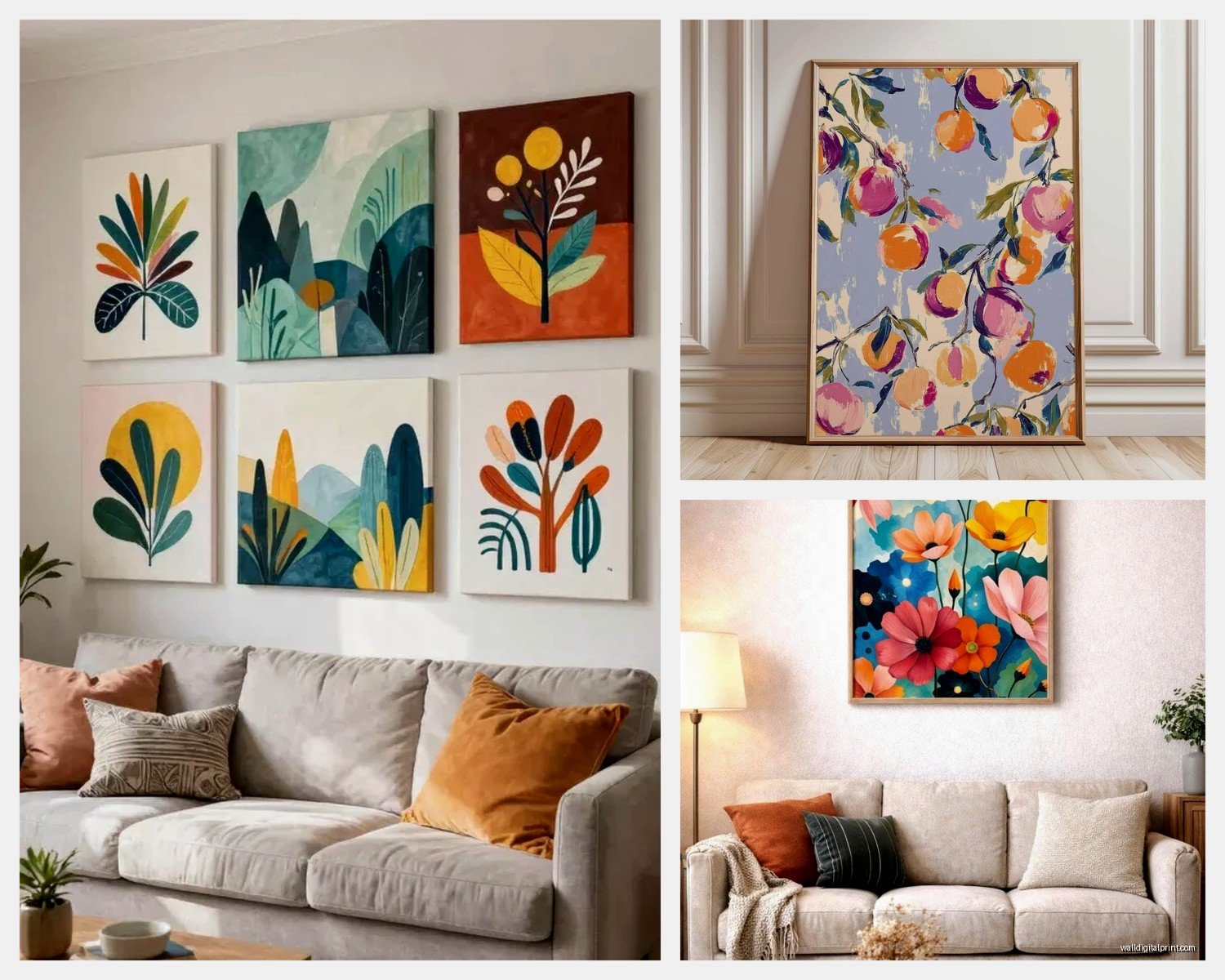
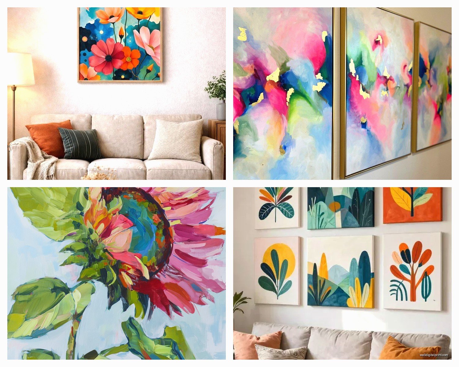
For multi-color pieces, I’ve found that larger scale works better than trying to do a gallery wall of small colorful pieces. One 48×60 inch vibrant abstract makes a statement, twelve small colorful pieces just looks chaotic unless you’re really good at curation.
The height matters too. Center of the art should be at eye level when standing, which is roughly 57-60 inches from the floor to the center of the piece. But if you’re hanging above a sofa, you want 6-8 inches between the furniture and the bottom of the art. This is stuff I measure obsessively because even two inches off makes it look wrong.
Color Considerations That Sound Obvious But Aren’t
The colors in your art need to have at least one or two colors that appear elsewhere in the room otherwise it looks disconnected. But you don’t want it to match exactly because that’s boring and looks like you bought everything from the same Target display.
I look for pieces where maybe 30% of the colors echo the room and 70% introduce new colors. So if you have a gray sofa and navy pillows, find art with some gray or navy in it but also introduces like coral, yellow, teal, whatever. That ties it in but keeps it interesting.
The lighting in your living room will shift colors throughout the day. Northern light makes colors appear cooler and more muted, southern light warms everything up, western afternoon light is super intense and makes vibrant colors almost glow. I always look at art samples in the actual room at different times of day before committing to large expensive pieces.
Where to Actually Buy This Stuff
Etsy has independent artists selling prints in all these materials, prices are usually better than galleries, and you can message them about customization. I’ve had artists adjust colors slightly or change sizes for basically no extra charge.
Saatchi Art and Artsy have higher-end pieces, more established artists, but you’re paying for that. Quality is consistently good though. I’ve never gotten a piece from either that was poorly printed or damaged.
Society6 and Redbubble are good for trendy stuff and they print on demand in all these different materials. Quality is hit or miss honestly. I’ve gotten some great pieces and some that looked cheap in person even though the preview looked fine online.
For acrylic and metal prints specifically, Fracture and WhiteWall are good. Fracture does direct-to-acrylic printing that’s frameless and ready to hang. WhiteWall is pricier but museum quality if you want the absolute best.
Local art fairs and studio tours are underrated. You see the actual piece, talk to the artist, and usually negotiate on price. I found this incredible multi-colored resin piece at a studio tour last fall for half what it would cost in a gallery.
Installation Tips Because This Matters More Than People Think
Use a level. Just use one. I’ve seen so many expensive pieces hung crooked and it ruins everything. Get a small torpedo level for like $8 and use it.
For heavy pieces—anything over 20 pounds—you need wall anchors if you’re not hitting a stud. I use EZ Ancor Twist-N-Lock anchors rated for drywall and they’ve never failed. The ones that come with frames are usually garbage.
Wire hanging vs sawtooth hangers vs French cleats depends on weight and size. Wire is most forgiving for getting level, sawteeth are fine for lightweight pieces under 10 pounds, French cleats are best for heavy or large pieces but require precise measurement.
Two hooks are better than one for pieces wider than 24 inches. Distributes weight and keeps it from tilting if someone bumps it or if the wall settles over time.
Okay I think that covers most of what I’ve learned through way too many trial and error situations. The main thing is just pick a material that matches your lifestyle—low maintenance if you have kids, something you can take with you if you’re renting, investment quality if this is your forever home. And for vibrant multi-color pieces specifically, think about how the material affects color intensity because that varies way more than people realize.