Wall Art Guide, Wall Art Tutoriels
Narrow Horizontal Wall Art: Long Thin Landscape Pieces
May
So I’ve been working with these long horizontal pieces for years now and honestly they’re kind of my secret weapon for those weird wall spaces that nobody knows what to do with. Like, you know that space above your couch that’s super wide but not tall? Or that hallway that goes on forever? Yeah, those spots.
Where These Actually Work Best
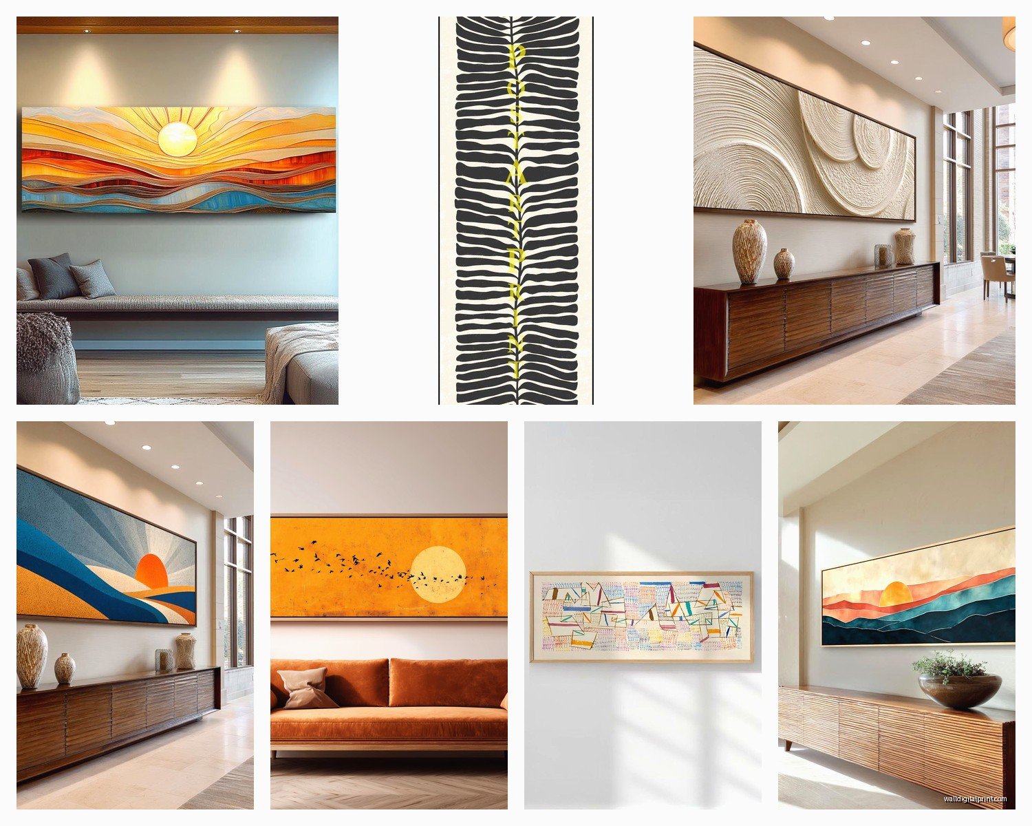
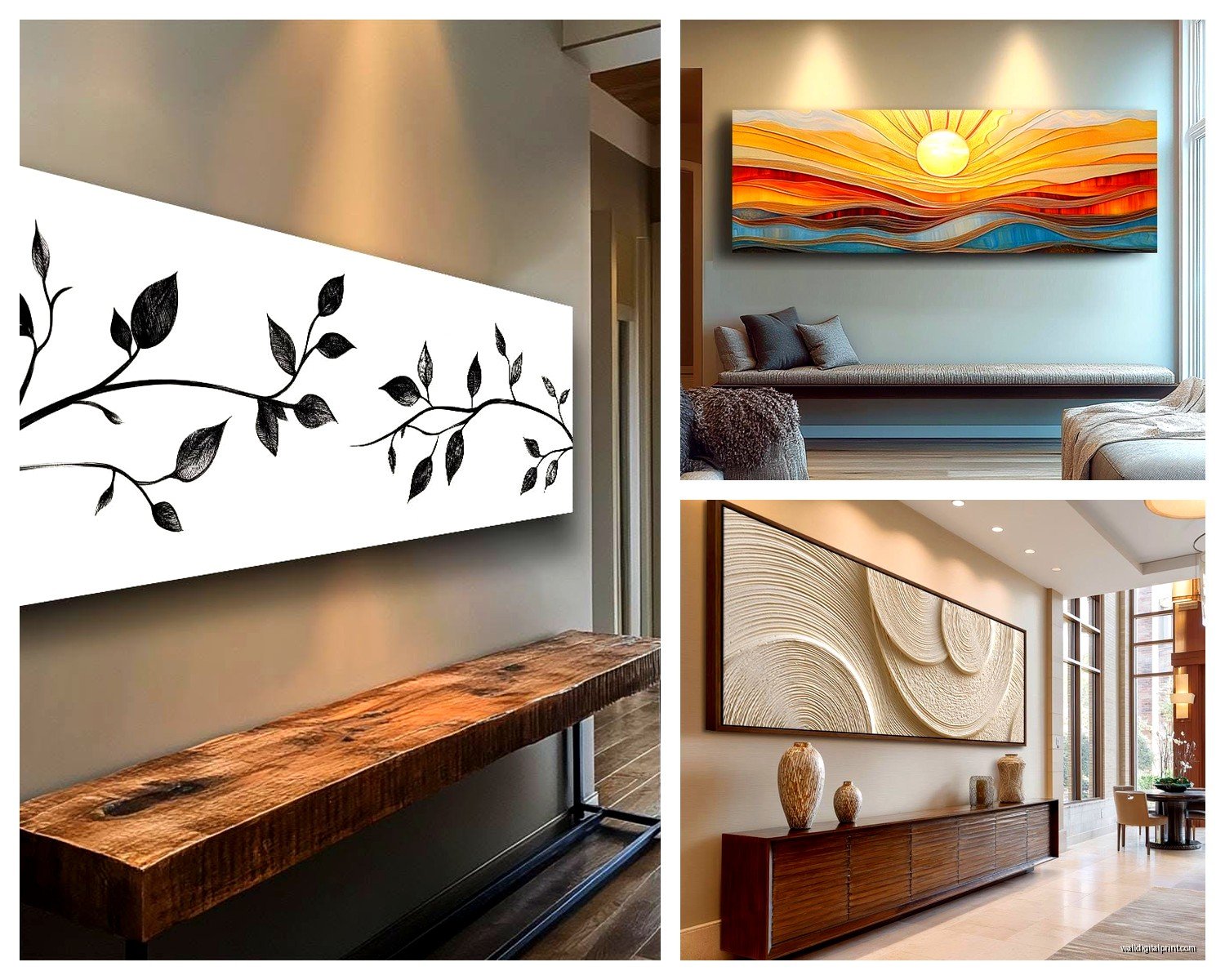
Okay so first thing – these aren’t just for above sofas, though that’s obviously the most common spot. I just finished a condo last month where we put a 60×12 landscape piece above the bed instead of the typical square art everyone does, and it completely changed how spacious the room felt. The horizontal line literally made the ceiling look higher, which sounds backwards but I swear it works.
Hallways are another spot where I’m always pushing clients toward these narrow horizontal pieces. Like a 48×10 or even longer if you’ve got the space. The thing is, hallways are already long and narrow, so you’re just emphasizing what’s already there instead of fighting it with a bunch of small square frames that make it feel choppy.
The Proportion Thing Nobody Talks About
Here’s what I wish someone had told me when I started – the art should be roughly two-thirds to three-quarters the width of your furniture. So if your sofa is 90 inches wide, you’re looking at somewhere between 60-68 inches for the art width. I’ve seen people go smaller and it just looks like the art is floating in this sea of wall space, super awkward.
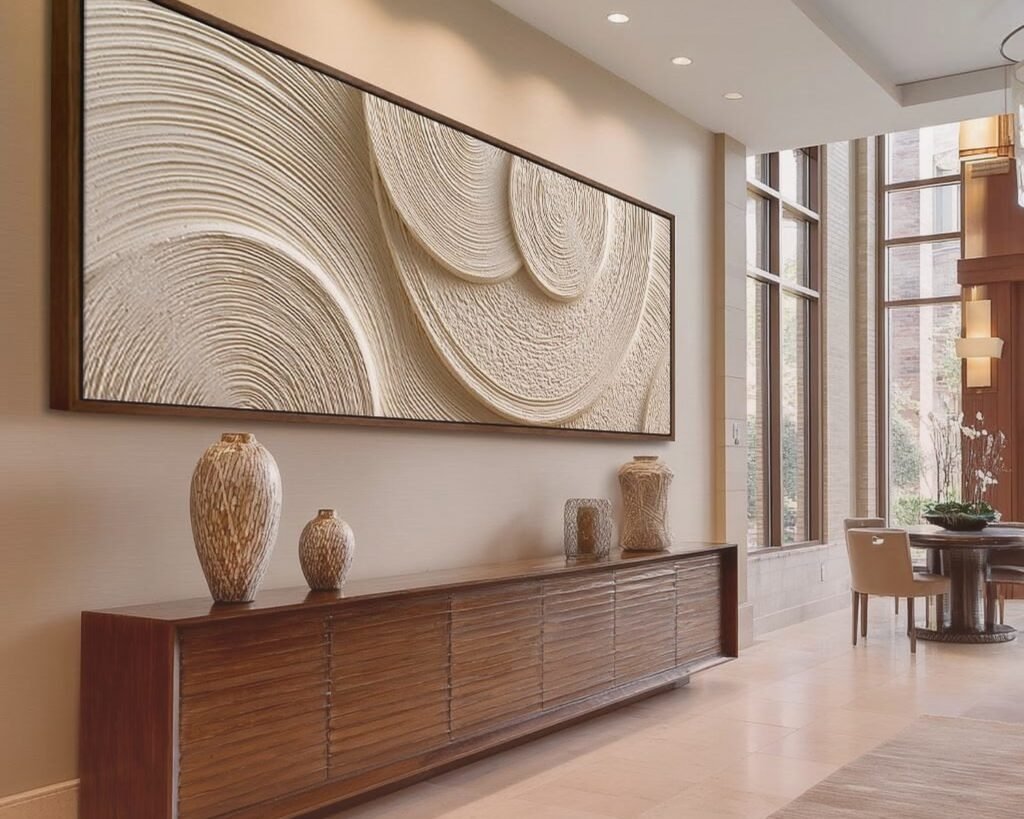
But also…and this is gonna sound weird but I’ve tested this multiple times…if you’re going above a console table or credenza that’s like 60 inches wide, you can actually go wider than the furniture itself. I did an 84-inch piece above a 60-inch credenza in my own dining room and everyone comments on it. The overhang creates this really intentional designer moment instead of looking matchy-matchy.
Height and Hanging Math That Actually Matters
The standard rule is center the art at 57-60 inches from the floor, which is average eye level. But with these narrow horizontal pieces, I usually cheat it down a bit because they’re already so slim. If you center a 10-inch tall piece at 57 inches, it can feel like it’s floating too high on the wall.
What I do instead: measure 8-10 inches up from the back of your sofa (or whatever furniture is below it) to the bottom of the frame. This creates a visual connection between the furniture and art without them feeling glued together. My cat knocked over a plant while I was measuring this in a client’s house last week and I had to redo the whole thing, but anyway – that 8-10 inch gap is the sweet spot.
For beds, I go 6-8 inches above the headboard if there is one. Without a headboard, you’re basically treating the mattress top as your starting point and going up from there.
The Aspect Ratio Numbers You Need
Most of these narrow horizontal pieces fall into these common ratios:
- Panoramic: 3:1 or 4:1 (like 48×12 or 60×15)
- Wide landscape: 5:2 (like 50×20 or 60×24)
- Super narrow: 6:1 or higher (like 72×10)
The 3:1 ratio is probably the most versatile – not so extreme that it looks gimmicky, but definitely makes a statement. I use these constantly. The 6:1 super narrow ones are trickier…they work amazing in modern minimalist spaces but can look a bit lost in traditional rooms with lots of other stuff going on.
Subject Matter That Works in This Format
Landscapes are the obvious choice, right? Mountains, coastlines, city skylines – all of that translates perfectly to a horizontal narrow format. But here’s what else works really well that people don’t think about:
Abstract horizons. Like those pieces that are just color field paintings with a strong horizontal line dividing them. I’ve got one in my office that’s basically just three stripes of color in blues and grays, 54×14, and it’s shockingly calming to look at while I’m working.
Botanical panoramas – think a row of eucalyptus branches or a series of leaves laid out horizontally. There’s this artist I work with who does pressed flower arrangements in these long thin frames and they’re perfect for bathrooms or narrow spaces.
Wildlife in motion. A running horse, flying birds in a line, even a swimming sea turtle. The horizontal format emphasizes movement in a way that square or vertical orientations just can’t.
Oh and another thing – text-based art works surprisingly well in this format. Like a favorite quote or lyrics stretched across a long canvas. Just make sure the font is big enough to read from across the room or it looks like you accidentally hung a ruler on your wall.
Materials and Framing Options
Okay so you’ve got a few routes here depending on your budget and the vibe you’re going for.
Canvas prints are probably the most affordable and they come ready to hang. The thing with canvas though is that really narrow pieces can feel flimsy if they’re not gallery-wrapped thick enough. I always recommend at least 1.5-inch depth, preferably 2-inch, so the piece has some actual presence on the wall.
Framed prints give you more flexibility with matting and frame styles. A thin black or natural wood frame keeps things modern and clean. But here’s the catch with framing these long narrow pieces – custom framing gets expensive FAST because of the length. I just helped a client frame a 72×12 print and the framing alone was like $400. If you’re on a budget, look for ready-made frames in standard sizes and find art to fit them instead of the other way around.
Metal prints have this really sleek contemporary look and they’re super durable. The colors pop differently than on canvas or paper – more vibrant and glossy. Great for modern spaces, maybe not ideal if you’re going for something soft and traditional.
Acrylic face mounting is my personal favorite for the right space – the art is printed on paper then mounted behind a sheet of acrylic. It has this incredible depth and the colors just glow. But it’s pricey and heavy, so you need proper hanging hardware.
Weight and Hanging Hardware
This is crucial and people underestimate it constantly. A 60-inch wide piece, even if it’s narrow, can be surprisingly heavy depending on the material.
For anything over 30 pounds, I’m using two heavy-duty D-rings and proper wall anchors or studs. The piece is too long to hang on just one nail – you need two points of contact or it’ll tilt and drive you crazy trying to level it.
Wait I forgot to mention – get a laser level. Like seriously, stop trying to eyeball these long horizontal pieces or using that tiny bubble level. I spent $25 on a basic laser level at the hardware store and it’s changed my life. You just project the line on the wall and mark where your hooks go. Takes two minutes instead of twenty minutes of adjusting.
For lighter pieces under 20 pounds, those sawtooth hangers on the back work fine with regular picture hanging hooks. But test it – hang it and then gently pull down on one corner. If the whole thing shifts or feels unstable, you need better hardware.
Creating Gallery Walls With Horizontal Pieces
This is gonna sound weird but mixing one long horizontal piece with other shapes creates a more interesting gallery wall than using all the same proportions. I did this in my living room last year where the main piece is a 48×16 landscape, and then I flanked it with two smaller square pieces below, kind of in an asymmetrical arrangement.
The key is to use the horizontal piece as your anchor – it’s the biggest and goes in the most prominent position, usually centered on the wall space. Then build around it with complementary pieces that don’t compete for attention.
Another option is stacking horizontal pieces vertically, like three narrow landscapes stacked on top of each other with maybe 4-6 inches between them. This works really well in narrow wall spaces like next to doorways or in small dining rooms. You get the impact of a larger piece but broken up in a way that feels more collected and personal.
Color Coordination Without Being Matchy
You don’t need the art to match your throw pillows exactly – actually please don’t do that, it feels very 2010 catalog vibes. What you want is for the art to share one or two colors with your room palette, but not all of them.
Like if your room is mostly neutrals with navy blue accents, look for a landscape piece that’s maybe 70% neutrals (grays, tans, whites) with some navy in the sky or water. That way it fits the space without looking like you bought everything as a set.
I’m watching this show about art forgers right now and it’s making me think about how much the frame impacts the colors you perceive in the art, which is…off topic but kinda relevant? A warm wood frame will pull out warmer tones in the art, while a cool gray or black frame emphasizes cooler tones. So if your landscape has both warm and cool elements, the frame choice can shift which ones dominate.
Where to Actually Buy These
Okay so for budget-friendly options, I’ve had good luck with:
Wayfair – tons of options in all sizes, you can filter by exact dimensions which is clutch. Quality varies wildly by seller though, so read reviews carefully.
Etsy – especially good for printable art that you can download and print at your local print shop in whatever size you need. There are artists selling landscape photography and abstract pieces specifically designed for narrow horizontal formats.
Society6 and Redbubble – lots of independent artists, decent quality prints, and they do framing too. Prices are mid-range.
For higher-end pieces, I’m always browsing:
Minted – their limited edition art is really beautiful and they have excellent framing options. More expensive but the quality shows.
Saatchi Art – original paintings and prints from artists worldwide. You can find some incredible one-of-a-kind pieces here.
Local art fairs and galleries – I’ve found some of my favorite pieces this way, and you can often commission custom sizes if you find an artist whose work you love.
Common Mistakes I See All the Time
Hanging it too high. Like I mentioned before, people default to that 57-inch center rule without considering that these narrow pieces need to relate to the furniture below them.
Going too small for the space. A 24-inch piece above a 90-inch sofa just looks sad and lost. Bigger is almost always better with these.
Forgetting about lighting. A long horizontal piece in a dim hallway is basically invisible. I always add picture lights or adjust existing lighting to highlight the art. Even a small LED strip mounted on top of the frame (hidden from view) can make a huge difference.
Not considering the room’s sight lines. Where do you see the wall from? If you mostly see it from one end of the room, a landscape with a strong focal point on one side might work better than a centered composition.
Mixing too many styles. Like if you’ve got a serene coastal landscape going on, don’t put an abstract geometric piece right next to it unless you really know what you’re doing. Keep the vibe consistent within the same wall space.
Specific Room Recommendations
Living rooms: Go big, 60-72 inches wide minimum above the sofa. Don’t be scared of size here.
Bedrooms: 48-60 inches works well above most queen and king beds. Keep the subject matter calming – save the dramatic pieces for living spaces.
Dining rooms: These are great above buffets or sideboards. 50-60 inches is usually right, and you can go more bold with color here since you’re not staring at it for hours like you would in a bedroom.
Bathrooms: Narrow horizontal pieces work great above the toilet (sounds weird but that’s prime real estate) or above towel bars. Just make sure the art is properly sealed if it’s going in a steamy space. 30-40 inches is usually plenty.
Offices: Perfect behind your desk or on the wall opposite your desk so you can look at it when you need a mental break. I’ve got that abstract one I mentioned earlier, and honestly it helps when I’m stressed.
Entryways: Long narrow pieces on the wall opposite the door create an immediate focal point when people walk in. 40-50 inches typically works depending on your space.
The thing about these narrow horizontal pieces is they really do solve specific design problems that other art orientations can’t. They emphasize width, create calm through that strong horizontal line, and they just work in those awkward spaces that would otherwise stay empty. Once you start noticing where they could work in your home, you’ll see opportunities everywhere.
Just measure twice, hang once, and for the love of god use a level.