Wall Art Guide, Wall Art Tutoriels
60×60 Wall Art: Large Square Format Gallery
May
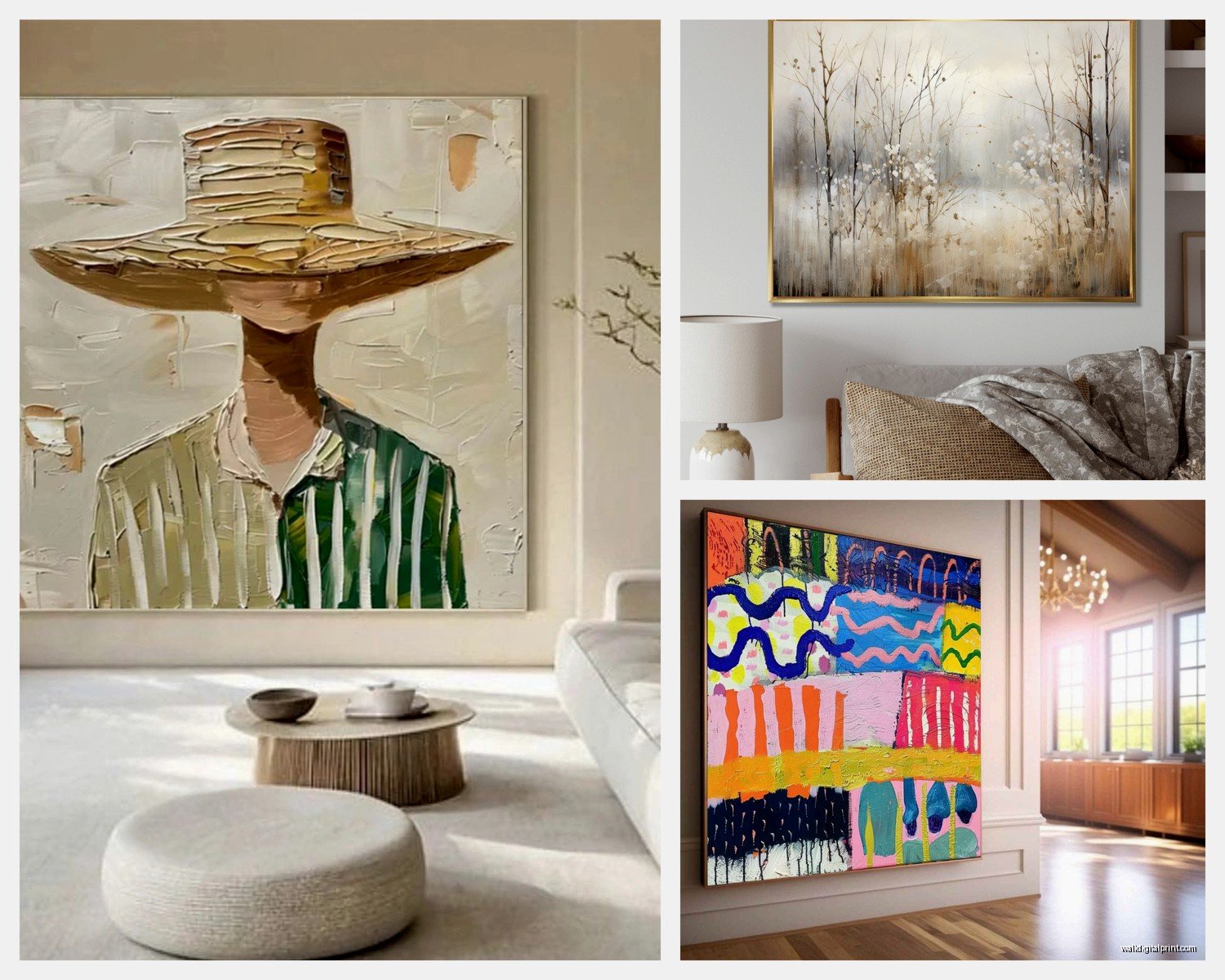
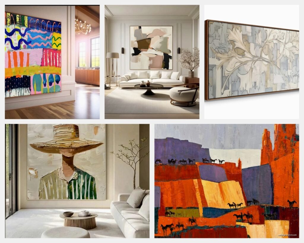
So I’ve been obsessing over 60×60 wall art lately and honestly it’s kinda taken over my life because once you start seeing these large square formats everywhere, you can’t unsee them. My client last week was like “I want something bold but not overwhelming” and I immediately thought 60×60 because it’s that perfect size that makes a statement without screaming at you when you walk in the room.
First thing you gotta know is that 60x60cm (that’s about 24×24 inches) is basically the sweet spot for square art. It’s large enough to be a focal point but not so massive that you need a forklift and three friends to hang it. I learned this the hard way with an 80×80 piece that required me bribing my neighbor with homemade cookies just to help me get it up the stairs.
Where These Actually Work Best
Living rooms are the obvious choice but here’s what I’ve found through trial and error. Above a console table? Perfect. You want about 6-8 inches of space between the top of the furniture and the bottom of the frame. I made the mistake of going 12 inches once and it looked like the art was floating away from the table, just awkward.
Bedrooms are trickier than you’d think. If you’re doing the above-the-bed thing, one 60×60 can look lonely unless your bed is like a full size or smaller. Queen and king beds… you might want to do two 60×60 pieces side by side with maybe 4-6 inches between them. Creates this modern gallery feel without being too matchy-matchy.
Oh and another thing, dining rooms are seriously underrated for this size art. I hung a 60×60 abstract piece in my own dining nook and my cat immediately decided the chair underneath was her new throne, but that’s beside the point. The square format somehow makes the space feel more intimate? I can’t explain the psychology but it works.
The Spacing Math Nobody Tells You
Okay so this is gonna sound weirdly specific but I’ve measured enough walls to know. Your 60×60 piece needs breathing room. Minimum 8 inches from any ceiling, at least 10 inches from doorframes or corners. I see people shove art right into corners all the time and it makes me twitchy.
The center of your artwork should be at eye level, which is supposedly 57-60 inches from the floor. But here’s the thing nobody mentions… whose eye level? I’m 5’6″ and my partner is 6’2″ so we compromised at 58 inches and honestly it looks fine for both of us. If you’re hanging in a hallway where people are walking, maybe go slightly higher because the viewing angle is different.
For gallery walls incorporating 60×60 pieces with smaller stuff, I usually do 3-4 inches between frames. Sometimes I go rogue and do 2 inches if I want a more clustered European salon style look. My art curator friend would probably kill me for saying this but… just eyeball it, move stuff around, take pics with your phone from different angles before you commit to drilling holes.
Frame Choices That Don’t Suck
Canvas wraps without frames can work but they give me DIY college apartment vibes unless the artwork itself is really sophisticated. I’m talking museum-quality prints or original paintings, not that mass-produced stuff from HomeGoods (no shade, I own three things from there).
Floating frames are having a moment and I get why. They create this shadow gap between the art and frame that adds depth. For 60×60 pieces, go with a frame that’s at least 1.5 inches deep, otherwise it looks flimsy. I used a 0.75 inch frame once and regretted it immediately, looked like I was trying to save money.
Black frames are classic and work with literally everything. White frames are great for Scandinavian minimal vibes. Natural wood frames… okay this is where I get picky. Light oak or ash for modern spaces, walnut for traditional or moody interiors. That reddish cherry wood everyone loved in 2005? We’re not doing that anymore.
Metal frames in brass or matte black are *chef’s kiss* for abstract or photographic work. They’re pricier but worth it if you’re investing in actual art and not just decorating.
What Actually Looks Good at This Size
Abstract art is the easy answer because it’s forgiving and works in most spaces. Bold color blocks, gestural brushstrokes, geometric patterns. I just curated a show last month with mostly 60×60 abstracts and they sold faster than anything else.
Photography can be stunning but you need high resolution images. Like seriously high res. A blurry or pixelated print at this size looks terrible and cheap. I once made the mistake of blowing up a phone photo to 60×60 for a mock-up and… yeah, no. Get professional prints or at least start with images that are 300 dpi minimum.
Line drawings and minimalist illustrations work surprisingly well. Single-line faces, botanical sketches, architectural drawings. There’s something about the simplicity that scales beautifully to this format.
Textural pieces like fiber art, mixed media, or heavily textured paintings are incredible at 60×60. The size lets you appreciate all those details without overwhelming the space. I have a textured piece in my office that’s basically layers of plaster and paint and people always want to touch it.
Colors and How They Change Rooms
Warm tones (reds, oranges, terracotta) make spaces feel cozy but can also make rooms feel smaller, so be careful in tight spaces. I used a burnt orange 60×60 piece in a small bedroom once and the client loved it but admitted it made the room feel more intimate, which was actually what they wanted but might not be your vibe.
Cool tones (blues, greens, grays) tend to recede visually so they can actually make a wall feel further away. Great for small rooms where you want to create depth. My living room has this massive blue-gray abstract and I swear it makes the whole space feel bigger.
Neutrals are safe but can be boring unless there’s interesting texture or composition. Beige and cream and white… they work as part of a larger gallery wall but a single 60×60 neutral piece needs to be really special or it’ll just disappear.
Wait I forgot to mention, black and white photography or graphics at 60×60 are basically foolproof. They add sophistication without committing to a color scheme. Perfect if you’re the type who changes throw pillows every season.
Hanging Hardware That Won’t Fail You
D-rings on the back of the frame are standard but annoying because you gotta level the wire perfectly. I prefer french cleats for anything this size and heavier. They’re more secure and the art hangs flush against the wall.
Wire hanging is fine for lighter pieces under 10 pounds but at 60×60, especially with glass, you’re probably over that. Use braided steel wire rated for at least 30 pounds even if your piece is lighter. Better safe than sorry and also your downstairs neighbor will appreciate not getting artwork dropped on their head.
Command strips… okay controversial opinion but I’ve used the heavy-duty ones for lightweight canvas pieces and they work. You need like 8-10 strips for a 60×60 though, and you gotta follow the instructions exactly. Press for 30 seconds, wait an hour before hanging, all that stuff. I got lazy once and the piece fell at 3am and scared my dog so badly she wouldn’t go near that wall for a week.
For drywall, you absolutely need wall anchors unless you’re hitting a stud. Toggle bolts are my go-to because they distribute weight properly. Those plastic anchors that come free with frames? Garbage. Don’t trust them with anything you care about.
Lighting Makes or Breaks Everything
Picture lights are classic but can look dated depending on your style. If you’re going for traditional or transitional, brass or bronze picture lights work great. Modern spaces… I’d skip them unless you find really sleek LED versions.
Track lighting or adjustable spotlights give you flexibility. You can highlight the art without permanent fixtures attached to the frame. I installed track lighting in my hallway and it’s genuinely one of the best decisions I’ve made because I can adjust when I swap art.
Natural light is tricky because UV rays will fade artwork over time. If your 60×60 piece is near a window, get UV-protective glass or acrylic. Costs more upfront but worth it if you’re investing in actual art. I learned this the expensive way with a print that faded on one side because afternoon sun hit it directly.
Oh and another thing, avoid hanging directly across from windows where you’ll get glare. Nothing worse than having a gorgeous piece that you can’t see half the day because of reflection. Slightly offset or on an adjacent wall usually solves this.
Styling Around Your 60×60 Piece
Less is more honestly. The piece is already substantial so you don’t need to flank it with matching sconces and a perfectly styled console table situation. Sometimes just the art is enough.
If you do want to add elements, go asymmetrical. Small sculpture on one side, stack of books on the other. Creates visual interest without looking too staged. I’m watching this design show while typing this and they just did the symmetrical thing and it looks like a hotel lobby, so… yeah.
Plants can work near large art but make sure they’re not blocking the view. A tall floor plant to the side? Great. A bushy monstera right in front? You’ve just paid for art you can’t see.
Don’t match your art to your throw pillows exactly. I see this all the time and it’s very 2010. Pull one accent color from the artwork for accessories but don’t go matchy-matchy with everything. Looks catalogue-staged instead of lived-in.
Budget Reality Check
You can find decent 60×60 prints starting around $100-150 with basic framing. Custom framing will run you another $150-300 depending on materials. So budget at least $250-450 for a proper piece.
Original art at this size starts around $500 and goes up to… well, infinity basically. I’ve sold 60×60 originals for $3000+ but I’ve also found amazing emerging artist work for $600-800. Depends what you’re looking for.
Print-on-demand sites let you upload your own images or buy from their libraries. Quality varies wildly so read reviews. I’ve had good luck with some and terrible experiences with others where the colors were completely off.
Thrift stores and estate sales sometimes have great frames you can repurpose. I found a perfect 60×60 frame for $30 at an estate sale and just needed to clean it up and add new art. Takes more time but if you’re into the hunt it’s worth it.
Common Mistakes I Keep Seeing
Hanging too high is like the number one issue. People think higher is better and then you need a stepladder to appreciate the art. Eye level means eye level, not ceiling level.
Choosing art that matches your couch exactly. Your couch will eventually need replacing and then you’re stuck with art that doesn’t work anymore. Pick art you genuinely love independent of your current furniture.
Buying multiple 60×60 pieces that are too similar. Unless you’re intentionally doing a series, mix up your styles and subjects. Three abstract pieces in the same color family just looks like you couldn’t make a decision.
Not considering the room’s function. A super intense emotional piece might not be great for a bedroom where you want to relax. Save that for the living room or office where it can spark conversation.
Okay I think that covers most of what I’ve figured out through years of hanging way too much art in way too many spaces. The main thing is just start somewhere and don’t be afraid to move stuff around until it feels right. Holes in walls can be patched and honestly nobody notices them as much as you think they do.