Wall Art Guide, Wall Art Tutoriels
Vintage Botanical Wall Art: Antique Plant Illustrations
May
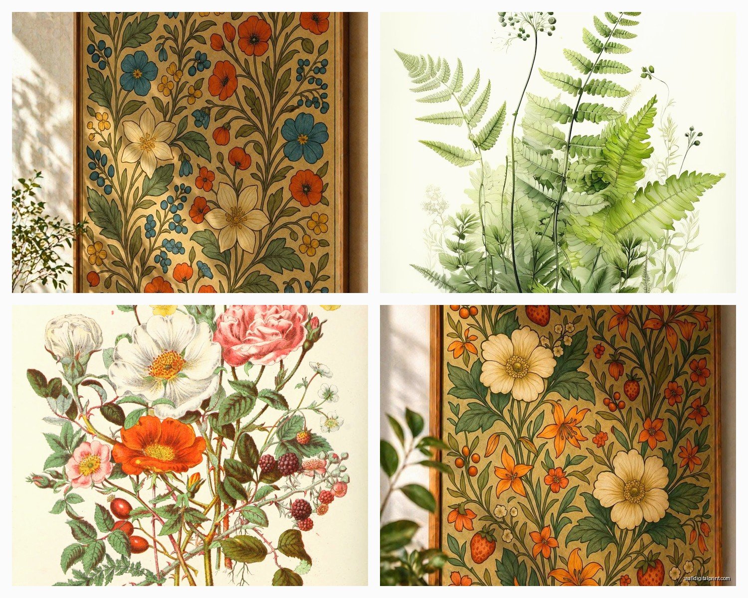
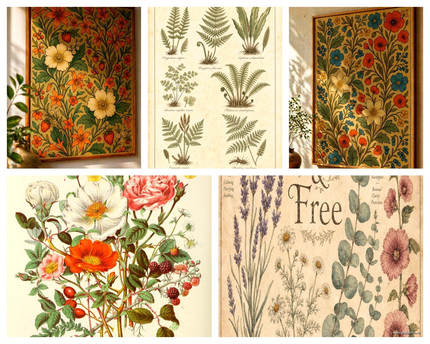
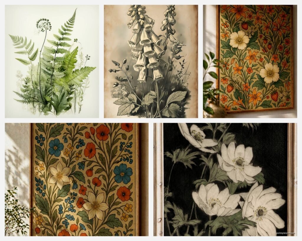
So I’ve been obsessing over vintage botanical prints lately and honestly it started because I found this incredible 1880s fern illustration at an estate sale for like $12 and now my apartment looks like a Victorian greenhouse but in a good way I promise.
Where to Actually Find These Things
Okay so first thing, you gotta know where to look because not all botanical prints are created equal. Etsy is obviously the easy answer but hear me out—the pricing is all over the place. I’ve seen the exact same print listed for $25 and $180 depending on whether the seller knows what they have.
Estate sales are genuinely your best bet if you have time on weekends. I go to at least two a month now and the trick is to show up on the last day, like Sunday afternoon when they’re desperate to clear stuff out. Found an entire portfolio of pressed botanical studies for $30 last month because nobody wanted to deal with the weird brown folder. My cat immediately tried to sleep on them which was stressful.
Antique shops can be hit or miss. The ones in trendy neighborhoods know exactly what these are worth now. But I found this place about 40 minutes outside the city that had a whole box of loose illustrations from old encyclopedias for $3 each. The owner was watching some cooking show and barely looked up when I bought like fifteen of them.
Online you want to check: eBay (search “antique botanical lithograph” not just botanical print), Ruby Lane for higher end stuff, even Amazon surprisingly has reproduction prints that look pretty authentic if you’re not trying to be precious about it. Sometimes Chairish has framed ones but they price them like they’re made of gold.
How to Tell What’s Actually Old vs Printed Last Week
This is gonna sound weird but smell it. Real antique paper has this specific musty vanilla smell that’s hard to fake. If it smells like nothing or like fresh printer paper, it’s new.
Look at the edges—old paper gets this soft deckled edge thing happening naturally over time. New prints trying to look old will have artificially torn edges that look too perfect somehow. The aging should be uneven, with maybe some foxing (those brown spots) in random places, not artfully distributed.
Check the printing method. Real antique botanicals were usually lithographs or engravings. You can see tiny dots or lines when you look close. Modern digital prints have this flat perfect quality that’s almost too crisp. I keep a magnifying glass in my bag now which makes me feel like a detective but whatever.
The paper thickness matters too. Antique book plates were printed on thicker stock than modern posters. If it feels flimsy, it’s probably a reproduction.
But Also Reproductions Are Fine
Honestly unless you’re spending serious money or reselling, good reproductions work perfectly fine for decorating. I have a mix of real antiques and nice prints from this Etsy shop that does museum-quality reproductions and nobody can tell the difference from across the room. Save your money for the ones that really matter to you.
What to Actually Buy
Okay so the most versatile ones are the simple black and white engravings. They go with literally everything and you can group them in huge galleries without it looking chaotic. I have like nine different fern varieties in my hallway and it just works.
Colored lithographs are gorgeous but trickier. The colors have usually faded to these soft muted tones which is beautiful but you gotta be careful mixing them with modern bright stuff. I learned this the hard way when I put a bright coral pillow near my rose prints and it looked terrible.
My Favorite Types
- Ferns and foliage—super popular right now but also timeless, tons of variety in shapes
- Medicinal herb illustrations—these often have handwritten Latin names which adds character
- Fruit and vegetable studies—perfect for kitchens obviously but I have strawberry prints in my bedroom and love them
- Tree bark and wood grain studies—weirdly modern looking, very graphic
- Mushroom and fungi illustrations—having a moment right now, can look almost abstract
- Seaweed and marine plants—if you want something different from the typical leaf prints
Size-wise, book plate sized ones (usually like 8×10 or 9×12) are easiest to find and work with. You can do big gallery walls with them. The huge specimen prints are stunning but expensive and harder to place in normal-sized rooms.
Framing Without Spending Your Entire Paycheck
Custom framing is insane expensive. Like $200+ per frame easily. Don’t do it unless you have one really special piece.
IKEA frames actually work great for this—the RIBBA and SILVERHÖJDEN lines come in standard sizes and they have that simple gallery look. I use the black ones mostly but the gold ones can be really pretty with colored botanicals. The white ones feel too modern for antique prints in my opinion.
thrift stores always have random frames. I found eight matching gold frames for $4 each last year and they’re perfect for my dining room gallery wall. You’ll probably need to clean them and maybe spray paint them but that’s easy.
Oh and another thing—you don’t always need glass. I have several unframed prints just mounted on mat board and pinned to the wall with brass pins. It’s more casual but works in certain spaces. My client was horrified when I suggested this but then she actually did it in her mudroom and loves it.
Matting Tricks
White mats are classic and make the prints feel more formal and museum-like. Cream or off-white mats feel warmer and work better if your prints have aged to that yellowy tone. I cut my own mats now because buying pre-cut ones got expensive—got a mat cutter on Amazon for like $35 and watched YouTube videos to learn. It’s not that hard once you do a few.
Double matting (two layers of mat board in different colors) looks really professional and high-end. I do a wider cream outer mat with a thin dark green or burgundy inner mat for botanical prints. Makes them look like they came from a fancy gallery.
How to Arrange Them Without Losing Your Mind
Okay so gallery walls stress everyone out but here’s what actually works. Lay everything out on the floor first. Take a picture. Move stuff around. Take another picture. Do this for like an hour while watching TV until it looks right in photos.
The classic grid is easiest—same size frames, equal spacing, done. I use 2-3 inches between frames usually. More than that starts looking disconnected.
For mixed sizes, I usually do one large anchor piece and build around it. Or I’ll do a horizontal line where all the bottom edges or centers align even if the frames are different sizes.
Salon style (frames of all different sizes clustered together) looks amazing but is the hardest to pull off. Start from the center and work outward. Keep the spacing consistent even if the frame sizes aren’t. I spent four hours on my living room salon wall and had to patch like twenty nail holes before I got it right.
Room-Specific Ideas
Bedroom: I have a simple grid of six pressed flower prints above my bed. Soft and calming. Avoid anything too spiky or aggressive looking—save the thistle prints for other rooms.
Bathroom: Ferns and moisture-loving plants make sense thematically. Make sure you seal them well or keep them away from direct shower steam. I had a print get wavy from humidity which was annoying.
Kitchen: Herbs, vegetables, fruit tree blossoms. I did a whole wall of different apple variety illustrations in my kitchen and people always comment on it. Citrus prints are really pretty too.
Home office: Tree studies, architectural plant drawings, anything more graphic and structured. The Latin botanical names look smart and serious.
Dining room: Go big here. This is where you can do dramatic salon walls or large-scale arrangements. I have floor-to-ceiling botanical prints in my dining room and it feels like eating in a garden library.
Hallways: Perfect for long horizontal arrangements. I did twelve matching fern prints in a single line down my hallway and the repetition is really satisfying.
Mixing Botanicals with Other Art
This took me forever to figure out but botanicals actually mix really well with other stuff if you’re thoughtful about it. I have botanical prints next to abstract art, vintage photographs, even a few modern line drawings and it works because I kept the frames consistent.
Black and white botanicals are the most mixable. They’re neutral enough to not compete with colorful modern pieces. The colored ones need more careful placement—I usually group them together rather than scattering them.
Wait I forgot to mention—botanical prints look amazing with other natural elements. Dried flowers, pressed leaves in frames, even framed fabric with botanical patterns. I have a whole wall that mixes antique prints with pressed Queen Anne’s lace I did myself and some vintage botanical wallpaper samples.
Caring for Actual Antique Prints
Keep them out of direct sunlight. UV will fade them so fast. I learned this when I put a beautiful rose lithograph in a sunny window and six months later it was basically beige.
If you’re storing them, use acid-free tissue paper between prints. Stack them flat, never rolled. Climate controlled storage if you’re serious about preservation but honestly my extras live in a portfolio under my bed and they’re fine.
Don’t try to “clean” old prints yourself. I tried to remove a smudge once with a barely damp cloth and the ink lifted. Just leave them as they are unless you want to pay a conservator.
The foxing and age spots are actually desirable to collectors so don’t stress about them. They prove authenticity and add character. I actually prefer prints with some visible age.
Budget Breakdown from My Experience
You can absolutely do this cheap. My first botanical wall cost maybe $80 total—$30 for six prints at an estate sale, $35 for IKEA frames, $15 for mat board I cut myself.
Or you can spend serious money. I have one client who dropped $3000 on three original 18th century hand-colored botanicals and honestly they’re stunning and probably a good investment.
Most people should aim somewhere in the middle. Like $30-60 per framed print is reasonable for nice reproductions or common antique book plates. Save up for one or two really special expensive pieces if you want but fill in the rest with affordable options.
Common Mistakes I See People Make
Hanging them too high. The center of your arrangement should be at eye level, like 57-60 inches from the floor. Everyone hangs stuff way too high for some reason.
Not committing to enough of them. One lonely botanical print looks sad. You need at least three, preferably more. They have more impact in groups.
Mixing too many different frame styles. Pick 2-3 max frame types and stick with them. All black, all gold, or black and wood, whatever. But not black AND gold AND silver AND white all together.
Choosing prints that are too similar. If you’re doing a gallery wall, vary the plant types and compositions. All roses gets boring. Mix in some leaves, stems, full plants, detail studies, different perspectives.
Forgetting about scale. Tiny prints in a huge room disappear. Large prints in a small bathroom overwhelm. I usually do medium to small in bathrooms and bedrooms, larger in living spaces and dining rooms.
Oh and another thing—not considering the wall color. Botanicals on white walls look crisp and gallery-like. On colored walls they can either pop beautifully or get lost depending on the combo. I have sage green walls in my bedroom and cream-matted botanicals look incredible against them. But bright botanicals would’ve been too much.
Anyway that’s basically everything I’ve figured out over the past year of becoming lowkey obsessed with these things. Start small, maybe get a few inexpensive ones and see how you like living with them before you invest heavily. They’re genuinely easier to work with than most art because the subject matter is so universally appealing and they fit most decorating styles from traditional to modern farmhouse to even minimalist if you keep them simple.