Wall Art Guide, Wall Art Tutoriels
Pink Abstract Wall Art: Feminine Modern Non-Representational
May
So I’ve been working with pink abstract pieces for like three years now and honestly it’s the one category where clients either GET it immediately or they’re totally scared of it, there’s no in between.
Let me start with what actually works because I just finished a condo last month where we did an entire pink abstract moment and it turned out way better than even I expected. The trick with these pieces is understanding that pink reads differently depending on what time of day you’re looking at it and what’s around it. Natural light makes dusty rose look almost gray sometimes, while artificial warm light turns the same piece super peachy. I learned this the hard way when a client texted me at 9pm saying her new artwork looked “wrong” and I had to explain that she was seeing it under different lighting than the showroom.
Picking the Right Pink Tone
Okay so there are basically four pink families in abstract art and you gotta figure out which one matches your vibe. There’s millennial pink which is that grayish-dusty situation, hot pink which is obviously very Barbie and bold, blush which leans peachy-cream, and then rose which has brown undertones. My cat knocked over my coffee while I was color matching samples last week and honestly the stain was a perfect example of rose-toned pink… anyway.
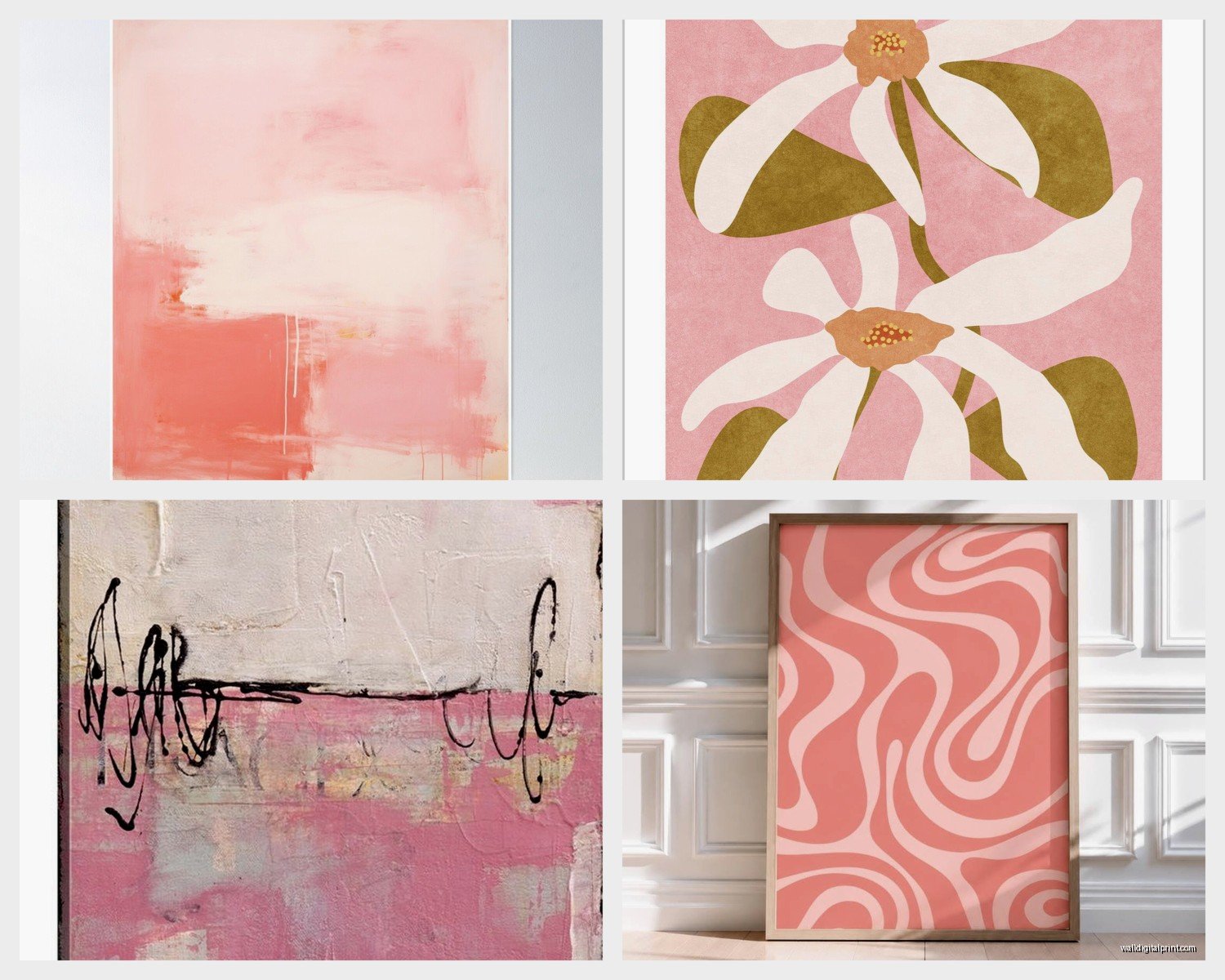
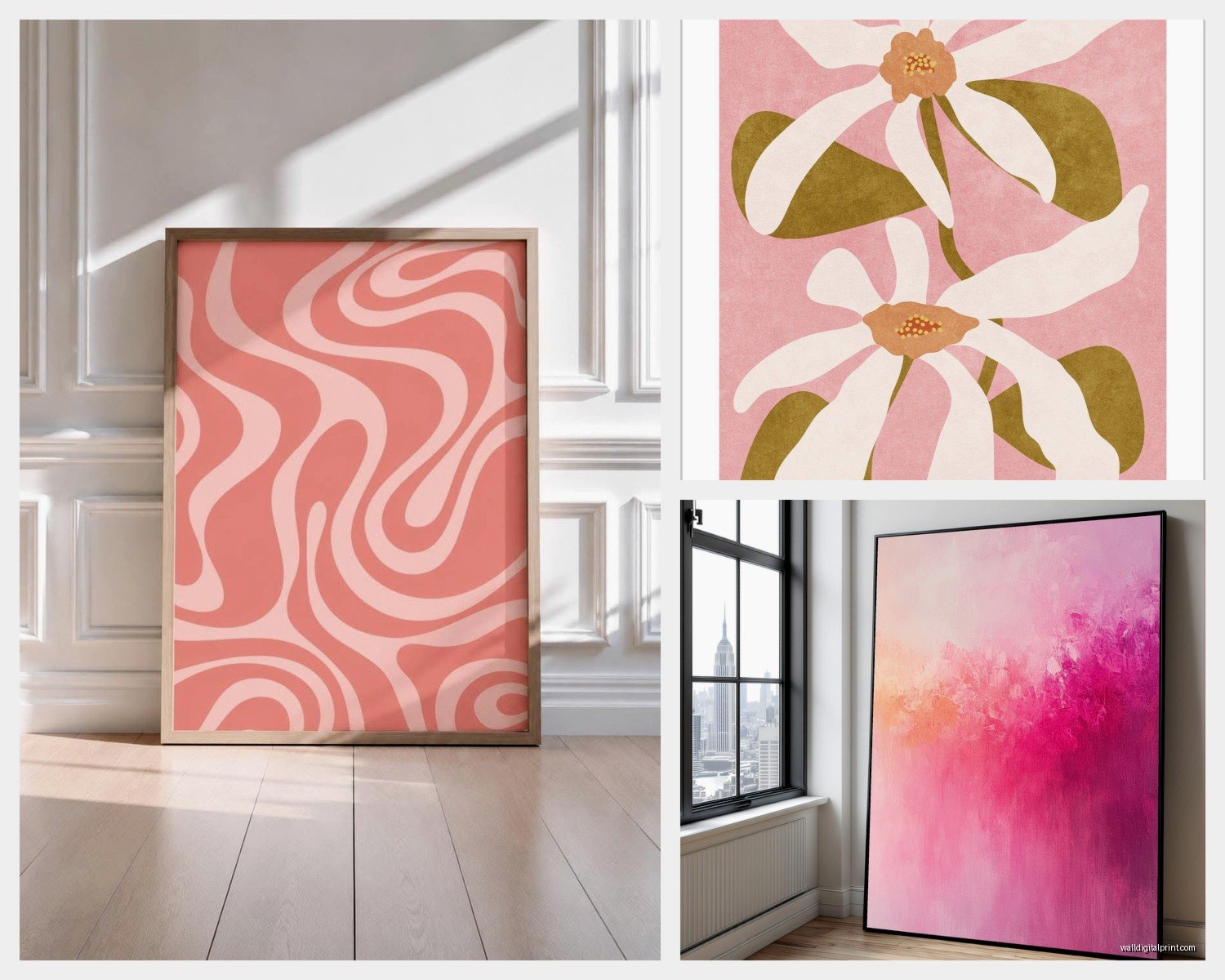
The millennial pink/dusty rose works in literally almost every space because it’s so muted. I use it in masculine spaces all the time and nobody even clocks it as “pink” really. It reads as neutral. If your room has gray, white, black, navy, or olive green – this is your pink. The abstract quality makes it even more versatile because there’s no recognizable imagery to distract from the color harmony.
Hot pink though… that’s a commitment piece. I only recommend it if you’ve already got other bold color in the room OR if you’re intentionally creating a focal point. Like last spring I did this living room where everything was white and natural wood and we threw up this massive hot pink abstract with some orange undertones and it became the whole personality of the room. But you can’t halfass hot pink, you know?
Size Matters More Than You Think
This is gonna sound weird but I measure the wall space while lying on the couch or sitting where you’d actually BE in the room. Standing measurements lie to you. When you’re seated, your eye level changes and suddenly that piece you thought was big enough looks tiny and awkward.
For over a sofa, you want the art to be roughly 2/3 to 3/4 the width of the sofa. I see people put these tiny 24×36 pieces over a giant sectional and it just floats there looking lost. With abstract art especially, going bigger almost always works better because the non-representational shapes need space to breathe and make sense to your eye.
I did a bedroom last month where we went HUGE – like 60×40 inches – with this soft pink and cream abstract above the bed and everyone who sees it asks about it. The scale makes it feel intentional and gallery-like instead of “I needed to fill wall space.” Oh and another thing, if your ceiling height is 9 feet or more, you probably need to go at least one size up from what you’re thinking.
Multi-Panel Versus Single Canvas
Multi-panel sets (diptychs or triptychs) work better in modern spaces with clean lines. They create visual rhythm. Single large-scale pieces work better in traditional or eclectic spaces where you want one strong statement. I personally prefer single canvas for pink abstracts because the color flow isn’t interrupted, but I have clients who swear by the three-panel setup.
If you go multi-panel, make sure they’re spaced 2-4 inches apart, not more. I’ve seen people hang them like a foot apart and it just looks confused.
What to Actually Pair With Pink Abstract Art
Okay so this is where people get nervous. They think pink abstract needs super feminine everything else but that’s actually when it gets too matchy and boring.
Best combinations I’ve done:
– Pink abstract with black leather furniture (adds edge)
– Pink with natural wood and cream (soft and collected)
– Pink with emerald green accents (surprisingly sophisticated)
– Pink with brass/gold metallics (classic)
– Pink with navy blue (my personal favorite lately)
The worst? Pink with too much white and light gray. It ends up looking washed out and builder-grade somehow. You need contrast or warmth to make the pink feel intentional.
Textures matter a ton too. If you’ve got a soft pink abstract piece, pair it with nubby linen, velvet, or chunky knit throws. The texture contrast makes the smooth canvas feel more dynamic. I’ve got this thing where I always add one unexpected rough texture – like a jute rug or raw wood coffee table – when working with feminine abstracts because it grounds everything.
Frame or No Frame
Most modern non-representational pieces look better unframed or with just a simple float frame. The gallery-wrapped canvas where the image continues around the edges is ideal for pink abstracts because it keeps that contemporary feeling.
If you DO frame, stick with natural wood, white, or black. Never gold or ornate frames with abstract work unless you’re deliberately going for that high-low mix, which is tricky to pull off. I tried a gilded frame on a pink abstract once thinking it would feel luxe and it just looked confused, like the art couldn’t decide what era it belonged to.
Float frames in light wood are probably the safest bet if you want some definition but don’t want to overpower the piece.
Placement Strategies By Room
Living room: Above the sofa is obvious but also consider the wall opposite your entrance. That’s what guests see first and a pink abstract there sets the tone immediately. If you’ve got a fireplace, flanking it with two medium pink abstracts can work, but make sure they’re identical or at least same-same size.
Bedroom: Above the bed is the move, but I’ve also done really beautiful moments above dressers or on the wall opposite the bed so it’s the first thing you see when you wake up. Something about soft pink abstracts in bedrooms just works – maybe because the non-representational quality is calming? Not sure, but every bedroom client who’s tried it has kept it.
Dining room: People forget about dining rooms but a large pink abstract on the main wall creates this elegant-but-not-stuffy vibe. Especially good if your dining setup is traditional because it modernizes without clashing.
Home office: Wait I forgot to mention this earlier but pink actually helps with creativity and calm, so home offices are perfect for softer pink abstracts. Not hot pink though – too stimulating. Go for the muted blush or dusty rose tones.
Lighting Your Pink Abstract
This is critical and nobody talks about it enough. Pink shifts dramatically under different lighting temperatures.
Warm white bulbs (2700-3000K) make pink look more coral and peachy. Cool white bulbs (4000K+) make pink look more true-to-color but can also make it look washed out if the pink is already pale. I almost always recommend 3000K for rooms with pink art – it’s that sweet spot.
If you’re gonna do picture lights or track lighting, angle them at about 30 degrees from the wall to avoid glare on the canvas. And honestly? Sometimes no direct lighting is better. Natural daylight plus ambient room lighting lets the piece integrate naturally instead of looking like a museum exhibit.
My client last year had this pink and white abstract in her bedroom and she put it on a dimmer-controlled wall sconce setup so she could adjust the mood. Game changer for nighttime versus morning viewing.
Budget Reality Check
Original pink abstracts from emerging artists start around $200-400 for smaller pieces and can go up to several thousand for established artists. High-quality prints and canvas reproductions run $100-300 depending on size. Society6, Minted, and Etsy have tons of options in the $150-400 range that look legit.
I’ve bought from all of the above and honestly unless you’re looking super close, a well-printed canvas reproduction looks basically identical to an original for most people. The texture isn’t quite the same but if you’re not a paint-texture person, you won’t care.
For large-scale pieces (over 48 inches), expect to spend at least $300-600 even for prints because the printing and shipping costs jump significantly. It’s worth it though – the impact of a large pink abstract is worth way more than the cost.
Where I Actually Buy
Etsy for unique pieces from individual artists – search “pink abstract canvas” and filter by size. You’ll find stuff nobody else has.
Society6 for trendy designs that ship fast. Their quality is consistent.
Local art fairs if you want original work and can negotiate. I’ve found incredible deals at neighborhood art walks.
HomeGoods/TJ Maxx sometimes has good abstract canvases but it’s hit or miss. I check every few weeks when I’m already there.
Common Mistakes People Make
Hanging it too high. The center of the artwork should be at 57-60 inches from the floor, which is average eye level. Over furniture, leave 6-8 inches between the furniture top and the bottom of the art.
Choosing pink that fights with their wall color. If you have beige walls with yellow undertones, cool-toned pink will look off. Match your undertones.
Getting scared and going too small. I promise you, bigger almost always looks better with abstracts.
Thinking they need to “match” the pink exactly in other decor. You don’t. In fact, pulling in complementary colors works better. If your abstract has dusty pink and cream, add sage green or soft blue elsewhere in the room instead of more pink.
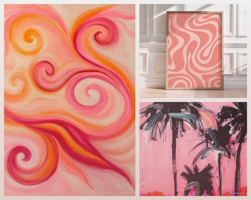
Not considering the mood of the brushstrokes or shapes. Aggressive, bold strokes feel energetic. Soft, blended areas feel calming. Make sure the energy of the piece matches what you want to feel in that room.
Okay so that’s basically everything I’ve figured out through a lot of trial and error and client projects. The main thing is don’t overthink it – if a pink abstract piece makes you feel something when you look at it, that’s probably the one. Trust your gut over design rules because you’re the one who has to live with it every day.