Wall Art Guide, Wall Art Tutoriels
Abstract Textured Wall Art: Dimensional Relief Surface
May
So I’ve been working with textured wall art for like three years now and honestly it’s one of those things that looks super intimidating but once you get the hang of placement and lighting it’s actually pretty straightforward.
The Whole Light Situation Nobody Talks About
Okay first thing – and I cannot stress this enough – the lighting makes or breaks dimensional relief art. I learned this the hard way when I hung this gorgeous piece in my client’s dining room and it looked completely flat until we adjusted the lighting. You need light hitting it from an angle, not straight on. Think like 30-45 degrees from the side. I usually do a picture light mounted above or if you’ve got track lighting that’s even better because you can adjust it.
My dog knocked over a lamp last week while I was testing positions and accidentally created the perfect shadow situation so like…sometimes chaos works? But seriously, get one of those clip lights from Home Depot for like $8 and test different angles before you commit to anything permanent.
Natural light is trickier because you can’t control it obviously. I had this whole thing where a client wanted her textured piece on the west wall and by 4pm it looked amazing but morning light? Dead flat. We ended up moving it to a perpendicular wall where it got indirect light all day and that worked way better.
Size and Scale Without Overthinking It
The rule I use is pretty simple – your art should take up about 2/3 to 3/4 of the furniture width below it. So if you’ve got a 6-foot sofa, you’re looking at 4-5 feet of art width. But here’s where textured pieces are different from flat art: they have actual physical presence, like they project into the room, so they can feel bigger than same-sized prints.
I’ve found that textured pieces with deep relief (like 2+ inches of dimension) can actually go slightly smaller than you’d think because they command so much visual weight. Had a 3×3 piece in my own living room above a console table and people always think it’s bigger than it is because of the shadows and depth.
Height Placement
Center of the artwork at 57-60 inches from the floor. That’s museum standard and it actually works for most spaces. But – and this is gonna sound weird but – for heavily textured pieces I sometimes go 2-3 inches higher because you want people’s eye line to catch those shadows and dimension. If it’s too low the texture reads differently.
What Actually Works in Different Rooms
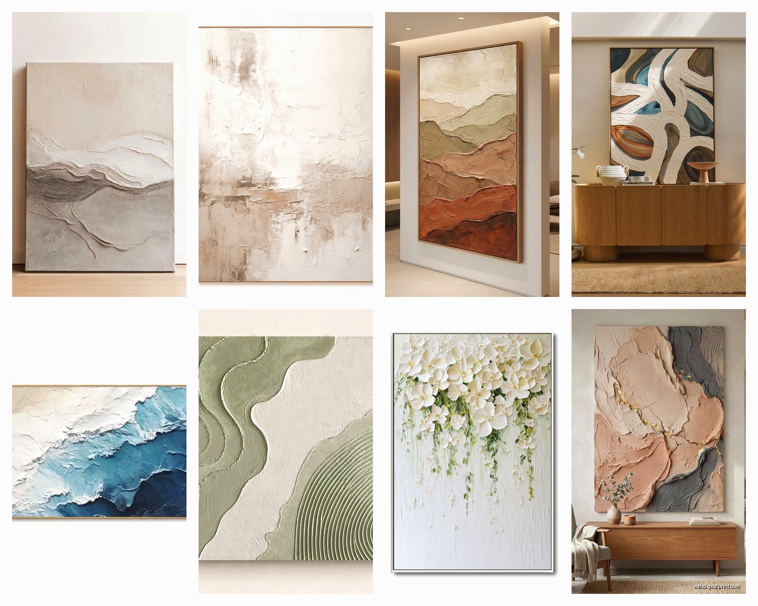
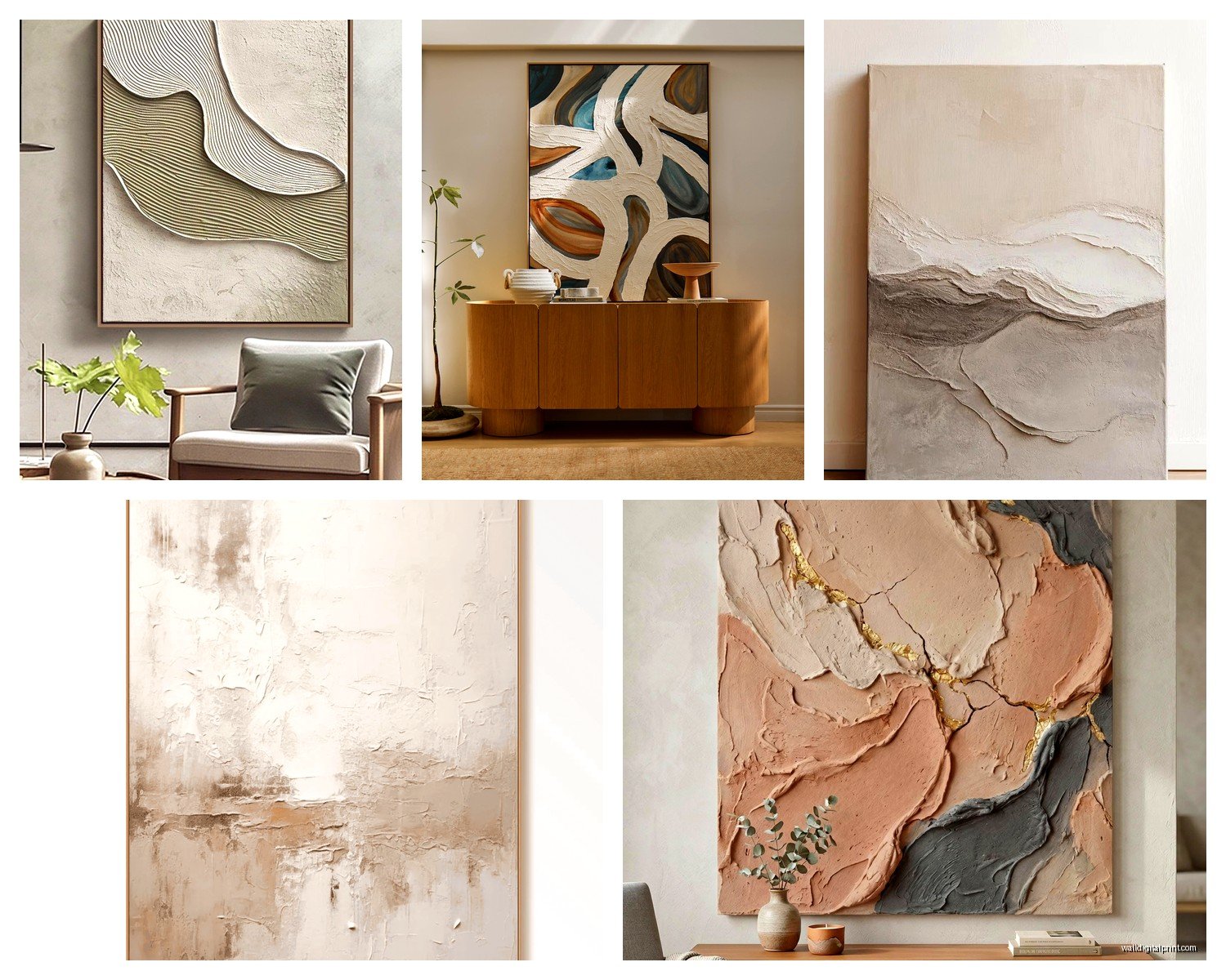
Living rooms are the easiest honestly. Large-scale abstract relief work over the sofa or fireplace is pretty foolproof. I’m obsessed with neutral textured pieces in cream, white, or gray because they add so much interest without competing with anything else in the room. One client has this all-white textured piece that looks completely different throughout the day as the light changes and it’s basically free entertainment.
Bedrooms – this is where I see people mess up the most. They go too busy with the texture. You want something calming, not something your eyes are gonna analyze when you’re trying to sleep. Subtle relief work, maybe horizontal lines or gentle wave patterns. I put a piece with soft circular patterns in my bedroom and it’s perfect because it’s interesting but not demanding.
Dining Rooms
Go dramatic here. Seriously. Dining rooms can handle bold textured pieces because you’re not in there 24/7. Deep relief, strong shadows, metallic finishes – all fair game. Just make sure it’s sealed properly because if you’re like me and gesture wildly while telling stories, you might splash wine on it. Not that this has happened. Multiple times.
Bathrooms are underrated for textured art but you gotta be careful about moisture. Sealed pieces only, and I mean properly sealed. Resin-coated works great. I have a small textured piece in my powder room and it’s a whole conversation starter but it’s specifically rated for humid environments.
Materials and Finishes That Don’t Suck
Plaster-based relief is classic and I love it for traditional or transitional spaces. It’s heavy though – you need serious hanging hardware. I’m talking heavy-duty D-rings and wall anchors rated for like 50+ pounds even if your piece is lighter. Better safe than having it crash down at 3am which has definitely never happened to me…
Wait I forgot to mention – wood relief panels are having a moment right now. They’re lighter than plaster which is nice for hanging, and they bring warmth. I just finished a project with these carved wood panels in a minimalist space and the contrast between the clean lines and organic texture was *chef’s kiss*.
Resin and Mixed Media
Resin pieces are cool because they can incorporate color and dimension together. The glossy finish catches light differently than matte plaster. But here’s the thing – cheaper resin can yellow over time, especially in direct sunlight. Learned that one the hard way. Look for UV-resistant resin if you’re going this route.
Metal relief work – copper, brass, aluminum – adds a whole different vibe. Industrial, modern, sometimes a bit art deco depending on the pattern. They’re durable and don’t need much maintenance which I appreciate. Just dust them occasionally and you’re good.
Hanging Hardware That Won’t Fail You
Okay so funny story, I used to just use whatever hanging kit came with the artwork and that’s how I ended up with a hole in my wall and a damaged piece. Now I always upgrade the hardware.
For pieces under 20 pounds you can probably get away with regular picture hangers but anything textured is usually heavier than it looks. I use:
- Heavy duty D-rings screwed into the frame, not those sawtooth hangers
- Picture wire rated for 3x the actual weight
- Wall anchors appropriate for your wall type – drywall anchors for drywall, masonry anchors for brick or concrete
- A level because eyeballing it never works no matter how many times I think it will
French cleats are amazing for really heavy pieces. They distribute weight evenly and make adjusting position easier. You can make them yourself if you’re handy or buy them pre-made. I keep a bunch in different sizes in my storage unit.
The Color and Style Coordination Thing
Neutral textured pieces work with literally everything which is why I push clients toward them when they’re unsure. White on white, cream on cream, gray on gray – the dimension creates the interest so you don’t need color.
But if you want color, pick up one accent color from your room. Like if you’ve got blue pillows, a textured piece with blue elements ties it together without being matchy-matchy. I generally avoid trying to match too precisely because it ends up looking forced.
Mixing Textures
This is where it gets fun. Textured wall art plays really well with other textures in the room – chunky knit throws, velvet pillows, natural wood furniture. The key is varying the scale of textures. If your art has fine detailed relief, go chunky with your textiles and vice versa.
I had a client who was watching that restoration show while we were planning her space and got inspired to mix really rough plaster wall art with smooth leather furniture and it actually worked perfectly. The contrast was the whole point.
Maintenance Real Talk
Textured pieces collect dust in all those crevices and it’s annoying. I use a soft brush attachment on a vacuum on low setting, or one of those microfiber dusters. For deeper cleaning maybe twice a year I use a barely damp cloth and immediately dry it.
Don’t use cleaning products unless the manufacturer specifically says it’s okay. I learned this when I tried to clean a plaster piece with wood cleaner (don’t ask why I thought this was smart) and it left this weird residue that took forever to fix.
Sealed pieces are obviously easier to maintain. If you’re buying or commissioning something custom, ask about sealing options. A good polyurethane or resin seal makes cleaning so much simpler.
DIY vs Buying and Budget Breakdown
You can totally DIY textured wall art with joint compound, canvas, and some patience. I made my first pieces this way and they’re still hanging in my hallway. It’s messy and takes practice but there’s something satisfying about it. You’re looking at like $30-50 in materials for a medium-sized piece.
Buying from artists on Etsy or similar – prices range wildly. Small pieces start around $80-150, medium pieces $200-400, large statement pieces can be $500-2000+ depending on the artist and materials. I think the $300-600 range is the sweet spot for quality handmade work that’ll last.
Big Box Store Options
HomeGoods, TJ Maxx, West Elm – they all carry textured art now. Quality varies a lot. Check the hanging hardware it comes with and the overall construction. If it feels flimsy in the store it’s gonna look cheap on your wall. But I’ve found some decent pieces at HomeGoods for under $100 that work great in the right context.
Common Mistakes I See All the Time
Hanging it too high – seriously this is like 80% of bad art placement. That 57-60 inch center point rule exists for a reason.
Ignoring the room’s existing architecture. If you have heavy crown molding and ornate trim, a super modern geometric textured piece might clash. Not that you can’t mix styles but it takes more finesse.
Overcrowding the wall. Textured pieces need breathing room. Don’t surround them with a bunch of other stuff. Let them be the focal point.
Wrong lighting I already mentioned but it bears repeating because it’s THAT important.
Not considering the viewing distance. A piece with really fine detailed texture needs to be somewhere people can get close to it. Large bold relief works from across the room.
Oh and another thing – forgetting about the sides. A lot of dimensional pieces look unfinished from the side if the artist didn’t extend the texture around the edges. This matters if your art is visible from multiple angles. Either make sure the sides are finished or plan to frame it.
Styling Around It
Keep furniture and decor simpler when you’ve got bold textured art. The art is doing the heavy lifting visually so you don’t need much else. I usually do a couple of simple accessories on the surface below and call it done.
Layering can work but it’s tricky. Sometimes I’ll lean a smaller piece of art in front of a console table with the textured piece above, or add one sculptural object, but that’s it. More than that and it gets chaotic.
Plants are your friend with textured art. The organic shapes of plants complement the dimensional quality of the artwork. I almost always add a plant somewhere near textured pieces.
The whole thing with textured dimensional art is that it rewards attention to detail in placement and lighting but once you get it right it’s pretty low maintenance and adds so much character to a space that flat art just can’t match.