Wall Art Guide, Wall Art Tutoriels
Abstract Neutral Wall Art: Modern Earth Tone Designs
May
So I’ve been obsessing over abstract neutral wall art lately and honestly it’s changed how I look at entire rooms. Like, my living room was basically a sad beige box until I figured out the actual strategy behind picking these pieces.
Why Earth Tone Abstract Art Actually Works
Okay so here’s the thing nobody tells you – earth tone abstract pieces are basically the cheat code for making a room look expensive without actually spending a fortune. I learned this when a client wanted their Airbnb to look “high-end but not intimidating” and we went with these warm ochre and terracotta abstracts. The reviews literally started mentioning the art. Like who does that.
The reason it works is because earth tones – your terracottas, ochres, warm grays, that weird greige color everyone’s using now, soft browns – they create this visual anchor without screaming for attention. Your eye rests on them instead of getting exhausted.
What Actually Counts as Earth Tone Abstract
I’m gonna be real, I thought earth tones just meant brown for the longest time. But it’s actually:
- Terracotta and rust shades
- Ochre, mustard, that burnt yellow situation
- Warm grays (not the cold blue-grays)
- Taupe and greige
- Cream and ivory
- Muted olive and sage greens
- Clay pinks and dusty roses
- Deep chocolate browns
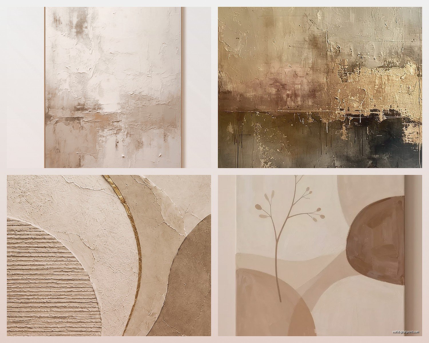
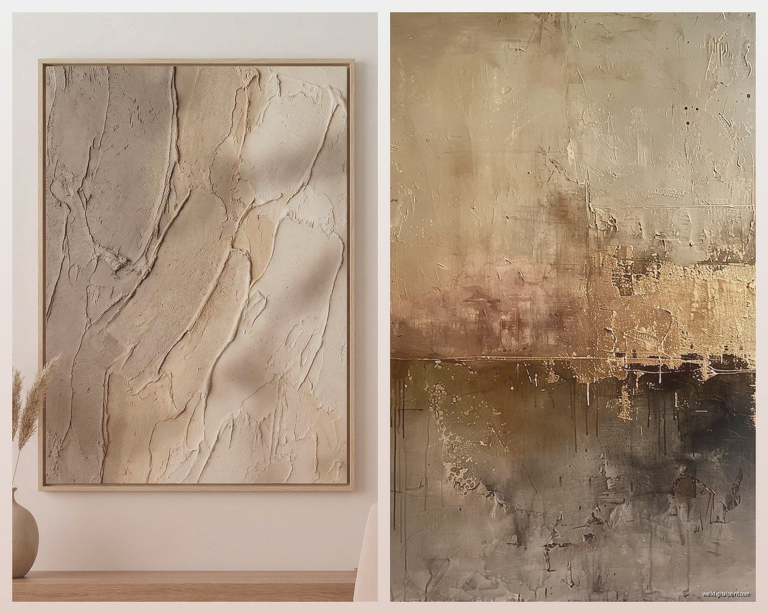
The abstract part means no recognizable objects. Just shapes, brushstrokes, textures, color blocks. Think Rothko but warmer, or those trending curved shape compositions you see everywhere now.
Size Actually Matters More Than You Think
So my sister bought this gorgeous abstract piece in terracotta and cream, spent like $400 on it, and it looked like a postage stamp on her wall. She got a 24×36 for a wall that needed at least 48×60. This is the mistake I see constantly.
Here’s my actual formula that works:
For above a sofa – the art should be roughly 2/3 the width of the sofa. So if your sofa is 84 inches, you want art around 56 inches wide. You can do a single large piece or a diptych/triptych situation.
For a feature wall with no furniture – go bigger than feels comfortable. Like genuinely, if you think “that’s too big,” it’s probably perfect. I have a 60×40 abstract in my bedroom and people always say it makes the room feel larger, not smaller.
For a gallery wall – the entire collection should follow that 2/3 rule, not individual pieces.
Where to Actually Buy This Stuff
Okay so I’ve tested basically everywhere at this point because I’m always sourcing for clients and my own spaces.
Etsy is honestly incredible for this. Search “abstract earth tone printable” and you can download high-res files for like $5-15, then print them at a local print shop or Printique online. I did this for my office with three 24×36 prints – the files cost $30 total, printing was $90. A similar quality framed piece from West Elm would’ve been $400+ each.
The downside is you gotta frame them yourself which is… it’s a whole thing. But IKEA Ribba frames actually look pretty decent for this style.
Society6 and Minted are my go-to when I don’t wanna deal with printing. They print on demand, decent quality, and they frame it for you. The earth tone abstract selection is huge. Expect to pay $150-400 for a large framed piece.
Anthropologie during sales. Their abstract art is genuinely beautiful but wildly overpriced at full retail. I wait for 30% off events. Just got a textured abstract in rust and cream tones for $189 that was originally $298.
Local art fairs – this is gonna sound weird but I’ve found my favorite pieces at random community art shows. There’s something about original work that just hits different, and emerging artists price way lower than established names. My favorite piece in my apartment is from a student art show, cost $120, and I get compliments on it constantly.
The Printable Route Deep Dive
Since I mention printables a lot, let me actually explain how to not mess this up because I definitely did at first.
Download a file that’s at least 300 DPI. This matters. I learned this the hard way when I printed a 72 DPI file at 30×40 and it looked like a pixelated mess. The listing should specify DPI – if it doesn’t, message the seller.
For print size, you want the file dimensions to match your desired print size at 300 DPI. So a file that’s 7200×10800 pixels at 300 DPI will print beautifully at 24×36 inches.
Print on matte paper, not glossy. Glossy looks cheap for abstract art unless it’s photography. The local print shop near me does matte fine art paper that has this subtle texture – it’s like $25-35 per large print and looks way more expensive than it is.
Styling Different Rooms
Living Room
This is where you can go bold with size. I have a massive abstract canvas above my sofa – mostly warm gray with terracotta and cream brushstrokes. The trick I learned is to pull at least two colors from the art into your pillows, throws, or rug.
My art has terracotta in it, so I have terracotta velvet pillows. It creates this cohesive thing without being matchy-matchy. Also my cat destroyed one of those pillows last week so now I only have three but whatever, it still works.
Oh and another thing – layer your art with other stuff on the same wall. I have a floating shelf below my large abstract with some ceramic vases and a small sculptural object. It makes the whole vignette feel intentional instead of just “I hung art here.”
Bedroom
Bedrooms need calmer energy so I go for abstract pieces with more muted tones. Think soft taupes, creams, maybe a hint of dusty rose or sage. Less contrast, more tonal variation.
I have a diptych above my bed – two 24×36 pieces with organic curved shapes in cream, taupe, and the palest ochre. Super calming, still interesting to look at.
One mistake I made initially was hanging bedroom art too high. Above the bed, the bottom of the frame should be like 6-8 inches above your headboard. Not a foot and a half like I had it. It looked like it was floating away.
Dining Room
This is where textured abstract pieces really shine. I’m talking about art with visible brushstrokes, mixed media, maybe some gold leaf accents. It catches light from a chandelier or pendant beautifully.
For above a sideboard or console, go horizontal. A 48×24 or 60×20 works better than a vertical piece. And again, that 2/3 width rule applies to the furniture piece.
Home Office
Okay so funny story – I had this theory that energizing colors would make me more productive, so I got this abstract with lots of rust and orange tones. Turns out it was super distracting. I switched to a piece that’s mostly warm gray and cream with just hints of terracotta and it’s way better.
For office spaces, consider pieces with some structure – geometric abstracts, color blocking, organized composition. The slight sense of order subconsciously helps with focus. Or maybe that’s just me being weird about it.
Mixing Multiple Pieces
This is where people get nervous but it’s actually not that complicated once you know the rules.
Stick to a color story – if one piece has terracotta, ochre, and cream, your other pieces should pull from that same palette. They don’t need all the same colors, but they should feel related.
I have three abstracts in my hallway – one is mostly cream with terracotta accents, one is warm gray with ochre, one is taupe with cream. Different but cohesive because the tones are all warm and earthy.
Vary the scale – don’t get three identical sized pieces unless you’re doing a formal triptych. Mix a large with two mediums, or one large with several smalls.
Consistent framing style – this is non-negotiable for me. All thin black frames, or all natural wood, or all white. Mixing frame styles with abstract art looks chaotic in a bad way.
Framing Options That Don’t Suck
Speaking of frames… I’ve tried everything at this point.
Thin black metal frames are my default for modern earth tone abstracts. They’re clean, they don’t compete with the art, they work with literally any decor style. IKEA’s Hovsta frame is shockingly good for $30-40.
Natural wood frames in oak or walnut work beautifully with warmer earth tones. They add texture without overwhelming. Just make sure the wood tone complements your other furniture.
Canvas wraps (where the print wraps around the edges, no frame) can look really high-end if done right. The key is making sure the edges are printed, not just white canvas. This works best with pieces that have color extending to the borders.
Floating frames create this cool shadow gap between the art and frame. Super modern looking. More expensive though – expect to pay $80-150 for a large one.
Wait I forgot to mention – if you’re doing a gallery wall with multiple pieces, use the same frame style but you can vary between sizes. I have a mix of 16×20, 11×14, and 8×10 all in matching thin black frames and it looks intentional instead of random.
Lighting Makes or Breaks It
Okay this is crucial and nobody talks about it enough. You can have the most beautiful abstract earth tone piece and it’ll look flat and boring without proper lighting.
I installed picture lights above two of my larger pieces and the difference is insane. It creates dimension, makes the colors richer, and honestly makes your art look like it belongs in a gallery.
If picture lights feel too extra, even just making sure you have good ambient lighting helps. I have warm LED bulbs (2700K) throughout my apartment because cool white light makes earth tones look muddy and sad.
Natural light is obviously ideal but watch out for direct sunlight – it’ll fade your art over time. I learned this when my favorite print above my desk started looking washed out after six months of afternoon sun. Now I have sheer curtains that diffuse it.
Common Mistakes I See Constantly
Hanging art too high – the center of your art should be at eye level, which is around 57-60 inches from the floor. Not ceiling level. Not where you think looks good when you’re standing on a ladder.
Going too small – I mentioned this already but seriously, size up. That piece you think is big enough probably isn’t.
Ignoring the undertones – not all earth tones play well together. Cool-toned grays with warm terracottas can look off. Stick to either all warm or all cool undertones.
Too much negative space – if you have a large wall, don’t put a tiny piece dead center. Either go bigger or create a gallery wall situation.
My Current Favorites
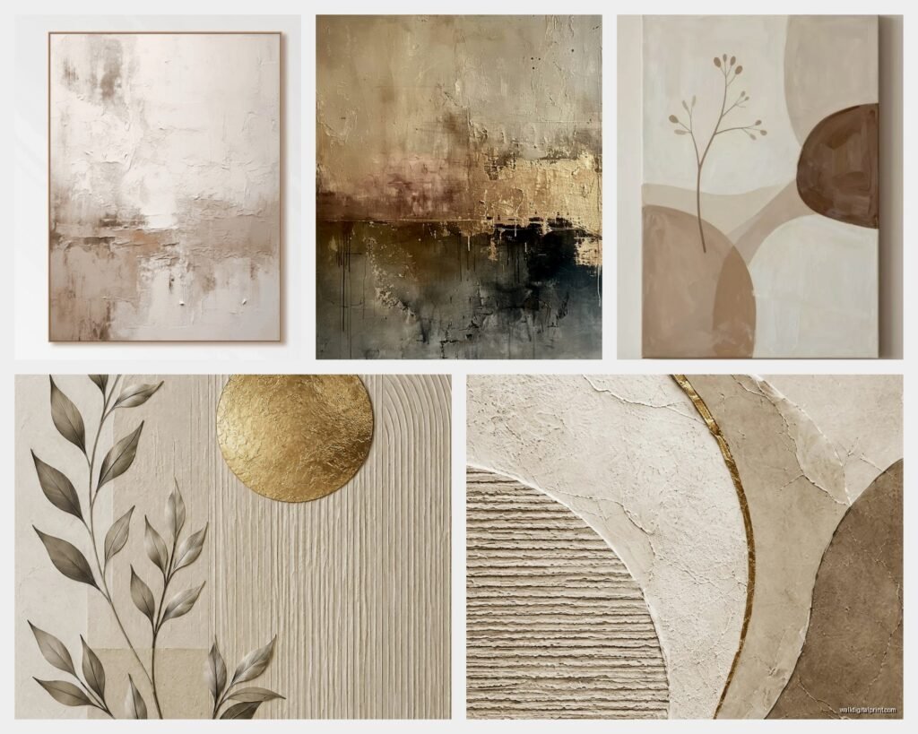
I’m really into this trend of organic curved shapes right now – like abstract arches and blob shapes in earth tones. It’s softer than geometric color blocking but still modern.
Also loving textured pieces that have visible brushstrokes or palette knife work. Even if it’s a print, you can find ones that mimic that texture. It adds so much depth.
And honestly anything with a mix of matte and metallic finishes. Like a mostly cream and taupe abstract with gold leaf accents. Chef’s kiss for a dining room or entryway.
The TV is playing this show about art forgers in the background and it’s making me paranoid about buying “original” pieces online but that’s probably not helpful information for you right now.
Budget Breakdown
Since everyone always asks what I actually spend:
Ultra budget route – $50-100 total
Download printable from Etsy ($5-15), print at local shop ($25-40), IKEA frame ($30-50)
Mid-range – $150-300
Print-on-demand from Society6 or Minted with basic framing, or Etsy from established artists with framing
Investment pieces – $400-800
Original art from emerging artists, high-quality gallery prints with custom framing, or designer pieces on sale
I mix all three in my spaces. My most expensive piece is $650 and my cheapest was $8 (a printable I found during a sale). Nobody can tell which is which unless they get really close.
Honestly the biggest game changer for me was just committing to the earth tone palette throughout my space. Once I stopped fighting it and leaned into warm neutrals, everything started looking more cohesive. The abstract art ties it all together without being too literal or themed.
Just start with one piece above your sofa or bed, make sure it’s big enough, and go from there. You don’t need to redo your whole house at once – I’ve been slowly collecting and rotating pieces for like two years and I’m still not done.