Wall Art Guide, Wall Art Tutoriels
Black and White Floral Wall Art: Monochrome Flower Prints
Jun
So I’ve been obsessing over black and white floral prints lately and honestly it started because a client wanted to do this whole monochrome thing but was worried it’d look too cold or like…I dunno, too much like a dentist’s office? But here’s what I’ve figured out after hanging probably 30+ different pieces in various rooms.
Size Actually Matters Way More Than You Think
Okay so first thing – everyone gets this wrong. They buy these tiny 8×10 prints thinking they can cluster them and it’ll look curated but it just reads as cluttered unless you really know what you’re doing. For black and white florals specifically, I’ve found you want to go bigger than you think. Like a 24×36 inch print for above a couch, or even 30×40 if your wall can handle it.
The monochrome thing means you’re already working without color to create impact, so scale becomes your best friend. I did this living room last month where we went with a massive 40×60 peony print and it completely transformed the space. My cat knocked over my coffee while I was hanging it which was…a whole thing, but anyway.
The Sweet Spot Sizes
- Above beds: 30×40 or 36×48 works perfectly, you want it taking up about two-thirds of your headboard width
- Living room focal walls: Go big or go home, 40×60 or even a triptych of 24×36 panels
- Hallways: Here’s where smaller works, 16×20 or 20×24 in a gallery wall situation
- Bathrooms: 11×14 or 16×20, anything bigger feels weird in a small bathroom
Print Quality and What to Actually Look For
This is gonna sound weird but I literally hold prints up to the light in stores now because I’ve been burned before. Black and white florals show EVERYTHING – every printing line, every quality issue. You can’t hide behind color saturation.
What you want is either museum-quality giclée prints or really high-quality digital prints. I’ve had good luck with prints on heavyweight matte paper, like 300gsm or higher. The cheap stuff on thin paper just looks…flat? Like it has no depth. And with flower prints you need that tonal variation, those subtle grays between the pure black and white.
Paper vs Canvas
So here’s where I’ve changed my mind over the years. I used to be all about canvas for everything, but black and white florals actually look incredible on paper with a simple frame. The canvas texture can sometimes compete with the flower details, especially if you’ve got something intricate like a botanical illustration style print.
Paper under glass gives you this crisp, clean look that really lets the contrast sing. But if you’re doing a more painterly style floral – like big brush strokes, abstract petals – then yeah, canvas works great.
Framing Options That Won’t Break the Bank
Oh and another thing – frames for black and white art are weirdly important. I’ve tried probably every combination and here’s what actually works:
Black frames: Classic, can’t go wrong, but they need to be the right width. Thin black frames (like 0.5 to 1 inch) work for modern spaces, but they can make the art feel a bit…corporate? Thicker black frames (2-3 inches) add weight and drama.
White frames: These are my secret weapon honestly. White frame with a black and white floral creates this floating effect that’s really elegant. Works especially well in bedrooms or spaces where you want it to feel lighter.
Natural wood: Light oak or maple frames with black and white florals is *chef’s kiss* – it warms up the monochrome palette without adding color. I did this in a dining room and it kept the space from feeling too stark.
No frame/canvas wrap: If you go canvas, the gallery wrap edge can work but make sure the image bleeds properly. Nothing worse than white edges showing.
wait I forgot to mention – you can get custom frames cut at most craft stores for way less than you’d think. I had three 24×36 frames cut for like $40 each which is honestly a steal.
Placement Rules I’ve Learned the Hard Way
The standard rule is hanging art at 57-60 inches center height (that’s museum standard) but in actual homes this doesn’t always work. With black and white florals, you’re creating a focal point so think about sightlines.
Where will people be when they see it? If it’s a bedroom piece, you’re mostly seeing it from the bed – hang it slightly lower than standard. Living room above a cofa? The center should be about 8-12 inches above the sofa back, not measured from the floor.
I had this hilarious situation where I hung a gorgeous magnolia print perfectly according to the rules and the client was like “I can’t see it from my reading chair” and she was right. We lowered it 4 inches and suddenly it worked.
Lighting Makes or Breaks It
Black and white prints need good lighting or they just disappear into the wall. Natural light is great but can cause glare on glass, so think about:
- Picture lights mounted above the frame – very traditional but effective
- Track lighting or adjustable spotlights aimed at the wall
- Wall sconces on either side for a symmetrical look
- Even just making sure there’s a floor lamp nearby that illuminates the wall
I did a client’s home office with a black and white rose print and we added a simple LED picture light – total game changer. Cost like $35 on Amazon.
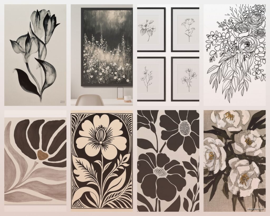
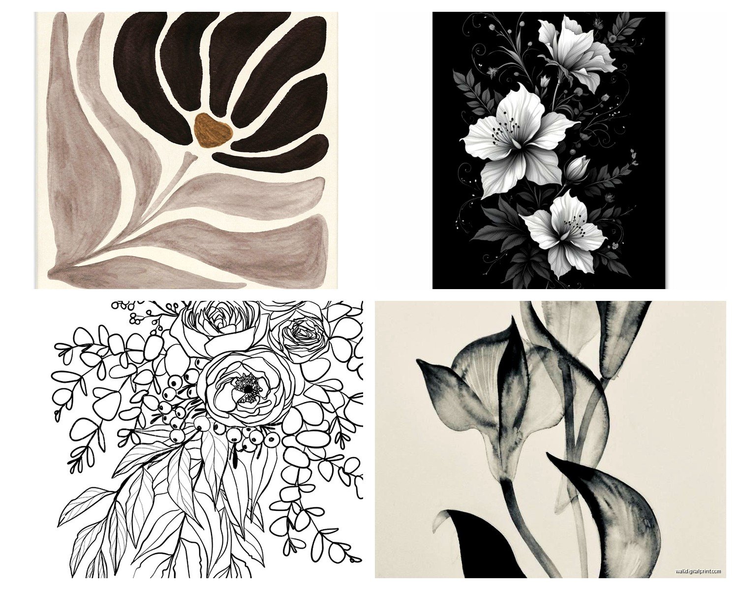
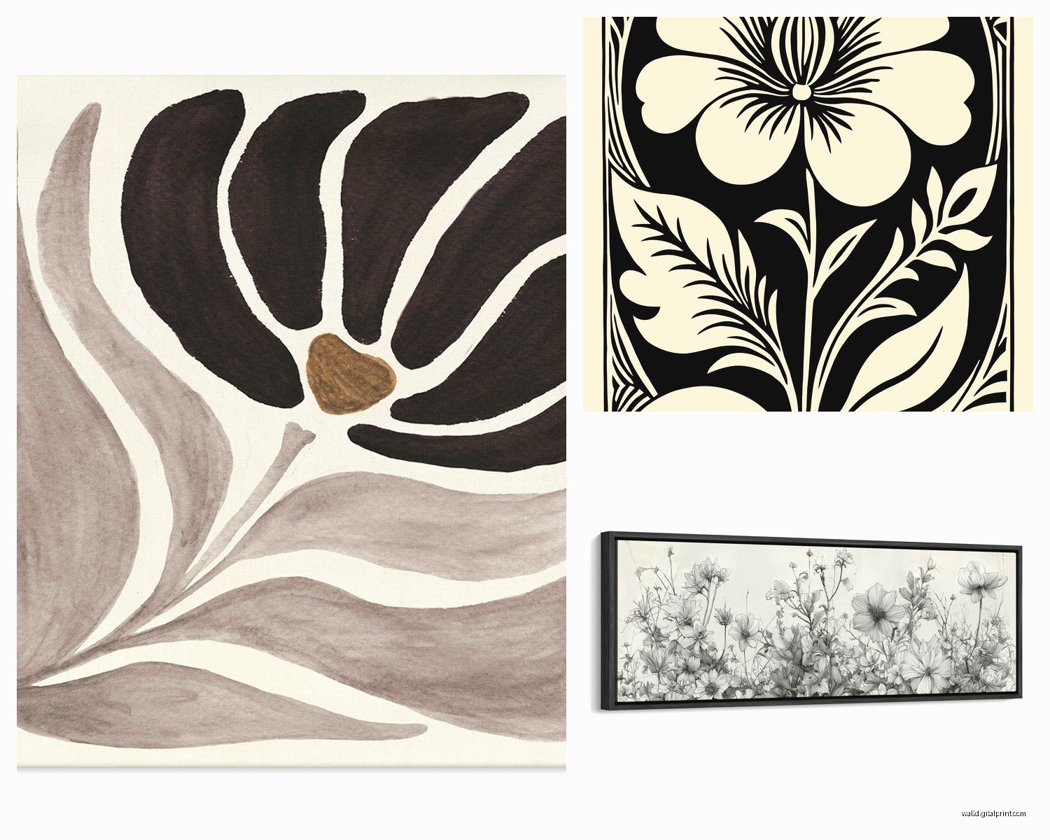
Style Matching Because Not All Florals Are Created Equal
Okay so this is where it gets fun. Black and white floral is a huge category and the style you pick totally changes the vibe.
Botanical illustrations: These are the detailed, scientific-looking ones. Very elegant, work great in traditional or transitional spaces. Think library vibes, home office, formal dining room. They pair well with dark wood furniture and classic decor.
Modern abstract florals: Big brush strokes, loose interpretation of flowers. These are perfect for contemporary spaces, minimalist rooms, or anywhere you want something with movement but not too much detail. I use these in living rooms and bedrooms a lot.
Photography-based prints: Actual photos of flowers in black and white. Super crisp, high contrast. These work in modern spaces but can also do well in farmhouse or rustic settings if you frame them right. The realism adds something different.
Line art florals: Simple line drawings of flowers. Very trendy right now, work well in small spaces or as part of a gallery wall. They’re subtle enough to group multiple pieces without overwhelming a room.
Mixing Multiple Pieces Without It Looking Chaotic
This is gonna sound weird but I have a whole system for this now. If you’re doing multiple black and white floral prints in the same room or in a gallery wall, you need some consistency.
Pick ONE thing to keep consistent: either the style (all botanical illustrations), the frame (all black frames), or the mat treatment (all with white mats). Then you can vary the other elements.
My go-to formula for a gallery wall with florals:
- One large anchor piece (24×36 or bigger)
- Two medium pieces (16×20)
- Three to four small pieces (8×10 or 11×14)
- All in the same frame color but sizes can vary
- Mix of flower types but keep the style consistent
Last week I did a stairway gallery wall with seven different black and white flower prints – roses, peonies, tulips, cherry blossoms – but they were all in the same photographic style with identical black frames. Looked cohesive even though they were all different flowers.
The Three-Print Rule for Easy Styling
If gallery walls stress you out, just do three prints in a row. Either horizontal above a sofa or vertically on a narrow wall. Three is enough to make a statement but not so many that you’re gonna lose your mind trying to arrange them.
I usually do three same-size prints (like three 20x24s) with identical frames, spaced 3-4 inches apart. Super easy, always looks good, takes like 20 minutes to hang.
Where Black and White Florals Work Best
Not every room needs or suits this kind of art, honestly. Here’s where I’ve had the most success:
Bedrooms: This is like, the perfect spot. Florals add softness, black and white keeps it sophisticated. Above the bed is obvious but I’ve also done beautiful arrangements on the wall opposite the bed so it’s the first thing you see when you wake up.
Dining rooms: Especially formal dining rooms. Black and white florals add elegance without being too casual. They work with basically any table setting or dinner party theme.
Entryways: Makes a strong first impression. A large black and white floral in an entryway says “this person has their stuff together” without being intimidating.
Bathrooms: Smaller prints work great here. The monochrome palette feels clean and spa-like. Just make sure you’re not hanging paper prints in a super steamy bathroom – canvas or sealed prints only.
Home offices: Adds personality without being distracting. The black and white keeps it professional but the floral element softens the space.
What to Pair Them With
The beauty of black and white is it literally goes with everything, but some combinations really shine:
Pair with warm wood tones – this is my favorite. The natural wood adds warmth that balances the cool monochrome. Works in basically any style from modern to farmhouse.
Add metallic accents – brass or gold with black and white florals is *so* good. It adds just enough color (well, metallic) without competing. Silver or chrome works too for a cooler palette.
Layer with textured neutrals – think linen, wool, chunky knits in cream, beige, gray. This keeps the room from feeling flat even though you’re working in monochrome.
oh and another thing – if your room has a lot of pattern already (patterned rug, busy curtains, whatever), black and white floral art actually helps calm things down. The monochrome acts as a visual rest point.
Budget Options That Don’t Look Cheap
You don’t need to spend $500 on original art to get this look. I’ve found gorgeous prints at:
- Etsy – tons of downloadable prints you can print yourself at Costco or a local print shop
- Society6 and Minted – good quality, reasonable prices, lots of size options
- Even Target and HomeGoods sometimes have decent black and white floral prints
- IKEA’s BJÖRKSTA series has some simple floral options that don’t look super IKEA-ish
For frames, IKEA and Amazon Basics are honestly fine for most situations. I’ve used both plenty of times. If you want to splurge on anything, splurge on the print quality, not necessarily the frame.
Common Mistakes I See All the Time
Hanging it too high – seriously, this is the number one thing. Art should relate to your furniture and to eye level, not float near the ceiling.
Choosing prints that are too busy – if the floral has too much detail and high contrast everywhere, it can be visually exhausting. You want some negative space, some areas for your eye to rest.
Not considering the room’s existing contrast – if you already have black furniture and white walls, adding high-contrast black and white art can be overkill. Sometimes you need a softer, more gray-toned floral print to balance things.
Mismatched scales – like putting a tiny 8×10 print on a huge empty wall. It just looks lost. Scale your art to your wall and furniture.
Forgetting about the mat – a white mat around a black and white print adds breathing room and makes even a cheap print look more expensive. Standard is 2-3 inches of matting, but you can go wider for more drama.
Maintaining and Protecting Your Prints
Real quick because this matters – if you’re investing in nice prints, protect them. UV-protective glass or acrylic prevents fading, especially if the print is anywhere near a window. Regular glass is fine for most situations but if you’ve got direct sunlight hitting the art, upgrade to UV protection.
Dust frames regularly because dust is super visible on black frames. Clean glass with streak-free cleaner and a microfiber cloth.
For unframed canvas prints, you can spray them with a protective coating – there are specific products for this. Just make sure the print is fully cured first (give it a few weeks after you get it).
The black and white color scheme actually helps with longevity – there’s no color to fade unevenly, so these prints tend to age better than color photography.
Anyway, that’s basically everything I’ve learned from actually hanging these in real rooms. The TLDR is go bigger than you think, pay attention to print quality, and don’t overthink the styling part – black and white florals are pretty forgiving once you get the basics right.