Wall Art Guide, Wall Art Tutoriels
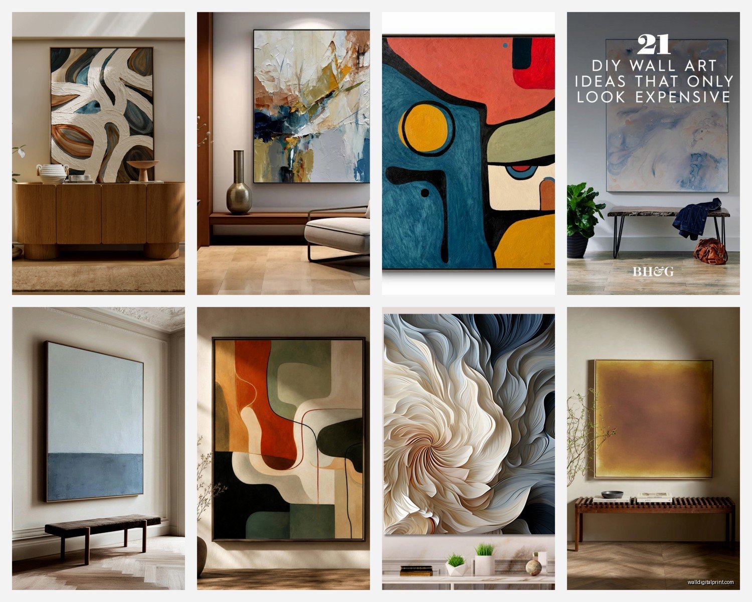
Large Abstract Wall Art: Oversized Modern Non-Representational
Jun
So I’ve been working with oversized abstract pieces for like three years now and honestly the biggest mistake people make is buying something too small thinking it’ll look “elegant” or whatever. It won’t. It’ll look like you hung a postcard on a giant wall.
Here’s the thing about scale that nobody tells you – you need to go WAY bigger than feels comfortable in your head. I had a client last month who kept insisting on a 24×36 piece for her living room and I literally had to tape out the dimensions on her wall with painter’s tape to show her how ridiculous it looked. We ended up with a 60×80 and she texted me like two weeks later saying she couldn’t believe she almost went smaller.
The rule I use is measure your wall space and aim for something that takes up about 2/3 to 3/4 of the available width. So if you have an 8-foot wide wall space above your sofa, you’re looking at a piece that’s roughly 5-6 feet wide. Yeah, I know that sounds insane when you’re standing in a gallery or scrolling online but trust me.
Where to Actually Find Them Without Going Broke
Okay so funny story, I used to think you HAD to spend thousands on original pieces and then my dog knocked over my coffee onto a “investment piece” I’d bought for staging and I had a minor breakdown. That’s when I started actually researching alternatives.
Saatchi Art is pretty solid for originals if you filter by size – they have this whole oversized section. You’re still gonna pay but you can find emerging artists doing 48×60 pieces for like $800-1500 instead of $5000. The shipping though… oof. Budget an extra $200-400 for anything over 48 inches.
Minted does large-scale prints that are actually good quality. I’ve used their 40×54 and 30×40 sizes and if you get the premium framing it looks legit. Nobody’s gonna know it’s a print unless they get right up on it. They run sales constantly so never pay full price – wait I forgot to mention, sign up for their email list and you’ll get 20% off within like two days.
Etsy is hit or miss but I’ve found some incredible oversized prints from studios in Poland and the UK. Search “large abstract canvas art” and filter by size. Read the reviews obsessively. I learned this the hard way when I got a “gallery wrapped canvas” that was basically a pixelated mess stretched over cheap wood.
The Print vs Original Debate
Look, I’m gonna be real with you – for most rooms, a high-quality giclée print is totally fine. I have both in my own place and guests literally cannot tell the difference from across the room. The texture thing that art snobs talk about? Yeah it’s real but it matters way less in a living room than in a gallery.
Where originals make a difference: if you’re hanging it somewhere with a lot of natural light where people will see the surface texture, or if you’re the kind of person who needs to know it’s one-of-a-kind for your own satisfaction. Both valid reasons! I have an original in my bedroom because I stare at it every morning and it makes me happy to know some artist in Vermont painted it.
Where prints are perfect: literally everywhere else. Your living room, dining room, office. Get a good one mounted on a deep gallery wrap or in a floater frame and it’ll look expensive.
Color Coordination Without Making It Matchy-Matchy
This is where people overthink everything. You do NOT need to pull exact colors from your sofa or whatever. Actually that usually looks worse because it’s too coordinated.
What I do instead is pick one accent color from the painting and let it echo somewhere else in the room. So if you’ve got this massive abstract piece with navy, rust, cream, and like sage green, maybe your throw pillows pick up the rust and there’s a sage plant in the corner. Done. The painting shouldn’t match your room, your room should support the painting.
Oh and another thing – neutrals are your friend if you’re scared of color. A big black and white abstract piece works in literally any room. I’ve used variations of this in minimalist spaces, maximalist spaces, modern, traditional… it’s the little black dress of wall art.
For colorful pieces, consider your lighting. Warm bulbs will make reds and oranges pop and can muddy blues. Cool bulbs do the opposite. I learned this when a painting I loved in the gallery looked completely different in my client’s apartment – turned out she had these super warm Edison bulbs everywhere.
Hanging the Damn Thing
Okay so this part is actually important because oversized pieces are heavy and if you screw this up you’ll have a hole in your wall and possibly a destroyed painting.
First, figure out the weight. Anything over 30 pounds needs serious hardware. I use heavy-duty picture hooks rated for like 50-75 pounds for most large pieces. The little sawtooth hangers that come attached to cheaper canvases? Rip those off immediately. They will fail.
For really heavy pieces – we’re talking 40+ pounds or anything with a thick wooden frame – you need wall anchors or you gotta hit a stud. I keep a stud finder in my car at all times because of this. If you can’t find a stud where you need one, use toggle bolts or those metal wall anchors. The plastic ones are garbage for anything heavy.
Height-wise, the center of the artwork should be at eye level, which is roughly 57-60 inches from the floor. But this is more of a guideline… if you’re hanging above furniture, you want the bottom of the frame to be 6-8 inches above the top of the sofa or console table.
Here’s what I actually do: I cut out paper templates the exact size of the painting and tape them to the wall. Move them around. Live with it for a day. My cat loves this process because she attacks the paper but whatever, it’s saved me from so many mistakes.
The Two-Hook Method
For anything wider than 36 inches, use two hooks instead of one. Space them about 1/3 of the way in from each edge. This distributes weight better and keeps the piece from tilting to one side. You’ll need D-rings or wire on the back of the frame positioned to match your hooks.
Wait I forgot to mention – some gallery-wrapped canvases don’t come with hanging hardware at all. You’ll need to add D-rings yourself or take it to a framing shop. It costs like $15-20 and takes ten minutes but it’s worth doing right.
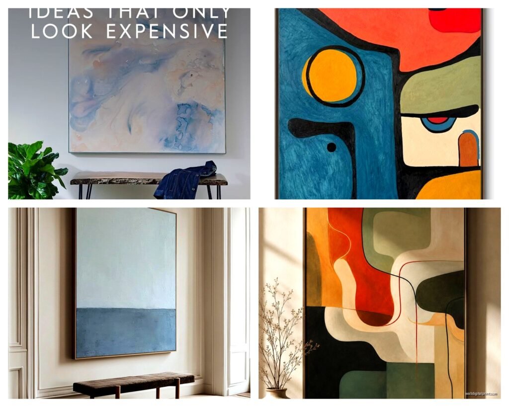
Styles That Actually Work in Real Homes
Gestural abstracts with lots of movement are great for modern and transitional spaces. Think big sweeping brushstrokes, drips, energy. These work well in living rooms and offices because they create visual interest without being too literal.
Color field pieces – those big blocks of color – are perfect for minimalist spaces or anywhere you want the art to be calming rather than energizing. I used a massive Rothko-inspired piece in a client’s bedroom and she said it helped her anxiety. The key is getting the colors right for the mood you want.
Geometric abstracts are having a moment and honestly they’re easier to work with than people think. The clean lines play well with both modern and mid-century furniture. Just make sure the scale is big enough – small geometric pieces look like decor from 2010.
Textured abstracts with heavy impasto or mixed media add dimension and work in spaces where you want that tactile element. These are especially good in dining rooms or entryways where people pass by closely enough to appreciate the surface quality.
What Doesn’t Work
Okay this is gonna sound harsh but super busy abstracts with every color ever? They don’t work in most homes. They’re overwhelming. I see these all the time on those dropship furniture sites and they make rooms feel chaotic. If the painting has more than 5 distinct colors, really think hard about whether your space can handle it.
Also those motivational word abstracts that say like “dream” or “inspire” with paint splatters? Please no. Just no.
Framing Decisions
Gallery wrap (where the canvas wraps around the edges of the frame) is the most popular option for contemporary abstracts. It’s clean, it’s modern, you don’t need an additional frame. Just make sure the sides are painted or the image wraps around – nothing worse than seeing raw canvas or staples on the edges.
Floater frames are my personal favorite for larger pieces because they give the artwork breathing room and make it look more expensive. The frame “floats” around the canvas with a small gap. You can get these custom made or find standard sizes at places like American Frame or even on Amazon if you’re on a budget.
Traditional frames with matting usually don’t work for oversized abstract pieces unless you’re going for a really specific classical-meets-modern vibe. The mat plus frame eats up so much visual space that you’d need an absolutely massive piece to pull it off.
Practical Stuff Nobody Mentions
Oversized art is a pain to move. I’m currently watching this true crime thing on Netflix and they just mentioned how hard it is to dispose of evidence and honestly moving large artwork is similarly difficult but for legal reasons. If you’re renting or move frequently, consider this. Some pieces literally won’t fit through doorways or up staircases.
Cleaning is another thing – dust accumulates on textured surfaces and you can’t just wipe it down like a print under glass. I use a super soft brush attachment on my vacuum on the lowest setting, held like an inch away from the surface. For glass-covered prints, microfiber cloth with a tiny bit of glass cleaner.
Sun damage is real. UV-protective glass or acrylic helps for framed pieces. For canvases, just don’t hang them in direct sunlight if you can avoid it. I’ve seen colors fade dramatically in south-facing rooms over a couple years.
Insurance – if you spend serious money on original art, photograph it and keep receipts. Add it to your renter’s or homeowner’s policy. This seems obvious but I’ve had friends lose expensive pieces in floods or break-ins with no documentation.
The Placement Game
Living room above the sofa is classic but make sure your sofa isn’t pushed right against the wall – leave like 3-4 inches of space so the painting has room to breathe and you’re not bumping it with your head.
Dining rooms can handle really bold pieces because you’re not staring at them constantly like in a bedroom. This is where I go bigger and bolder with color.
Bedrooms need calmer vibes usually. I tend toward softer abstracts, cooler colors, less aggressive compositions. You’re gonna look at this thing first thing in the morning and last thing at night.
Hallways and staircases are underutilized – a long horizontal abstract in a hallway creates great flow. Just watch the width, you need walking clearance.
Office spaces can handle intellectual or energizing pieces. Geometric abstracts work great here, or gestural pieces that create movement.
Oh and if you have high ceilings, vertical orientation pieces draw the eye up and make the space feel even taller. This is gonna sound weird but I sometimes prefer vertical pieces even on wide walls just for the drama of it.
The thing is you gotta live with a piece for a while before you really know if it works. I’ve loved things initially that drove me crazy after a month and vice versa. If you can, try to find sellers with good return policies or at least look at tons of photos in different lighting before committing to something huge and expensive.