Wall Art Guide, Wall Art Tutoriels
Modern Black Wall Art: Contemporary Dark Bold Designs
Jun
So I’ve been completely obsessed with black wall art lately and honestly it started because I needed to fix this disaster of a white wall in my office that was just… screaming at me every morning. Like you know when a space just feels wrong?
The thing about modern black art is it’s way trickier than you’d think because it can either look incredibly sophisticated or like you’re trying too hard to be edgy. I learned this the hard way when I bought this massive black abstract piece that made my living room look like a funeral home for about two weeks before I returned it.
Getting the Scale Right (This Is Where Everyone Messes Up)
Okay so the biggest mistake I see is people buying art that’s too small. With black pieces especially, you need them to make a statement otherwise they just look like… weird dark spots on your wall? The rule I use now is measure your wall space and go for art that takes up about 60-75% of the available width. My dining room wall is about 8 feet wide and I went with a triptych that spans about 6 feet total and it’s perfect.
But here’s the thing – if you’re putting it above furniture, the art should be roughly two-thirds to three-quarters the width of whatever’s below it. I have this sleek black line drawing above my credenza and it’s exactly 48 inches wide while the credenza is 60 inches, and the proportions just work.
Oh and another thing, hang it at eye level which is usually around 57-60 inches from the floor to the center of the piece. I used to hang everything too high because I’m tall but then I had my friend Sarah over (she’s like 5’3″) and she was like “why is all your art in the ceiling” and I realized I’d been doing it wrong for years.
Types of Black Art That Actually Work
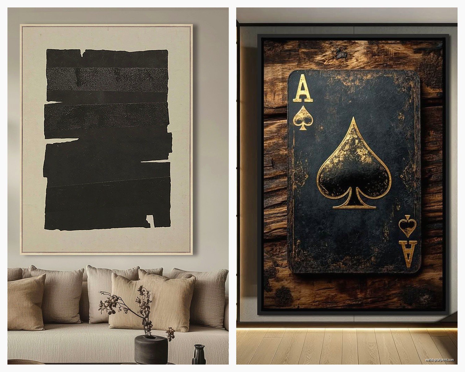
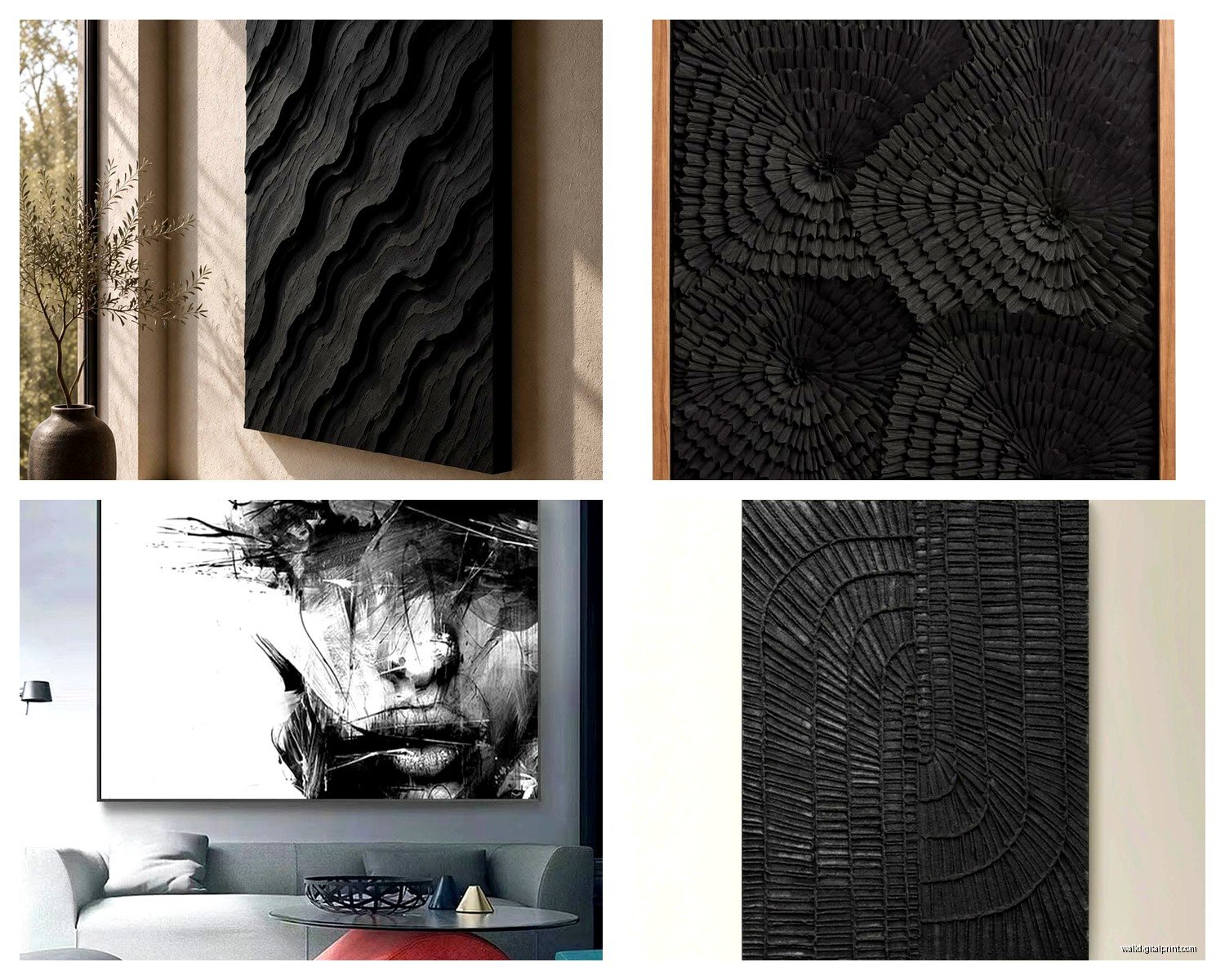
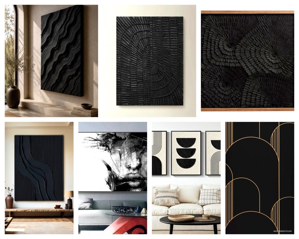
Abstract Black and White Pieces
These are probably the easiest to work with because the contrast does a lot of heavy lifting. I’ve got this black brushstroke piece with just hints of white that sits in my bedroom and it adds drama without being overwhelming. The key is looking for pieces with some texture or movement – flat black paint on canvas can read as… unfinished? Unless that’s specifically the vibe you want.
Geometric abstracts in black are having a moment right now. Think bold lines, circles, architectural shapes. They work especially well in modern or minimalist spaces. I curated a show last month with a bunch of these and my client ended up buying three for her new apartment.
Black Line Drawings
This is gonna sound weird but some of my favorite pieces are just simple black line art on white backgrounds. Female figures, faces, abstract shapes – they’re everywhere right now and for good reason. They’re sophisticated without being pretentious. I have one in my bathroom (yeah, bathroom art is a thing I’m passionate about) and guests always ask where it’s from.
The trick with line drawings is making sure the lines are actually interesting. Some of them are just… boring? Look for pieces where the artist clearly made intentional choices about line weight and negative space.
Photography and Digital Prints
Black and white photography obviously but also moody dark photographs with just touches of color can be stunning. I found this print of a stormy ocean that’s mostly blacks and grays with just a hint of deep blue and it’s become one of my favorite pieces. It’s in my hallway where there’s limited natural light and it actually works better there than it would in a bright room.
Where to Actually Buy This Stuff
Okay so I’m gonna be honest, I’ve wasted so much money figuring this out. Etsy is great for affordable prints – you can find digital downloads for like $5-15 and then just get them printed at a local print shop or online. The quality varies wildly though so check the reviews and make sure you’re getting high resolution files.
For original pieces or higher-end prints, I love Saatchi Art and Minted. Saatchi has a really good return policy which matters when you’re buying art online because colors can look different on screens. I bought a piece I thought would be charcoal black and it arrived more like… dark purple? Returned it, no issues.
Wait I forgot to mention – Society6 and Redbubble are good for trendy contemporary pieces and they print on demand so you can get the same design in different sizes. The canvas quality isn’t amazing but for the price it’s decent. My cat literally knocked one off the wall last month (thanks, Luna) and it survived without damage so they’re more durable than I expected.
If you want something really special, look for local artists on Instagram. Search hashtags like #blackabstractart or #contemporaryblackart and you can often commission custom pieces. I did this for a client’s office and the artist created something specifically sized for the space and it cost less than buying from a gallery.
Framing Decisions That Matter
This is where things get expensive fast if you’re not careful. For black art, I usually go with one of three framing options:
Simple black frames – they disappear into the art and create this seamless look. Michael’s has decent affordable options and they’re always running 50% off sales. Pro tip: sign up for their email list because the coupons are actually worth it.
Natural wood frames – creates a nice contrast and warms up the space. I use these when the room has other wood elements. My living room has a black abstract piece in a light oak frame and it ties into the coffee table and shelving.
No frame at all – for canvas pieces especially, sometimes the gallery wrap edge is enough. This works best with bold abstracts where you want the art to feel more casual and approachable.
Matting is a whole other thing… white mats with black art create maximum contrast but can feel formal. Black mats are dramatic but make the piece feel smaller. I usually skip mats for modern pieces unless they’re photographs or prints that need that extra layer of sophistication.
The Glass Debate
Museum glass is expensive (like $200+ for a medium piece) but it’s worth it for valuable art because it has UV protection and basically no glare. For affordable prints though? Regular glass is fine or just go with acrylic which is lighter and won’t shatter if it falls. I use acrylic for anything hanging in high-traffic areas or above furniture where someone might bump it.
Making It Work in Different Rooms
Living Room: This is where you can go big and bold. I have a massive three-panel black abstract piece above my sofa and it’s the first thing people notice when they walk in. Balance it with lighter furniture and textiles – I learned this after my room looked like a cave when I paired black art with a charcoal sofa. Added cream pillows and a light rug and suddenly the space felt intentional instead of dark.
Bedroom: Black art can actually be really calming here which sounds counterintuitive. I have a simple black brushstroke piece that feels meditative. Avoid anything too chaotic or aggressive in composition – save that energy for public spaces. Oh and if your bedroom is small, stick to one statement piece rather than a gallery wall.
Kitchen/Dining: This is tricky because you don’t want anything that makes the space feel heavy while you’re eating. I use black line drawings or black and white photography here. There’s something about clean lines that works with the functional nature of these spaces. My dining room has three framed black ink botanical prints and they add elegance without overwhelming.
Home Office: Go for something that energizes you but isn’t distracting. Geometric black art works great here. I have a piece with intersecting black lines that’s interesting enough to look at during Zoom calls but not so busy that it pulls focus. Multiple people have asked about it during video meetings which is always fun.
Bathroom: Yes, bathroom art is real and necessary. Small black line drawings or simple black and white photos work perfectly. Make sure you frame them properly with glass to protect from humidity. I have a tiny black abstract in my powder room and it makes the space feel so much more finished.
Styling Around Black Art
The room needs balance or everything feels too heavy. Here’s what actually works from my experience:
Mix in metallics – gold, brass, or copper accents warm up spaces with black art. I have gold candlesticks on the console below my black abstract piece and the combination is chef’s kiss.
Layer textures – velvet pillows, woven throws, textured rugs. The tactile variety keeps the space from feeling flat even with bold black art dominating visually.
Add greenery – plants are your friend here. The organic shapes and colors provide relief from all the drama. I have a fiddle leaf fig next to my largest black piece and they balance each other perfectly.
Consider your lighting – this is huge. Black art needs good lighting or it just becomes a dark blob on the wall. I added picture lights above my two main pieces and it completely transformed them. Even just ensuring there’s adequate ambient light in the room makes a difference.
Common Mistakes I’ve Made So You Don’t Have To
Buying art that matches your furniture too exactly – it ends up looking matchy and weird instead of curated. Your black art doesn’t need to be the exact same shade as your black chairs.
Hanging a gallery wall of all black pieces too close together – they need breathing room or it becomes visual chaos. I space mine at least 2-3 inches apart minimum.
Forgetting about the wall color – black art on dark walls can disappear. It works sometimes for a moody vibe but usually you want at least a mid-tone wall color. My office walls are a soft gray and the black art pops beautifully.
Not considering the room’s natural light – that moody dark photograph looks amazing in the store but in your dim hallway it might just look like… darkness. I moved pieces around so much in my first apartment before I figured this out.
Okay so funny story, I was watching this design show last week while organizing my storage room and they had someone hang a massive black canvas completely off-center and called it “intentional asymmetry” and I was just… no. Sometimes centered is good. Don’t overthink it.
Budget-Friendly Options That Don’t Look Cheap
You don’t need to spend thousands to get good black art. Digital downloads printed at home or through a print service can look just as good as expensive prints if you choose high-quality files and proper printing. I’ve done this for probably half the art in my house.
DIY is also an option if you’re even slightly artistic. Black acrylic paint, some canvas, and bold confident strokes can create surprisingly sophisticated pieces. I made one for my guest room during lockdown and people think I bought it at a gallery.
Thrift stores and estate sales sometimes have amazing pieces that just need new framing. I found a vintage black ink drawing for $12 at an estate sale, put it in a $30 frame, and now it looks like it cost hundreds.
Print-on-demand services let you test different pieces without commitment. Order a small size first, live with it for a week, and if you love it, order the larger version for the actual space.
The main thing is trusting your gut – if you love a piece and it makes you feel something when you look at it, that matters more than whether it follows all the “rules.” My favorite piece in my whole house is this abstract black painting that technically doesn’t go with anything else in the room but I don’t even care because it makes me happy every time I see it.