Wall Art Guide, Wall Art Tutoriels
Black Modern Wall Art: Dark Contemporary Bold Statement
Jun
So I’ve been absolutely obsessed with black modern wall art lately and honestly it’s one of those things that sounds risky but actually works in like 90% of spaces if you do it right. My friend Sarah just texted me last week freaking out because she bought this massive black abstract piece and didn’t know where to put it, and I had to walk her through the whole thing.
Why Black Art Actually Works (Even in Small Spaces)
Okay so here’s the thing everyone gets wrong – they think black art makes rooms feel smaller or darker, but that’s only true if you’re doing it wrong. Black creates depth, which is totally different from making things feel cramped. I tested this in my own apartment last year when I was going through that whole minimalist phase (still kinda in it tbh), and a large black geometric piece actually made my living room feel bigger because it created a focal point that pulled your eye.
The trick is contrast. You can’t just throw black art on a dark wall and expect magic. I learned this the hard way with a client’s dining room where we had to repaint because the charcoal walls plus black art just created this weird void situation.
Best Wall Colors for Black Modern Art
- Bright white or off-white – this is the classic and it WORKS
- Light gray (like that Repose Gray everyone uses) – super sophisticated
- Warm beige or greige – adds softness while keeping contrast
- Unexpected: dusty pink or sage green – I did this in my bedroom and people always comment
- Navy blue if you’re feeling bold – but only in rooms with tons of natural light
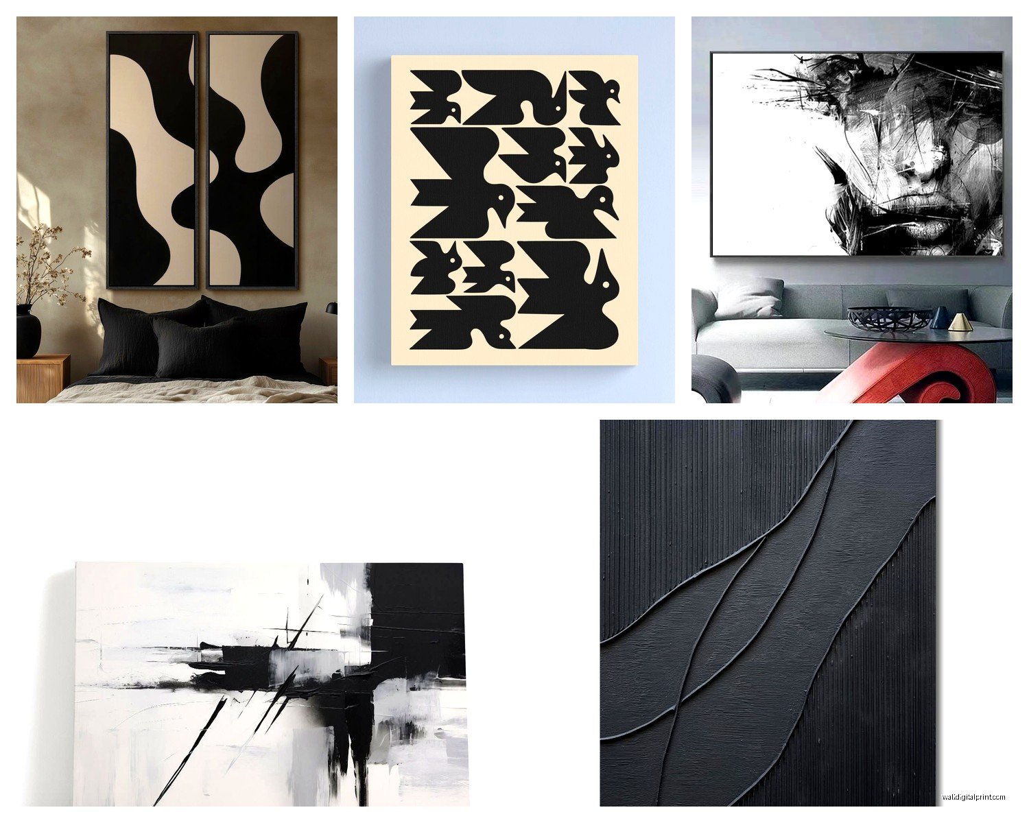
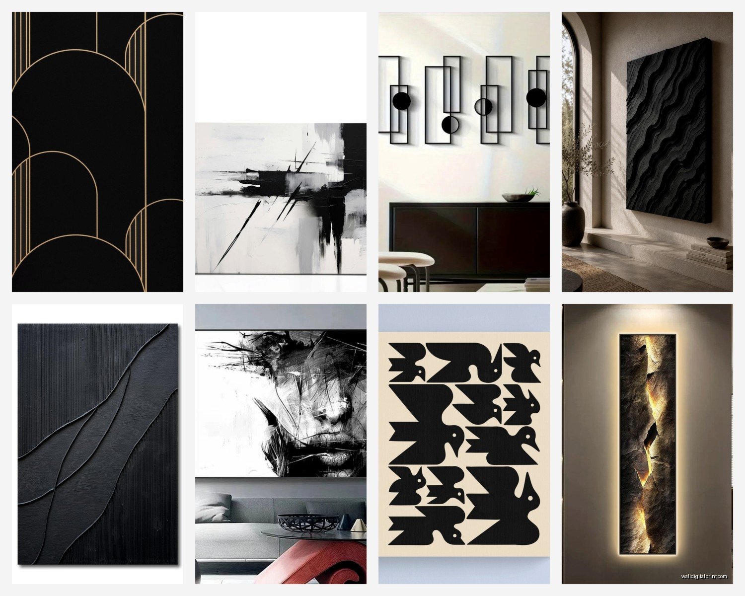
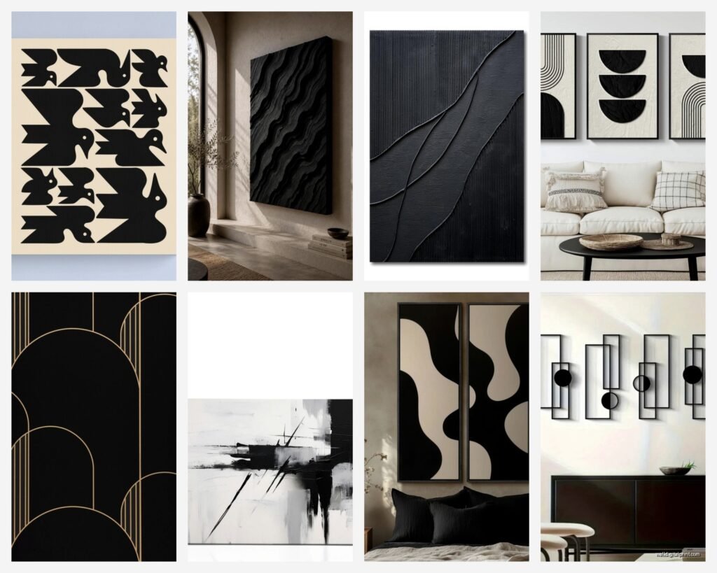
Types of Black Modern Wall Art That Actually Look Good
Gonna break this down by style because not all black art is created equal and some of it honestly just looks like someone spilled ink and called it art.
Abstract Minimalist Pieces
These are your safest bet if you’re new to this whole thing. Think black brushstrokes on white canvas, geometric shapes, that kind of vibe. I have this one above my couch that’s literally just three black circles of different sizes and I get more compliments on it than pieces I spent way more money on. The key with abstract is scale – go bigger than you think you need. Like if you think a 24×36 will work, get the 36×48 instead.
Wait I forgot to mention – you can find amazing affordable options on Etsy from actual artists, or if you’re on a budget, places like Society6 do prints that don’t look cheap. Just avoid anything too glossy because it photographs weird and reflects light in annoying ways.
Line Art and Sketches
This is having such a moment right now. Single-line drawings, architectural sketches, figure drawings – all in black ink or paint. Super elegant and works in literally any room. My sister has one of those continuous line face drawings in her entryway and it’s the first thing you see when you walk in.
Pro tip: mix different frame styles with line art. Like a thin black frame for one piece, a thicker matte black for another. It keeps things from feeling too matchy-matchy which can read as trying too hard.
Typography and Text-Based Art
Okay so this can go wrong FAST if you pick something cheesy, but when it’s done right it’s *chef’s kiss*. I’m talking about actual good typography, not the “Live Laugh Love” stuff. Abstract letters, foreign text, poetry excerpts – that kind of thing. Just make sure it actually means something to you because you’re gonna be looking at it every day.
Photography and Prints
Black and white photography is obviously the classic, but I’m also really into black-heavy architectural photography lately. Like stark shadows, geometric buildings, that kind of thing. There’s this photographer on Instagram who does all these black facade shots that I’m borderline obsessed with.
Size and Placement (This Is Where People Mess Up)
My cat just knocked over my coffee while I’m writing this but anyway—
The biggest mistake I see is people buying art that’s too small. Like they’ll have this huge blank wall and put up a 16×20 print and wonder why it looks weird. Here’s my rule: measure your wall space and fill at least 60-75% of it with art or a gallery wall situation.
Solo Large Pieces
If you’re doing one big statement piece, center it on the wall but not necessarily in the middle of the whole wall – center it in relation to your furniture. So like above a sofa, the middle of the art should be about 8-10 inches above the back of the couch. I always do a paper template first because I’ve definitely put holes in walls in the wrong spots before.
For large black pieces specifically, you want them somewhere that gets good natural light during the day but also has decent ambient lighting at night. Black art in a dark corner just disappears and that’s a waste.
Gallery Walls with Black Art
This is gonna sound weird but I actually plan gallery walls on my floor first. Cut out paper templates of all your frames, arrange them on the floor until it looks good, take a photo, then recreate it on the wall. Saves so much time and wall damage.
For black modern pieces in a gallery wall:
- Mix sizes but keep a consistent color palette (black, white, maybe one accent color)
- Vary the frame styles slightly – all identical frames can look too corporate
- Leave consistent spacing between frames (I do 2-3 inches usually)
- Include at least one larger anchor piece so it doesn’t look too scattered
Oh and another thing – you don’t have to fill the whole wall at once. Start with 3-5 pieces and add over time. Some of my best gallery walls evolved over like a year.
Framing Options That Don’t Suck
Okay so framing is where you can either elevate a piece or make it look cheap. For black modern art, I almost always go with:
Matte black frames – classic, never wrong, makes the art pop. Just make sure they’re actually matte and not that weird satin finish that some cheap frames have.
Natural wood frames – lighter woods like oak or maple create amazing contrast with black art. I did this in my office and it warms up the whole space.
White or off-white frames – for when you want the art to really stand out. Works especially well with black and white photography.
No frame at all – if you have a canvas piece with finished edges, sometimes just hanging it frameless looks super modern and clean. But only if the edges are actually finished properly.
Mat or No Mat?
Honestly this depends on the piece. For prints and photography, a white mat creates breathing room and makes the piece feel more expensive. For abstract paintings or pieces that are already large, skip the mat. I usually do a mat that’s at least 2-3 inches wide if I’m using one at all.
Lighting Your Black Art Properly
This is something I didn’t realize mattered until I installed picture lights in my living room and suddenly my art looked like it belonged in a gallery. Black art especially needs good lighting because otherwise it just looks like a dark blob on your wall.
Options That Work
Picture lights: These are those little lights that mount above the frame. Battery-operated ones exist now so you don’t need an electrician. Game changer.
Track lighting: If you’re doing a whole gallery wall, adjustable track lights let you highlight specific pieces.
Recessed lighting: If you’re building or renovating, plan for recessed lights aimed at your art walls.
Floor lamps with adjustable heads: Budget-friendly option that works surprisingly well.
The goal is to avoid glare while still illuminating the piece. Angle lights at about 30 degrees if possible.
Rooms Where Black Art Actually Works Best
I’ve tested this in basically every room type at this point and here’s what I’ve learned:
Living Rooms
This is the obvious choice and it works. Large statement pieces above the sofa, gallery walls on accent walls, whatever. Just make sure you’re balancing the visual weight – if you have a massive black piece on one wall, you need something to balance it on the opposite side. Doesn’t have to be art, could be a big plant or a statement furniture piece.
Bedrooms
Okay so people think black art in bedrooms is too intense but I have a huge black abstract piece above my bed and it’s actually really calming? The key is pairing it with soft textiles and warm lighting. My bedroom has white walls, linen bedding, and warm Edison bulbs, and the black art just anchors everything.
Home Offices
YES. Black modern art in offices looks so professional and put-together. I have three black line drawings in my office and they create this focused, sophisticated vibe without being distracting. Just avoid anything too chaotic or busy because you need to actually work in there.
Bathrooms
Hear me out – small black and white prints in bathrooms are underrated. I have two framed black botanical prints in my bathroom and they make it feel like a spa. Just make sure they’re in frames that can handle humidity or keep them away from the shower.
Dining Rooms
Perfect for black art because dining rooms can handle drama. I did a client’s dining room last month with this massive black abstract piece and it completely transformed the space. Makes dinner parties feel more sophisticated somehow.
Mixing Black Art with Other Decor
This is where it gets fun because black art is actually super versatile. Here’s what I’ve found works:
Pair it with metallics – gold, brass, or copper accents look incredible with black art. I have gold picture lights on my black pieces and the combination is *perfect*.
Add texture – black art on a smooth wall can feel flat, so bring in texture through rugs, throws, woven baskets, whatever. Creates visual interest and depth.
Use plants – this is my secret weapon honestly. Big leafy plants next to black art creates this modern jungle vibe that I’m obsessed with. The organic shapes balance the graphic quality of the art.
Keep furniture simple – let the art be the statement. If you have a bold black piece, your furniture should probably be pretty streamlined and neutral.
Budget Options vs Investment Pieces
Look, not everyone can drop $500 on a single piece of art and that’s totally fine. I mix high and low in my own space all the time.
Budget-Friendly Sources
- Printable art on Etsy – download and print at your local print shop for like $20 total
- Society6 or Redbubble – support independent artists without breaking the bank
- Thrift stores and estate sales – you can find amazing vintage pieces and just reframe them
- DIY – honestly if you can paint black brushstrokes or geometric shapes, do it yourself
- Frame nice magazine tearouts or book pages – sounds weird but I’ve done this and it looks good
When to Invest
Spend money on the pieces that are gonna be your main focal points. Like the art above your sofa or bed – that’s where you want quality. Smaller accent pieces can totally be budget finds. I have a $400 piece above my couch and $15 Etsy prints in my hallway and they all look cohesive.
Also invest in good framing for pieces you love. A cheap print in an expensive frame looks better than an expensive print in a cheap frame, trust me on this.
Common Mistakes to Avoid
Okay rapid-fire things I’ve seen go wrong:
Hanging art too high – the center should be at eye level, which is usually around 57-60 inches from the floor
Using command strips for heavy pieces – just use proper anchors, I’ve seen too many pieces fall
Buying art just because it’s on sale – only get pieces you actually love
Ignoring scale – measure everything twice
Putting art in direct sunlight – it’ll fade over time even if it’s just black ink
Forgetting about the rest of the room – art should complement your space, not fight with it
my dog is currently barking at absolutely nothing but anyway—
Making It Work in Rentals
Since I rent my place, I’ve gotten pretty good at this. Command picture hanging strips work for lighter pieces (under 10 pounds or so). For heavier stuff, I just use regular nails in the walls and patch the holes when I move – spackle is like $5 and takes two seconds.
Lean large pieces on mantels, shelves, or the floor against the wall if you really can’t make holes. It’s actually a whole aesthetic now. Just make sure they’re secured so they don’t fall.
The best part about black modern art is it’s usually pretty timeless so you can take it with you when you move and it’ll work in your next place too. Unlike that weird bohemian tapestry phase I went through in 2019 that definitely wouldn’t work in my current space.