Wall Art Guide, Wall Art Tutoriels
White Floral Wall Art: Pure Neutral Flower Botanical
Jun
So I’ve been working with white floral art for like three years now and honestly it’s one of those things that sounds boring until you actually see it in a space and then you’re like oh THAT’S why everyone uses it.
The thing about white florals is they’re not actually white-white, you know? Like I was staging this condo last month and the client kept saying she wanted “pure white flowers” and I had to explain that pure white against a white wall just disappears. What you actually want is cream, ivory, maybe some soft gray tones in there. The shadows and depth are what make it work.
Why White Florals Actually Work
Okay so here’s what I figured out after hanging probably 200+ pieces of botanical art in various homes. White floral art works because it gives you that organic, soft feeling without committing to a color. My client Sarah was redoing her living room every six months because she’d get tired of whatever color scheme she picked, and I finally convinced her to go with large-scale white peonies and she’s had them up for two years now. Still not bored.
The neutral thing means you can change your throw pillows, your rug, whatever, and the art still works. I’ve got this one piece in my own bedroom—actually bought it after my dog chewed up my previous art situation, long story—but it’s these really delicate white cherry blossoms on this pale gray background and it’s worked through like four different duvet covers at this point.
Size Matters More Than You Think
This is gonna sound weird but most people buy their floral art too small. Like way too small. You want to go bigger than feels comfortable when you’re shopping online. I learned this the hard way when I ordered what I thought was a “large” botanical print and it showed up and looked like a postage stamp on the wall.
Here’s my actual sizing guide that I use:
- Above a queen bed: minimum 40 inches wide, but 48-60 inches is better
- Above a sofa: at least two-thirds the width of the sofa, sometimes I go three-quarters
- In a dining room: go dramatic, like 36×48 or bigger
- Bathroom: this is where you can do smaller, like 16×20 or 20×24
- Entryway: depends on the wall but I usually do 24×36 minimum
I had this whole situation last week where a client bought these cute little 11×14 white floral prints for above her king bed and we had to have this awkward conversation about how they looked like they were floating in space. We ended up doing one large 48×60 piece instead and it completely changed the room.
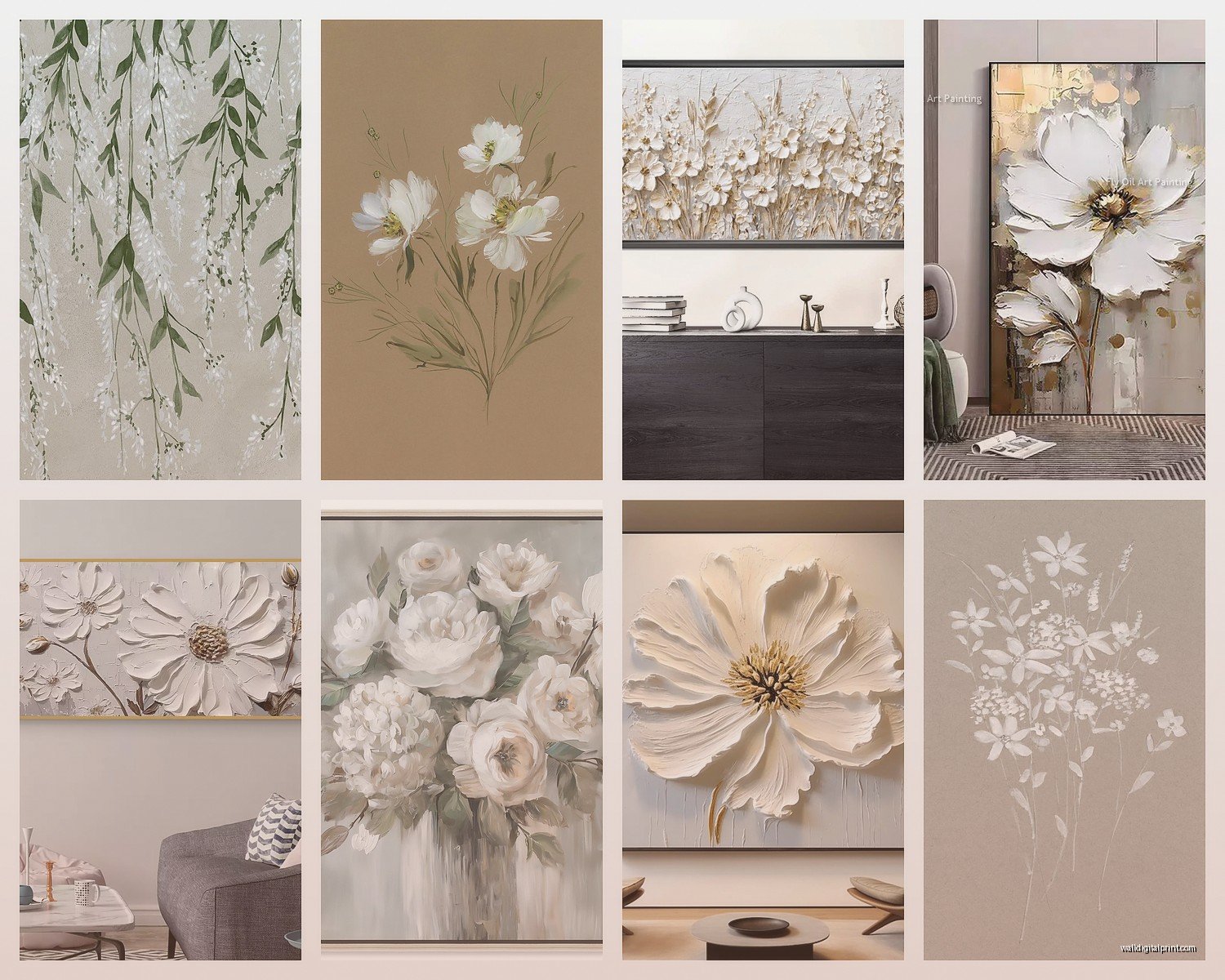
The Different Styles You’ll See
So there are like several categories of white floral art and they all do different things. Let me break down what I’ve actually used in real spaces.
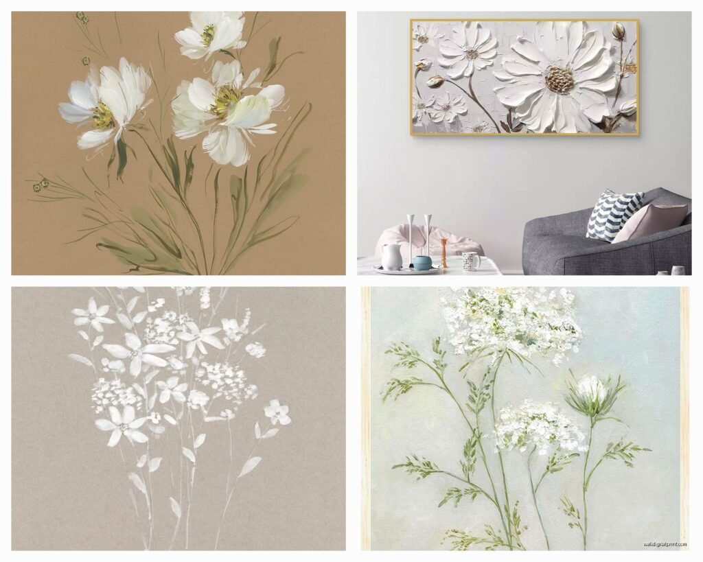
Minimalist Line Drawings
These are those simple black line drawings on white backgrounds—you’ve definitely seen them. Single stem flowers, very clean. I use these in modern spaces, Scandinavian-style rooms, anywhere that’s already pretty minimal. They’re safe but they can also be kinda boring if that’s all you do. Mix them with something that has more texture.
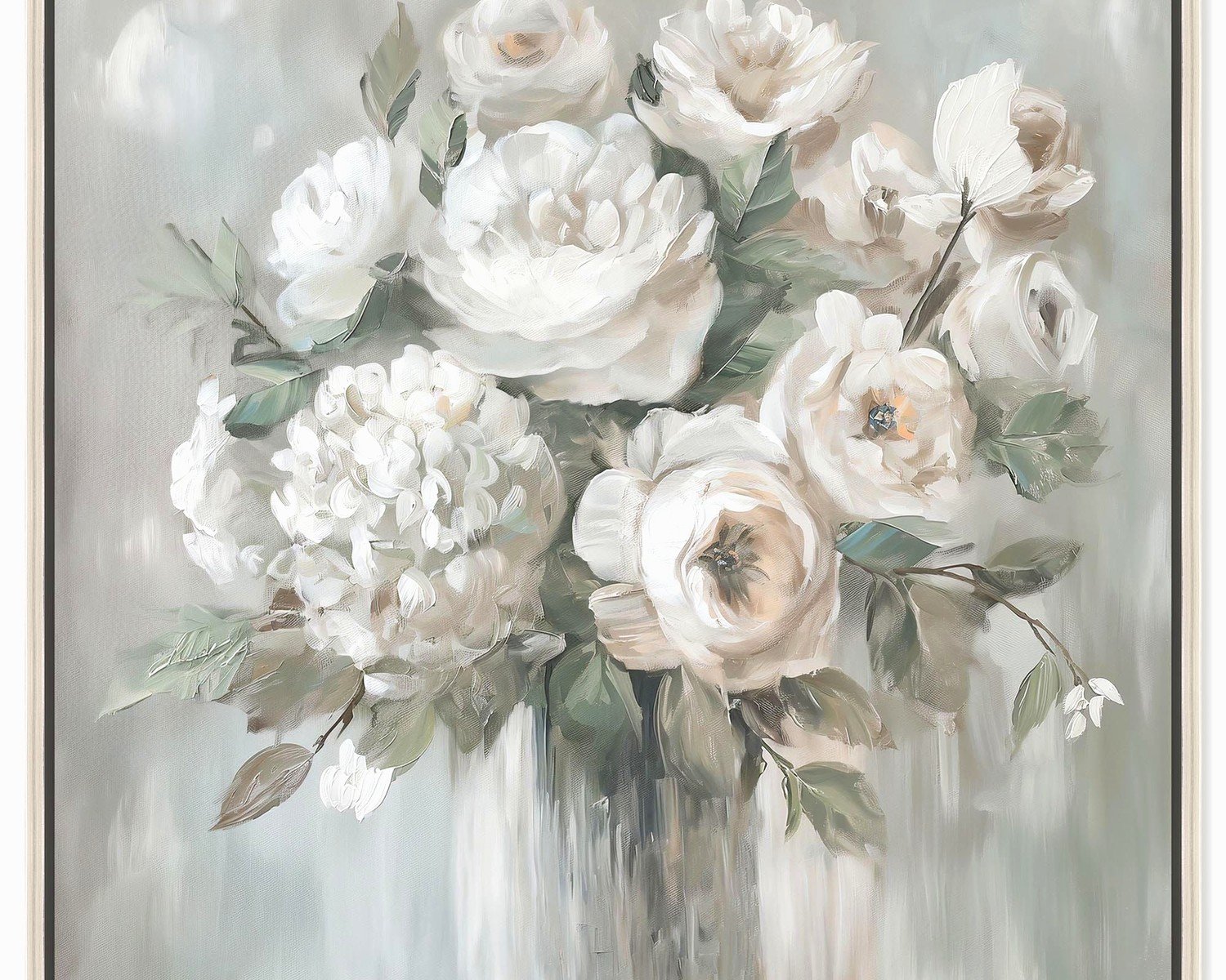
Watercolor Botanicals
Soft, painterly, lots of cream and beige tones usually. These work in basically any space but they’re especially good in bedrooms and bathrooms where you want that calm feeling. I’ve got a set of three watercolor magnolias in my guest bathroom and people always ask about them.
The thing with watercolors is you gotta make sure they’re printed well. Cheap watercolor prints look muddy and weird. You want to see the actual brush strokes or at least good quality digital printing that mimics them.
Photography Prints
Real flower photography in black and white or very desaturated colors. These can be super dramatic—like a huge peony bloom that fills the whole frame. I use these when I want to make a statement. They work great in modern spaces, contemporary dining rooms, even offices.
Pressed Flower Style
That vintage botanical illustration look, like something from an old science textbook. Usually on aged paper or that off-white background. These are perfect for traditional spaces, farmhouse style, anywhere you want that collected-over-time feeling.
Where to Actually Buy This Stuff
Okay so I’m gonna be honest about where I source things because I get asked this constantly.
For budget-friendly options I actually use Etsy a lot. You can find downloadable prints for like $5-15 and then just get them printed at a local print shop. The quality varies wildly though so read the reviews. I’ve found some amazing artists on there who do custom sizing too.
Target and HomeGoods sometimes have decent options but it’s hit or miss. You gotta go in person and really look at the print quality. If it looks pixelated or the colors are off don’t buy it just because it’s cheap.
For mid-range I really like Minted and Artfully Walls. They do good quality printing and have actual artists. Prices are usually $100-300 depending on size which honestly isn’t bad for something you’ll look at every day for years.
High-end I’ve used Serena & Lily, Pottery Barn, and some local galleries. You’re paying for better framing usually and sometimes original art. Worth it if you have the budget but not necessary.
Oh and another thing—Society6 and Redbubble let artists upload designs and you can get them printed in different sizes. The quality is decent and there’s tons of variety.
Framing Is Where People Mess Up
So you can have the most beautiful white floral print and completely ruin it with the wrong frame. I’ve seen this happen so many times.
For white floral art I almost always use:
- Simple wood frames in light oak, white oak, or maple
- Thin black frames for a modern look
- White or cream frames if the art has darker elements
- Natural wood with visible grain for a more organic feel
What I avoid: ornate gold frames unless it’s a traditional space, thick chunky frames that compete with the art, anything too trendy that’ll look dated in two years.
The mat matters too. I usually do white or cream mats, sometimes no mat at all if I’m going for a more contemporary look. A mat that’s too bright white can make the art look dingy by comparison, so go for off-white or cream most of the time.
DIY Framing vs Professional
Look, I’ve done both. For prints under 20×24 I’ll usually just buy a ready-made frame from Michael’s or Amazon. For anything larger or if it’s gonna be a focal point I get it professionally framed. The difference in quality is noticeable.
Framebridge does good mail-order framing if you don’t have a local framer you like. It’s more expensive than DIY but less than high-end custom framing.
Styling White Florals in Different Rooms
Living Room
In living rooms I usually go big and make the white floral art the focal point. Above the sofa is the obvious spot but I’ve also done whole gallery walls of different white florals in varying sizes. The key is to keep some consistency—all black and white photos, or all watercolors, or whatever. Mixing styles too much looks messy.
I did this one living room where we hung a massive 60×40 white peony photograph above a gray sofa and then echoed it with smaller white floral prints on the adjacent wall. Really cohesive, not boring.
Bedroom
Bedrooms are where white florals really shine because you want that calm restful vibe anyway. I almost always do something soft here—watercolors or soft-focus photography. Above the bed is standard but I’ve also done them on the wall opposite the bed so it’s the first thing you see when you wake up.
My own bedroom has three matching white cherry blossom prints in a horizontal row above the headboard. Super simple but it works.
Bathroom
Bathrooms can handle more variety in size. I’ve done everything from one large statement piece to a collection of smaller botanical prints. Just make sure they’re actually framed or sealed somehow because humidity is real. I learned this when a client’s unframed paper print got all wavy and gross.
Kitchen and Dining
People don’t think about art in kitchens enough but white florals work great here. They’re not gonna clash with your dishes or whatever. In dining rooms I like to go more dramatic—big bold blooms, high contrast.
Wait I forgot to mention—if you’re putting art in a kitchen make sure it’s not right above the stove where it’ll get grease splatter. Sounds obvious but I’ve had to explain this more than once.
Creating a Gallery Wall
Gallery walls with white floral art are actually easier than you’d think because the neutral palette means things coordinate automatically. Here’s what I do:
Start with your largest piece and build around it. I usually do odd numbers—3, 5, 7 pieces. Mix up the sizes but keep the frames consistent or at least coordinated. All black frames, all wood, or maybe wood and white together.
I literally cut out paper templates the size of my frames and tape them to the wall with painter’s tape before I hammer any nails. Sounds tedious but it saves so much time and frustration. My cat kept attacking the paper templates when I was doing my hallway which was annoying but also kinda hilarious.
Spacing should be about 2-3 inches between frames. Too close looks cluttered, too far apart looks disconnected.
Mixing White Florals with Other Art
You don’t have to do ONLY white floral art everywhere. That would be weird and kinda hotel-ish. I mix it with:
- Abstract art in neutral tones
- Black and white photography
- Simple landscapes
- Textured pieces like woven wall hangings
The key is keeping your color palette consistent even if the subject matter changes. If you’ve got white florals in the living room you can totally do a landscape in the hallway as long as the tones work together.
What Doesn’t Work
Okay so things I’ve tried that didn’t work: mixing white florals with super bright colorful art. It just looks confused. Also mixing really modern minimal white florals with traditional oil paintings—the styles clash too much.
Seasonal Switching
Some people like to switch their art seasonally which honestly sounds exhausting to me but if you’re into it white florals give you options. Cherry blossoms in spring obviously, white peonies for summer, white mums or cotton stems for fall, white amaryllis or paperwhites for winter.
I have one client who actually does this and stores the off-season art in her basement. More power to her but I’m too lazy for that.
The Practical Stuff Nobody Tells You
Hanging art on different wall types is annoying and everyone has opinions. For drywall I use regular picture hangers rated for the weight. For plaster I use anchors. For brick or concrete you need special masonry hooks or a drill.
Height matters—the center of your art should be at eye level, which is usually around 57-60 inches from the floor. But this depends on your ceiling height and furniture. Above a sofa I go a bit higher, like 8-10 inches above the sofa back.
Lighting makes a huge difference. White florals can look flat without good light. I always recommend having at least one light source that illuminates the art—either natural light or a picture light or even just a well-placed lamp.
If you’re renting and can’t put holes in the walls, command strips actually work pretty well for lighter frames. I’ve used them in apartments and they hold up fine. Just follow the weight limits.
My Current Favorites
Right now I’m really into oversized single bloom photography. Like one huge white peony or magnolia that fills the whole frame. Very dramatic, very simple. I just used a 48×72 white ranunculus photo in a client’s entryway and it’s stunning.
I’m also seeing more abstract interpretations of florals—like where you can tell it’s a flower but it’s more about the shapes and shadows than realistic detail. These work great in modern spaces.
The pressed botanical trend is still going strong and honestly I don’t think it’s going anywhere because it’s so versatile.
Common Mistakes to Avoid
Hanging art too high is like the number one mistake I see. People think they need to fill the wall space all the way up but it just looks weird. Keep it at eye level.
Buying art that’s too small for the space—already mentioned this but it’s worth repeating because everyone does it.
Not considering the undertones. If your walls are warm white and you get art with cool gray tones it’s gonna look off. Pay attention to whether your whites are warm or cool.
Forgetting about the existing elements in the room. Your white floral art should complement your furniture and other decor, not fight with it.
Using too many different frame styles in one space. Pick a framing style and stick with it, at least within the same room.
Okay I think that covers most of what I’ve learned about white floral art. It’s one of those things that seems simple but there’s actually a lot to consider if you want it to look intentional and pulled-together rather than just… there.