Wall Art Guide, Wall Art Tutoriels
Accent Wall Art: Statement Pieces & Focal Point Design
Jun
So I was literally just rearranging my gallery wall last night at like 11pm because I couldn’t sleep and it got me thinking about how many people totally overthink accent wall art. Like, you’re probably staring at that big empty wall right now wondering if you should do one massive piece or a bunch of smaller ones, right?
The Whole “Statement Piece” Thing Actually Means Something
Okay so here’s what I learned after styling probably 50+ living rooms in the past three years – a statement piece is basically anything that makes someone walk into your room and go “oh wow, what’s that?” It doesn’t have to be expensive or even that big, it just needs to be THE thing that your eye goes to first.
I had this client who spent like $3000 on this massive abstract painting and it looked… fine? But then my neighbor hung up this weird vintage map she found at a flea market for $45 and everyone who visits asks about it. The difference was the map had a story and unexpected colors that pulled from her throw pillows.
Size Actually Matters But Not How You Think
People always ask me about the whole “art should take up 2/3 of your furniture width” rule and honestly? It’s a decent starting point but I’ve broken it so many times. What actually matters more is visual weight. Like, a large piece with lots of white space can feel smaller than a medium-sized piece that’s super detailed and colorful.
For reference:
- Over a sofa: I usually go 50-75% of the sofa width if it’s one piece
- Over a console table: 75-90% looks better because consoles are narrower
- Over a bed: anywhere from 50-66% of the mattress width, not the whole bed frame
- Random empty wall: literally whatever feels right, there’s no furniture to anchor to
Choosing Your Focal Point (Without Making Your Brain Explode)
This is gonna sound weird but I actually close my eyes when I walk into a room sometimes, then open them and see where I naturally look first. That’s usually where your focal point should be. It’s typically:
The wall opposite the main entrance
Above the largest piece of furniture
Wherever the best natural light hits
That weird architectural feature you’re trying to either highlight or distract from
My living room has this bizarre alcove that the previous owner painted teal for some reason, and instead of repainting I just leaned into it with a huge black and white photograph. Now people think it was intentional?
One Big Piece vs Gallery Wall Situation
Okay so I go back and forth on this constantly. Here’s when I do each:
One large statement piece when:
- The room already has a lot going on (patterned furniture, busy rugs, lots of decor)
- You want the space to feel more modern and clean
- You’re lazy like me and don’t wanna deal with hanging 15 different frames
- The wall is behind something tall like a headboard where multiple pieces would get blocked
- You found something you absolutely love and it doesn’t need backup dancers
Gallery wall when:
- You have a collection of stuff (family photos, travel prints, your own art)
- The room feels too minimal and needs more personality
- You can’t afford one big piece but can slowly collect smaller ones
- The wall is in a hallway or staircase where people can actually stop and look at details
I literally just helped my sister do a gallery wall in her hallway and we used like 12 pieces – mix of photos, small paintings, even a decorative plate. Took us three hours and two bottles of wine but it looks sick.
What Actually Works As Statement Art
This is where people get stuck scrolling Etsy at midnight (me last Tuesday). Here’s what I’ve seen work really well:
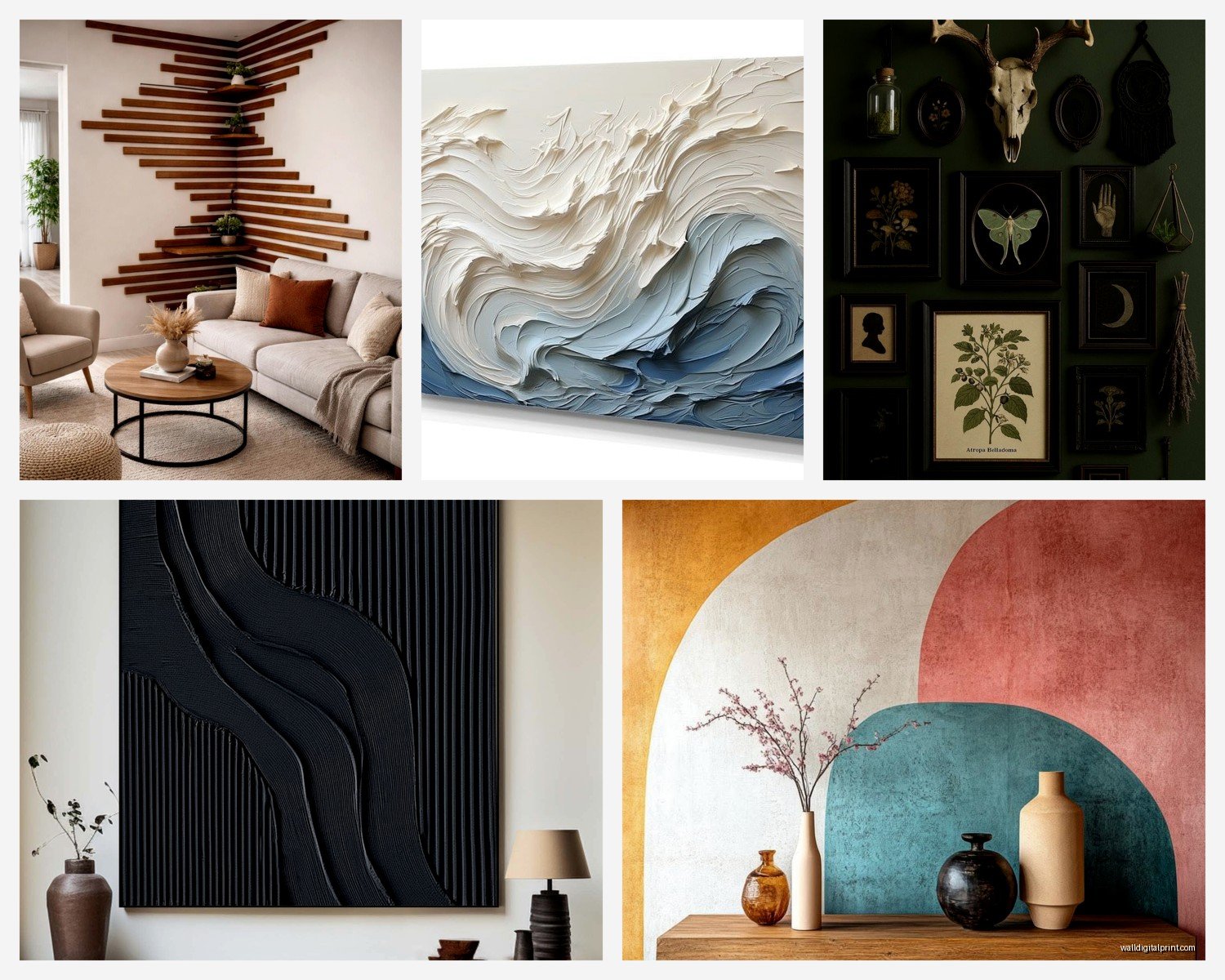
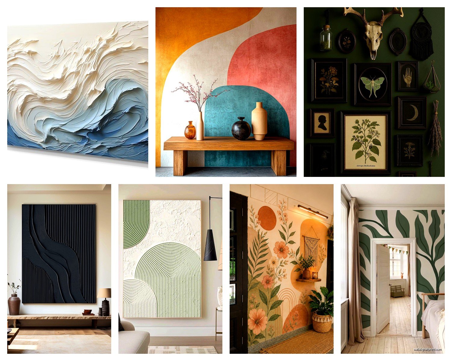
Abstract Art
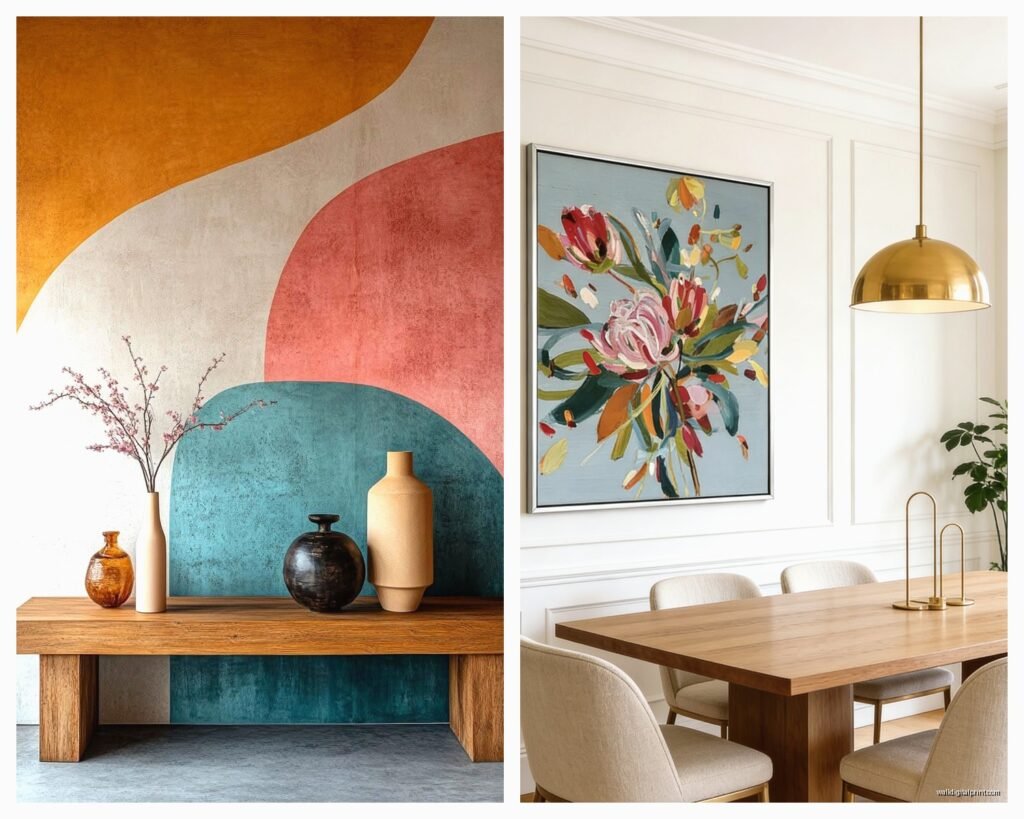
Super forgiving because there’s no “right way” to hang it and it goes with almost anything. I’m obsessed with large abstract pieces that pull 2-3 colors from your existing room. Like if you have navy pillows and brass accents, find something with those tones.
Pro tip: Don’t match your art to your room exactly. Pull accent colors, not your main colors. So if your sofa is gray, don’t get gray art – get art that has the same rust color as your throw blanket.
Photography
Oversized photography is having a moment and I’m here for it. Black and white landscapes, architectural shots, even those really close-up nature photos. They feel more sophisticated than paintings sometimes? I dunno, my cat just knocked over my coffee so I’m distracted, but yeah – photography reads as more curated.
Textile Art and Tapestries
Okay this surprised me but woven wall hangings and tapestries are not just for boho rooms anymore. I hung this modern geometric tapestry in a client’s minimalist bedroom and it added texture without adding clutter. Plus they’re lighter than framed art so easier to hang.
Mixed Media and 3D Pieces
Anything with actual dimension – like metal sculptures, wooden art, macramé, shadow boxes. These are great for rooms that feel flat. I have this metal tree sculpture thing in my entryway that casts cool shadows when the sun hits it.
The Technical Stuff Nobody Tells You
Hanging Height:
The center of your art should be at 57-60 inches from the floor. This is “gallery height” and it actually works in most homes. But if everyone in your house is super tall or short, adjust accordingly. I’m 5’3″ and I hang stuff slightly lower because otherwise I’m staring at the bottom of frames.
Above Furniture:
Leave 6-12 inches between the top of your furniture and bottom of your frame. Less than 6 inches looks cramped, more than 12 inches looks disconnected. I usually do 8 inches and call it a day.
Hardware Matters:
For anything over 20 pounds, use wall anchors or find the studs. I learned this the hard way when a mirror crashed at 3am and nearly gave me a heart attack. For really heavy pieces, I use those heavy-duty picture hangers rated for like 50+ pounds.
Oh and another thing – use a level. I know it seems obvious but I’ve eyeballed it before and it always ends up crooked. Even if it’s just slightly off, your brain knows something’s wrong.
Lighting Your Statement Piece
This is optional but it makes such a difference. I added a picture light above my dining room art and suddenly it looks like it belongs in a gallery. You can also use:
- Track lighting pointed at the wall
- Wall sconces on either side
- An uplight on the floor pointing up (creates drama)
- Even just a well-placed lamp that happens to illuminate it
Natural light is great but make sure it’s not direct sunlight or your art will fade. I learned this after my favorite print got totally washed out in my south-facing office.
Color Coordination Without Being Matchy-Matchy
So there’s this thing I do where I take a photo of my room on my phone, then when I’m shopping for art online, I pull up the photo and compare. Sounds basic but it’s saved me from so many returns.
You want your statement art to either:
- Pull colors that already exist in the room (safest option)
- Introduce ONE new accent color that you’ll repeat elsewhere
- Go totally neutral if your room is already colorful
- Be the only colorful thing if everything else is neutral
My bedroom is all whites and grays and I have this massive coral and gold abstract above my bed. It’s literally the only warm color in there and it works because it’s intentional.
Frame or No Frame?
Canvas prints: usually look better without frames, just hang them as is
Photographs and prints: need frames unless you’re going for a very casual poster vibe
Textiles: no frame needed obviously
Original paintings: depends on the edges – if they’re finished, skip the frame
I’m really into floating frames right now where the art sits inside but you can see the edges. Very modern and worth the extra $30.
Where to Actually Buy This Stuff
Okay so I’m gonna be honest, I’ve bought art from literally everywhere:
Etsy: Great for prints and original work from actual artists. Search by color or style. I got this amazing line drawing from a seller in Portugal for like $40.
Society6 and Minted: Good for prints but can feel generic. Everyone has the same stuff but the quality is solid.
Local art fairs and markets: This is where I find my favorite pieces. You meet the artist, get a story, and have something unique.
Thrift stores and estate sales: Hit or miss but I’ve found incredible vintage pieces. Just check for damage and be prepared to maybe reframe.
Frame your own stuff: Seriously, blow up a photo you took on vacation, buy a cheap frame from Target, done. Some of my favorite “art” is just stuff I found meaningful.
Rent art: There are services where you can rent art monthly. Good if you get bored easily or wanna try before you buy something expensive.
Common Mistakes I See All The Time
Hanging art too high – like way too high, almost on the ceiling
Choosing art that’s too small – go bigger than you think
Matching your art to one throw pillow exactly – it looks try-hard
Hanging everything the same way – mix orientations and sizes
Forgetting about the space above – if there’s 2 feet between your art and ceiling, something’s off
Not considering the view from other rooms – I hung something once that looked great from the living room but blocked a nice view from the kitchen
wait I forgot to mention – if you’re doing a gallery wall, lay it out on the floor first and take a photo. Then recreate that on the wall. Use painter’s tape to mark where frames go. I skip this step sometimes when I’m feeling confident and always regret it.
Making It Feel Intentional
The difference between “I hung some art” and “this is a designed focal point” comes down to:
Repetition of color or style elsewhere in the room
Proper lighting that highlights the piece
Negative space around it – don’t crowd it with other stuff
Quality framing if applicable
Hanging it at the right height
I styled this rental apartment once where we couldn’t paint or do much, but we hung this massive abstract piece and suddenly the whole boring beige room had a vibe. The art dictated everything else – we picked pillows that matched, moved furniture to face it, added a plant nearby. It became the anchor.
Your statement piece should feel like the room was designed around it, even if you added it last. That’s the whole point of a focal point, right? Everything else supports it.
Just start with what you actually like, not what you think you’re supposed to have. I see so many people buy generic beach scenes for their coastal-themed room when they’ve never even been to the beach. Like, if you love abstract faces or vintage maps or photos of architecture, start there. The room will come together around your actual taste way easier than forcing it around some design “rule.”