Wall Art Guide, Wall Art Tutoriels
Wall Art Collage: Gallery Wall Arrangement Guide
Jun
So I was up way too late last night because I fell down this rabbit hole trying to fix my living room gallery wall and honestly I’ve done like fifteen of these for clients but doing your own is somehow harder? Anyway here’s what actually works.
Start With the Floor Seriously
Okay so the biggest mistake everyone makes is buying frames first. Don’t do that. I learned this the hard way when I had to return like nine frames to three different stores because my cat knocked over my coffee while I was measuring and I just… anyway.
Get kraft paper or newspaper or honestly even garbage bags taped together and cut out the exact sizes of frames you’re thinking about. Then tape them to the wall with painter’s tape. You can move stuff around without putting holes everywhere and you’ll actually see what works. I usually do this on a Saturday morning and just leave it up for a few days because what looks good at 10am looks completely different at 7pm when the light changes.
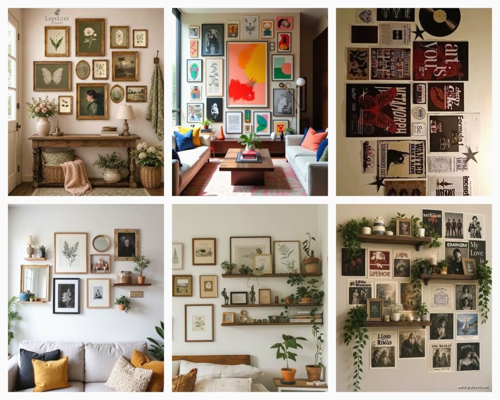
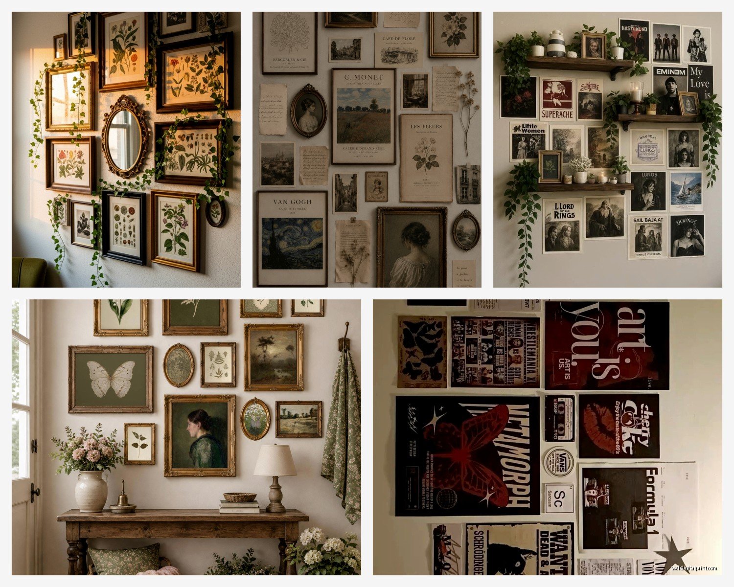
The actual layout options that don’t suck
There’s like a million ways to arrange gallery walls but most of them look chaotic in a bad way. Here’s what I keep coming back to:
- Grid layout – same size frames, equal spacing, super clean but can feel a bit corporate if you’re not careful
- Salon style – different sizes all grouped together, this is the Pinterest one everyone tries but it’s actually the hardest to pull off
- Linear arrangement – frames in a horizontal or vertical line, easiest one honestly
- Central focus – one big piece in the middle with smaller stuff around it, this is my go-to for clients who get overwhelmed
The Spacing Thing Nobody Tells You Right
So everyone says 2-3 inches between frames and like yeah that’s technically correct but it depends SO much on your frames and art. I did a gallery wall last month with really ornate vintage frames and we needed 4 inches between them because otherwise it was just visual chaos. But then I have these thin black frames at home that look better at 1.5 inches apart.
Here’s what I actually do: lay everything out on the floor first. Like literally arrange your frames on the ground in front of the wall. Take a photo from above. That photo will tell you way more than any measurement guide.
The standard is 57 inches to the center of your artwork which is supposedly average eye level but I’m 5’3″ and my husband is 6’1″ so like… whose eye level are we talking about? I usually go with 60 inches in rooms where people are standing and 54-56 inches in dining rooms or bedrooms where you’re seated more often.
Frame Selection Without Losing Your Mind
Oh and another thing – you don’t need to match your frames perfectly unless you’re doing a grid. Actually matching frames in a salon wall looks weirdly formal? I usually pick 2-3 frame colors max and vary the styles within those colors. Like all black frames but some are thin modern ones and some are chunkier traditional ones.
IKEA Ribba frames are honestly fine for this. I know everyone’s gonna judge me but I’ve used them in client homes that cost more than my car. Just swap out the mat if it comes with one because their mats are flimsy. Michaels has good mats and they’re always having a sale.
Mix in some non-frame elements too – a small mirror, a wooden letter, maybe a small shelf. Breaks it up in a good way.
What to actually put in the frames
This is gonna sound weird but I have a folder on my phone of just random art I screenshot from everywhere. When I see a print I like on someone’s Instagram or whatever I just save it. Then I go through Society6 or Minted or even Etsy and search for similar vibes.
Don’t try to have a “theme” that’s too specific. Like don’t do all botanical prints unless you really really love that because you’ll get sick of it. I did all vintage maps once and couldn’t look at them after six months. Now I mix it up – some photography, some abstract stuff, maybe a vintage poster, some text-based art.
The Actual Hanging Process
Okay so you’ve got your paper templates up and you like the arrangement. Now comes the annoying part. You need:
- A level (the app on your phone works fine honestly)
- Pencil
- Measuring tape
- Hammer and nails OR command strips if you’re renting
- Those little felt pads for protecting walls
Mark the center of each paper template. Then measure from the top of your frame to the hanging hardware on the back. Subtract that measurement from the center mark. That’s where your nail goes. I write this down every single time because I will forget between frames.
Wait I forgot to mention – if you’re hanging on drywall you’re probably fine with regular picture hanging nails for anything under 20 pounds. Heavier stuff needs anchors. Plaster walls are trickier and you might need actual wall anchors even for lighter pieces.
Command strips are actually okay now
I used to hate Command strips but they’ve gotten so much better. The picture hanging strips hold up to 16 pounds if you use enough of them and I’ve had gallery walls stay up for years with them. Just follow the directions exactly – press for 30 seconds, wait an hour before hanging, whatever it says. People skip steps and then blame the product.
Pro tip my contractor friend told me: clean the wall with rubbing alcohol first and let it dry completely. Makes such a difference with adhesion.
Starting Points That Make It Easier
If you’re doing a salon wall situation start with your biggest piece and work outward. Or start from the middle and work out. Don’t start from one corner because you’ll run out of wall in weird ways.
For grid layouts I actually start from the top left and work across and down because that’s how my brain works but some people prefer middle-out for those too.
Linear arrangements are easiest if you hang the middle piece first then work outward from there to keep things balanced.
The Stuff That Goes Wrong
So you’re gonna make some holes in the wrong place. It happens to everyone including me and I do this professionally. Keep some spackle around. The little squeeze tubes are like three dollars and you can fix holes in thirty seconds.
Your frames probably won’t be perfectly level. Like you can try but walls aren’t perfectly straight and frames aren’t perfectly square and at some point you just gotta accept that it’s close enough. Step back 10 feet and if it looks good from there you’re done.
Sometimes you hang everything and it just feels wrong. I had this happen in my bedroom last year – spent three hours hanging 11 frames and then hated it. Left it up for a week to see if it would grow on me and it didn’t so I redid the whole thing. Happens to the best of us.
Lighting makes or breaks it
Oh man I almost forgot about lighting. If your gallery wall is on a dark wall or in a dim hallway you need some kind of light on it or it’s just gonna disappear. Picture lights are expensive and kind of old-fashioned looking but there are these battery powered puck lights now that you can stick above frames.
Or just make sure there’s a floor lamp or table lamp that throws light toward that wall. I’m literally watching my gallery wall right now and half of it is in shadow because I forgot to turn on the lamp and it looks so different.
Scale Issues People Don’t Think About
Your gallery wall should take up about two-thirds to three-quarters of your wall space. Tiny gallery wall on huge wall looks lost. Huge gallery wall on tiny wall looks overwhelming.
I usually tape out a rough rectangle of where the whole thing will go before I even pick frames. Like if you have an 8-foot wide wall maybe your gallery wall is 5-6 feet wide total. Leave some breathing room.
Also consider what’s below the wall – if it’s above a sofa the gallery wall should be wider than the sofa or at least close to the same width. Above a console table same thing. Floating in the middle of a wall with nothing below it is harder to pull off but can work if the arrangement is really strong.
Mix Your Art Mediums
All prints can look flat. Mix in some stuff with texture – maybe a small woven piece, a framed fabric sample, something three-dimensional. I have this small ceramic piece hanging in my gallery wall that’s not even in a frame and it adds so much interest.
Black and white mixed with color usually works better than all color unless you’re really committed to a specific color palette. All black and white can look good but sometimes reads as cold.
Where to find art that doesn’t cost a fortune
Honestly thrift stores and estate sales are goldmines. I found this amazing vintage botanical print at Goodwill for $4 and it’s my favorite piece in my whole house. You can also print stuff yourself – there are tons of public domain images you can download and print at FedEx or Staples for cheap.
Society6, Minted, Etsy, even Amazon has some decent prints now. Follow artists on Instagram and buy directly from them when you can. Usually cheaper than going through a retailer and you’re supporting actual artists.
Your own photos work great too if you have them printed nicely. I have three photos I took on vacation in Italy and they mean more to me than any expensive print I could buy.
Okay Last Thing About Flexibility
Don’t think of your gallery wall as permanent. I swap pieces out seasonally sometimes or when I find something new I love. That’s the whole point of doing multiple smaller pieces instead of one big statement piece – you can evolve it over time.
Keep a few extra frames in your closet in coordinating styles so when you find new art you can just swap it in without redoing the whole wall.
And honestly if you hang it all and don’t love it that’s okay too. Take it down and try something else. It’s just walls and nails and everything can be fixed with a little spackle and paint. I’ve redone my own gallery wall like four times in two years and each time I learn something new about what I actually want to look at every day which is kinda the whole point right?