Wall Art Guide, Wall Art Tutoriels
Corner Wall Art: Angled Space Filling Placement Ideas
Jun
So I’ve been obsessing over corner wall art lately because honestly, corners are the most awkward spaces and everyone just… ignores them? Which is wild because I had this client last month who had this gorgeous loft with these angled corners and we basically turned them into the focal points of the whole space.
Why Corners Are Actually Perfect for Art
Okay so here’s the thing about corners that nobody tells you. They create natural sight lines. Like when you walk into a room, your eye automatically travels to corners because they’re where walls meet and your brain is weirdly programmed to notice that. I learned this when I was curating this gallery show and the corner pieces got way more attention than the center wall stuff.
The trick is you gotta work WITH the angle instead of fighting it. I see so many people try to hang art like the corner doesn’t exist and it just looks… off.
The Basic Approaches That Actually Work
The Wrap-Around Method
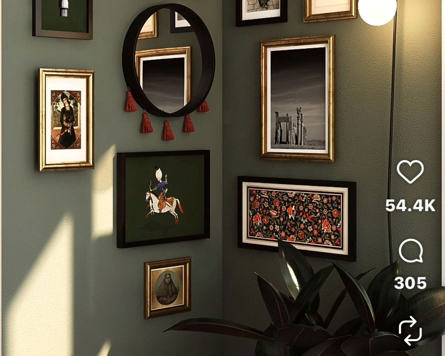
This is my go-to honestly. You take two pieces that either match or complement each other and let them wrap around the corner. The key is keeping them at the same height – like the centers should align even though they’re on different walls.
I did this in my own bedroom with two abstract pieces I found at this estate sale (was supposed to be looking for a client but whatever). Hung them so they’re about 57 inches at center height, which is apparently the museum standard but also just feels right when you’re standing in the room.
The spacing from the corner matters more than you’d think. I usually do 6-8 inches from the corner edge on each side. Closer than that and it feels cramped, further and you lose the connection between the pieces.
The Single Large Piece Angled Across
Wait I forgot to mention – if you have a corner that’s like, really prominent, you can actually hang one large piece so it spans across the corner itself. Not flat against either wall but literally bridging the corner.
This sounds weird but it works amazing with canvas pieces because they’re lightweight enough. You need two hooks, one on each wall, and the canvas kind of bows slightly in the middle where it crosses the corner. Creates this sculptural effect that’s super unexpected.
I did this with a 36×48 canvas in a client’s office and everyone asks about it. The canvas was this deep teal abstract thing and the way it catches light from both sides of the corner is *chef’s kiss*.
You gotta make sure the canvas has a deep enough frame though – like at least 1.5 inches – or it’ll look flimsy. And obviously this only works with certain art styles. Don’t try it with something precious or a print behind glass.
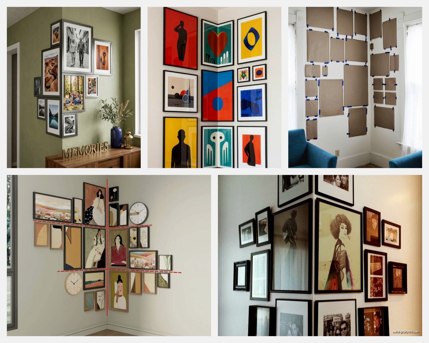
The Gallery Wall Approach for Corners
Okay so funny story, I was watching The Great British Baking Show last night (Paul Hollywood is so harsh omg) and got inspired to do a “scattered” gallery wall in my corner space because the way they arrange stuff on those tables is kind of genius?
For corner gallery walls, you want to think about flow. Start with your anchor piece – usually the largest or most eye-catching – and place it first. I typically put mine about 6-12 inches from the corner on one wall.
Then build out from there but here’s the key: don’t make it symmetrical. Let some pieces wrap around the corner, let others stay on just one wall. The asymmetry makes it feel organic instead of forced.
My Actual Layout Process
I trace all the frames on kraft paper first (learned this the hard way after putting like 20 holes in a client’s wall). Cut them out, tape them up, live with it for a day or two. Take a photo, send it to yourself, look at it on your phone because somehow things look different on a phone screen.
The spacing between frames in a corner gallery wall should be consistent – I do 2-3 inches between each piece. Any more and it feels disconnected, any less and it’s cluttered.
Working With Awkward Angled Ceilings
Oh and another thing – if you have angled ceilings meeting in a corner (like in an attic space or vaulted ceiling situation), you gotta acknowledge that angle in your placement.
I had this project in a converted barn where the ceiling was slanted and met in this dramatic corner. We hung pieces following the angle of the ceiling line, stepping them down gradually. Started with a tall vertical piece at the highest point and worked down to smaller squares as the ceiling got lower.
It created this cascading effect that felt intentional instead of like we were just trying to fill space. Used a mix of framed photography and small paintings, all in similar tones so it felt cohesive.
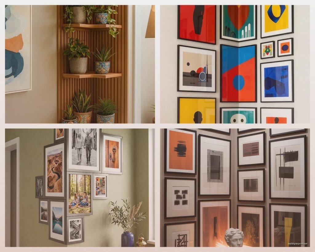
Corner Shelving Plus Art
This is gonna sound extra but combining corner shelves with art is actually brilliant for small spaces. You can get those floating corner shelves – the triangular ones that fit into the corner angle – and then hang art above or around them.
I did this in my tiny apartment bathroom (yes, art in the bathroom, it’s allowed). Put a small corner shelf about 4 feet up, styled it with a plant and some pretty bottles, then hung a small framed print above it. The shelf breaks up the space so the art doesn’t feel like it’s floating awkwardly.
The proportions matter here though. The shelf should be narrower than your art piece, or at least not wider. Otherwise it looks bottom-heavy and weird.
Lighting Considerations Nobody Talks About
Okay so corners are naturally darker because they’re where two walls meet and light doesn’t hit them straight on. Which means you need to think about lighting way more than you would for regular wall art.
I use those battery-operated picture lights sometimes – the ones that clip onto the frame. For corners especially, positioning two lights (one on each piece if you’re doing the wrap-around method) creates this really nice ambient glow.
Or if you’re fancy, track lighting aimed at the corner. My client with the loft had track lighting installed and we angled two spotlights to converge in the corner where her art was. Super dramatic for evening entertaining.
Natural Light and Corners
If your corner is near a window, you gotta think about how light moves through the space during the day. I learned this when I hung this gorgeous watercolor in a corner near a west-facing window and by 5pm every day it was completely washed out by direct sunlight.
UV-protective glass is worth it for corners near windows. Yes it’s more expensive but like, you don’t want your art fading in weird patterns because of the angle of light exposure.
Scale and Proportion Rules I Actually Follow
The general rule is your art should take up 2/3 to 3/4 of the available wall space. But in corners this gets tricky because you’re dealing with two walls meeting at an angle.
What I do is measure from the corner outward on both walls – usually about 4-6 feet in each direction depending on the room size. That’s your “corner zone” for art placement. Within that zone, your art (whether it’s one piece, two pieces, or a gallery wall) should fill about 60-70% of the space.
My cat just knocked over my coffee cup so gonna speed through this next part…
Common Size Combinations That Work
- Two 24×36 pieces, one on each wall – classic and balanced
- One 30×40 with three 8x10s scattered on the adjacent wall – creates visual interest
- Three 16x20s on one wall, two 20x24s on the other – asymmetrical but weighted correctly
- Five to seven mixed sizes (ranging from 5×7 to 16×20) spread across both walls – gallery wall style
The key is having at least one larger anchor piece. All small pieces in a corner feels cluttered and indecisive.
Art Styles That Work Best in Corners
Not all art is created equal for corner placement. I’ve found that certain styles just work better with the angular geometry of corners.
Abstract pieces are forgiving because there’s no “correct” orientation. If something looks slightly off due to the corner angle, it just reads as part of the abstract nature.
Geometric art is amazing in corners because you can play with how the lines and shapes in the art interact with the corner lines. I once hung two pieces with strong diagonal lines so they created this implied X pattern across the corner. Very satisfying.
Photography can be tricky – especially portraits or anything with a clear subject. The corner can make it feel like the subject is being boxed in or hidden. Landscapes work better, or architectural photography where the lines can echo the corner structure.
Hardware Considerations for Corner Hanging
Regular picture hanging wire and hooks work fine for most corner applications, but if you’re doing the wrap-around method with larger pieces, you need to think about weight distribution differently.
I use D-rings instead of wire for heavier pieces in corners because they give you more control over the exact angle. Position the D-rings about 1/3 down from the top of the frame, and use wall anchors rated for more weight than you think you need.
For the angled-across-the-corner method I mentioned earlier, you need hooks that can support the piece at an angle. I use heavy-duty picture hooks rated for at least 50 pounds, positioned so the piece hangs at a slight forward tilt rather than trying to sit flush against walls it’s not actually touching.
Color Coordination in Corner Spaces
This is where it gets fun – corners create natural color blocking opportunities. If you have two walls in different colors meeting at a corner, you can either choose art that bridges both colors or use art to intensify the contrast.
I worked with a client who had a navy wall meeting a cream wall at a corner. We hung two pieces – one with navy and gold tones on the cream wall, one with cream and coral tones on the navy wall. The art became this transitional element that made the bold color choice feel intentional instead of jarring.
Or you can go full contrast – dark art on light walls, light art on dark walls, meeting in the corner for maximum drama.
Dealing With Corner Furniture
Real talk – most corners have furniture in them. Corner desks, accent chairs, floor lamps, that weird side table you inherited. You gotta work with this.
Art above corner furniture should start at least 6-8 inches above the furniture height. So if you have a corner chair that’s 36 inches tall, your art should start at 44 inches minimum.
And the art shouldn’t be wider than the furniture below it – or if it is, only slightly. I usually keep art within 1.2x the width of the furniture. Anything more and it looks like the art is gonna topple over onto whatever’s below.
Seasonal Rotation Strategy
Oh wait, I forgot to mention – corners are actually perfect for seasonal art rotation because they’re distinct enough that changing the art feels like a refresh but not so prominent that empty walls look weird while you’re swapping things out.
I keep lightweight pieces for my corners specifically so I can rotate them easily. Spring florals, summer abstracts, fall landscapes, winter moody pieces. The corner location makes even small changes feel impactful.
Use Command strips for lighter pieces if you’re planning to rotate frequently. Yeah I know some people are purists about proper hanging hardware but honestly, for pieces under 5 pounds, Command strips are a lifesaver when you’re changing things out every few months.
Budget-Friendly Corner Art Solutions
You don’t need expensive original art for corners. Some of my favorite corner installations use:
- Large-scale prints from Minted or Society6 in simple frames
- Thrifted frames with new mats and personal photos or downloaded art
- Fabric stretched over canvas frames – I did this with vintage scarves once and it was stunning
- Pages from old books or maps framed in matching frames for a gallery wall effect
- Your own photography printed large at a local print shop
The frame consistency matters more than the art price tag. All matching frames make even cheap prints look curated and intentional.
Okay I think that covers most of what I’ve learned through trial and error with corner art placement. The main thing is just commit to the corner as a feature instead of treating it like dead space. Corners have potential, they just need you to see it.