Wall Art Guide, Wall Art Tutoriels
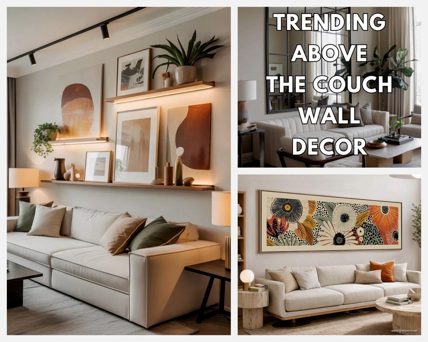
Wall Art Behind Sofa: Above Couch Focal Point Placement
Jun
So I was literally just rearranging a client’s living room yesterday and we spent like an hour just staring at the wall behind their sofa trying to figure out the whole art placement thing, and honestly it’s one of those spaces that people mess up constantly because there’s this weird pressure for it to be perfect since everyone’s gonna see it when they walk in.
First thing – and I cannot stress this enough – you gotta measure before you do anything. I know it sounds obvious but I’ve watched people (including myself at 11pm on a Tuesday) just eyeball it and then you’re left with nail holes everywhere. The basic rule I always start with is your art should take up about two-thirds to three-quarters of the sofa width. So if your couch is 84 inches wide, you’re looking at art or a gallery wall that spans roughly 56 to 63 inches. Not exact science but it keeps things proportional.
Height is where everyone gets tripped up though. You want the center of your artwork to sit at eye level, which is typically 57 to 60 inches from the floor – that’s the standard gallery height. BUT and this is important, when you’re putting art above a sofa, you need to account for the sofa back. I usually leave 6 to 12 inches between the top of the couch and the bottom of the frame. Less than 6 inches and it looks like the art is sitting ON the sofa which feels weird and cramped. More than 12 inches and you get this awkward floating situation where the art doesn’t relate to the furniture at all.
My cat just knocked over my coffee while I’m typing this but anyway –
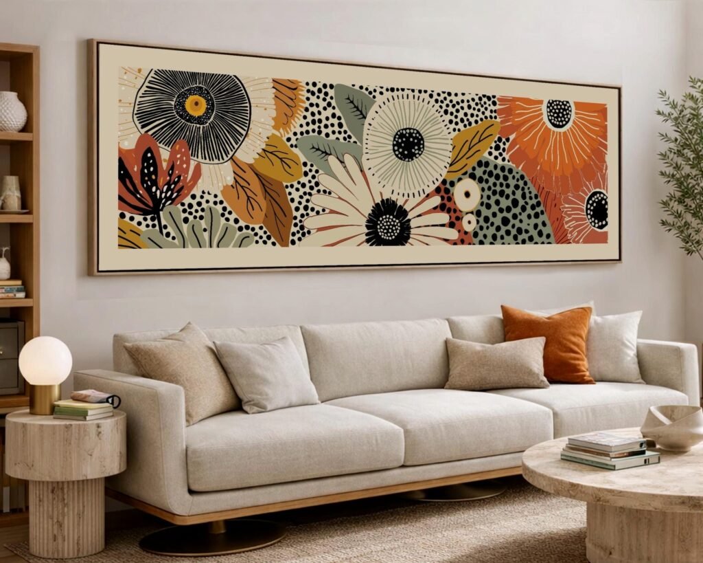
The actual size of the art matters way more than people think. I see SO many living rooms where someone bought this tiny 16×20 piece for a massive sectional and it just looks lost. For a standard 3-seater sofa that’s around 7 feet wide, I’d go with either one large piece that’s at least 40 inches wide, or a gallery wall arrangement that fills that two-thirds rule I mentioned. If you’re doing a single piece, going bigger is usually better than going smaller. I had this moment last month where a client was debating between a 30×40 and a 48×36 for their sofa wall and we went with the larger one and the difference was honestly dramatic.
Oh and another thing – orientation matters depending on your wall height and sofa style. If you have a low-profile modern sofa and standard 8-foot ceilings, a horizontal piece usually works better because it emphasizes width and makes the room feel more spacious. Vertical pieces can work great if you have higher ceilings or you’re trying to draw the eye up, but they need to be substantial enough that they don’t look like a random portrait floating there.
Gallery walls are their own whole situation. I actually prefer them sometimes because you can customize the size more easily and they feel less formal? But they require more planning. What I do – and this is gonna sound weird but it works – is trace all your frames on kraft paper, tape the paper to the wall, and move things around until it looks right. Then you mark your nail holes right through the paper. Saves you from the nightmare of trying to wing it with a level and ending up with seventeen holes you gotta spackle later.
For gallery wall layouts, there’s a few approaches that actually work. The grid layout is the easiest – same size frames arranged in rows and columns, super clean and modern. I use this one a lot for clients who get anxious about asymmetry. Then there’s the salon style which is more organic and mixed frame sizes, but you need to maintain roughly even spacing between frames (I aim for 2 to 3 inches). The key with salon style is to map out the overall shape first – usually a rectangle or square perimeter – then fill in the middle.
Wait I forgot to mention – you gotta think about what’s actually in the art too. This sounds obvious but the colors and mood need to work with your sofa and room. I had a situation where someone bought this gorgeous abstract piece with lots of deep blues and teals, but their sofa was this warm cognac leather and the whole thing just fought with itself. You don’t need to match exactly – actually please don’t match exactly because that’s boring – but there should be some kind of conversation happening between the art and the furniture.
The style of your sofa also dictates some decisions. Modern low-profile sofas with clean lines can handle more dramatic or abstract art because there’s not much visual competition. But if you’ve got a traditional sofa with rolled arms and tufting and whatever, sometimes a simpler art choice works better so the whole wall doesn’t feel chaotic. I’m working with someone right now who has this very ornate Victorian-style sofa and we’re going with a single large-scale photograph in a simple frame because adding more decorative elements would’ve been too much.
Lighting is something nobody thinks about until after they hang everything. If you’re putting art above your sofa, you probably want to light it properly especially if it’s a focal point. Picture lights that mount to the frame work great for traditional pieces. Track lighting or adjustable ceiling fixtures give you more flexibility. I’ve also used those battery-operated LED strips behind frames for a more modern look – saw that on some design show while I was binge-watching at 2am and actually tried it.
Oh and frames matter more than people realize. Heavy ornate frames need more substantial art and work better with traditional spaces. Simple thin frames or even floating frames (where the art sits in clear acrylic) feel more contemporary. I keep a running list of frame sources because clients always ask – Framebridge is good for custom but pricey, Michael’s does decent custom framing especially with coupons, and honestly IKEA frames are fine for prints if you’re on a budget.
One thing that’s kinda changed my approach lately is thinking about the negative space around the art. You don’t need to fill every inch of wall. Sometimes a smaller piece with lots of breathing room around it can feel more intentional than a massive piece that dominates everything. I did this in my own living room actually – went with a 30×40 piece above my 6-foot sofa with probably 18 inches of space on each side and it works because the art itself is really bold and colorful so it doesn’t need to be huge to make an impact.
If you’re going with multiple pieces – like a diptych or triptych – keep them close together. I usually do 2 to 4 inches between panels max. Too much space and they read as separate pieces instead of one cohesive artwork. And make sure they’re level with each other which sounds basic but I’ve seen so many installations where one panel is like half an inch higher and once you notice it you can’t unsee it.
Texture adds another layer to consider. A flat print under glass feels different than an oil painting with visible brushstrokes or a textile wall hanging. For spaces that already have lots of texture – like a velvet sofa, patterned pillows, a chunky knit throw – sometimes a simpler flat piece balances things out. But if your sofa and space are pretty minimal, a textured piece can add that tactile interest you need.
The whole command strips versus nails debate comes up constantly. For lightweight frames under like 8 pounds, command strips work fine and you avoid holes. But for anything substantial or valuable, just use proper picture hanging hardware. I prefer D-rings and picture wire for larger pieces because they distribute weight better than sawtooth hangers. And definitely hit a stud if you’re hanging something heavy – I learned this the hard way when a frame came crashing down at 3am and scared the hell out of me and my dog.
Here’s something I don’t see talked about enough – the art behind your sofa should relate to the rest of your room but doesn’t have to match perfectly. If you have other art on adjacent walls, there should be some thread connecting them whether that’s color palette, frame style, subject matter, or even just the overall vibe. I worked on this living room where we did black and white photography throughout, all different subjects and frame sizes, but the cohesive black and white treatment tied everything together.
Seasonal swaps are actually easier with the sofa wall than people think. If you use picture ledges instead of hanging directly, you can rotate art whenever you want. I have one client who changes her sofa wall art every few months and uses a picture ledge system – way easier than patching and repainting nail holes constantly. Plus you can layer smaller pieces in front of larger ones for more depth.
Scale gets weird with sectionals because they’re so large. For an L-shaped sectional, I usually treat the longest straight section as the “back” and center the art there rather than trying to span the entire sectional which would require like a 10-foot piece of art. If you have a U-shaped sectional, sometimes art on the wall behind the middle section works, or you might be better off doing floor lamps and plants as your vertical elements and putting art on other walls entirely.
One mistake I see constantly is hanging art too high. People think they need to fill the wall space all the way up to the ceiling but that just makes everything feel disconnected. Even with high ceilings, keeping your art at that proper height relative to the sofa creates better visual cohesion. You want the art and furniture to feel like they’re part of the same vignette not separate elements.
Abstract versus representational is totally personal preference but think about how you actually use the space. If this is a formal living room you use for entertaining, dramatic or conversation-starting art works great. If it’s your everyday Netflix sofa, maybe something calming makes more sense. I have a huge abstract piece behind my own sofa that’s mostly blues and grays because I wanted something interesting but not distracting when I’m trying to watch true crime documentaries.
Budget-wise, you’ve got options at every level. Original art from local artists or online galleries like Saatchi Art starts around $200 and goes up infinitely. Print shops like Minted or Society6 have good stuff for $50-200 depending on size. Even printable art from Etsy that you frame yourself can look expensive if you choose well and frame it properly. I’ve mixed $1000 originals with $30 Etsy prints in the same gallery wall and nobody can tell which is which.
The whole thing really comes down to proportion and intention. Measure your space, consider the scale, think about how the art relates to your sofa and room, and then just commit to a decision because you can always change it later if you hate it. I’ve rehung my own living room art like four times in the past year because I keep second-guessing myself so you’re definitely not alone if this feels complicated.