Wall Art Guide, Wall Art Tutoriels
Wall Art for Behind Couch: Living Room Seating Focal Point
Jun
So I’ve been dealing with this exact situation for literally the past three weeks because my brother texted me at like 11pm asking why his living room looks “sad” and it was 100% the blank wall behind his couch. The thing is, most people think you just slap up whatever art fits the space but there’s actually a method to making it look intentional and not like you just moved in.
Getting the Scale Right First
Okay so this is where everyone messes up. The art behind your couch should be roughly two-thirds to three-quarters the width of your sofa. I learned this the hard way when I hung this gorgeous abstract piece above my own couch and it looked like a postage stamp floating in space. My cat kept staring at it judgmentally which honestly made it worse.
For a standard 84-inch sofa, you’re looking at art that’s about 56-63 inches wide. But here’s the thing… you don’t need ONE piece. You can do a gallery wall, a diptych, a triptych, whatever. The total visual weight just needs to match that proportion. I had a client who insisted on this tiny 24×36 print above her massive sectional and I literally had to photoshop it for her to see why it looked off.
Height Placement That Actually Works
The center of your artwork should be at eye level when you’re standing, which is usually 57-60 inches from the floor. But wait, here’s where it gets tricky with couches. You want 6-12 inches of space between the top of your couch back and the bottom of your art. Not more, not less, or it starts looking disconnected.
I measured this obsessively last month because a client swore her art was hung correctly and it just looked… floaty. Turned out she had 18 inches of gap and once we lowered it, the whole room clicked into place. If your couch back is 36 inches high, you’re looking at hanging your art so the bottom edge sits around 42-48 inches from the floor.
Quick Math for Hanging
- Measure your couch back height
- Add 6-12 inches
- That’s where your art bottom should be
- Mark the center point of your art at roughly 57-60 inches if possible
- If those numbers conflict, prioritize the gap spacing over the eye-level rule
Single Large Piece vs Gallery Wall
Okay so funny story, I was watching that design show on Netflix while trying to figure this out for my own place and they kept showing these massive single canvases and I thought that was THE way. Spent $400 on this huge abstract piece and… it worked, but it also felt kinda corporate? Like a hotel lobby?
Single large pieces work best when:
- Your room has a modern or minimalist vibe
- You want maximum impact with minimum effort
- Your couch is a solid color without tons of pattern
- You’re gonna move soon and don’t wanna deal with multiple nail holes
Gallery walls are better when you’ve got more of an eclectic style or you wanna showcase multiple things. I personally love them because you can mix photography with prints with maybe a small shelf and it feels collected over time rather than bought all at once.
What Style of Art Actually Works Here
This is gonna sound weird but the art behind your couch shouldn’t match your couch too perfectly. I had this client with a navy velvet couch who wanted navy abstract art and it just… disappeared. You want contrast but not chaos.
Abstract Art
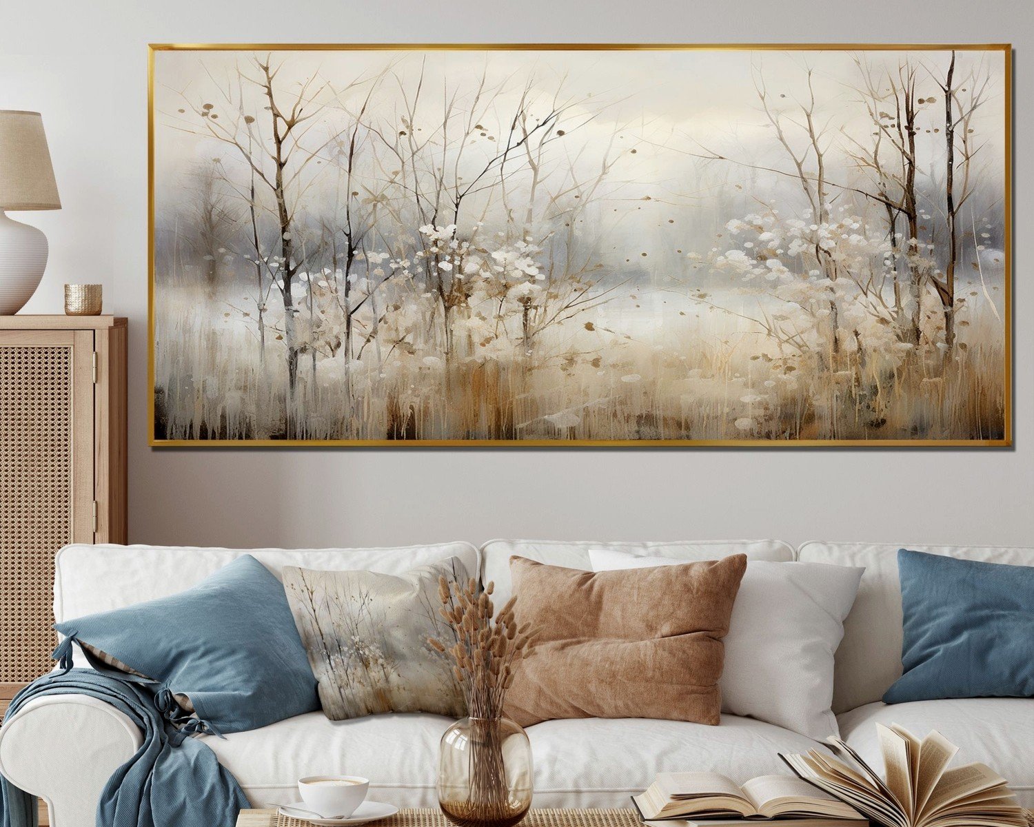
Honestly this is the easiest route. Abstract works with pretty much everything and doesn’t demand attention the way a giant portrait would. I’ve been using a lot of neutral abstracts lately, lots of beiges and creams with maybe a pop of terracotta or sage. It’s forgiving if your throw pillows change seasonally.
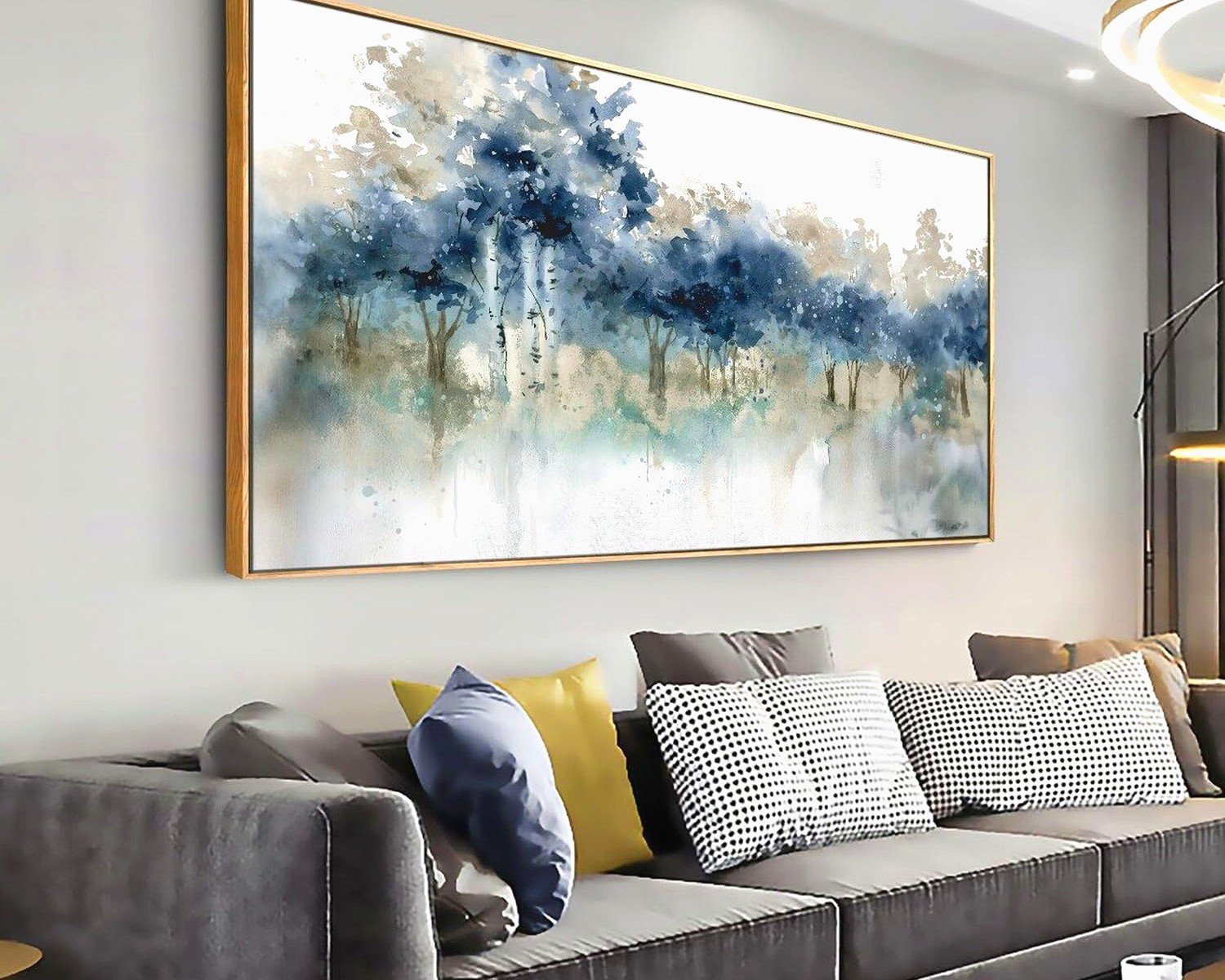
Landscape or Nature Photography
Works great if your room feels too urban or you want that calming effect. I did a series of three black and white mountain prints for my brother’s place and it completely changed the energy. Just make sure the frames are substantial enough, thin black frames can look cheap if the prints are large.
Line Drawings or Minimalist Prints
Super trendy right now but also timeless if you pick the right ones. Female figure line drawings, botanical sketches, architectural drawings. These work especially well if your room has a lot going on already because they’re visually quiet.
Frame Choices That Don’t Look Basic
Oh and another thing, frames matter way more than people think. I default to these options:
- Natural wood frames for warm, organic spaces
- Black frames for modern or when you want the art to pop
- White frames if your walls are white and you want a gallery feel
- Gold or brass frames for traditional or glam spaces but honestly these can go wrong fast
The biggest mistake is mixing frame colors in a gallery wall. Stick to one finish. I learned this after creating what I lovingly called “the chaotic wall of 2019” in my first apartment. Mixed metals, mixed woods, it was a disaster.
Matting Question
If you’re doing smaller prints, mats make them look more expensive and substantial. I usually do white mats even with black frames because it gives the eye a place to rest. Without mats, smaller prints can look cluttered when grouped together.
Gallery Wall Layouts That Don’t Require a PhD
Wait I forgot to mention the easiest way to plan a gallery wall. Trace your frames on kraft paper, tape the paper to the wall, move it around until it looks right, then nail through the paper. Remove paper after. Sounds extra but it saves so many unnecessary holes.
Grid Layout
Same size frames, arranged in a perfect grid. This is foolproof but can look a bit rigid. Works great in modern spaces. I did a 2×3 grid of 16×20 prints last month and it took maybe 30 minutes to hang once I had the measurements.
Salon Style
Different sized frames arranged organically but with some kind of alignment, usually along a central horizontal line. This is what I have behind my couch currently. It looks collected and interesting but you gotta spend time arranging it. I literally laid everything on the floor first and took a photo from above to see how it looked.
Horizontal Row
Three to five frames in a single horizontal line. Super clean, works in smaller spaces. The trick is keeping consistent spacing between frames, usually 2-3 inches.
Color Coordination Without Overthinking
Your art should pull colors from your room but not match exactly. If you’ve got blue throw pillows, maybe there’s some blue in the art. If your rug has terracotta, echo that. But don’t make it matchy-matchy or it feels staged.
I’ve been using this rule lately: pick three colors from your room and make sure at least one of them appears in your art. The other colors in the art can be whatever. This way it feels cohesive but not forced.
Budget-Friendly Sources That Don’t Look Cheap
Because not everyone has $2000 to drop on original art. I get it.
Printable Art from Etsy – You download, you print at a local print shop or online, you frame. I’ve done this probably 50 times. Quality varies but read reviews. Cost is usually like $5-15 per print plus printing and framing.
Artifact Uprising or Printique – Upload your own photos, they print them beautifully. I did a series of vacation photos this way and people always ask where I got them.
Society6 or Minted – More expensive than Etsy printables but they come framed. The quality is consistent which matters.
Thrift stores and estate sales – This takes time but you can find incredible stuff. I found a set of vintage botanical prints for $30 total last year and they’re my favorite thing in my living room.
Lighting That Makes Your Art Actually Visible
This is something people forget. If your art is backlit or in a dark corner, it doesn’t matter how perfect it is. I added picture lights above my gallery wall and it made such a difference at night.
Options:
- Picture lights that mount above the frame (battery-operated ones exist now)
- Track lighting aimed at the wall
- Wall sconces on either side of the art
- Floor lamp positioned to uplight the wall
The goal is to eliminate glare while making the art visible. I usually position lights at a 30-degree angle to avoid reflections on glass.
Common Mistakes I See Constantly
Hanging art too high – If you’re standing back and tilting your head up, it’s too high. This happens all the time in houses with vaulted ceilings where people think they need to fill vertical space.
Going too small – I mentioned this already but seriously, people are terrified of large art. Your wall can handle it. Go bigger than you think.
Not considering the couch style – A super ornate traditional couch with ultra-modern abstract art can work but it takes finesse. Usually it’s safer to keep the art style somewhat aligned with your furniture vibe.
Forgetting about the TV – If you’ve got a TV on the same wall or nearby, your art needs to either complement it or be far enough away that they don’t compete. I had a client with a TV on one side of the room and massive art behind the couch and it was like two focal points fighting for attention.
Temporary Solutions If You’re Renting
Command strips are your friend but they have weight limits so read the package. I’ve used them for frames up to about 5 pounds successfully. For heavier pieces, there are picture hanging systems that use one small nail and redistribute weight.
Leaning art on a console table behind the couch is also totally valid. Layer a couple pieces at different heights and it looks intentional. My brother does this because he moves every two years and refuses to put holes in walls.
Seasonal Swaps and Flexibility
Wait, one more thing. If you get bored easily like me, consider making your art setup modular. I have a few pieces I rotate seasonally. Warmer tones and landscapes in fall, lighter abstracts in spring. It’s extra but it keeps the room feeling fresh.
The easiest way to do this is with a picture ledge mounted behind the couch. You can swap out art without new nail holes every time. I installed one last year and it’s been great for testing new pieces before committing to hanging them.
Working With What You Already Have
If you’ve got art you love but it’s the wrong size, you can build around it. Add smaller pieces on either side, or put it on a larger mat, or create a gallery wall where it’s one of several pieces. I had this tiny painting my grandmother made and I built an entire wall around it by adding complementary prints and photos.
Just make sure the spacing between pieces in a gallery wall is consistent, usually 2-3 inches works. More than that and it starts looking disconnected, less and it feels crowded.
Anyway that’s basically everything I’ve figured out through trial and error. The main thing is just to commit to a size that feels too big and work from there, honestly most people’s instinct is to go too small and then it never looks quite right.