Wall Art Guide, Wall Art Tutoriels
Wall Art in Room: Placement & Display Ideas by Space
Jun
So I was literally rearranging my living room last Tuesday when my neighbor texted asking where to put this massive canvas she bought, and honestly? Most people get wall art placement completely wrong because they’re either too timid or they just slap it up without thinking about the actual room dynamics.
Living Room Wall Art That Actually Works
Okay so living rooms are tricky because they’re usually the biggest space and people panic. Here’s what I’ve learned after styling like 60+ living rooms (and redoing my own three times because I’m apparently incapable of leaving things alone):
The sofa wall is your anchor point. Whatever you hang there needs to be roughly two-thirds the width of your sofa. Not exact, but like… if your sofa is 90 inches, you’re looking at 60 inches of art width. This can be one piece or a gallery wall, doesn’t matter.
Height is where everyone messes up though. The center of your artwork should be 57-60 inches from the floor. I know everyone says 57 but honestly in rooms with higher ceilings I go up to 60. You want it at eye level, and most people hang stuff way too high because they’re thinking about the wall space instead of where their actual eyes are when they’re standing in the room.
Gallery Walls Without Losing Your Mind
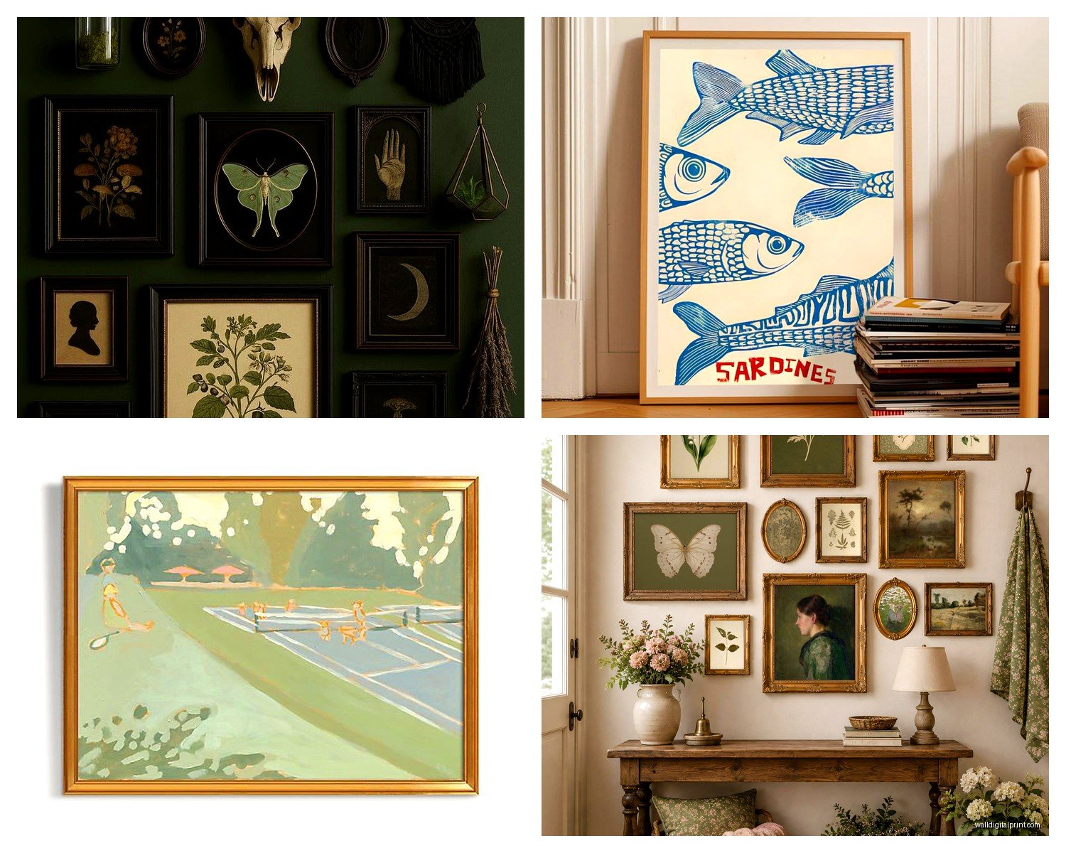
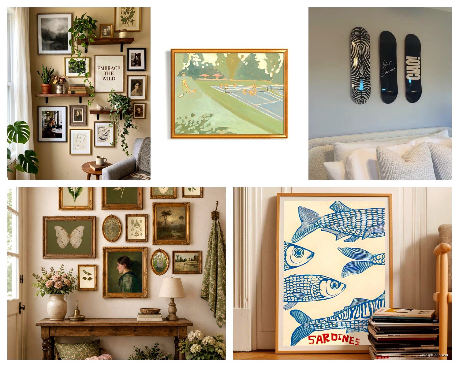
Gallery walls stress people out but they’re actually forgiving if you plan it right. I literally use painter’s tape on the floor to map out the arrangement before I touch the wall. Sounds excessive but I learned this after putting 47 nail holes in my bedroom wall in 2019 and having to repaint the entire thing.
Start with your largest piece and build around it. Keep spacing consistent—I do 2-3 inches between frames. Mix frame colors if you want but keep mat colors similar or it looks chaotic. My rule: no more than three frame colors in one gallery wall.
Oh and another thing, odd numbers work better visually. Five pieces, seven pieces, nine pieces. Even numbers feel too symmetrical unless you’re doing a really structured grid, which can look amazing in modern spaces but feels stiff in traditional rooms.
Bedroom Art Placement
Bedrooms are actually easier than people think. Above the bed is the obvious spot, but the art needs to be substantial enough to anchor that big piece of furniture. I usually go for something that’s at least 50-60% of the bed width.
Hang it about 6-8 inches above your headboard. Not 12 inches, not 3 inches. That middle range just works. I tested this in my own bedroom with different heights and took photos, and anything outside that range either floated too much or felt cramped.
If you don’t have a headboard, you can go lower—like 4-5 inches above where your pillows sit. But you gotta make sure it’s not gonna get damaged by someone sitting up in bed. Learned that one the hard way when my friend’s kid headbutted a frame and it shattered everywhere.
The Sides of Your Bed
This is gonna sound weird but I actually love art on the wall beside the bed, especially in smaller bedrooms where you can’t fit much above the headboard. Small to medium pieces—like 16×20 or 20×24—work great here. Hang them so the center is at sitting eye level, around 40-44 inches from the floor.
You can do matching pieces on both sides but honestly? I think it’s more interesting to do complementary pieces that aren’t identical. Same color palette, different subjects or compositions.
Dining Room Display Ideas
Dining rooms are my favorite to style because you can be more dramatic here. People are sitting down, so they’re actually looking at your walls more than in other rooms.
Large statement pieces work beautifully here—I’m talking 40×60 inches or bigger if you have the wall space. Or do a series of three vertical pieces. The vertical orientation works really well in dining rooms because it draws the eye up and makes the ceiling feel higher.
If you’re hanging above a sideboard or buffet, same rule as the sofa: leave 6-8 inches between the furniture and the bottom of the frame, and keep the art width to about two-thirds of the furniture width.
Wait I forgot to mention—dining rooms are great for more colorful or bold art because you’re not in there 24/7 like the living room. I went with this massive abstract piece in deep reds and oranges in my dining room and it would be overwhelming in my bedroom but it’s perfect for a space I’m only in for meals.
Corner Spaces
Corners in dining rooms always feel awkward but you can put smaller pieces there, maybe 8×10 or 11×14, clustered together. Or one medium piece. Just don’t leave corners completely bare if the room is small—it makes the space feel unfinished.
Hallways and Entryways
Hallways are actually super fun once you stop thinking of them as just passage space. You can do a whole progression of art down a long hallway—I did this with black and white photography in my last apartment and people always commented on it.
For narrow hallways, stick to smaller pieces or a single line of frames. If you try to do multiple rows it’ll feel crowded. I learned this by ignoring my own advice and creating what my sister called “a visual traffic jam” in my hallway.
Spacing between frames in a hallway: I do 3-4 inches. You want a little more breathing room since people are walking past, not sitting and contemplating.
Entryway Statements
Your entryway is literally the first thing people see so don’t be boring here. A large mirror works great (and makes small entryways feel bigger) but if you’re doing art, go bold. This isn’t the place for subtle watercolors unless that’s genuinely your whole aesthetic.
I have this massive botanical print in my entryway—it’s like 36×48—and it completely sets the tone for the rest of my place. Hang it at the standard 57-60 inches center point, unless you have a console table underneath, then adjust accordingly.
Bathroom Art That Won’t Get Ruined
Okay so bathrooms have humidity issues and people forget this. Don’t put anything valuable or paper-based in a bathroom without a good ventilation fan. I made this mistake with a vintage botanical print and it got wavy within like three months.
Go for prints with glass covering them, or better yet, canvas pieces that can handle moisture. Keep art away from direct shower spray obviously, but even steam can damage stuff over time.
Small bathrooms need small art—8×10 or 11×14 max. Anything bigger overwhelms the space. You can do a small gallery wall of 4-6 pieces if you want more impact.
My cat literally knocked a frame off my bathroom wall last month so also make sure things are secured properly, especially if you have pets who like to parkour off your toilet tank.
Home Office Wall Art
This is important because you’re staring at these walls during video calls and like, all day while you work. Behind your desk is prime real estate but remember: this is what other people see on Zoom.
I keep the art behind my desk relatively neutral and professional—not boring, just not like, super personal or controversial. Save the weird stuff for the walls you face while working, where only you see it.
Motivational quotes are fine if that’s your thing but they can read really cheesy on video calls. Just saying. I have one client who had this huge “HUSTLE” print behind her desk and… yeah, we moved it.
The Wall You Face
This is actually more important than the wall behind you. You’re looking at it constantly, so it needs to be something that doesn’t distract you but also doesn’t bore you into a coma.
I rotate art in my office every few months because I get sick of looking at the same thing. Easier to do with smaller pieces obviously. Right now I’ve got this abstract piece that’s mostly blues and greens, super calming, helps when I’m stressed about deadlines.
Above Furniture Placement Rules
This applies everywhere but it’s worth breaking out separately because people ask me about this constantly. When you’re hanging art above any piece of furniture—sofa, console table, dresser, whatever—the art should not be wider than the furniture piece.
Actually, it should be narrower. About 70-80% of the furniture width is the sweet spot. And leave that 6-8 inches of space between the furniture top and the frame bottom. Less than that feels cramped, more than that and the art floats away visually.
If you’re doing multiple pieces above furniture, treat them as one unit. The combined width should still be 70-80% of the furniture width, and keep the spacing between pieces consistent.
Leaning vs Hanging
Okay so leaning art is having a moment and I actually love it for rental situations or if you’re commitment-phobic about nail holes. You can lean large pieces on mantels, console tables, dressers, even the floor against the wall.
The trick is layering. Don’t just lean one piece—do 2-3 pieces at different heights. Overlap them slightly. Add a small plant or object in front. This creates depth and looks intentional instead of like you just haven’t hung your art yet.
I have a whole situation on my bedroom dresser with three different frames leaning—a large one in back, medium one overlapping it, small one in front. Took me like 20 minutes to get the composition right but now I can change it up whenever I want without dealing with holes in the wall.
Floor Leaning for Large Pieces
Really large pieces—like 40×60 or bigger—can lean directly on the floor against the wall and look super intentional. This works best in bedrooms and living rooms. Make sure the piece is heavy enough that it won’t tip over, or use those museum putty things to secure the bottom.
I’m watching this design show while writing this and they literally just did a floor-leaning piece in someone’s bedroom, so yeah, it’s definitely a thing.
Lighting Your Wall Art
This is gonna sound extra but lighting makes such a huge difference. If you have art you actually care about, add picture lights or use track lighting to highlight it. The shadows and depth this creates totally transforms how the art looks.
In my living room I have two small picture lights on my main pieces and people always think the art is way more expensive than it actually is because the lighting makes it look gallery-quality.
If picture lights aren’t an option, just make sure you have good ambient lighting in the room. Art in dark corners might as well not exist.
Anyway, that’s basically everything I’ve learned from years of putting holes in walls and moving things around at midnight because I suddenly decided the placement was wrong. The main thing is to actually commit and put stuff up—you can always move it later, and nail holes are easy to fix. Don’t let perfect be the enemy of done or whatever that saying is.