Wall Art Guide, Wall Art Tutoriels
Wall Art Drawing: Sketch Illustration Line Art Designs
Jun
So I’ve been messing around with line art in my own space for like three years now and honestly it’s one of those things that looks super minimal and easy but there’s actually a whole strategy to not making your walls look like a boring doctor’s office.
First thing – and I cannot stress this enough – size matters way more than you think. I see people buying these tiny 8×10 prints and hanging them on massive walls and it’s just… no. You want your main pieces to take up about two-thirds to three-quarters of the width of your furniture below it. So if you’ve got a couch that’s 84 inches wide, you’re looking at something around 50-60 inches across. That might mean one large piece or a gallery wall situation.
The gallery wall thing is where people get stuck though. I literally spent four hours last Tuesday helping a client arrange line drawings in her hallway because she’d already put like twenty nail holes in the wall. Here’s what actually works – lay everything out on the floor first in the exact arrangement you want. Take a photo from directly above. That’s your template. Use painter’s tape on the wall to mark where each piece goes before you commit to nails. Sounds basic but you’d be shocked how many people skip this and end up with wonky spacing.
Picking Your Style Without Looking Like Everyone Else
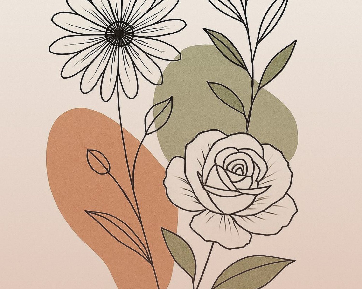
Okay so line art comes in basically a few categories and mixing them is where people either nail it or make it look chaotic. You’ve got your figure drawings – like those one-line face profiles or body silhouettes that were everywhere in 2019. Then there’s architectural line drawings, botanical sketches, abstract geometric stuff, and those continuous line illustrations.
What I tell people is pick ONE dominant theme and then you can sprinkle in other styles as accents. Like my living room is mostly botanical line drawings – super detailed plant illustrations – but I threw in one abstract face profile above my bar cart and it works because the line weight is similar. The line weight thing is key actually. If you mix thick bold lines with super delicate whisper-thin lines, it can look messy unless you really know what you’re doing.
I made this mistake in my first apartment where I had this gorgeous thick-lined abstract piece next to these delicate fern sketches and it just felt… off. My cat kept knocking the smaller frames down anyway so I eventually reorganized the whole wall.
Frame Colors and Matting
This is gonna sound weird but the frame matters more than the actual artwork sometimes. Black frames are safe and they work with literally everything but they can read heavy. White or natural wood frames feel lighter and more Scandinavian. I’m obsessed with natural oak frames right now – they warm up line art that might otherwise feel too cold or sterile.
Matting is where you can really elevate cheap prints. A good thick mat – like 3-4 inches on all sides – makes even a $15 Etsy print look expensive. I usually go with white or off-white mats for line art because colored mats can compete with the simplicity of the drawings. Although I did see someone use a deep charcoal mat with white line art on black paper and it was stunning in a moody bedroom.
Where to Actually Hang This Stuff
Eye level is supposed to be 57-60 inches from the floor to the center of the artwork but honestly in a room where you’re mostly sitting – like a living room or dining room – you can go a bit lower. I usually do 54-56 inches in those spaces.
Behind the sofa is obvious but also think about:
- Above a console table in an entryway
- In the bathroom – people forget about bathrooms but a simple line drawing looks amazing
- Bedroom wall opposite your bed so it’s the first thing you see
- Hallways but only if they’re wide enough that you can step back and actually see the art
- Kitchen if you’ve got blank wall space near your table
I have this one client who put a series of herb line drawings in her kitchen and it’s such a vibe. Way better than the generic “EAT” sign she had before.
The Gallery Wall Formula That Actually Works
Okay so if you’re doing a gallery wall with multiple line art pieces, here’s my formula that I’ve used like fifty times and it always works:
Pick 5-9 pieces total. Odd numbers look better. Start with your largest piece – that’s your anchor. Position it slightly off-center, not dead center. Then build around it with smaller pieces. Keep your spacing consistent between frames – I use 2-3 inches between each frame.
The template method I mentioned earlier is crucial here but also, there’s this trick where you cut out paper templates the exact size of your frames and tape those to the wall first. You can rearrange paper way easier than filled frames. I learned this after dropping a frame on my foot trying to hold it up and check placement at the same time.
Color-wise for the actual artwork, monochrome is safest – all black line drawings on white backgrounds. But you can mix in one or two pieces with a single accent color if you wanna be slightly more adventurous. I’ve got mostly black line art but two pieces have this rust orange color and it ties into my throw pillows.
Mixing Line Art with Other Art Styles
This is where it gets fun but also where you can mess up. Line art plays really well with:
- Black and white photography
- Watercolor pieces that have a lot of white space
- Abstract art with minimal color palettes
- Typography prints if they’re simple
It does NOT play well with:
- Super colorful busy paintings
- Heavy ornate frames mixed with modern line art
- Anything too rustic unless your line art has a hand-drawn sketchy quality
I tried mixing my line drawings with this vibrant abstract painting I got at a street fair and it was a disaster. Ended up moving the painting to my office and keeping the living room more cohesive.
Budget Options vs Splurge-Worthy Pieces
Look, you don’t need to spend $500 on every piece. I mix cheap prints with investment pieces all the time. Etsy and Desenio have great affordable line art prints – like $10-30 range. Print them yourself at a local print shop on nice paper and they look way more expensive. I use a print shop near me that does museum-quality printing and it’s only like $25 for a large print.
For frames, IKEA’s Ribba frames are actually solid for the price. But if you’re doing a big statement piece, invest in a nicer frame. I like Framebridge for custom framing – it’s pricey but worth it for your main focal point.
Original line drawings from actual artists – yeah those can run you $200-800 depending on the artist but there’s something cool about having an original. I have one commissioned piece in my bedroom that an illustrator friend did and every time someone asks about it I love saying it’s one of a kind.
Common Mistakes I See All the Time
Hanging things too high is like the number one issue. If you’re straining your neck to look at it, it’s too high. Another thing is not considering the room’s lighting. Line art can get washed out in really bright direct sunlight, so think about glare. I use museum glass on my favorite pieces to reduce glare – it’s expensive but makes a huge difference.
Also people forget to step back. Like way back. What looks good from two feet away might look weird from across the room where you’ll actually be viewing it most of the time.
Oh and another thing – themed sets can look cheesy if you’re not careful. Like those matching “inhale/exhale” prints or the “hello/goodbye” entrance sets. If you’re gonna do word art mixed with line drawings, make sure it’s not too literal or cutesy unless that’s specifically your vibe.
Creating Movement and Flow
This sounds fancy but it just means your eye should move naturally across the wall. I usually do this by varying the heights slightly in a gallery wall, or by choosing pieces that have directional lines pointing in different ways. Like if you have three figure drawings, don’t have them all facing the same direction – it’s more interesting if they interact differently with the space.
Diagonal arrangements work better than perfectly straight grids for line art because the art itself is already so structured and geometric. A little asymmetry keeps it from feeling too stiff.
Wait I forgot to mention – if you’re renting and can’t put a ton of holes in the walls, lean larger pieces on mantels or shelving units. Layer them with smaller pieces in front. It’s very editorial and you can change things up easily. I did this in my last apartment and honestly preferred it to hanging everything.
Specific Room Recommendations
Bedroom: Keep it calm. Single-line face profiles or abstract organic shapes work great. Avoid anything too busy or energetic. I have two simple line drawings of reclining figures above my bed and they’re perfect – interesting enough to look at but not so stimulating that they mess with sleep vibes.
Living Room: This is where you can go bigger and make statements. Botanical line drawings, architectural sketches, abstract compositions. Group smaller pieces or go with one large statement piece. Think about what you’ll see from your couch.
Home Office: Motivational without being cheesy – maybe architectural drawings of buildings, maps done in line style, or geometric patterns. I’ve got city skyline line drawings in my office and they feel professional but still interesting.
Bathroom: People sleep on bathroom art but it’s such a good spot for line drawings. Botanical stuff, simple abstract shapes, even cheeky figure drawings if that’s your thing. Just make sure frames are sealed properly because humidity.
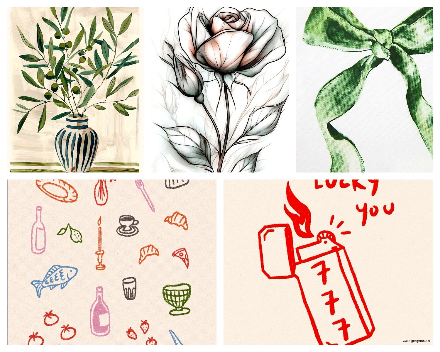
Kitchen/Dining: Food illustrations, herb sketches, wine bottle line drawings, or abstract pieces that complement your color scheme. Keep it fun and light.
The thing about line art is it’s having a moment right now but it’s also kinda timeless? Like it won’t look dated in five years the way some trends will. Just avoid anything too meme-y or overly trendy with the subject matter.
And honestly if you’re stuck just start with one piece you really love and build from there. I started with one botanical print I found at a flea market and now I have like twenty coordinating pieces throughout my apartment. It evolved naturally and that’s way better than trying to plan the whole thing perfectly from the start.