Wall Art Guide, Wall Art Tutoriels
Coffee Wall Art: Cafe-Inspired Kitchen & Dining Decor
Jun
So I’ve been obsessing over coffee wall art lately because my own kitchen looked so boring and I kept thinking about this cafe I went to in Portland that had the most amazing vibe. And honestly it’s not that hard to pull off at home but there are definitely some things I wish someone had told me before I started.
Finding the Right Coffee Art Style
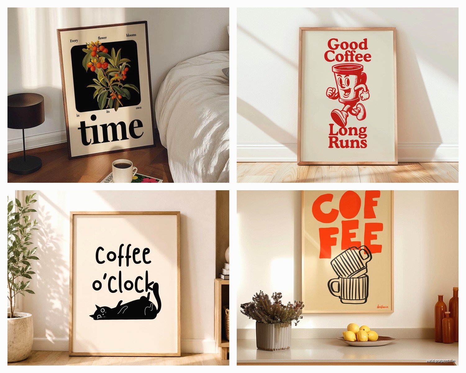
The biggest mistake is thinking all coffee art looks the same. It really doesn’t. You’ve got vintage coffee ads which are super fun but can read as kitsch if you’re not careful, then there’s minimalist line drawings of coffee cups, botanical prints of coffee plants, typography prints with coffee quotes, and then like abstract stuff that just feels coffee-shop-ish without being literal about it.
I started with vintage ads because I thought they’d be easy. Bought three prints from this Etsy shop and they looked amazing online but when they arrived they were SO orange-toned. Like way more than the photos showed. Ended up keeping one above my coffee station but returned the other two. The one I kept is this French coffee advertisement from the 1920s and it works because my kitchen has warm wood tones already.
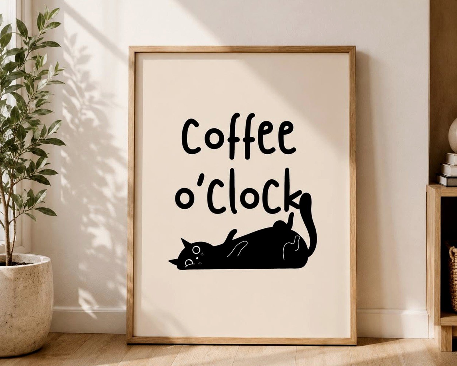
Typography prints are honestly the easiest to work with. Something like “But First Coffee” or just the word “Espresso” in a nice font. I know they’re kind of basic but they actually work really well as part of a gallery wall. Don’t make them the centerpiece though or it’ll look like a HomeGoods exploded in your kitchen.
What Actually Works in Different Spaces
Kitchen coffee art needs to handle humidity and potential splashes. This sounds obvious but I ruined a watercolor print by hanging it too close to my sink. Now I only use prints behind glass or canvas prints in the actual kitchen workspace area.
For dining rooms you have more flexibility. I did a whole wall of coffee-related botanical prints for a client last year and it looked incredible. We used these vintage-style illustrations of coffee plants, the flowers, the cherries, the beans at different stages. Got them all from the same seller on Etsy so they had a cohesive style. Framed them in simple black frames, different sizes but all the same frame style. That’s key actually.
Oh and another thing, if you have a breakfast nook situation those tall narrow spaces are perfect for a vertical coffee-themed print. Like a stack of coffee cups or a tall coffee plant illustration.
Size and Placement Rules That Actually Matter
Okay so everyone says your art should be 2/3 the width of your furniture and that’s… mostly true? But with kitchen and dining stuff it’s different because you’re often hanging above appliances or between cabinets or in weird spaces.
Above a coffee bar or beverage station I’ve found that 16×20 inches is the sweet spot. Big enough to make an impact but not so big it overwhelms the counter below. If you go bigger like 24×36 you need at least 5 feet of counter space below it or it looks unbalanced.
For dining room walls where you’ve got more space, go bigger. I did a 30×40 canvas print of coffee beans in macro for my own dining room and it’s honestly one of my favorite things. It’s abstract enough that it doesn’t scream COFFEE but if you know you know.
The height thing trips people up. You want the center of your art at eye level which is usually 57-60 inches from the floor. But in kitchens where you’re standing at counters a lot I actually hang things slightly higher, maybe 60-65 inches at center. In dining rooms stick with the 57 inch rule.
Gallery Walls vs Single Statement Pieces
I’ve done both and honestly it depends on your vibe. Gallery walls are more work but they let you mix different coffee themes without it looking too literal.
My favorite gallery wall formula for coffee stuff is: one large vintage ad (16×20), two medium botanical prints (11×14), three small typography or simple illustrations (8×10). Arrange them before you hammer anything. I use painter’s tape on the wall to map it out because I’m terrible at visualizing space.
Wait I forgot to mention, if you’re doing a gallery wall keep your frames consistent. All black, all wood, or all white. Don’t mix metals and woods together unless you really know what you’re doing. I learned this the hard way when I mixed brass and black frames and it looked like I’d decorated over ten years without a plan.
Statement pieces are easier honestly. One large canvas or framed print, done. I love those oversized coffee cup photos for this. There’s this one print I keep recommending to clients, it’s a latte with really pretty foam art, shot from above. Sounds basic but it’s actually really striking at 36×36 inches.
Colors That Work With Coffee Themes
Coffee art is naturally brown, beige, black, cream, you know. Which is great if your kitchen is neutral but can look muddy if you’re not careful.
I always try to pull one accent color through. Like if you have blue cabinets, find coffee art that has even just a touch of blue in it. Could be the background color, could be part of the design. This one client had sage green cabinets and we found these coffee plant illustrations with green leaves and it tied everything together perfectly.
Black and white coffee photography is super safe and works with literally everything. Can’t go wrong with black and white shots of espresso machines, coffee beans, cups, whatever. They add interest without adding color which is sometimes exactly what you need.
My cat just knocked over my water bottle but it’s fine. Anyway.
If you have a colorful kitchen, go for vintage coffee ads because they often have pops of red, yellow, blue. That vintage advertising color palette somehow works with everything.
Where to Actually Buy This Stuff
Etsy is honestly my go-to for coffee wall art. You can find vintage reproduction prints, digital downloads that you print yourself, original art, whatever. Just read the reviews because quality varies wildly.
For digital downloads, print them at a local print shop not your home printer. I tried printing an 11×14 on my inkjet and it looked terrible. Took the same file to FedEx Office and it was perfect. Cost like $8.
Society6 and Redbubble have tons of coffee art and they print on demand which means you can get the same design as a framed print, canvas, whatever. The quality is pretty good. I’ve ordered from both and honestly Society6’s framing is nicer but Redbubble has more designs.
If you want something really unique, commission an artist. I found this watercolor artist on Instagram who painted my actual coffee setup, like my specific espresso machine and favorite mug. Cost $150 but it’s completely one of a kind and everyone asks about it.
This is gonna sound weird but also check museum shops online. The Met and other museums have coffee-related prints in their collections, historical advertisements and stuff. The reproduction quality is usually excellent because museums don’t mess around.
DIY Options That Don’t Look DIY
Okay so funny story, I needed coffee art for a rental kitchen where I couldn’t make holes in the walls. Ended up creating my own using command strips and some creativity.
You can buy coffee-themed scrapbook paper or wrapping paper, frame it, and it looks legit. Did this with some vintage coffee label designs I found. Framed them in IKEA frames and nobody knew they started as wrapping paper.
Another trick is printing your own coffee photos. If you have a nice camera or even a good phone camera, style some coffee shots. Stack some vintage coffee tins, arrange beans in a bowl, whatever. Print them large and they look professional. I did this for my breakfast nook with photos of my actual vintage coffee grinder collection.
Oh and you can make typography prints super easily. Use Canva or even just Word, type out a coffee quote in a nice font, adjust the sizing, print it. Put it in a frame and boom. I made three of these for like $20 total including frames.
Framing Options and Why They Matter
Frames make such a huge difference it’s almost annoying. The same print looks completely different in a cheap frame versus a nice one.
For kitchens I like simple frames without a lot of detail. Black metal frames are my favorite because they’re modern and don’t compete with the art. Wood frames work great in traditional kitchens or if you’ve got wood cabinets.
White frames can work but they show dirt in kitchens. Just being honest about that.
Mat or no mat? I usually say yes to mats because they make even small prints look more substantial. A 5×7 print in an 11×14 frame with a mat looks way better than a 5×7 print in a 5×7 frame. But mats are expensive so if you’re on a budget skip them and just size your prints to fit your frames exactly.
If you’re getting stuff framed professionally, go to a local frame shop not Michael’s. Yeah it costs more but the quality difference is huge. Although Michael’s is fine for basic stuff honestly, and they always have 50% off coupons.
Styling Around Your Coffee Art
The art shouldn’t exist in isolation. You gotta style around it a bit or it looks random.
If you have coffee art above your coffee station, add some coordinating elements below. Vintage coffee tins, a nice espresso machine, maybe some coffee table books about coffee. Create a whole vignette.
In dining rooms, echo the colors from your art in your table settings. If your coffee print has warm browns and creams, use those tones in your placemats or napkins sometimes. Doesn’t have to be matchy-matchy but there should be some visual connection.
I also like adding real coffee elements as decor. A bowl of coffee beans, some vintage coffee scoops, whatever. It reinforces the theme without being over the top.
Lighting Considerations
Don’t hang valuable prints in direct sunlight, they’ll fade. Learned this when a print I loved got completely washed out over one summer. Now I only put cheaper prints or canvases in sunny spots.
If you have under-cabinet lighting in your kitchen, position your coffee art where it’ll get some of that light. It really makes the colors pop at night.
For dining rooms, consider adding a picture light above a large coffee art piece. Creates a gallery feeling and makes dinner parties feel fancier.
Mixing Coffee Art With Other Kitchen Art
You don’t have to make your whole kitchen coffee-themed unless you really want to. I usually mix coffee prints with other food or beverage art.
Coffee pairs well with wine art, general food illustrations, herb prints, vintage food advertisements. Keep the style consistent even if the subjects vary. Like all vintage ads, or all botanical illustrations, or all black and white photography.
One wall could be coffee-focused and another could be herbs or vegetables or whatever. Just don’t put them right next to each other or it looks confused.
The key is creating zones. Coffee art near the coffee station or breakfast area, other food art near the stove or dining table.
What to Avoid
Okay so things that don’t work. Live laugh love style coffee quotes. They’re just tired at this point. If you want typography go for something more unique or just the word “coffee” in a pretty font.
Overly cutesy stuff unless that’s really your vibe. Like cartoon coffee cups with faces. It can work in a playful kitchen but usually looks dated.
Too many different frame styles in one space. Pick a frame style and stick with it for all your coffee art at least.
Hanging art too high. This is the number one mistake I see. Your art should feel connected to your space not floating near the ceiling.
Super literal coffee art everywhere. Like if every single piece says COFFEE or shows a coffee cup it’s too much. Mix in some abstract pieces or botanical prints that just suggest coffee without screaming it.
And honestly don’t spend a fortune unless you really love something. Some of my favorite coffee prints cost $15. The framing is usually where the money goes anyway.
I think that covers most of what I’ve learned through trial and error. The main thing is just start with one piece you really love and build from there. You don’t need a whole gallery wall on day one.