Wall Art Guide, Wall Art Tutoriels
Tropical Wall Art: Island Paradise Decor & Botanical Prints
Jun
So I’ve been basically living and breathing tropical wall art for the past six months and honestly it started because a client wanted their downtown loft to feel like Bali but not in that tacky tiki bar way, you know? And I fell down this whole rabbit hole of botanical prints and island vibes and now my own apartment looks like a jungle so here’s what actually works.
The Stuff That Actually Looks Good vs Tourist Trap Garbage
Okay so first thing – those mass-produced palm leaf prints from the big box stores? They’re fine if you’re gonna be strategic about it. I have one in my guest bathroom and it works because I paired it with actual texture. But if you’re going for that elevated tropical look, you need to think about layers and not just slapping up a banana leaf poster and calling it done.
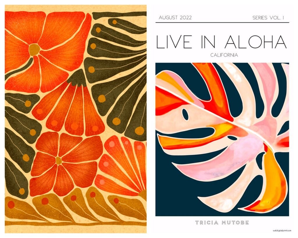
The prints that actually look expensive are the vintage botanical illustrations. Like the kind that look like they came from old science textbooks? Those are chef’s kiss. I found this set of antique monstera prints on Etsy from a seller who basically digitizes old botanical drawings and they were like $40 for three 11x14s. Framed them in simple black frames from IKEA and people literally ask if they’re original vintage every time.
What I Actually Buy and Where
Real talk – I source from like five places depending on budget:
- Etsy for vintage botanical reproductions and indie artists doing watercolor tropical stuff
- Minted when I need something more polished and the client has budget
- Society6 for those really artsy interpretive pieces
- Local art fairs because sometimes you find someone doing incredible palm photography
- Okay this is gonna sound weird but estate sales – old people had the BEST tropical prints from the 70s and 80s
The estate sale thing I discovered by accident when I was looking for a vintage credenza and walked out with this massive framed bird of paradise print that’s now the centerpiece of my dining room wall. Cost me $15 and it’s the real deal, like actual art.
Color Schemes That Don’t Make It Look Like a Kids Playroom
Here’s where people mess up – they think tropical means bright primary colors everywhere. And yeah, tropical places have color, but the sophisticated version is way more nuanced.
I usually stick to one of three palettes:
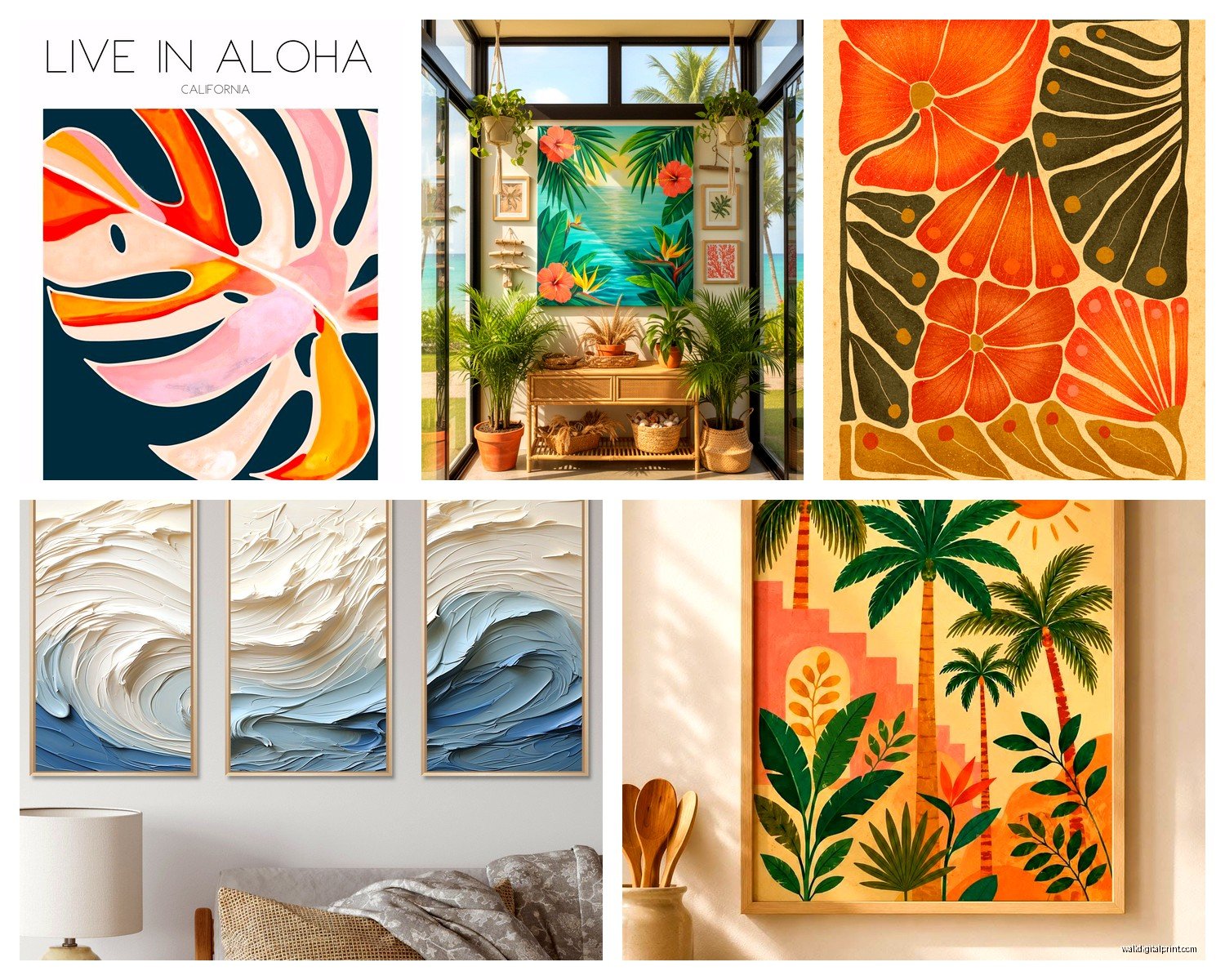
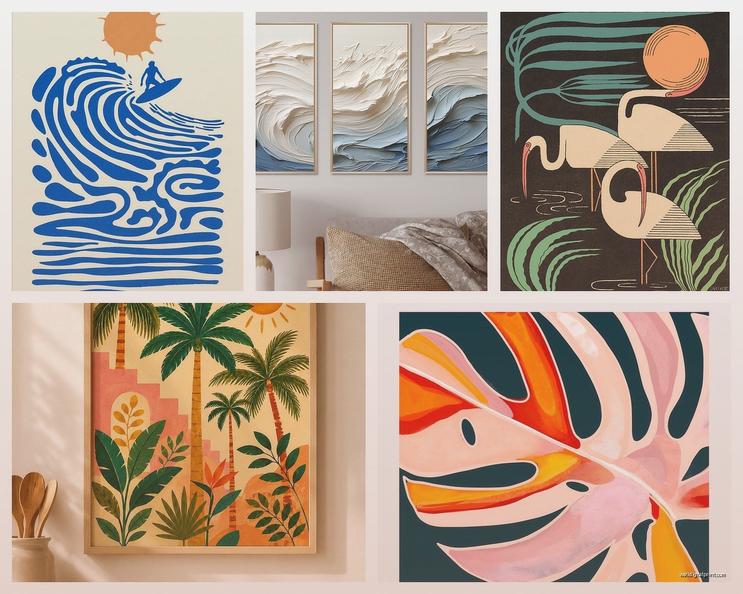
The first is what I call “green and neutral” which is literally just various shades of green botanical prints with white/cream/beige backgrounds. This is the easiest to pull off and works in literally any room. My living room is this – I’ve got seven different botanical prints in various sizes, all with white backgrounds, all in matching black frames. Sounds like it would be boring but the different shades of green and the various plant types make it interesting.
Second palette is “sunset vibes” – think coral, terracotta, dusty pink, with pops of teal or turquoise. This one’s trickier because it can go south fast if the tones are too bright. I did a bedroom last month with this scheme and the key was keeping everything slightly muted. Watercolor prints work really well for this because they have that soft bleeding color quality that doesn’t feel harsh.
Third is “moody tropical” which is my personal favorite right now. Dark backgrounds – navy, charcoal, even black – with bright green or colorful tropical elements. There’s this print I’m obsessed with from an artist who does monstera leaves on black backgrounds with gold accents and it’s just *dramatic* in the best way.
Size and Placement Because This Is Where Everyone Screws Up
I cannot stress this enough – people buy art that’s too small. Like way too small. If you’ve got a standard 8-foot wall, you need art that’s at least 24 inches wide at minimum. Preferably bigger. One large statement piece or a gallery wall that takes up significant space.
My rule is the art should take up about 2/3 to 3/4 of the wall width. So if you’ve got a couch that’s 84 inches wide, you want your art situation above it to be roughly 56-63 inches wide. You can achieve this with one massive piece or a gallery wall arrangement.
Oh and another thing – hang stuff at eye level which is usually 57-60 inches from the floor to the CENTER of the artwork. Not the bottom, the center. I see this mistake constantly and it makes everything look off.
Gallery Wall Configurations That Work
Okay so I’ve done probably 30 tropical gallery walls at this point and here’s what actually works:
The grid layout is foolproof. Same size frames, same matting, arranged in a perfect grid. I did a 3×3 grid of 11×14 botanical prints in a hallway and it’s stunning. Very organized, very clean.
The salon wall is harder but more interesting – different sized frames arranged organically. The trick here is to lay it ALL out on the floor first. Take a picture. Move stuff around. Take another picture. Don’t commit to putting holes in the wall until you’re 100% sure. I use painter’s tape to mark where frames will go before I start hammering.
The leaning method is honestly my favorite for tropical art because it feels more casual and beachy. Get a picture ledge (IKEA has good ones) and lean frames on it in layers. You can easily switch stuff out and it doesn’t feel as permanent and stuffy.
Mixing Prints with Other Tropical Elements
This is where it gets fun – tropical wall art shouldn’t exist in a vacuum. I always tell people to think about the whole vibe.
Pair botanical prints with actual plants. Like real ones. The combo of art plants and real plants makes everything feel more intentional and lush. I’ve got a massive monstera in the corner of my living room that basically echoes the monstera prints on my wall and it just works.
Texture is huge. If you’re doing tropical prints, bring in natural materials – rattan, bamboo, jute, linen. A botanical print in a bamboo frame hits different than the same print in a metal frame. I switched out all my frames last year to natural wood and bamboo and it completely changed the feel.
Wait I forgot to mention – lighting matters so much. If you’ve got botanical prints with dark backgrounds, you need good lighting on them or they disappear into the wall. I added picture lights above my moody tropical pieces and it made them actually visible at night.
The Actual Prints and Artists I Keep Going Back To
There’s this artist on Etsy – I think the shop is called “Vintage Botanical Prints” or something – who does reproductions of Pierre-Joseph Redouté’s work and they’re incredible. Museum quality digital prints for like $12. I’ve probably bought 20 from them at this point.
For more modern tropical stuff, I’m obsessed with anyone doing abstract palm leaves. There’s a trend right now of like minimalist line drawings of tropical plants and when you do a whole wall of them it’s really striking. Very different from the traditional botanical illustration vibe but still clearly tropical.
Photography prints of tropical beaches and landscapes can work but they have to be really good quality. I’m talking professional photographer level stuff, not iPhone vacation pics (I learned this the hard way when a client wanted to frame their honeymoon photos and they just looked… bad). If you’re gonna do beach photography, look for shots with interesting composition – dramatic clouds, unique angles, not just a basic beach snapshot.
DIY Options If You’re Crafty or Broke
My sister wanted tropical art but had zero budget so we got creative. Pressed real palm fronds between glass in cheap frames – looked amazing and cost basically nothing except the frames. You can also do this with ferns and other tropical-looking leaves if you don’t live somewhere with palm trees.
Print your own from free sources – lots of museums have digitized their botanical collections and you can download high-res images for free. The Smithsonian, New York Public Library, Biodiversity Heritage Library… just print them at a local print shop on good paper and frame them. I did this for my powder room and spent maybe $60 total for three large prints.
Painted my own once when I was watching that baking show and got inspired – just abstract palm leaves in acrylic on canvas. It’s not amazing but it’s big and fills space and nobody knows I made it unless I tell them.
What Doesn’t Work and What I’ve Wasted Money On
Canvas prints usually look cheap unless you’re spending serious money. The texture is wrong and they often have this weird sheen. Stick with paper prints in frames.
Those peel and stick wall decals of palm trees – just no. They always look like decals. Maybe okay for a kids room but not if you’re going for sophisticated tropical.
Mixing too many different tropical themes gets messy fast. Like don’t do palm leaves AND hibiscus flowers AND pineapples AND flamingos all together. Pick a lane. I usually stick to either botanical/foliage OR tropical flowers OR beach/ocean themes in any given space, not all of them mixed together.
Super bright neon tropical prints might look good in photos but in person they’re overwhelming. I bought this huge flamingo print once that was so aggressively pink it gave everyone a headache. Returned it and got something with softer tones.
Room by Room What Actually Makes Sense
Living room is where you can go biggest and boldest. This is statement piece territory. I’ve got a 40×60 palm leaf print above my couch and it’s the first thing people notice when they walk in.
Bedroom should be more calming – I lean toward the green and neutral palette here. Botanical prints in soft colors. Save the dramatic stuff for other rooms.
Bathroom is perfect for smaller botanical prints, especially if they have that vintage scientific illustration vibe. Humid environment means you gotta make sure frames are sealed well though or you’ll get moisture damage.
Kitchen can handle fruit prints – tropical fruits like pineapple, papaya, banana – but keep it classy. Small prints, good frames, not cutesy.
Home office is where I do the moody tropical stuff because it feels sophisticated and helps with the “I’m working from my island villa” fantasy which let’s be honest is what we’re all going for here.
Framing Because It’s Half the Battle
Standard frames from Michael’s or IKEA work fine if you’re doing a cohesive gallery wall where they’re all the same. I usually go with simple black or natural wood – nothing ornate or distracting.
For statement pieces, invest in custom framing. I know it’s expensive but a really good frame elevates everything. I had a meh tropical print custom framed with a linen mat and suddenly it looked like a $500 piece of art.
Floating frames where the print is between two pieces of glass look incredible for botanical prints especially. Very modern and clean.
No frame at all can work if you’re mounting prints directly to boards or foam core. I’ve done this with vintage-style prints and it has this cool unfinished look that feels artsy.
Keeping It From Feeling Themed
The difference between sophisticated tropical and tiki bar is restraint. You don’t need to telegraph ISLAND PARADISE with every single element. Let the art speak for itself and keep other decor relatively neutral.
I always mix in non-tropical elements so it doesn’t feel costumey. Modern furniture, industrial metals, contemporary accessories – these balance out the tropical prints and make everything feel more curated and less themed.
And honestly sometimes less is more. One perfect botanical print in a room can be more impactful than 47 palm leaf prints everywhere.
My cat just knocked over my coffee so that’s fun but yeah – tropical wall art is really about finding that balance between bringing in that lush, vacation-y feeling without making your house look like a resort lobby. Start with one or two pieces you really love, build from there, and don’t be afraid to edit down if it starts feeling like too much.