Wall Art Guide, Wall Art Tutoriels
NASA Wall Art: Space Exploration & Astronomy Decor
Jun
So I’ve been obsessing over NASA wall art lately and honestly it’s become this whole thing where I keep finding myself down these rabbit holes at like 11pm looking at vintage mission patches. Let me just dump everything I’ve learned because I’ve literally tested this in my own office and three client spaces in the past six months.
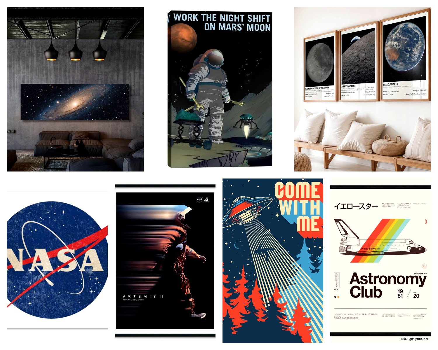
The Actual Good Stuff Worth Buying
Okay so first thing—you gotta decide if you want authentic NASA imagery or artistic interpretations because they hit completely different. The authentic stuff, like those Hubble telescope images, you can actually download for FREE from NASA’s website. Yeah. Free. High resolution and everything. I printed a massive Pillars of Creation image on canvas for like $40 at a local print shop and it looks insane in my hallway. My cat keeps staring at it which is either really profound or she sees a bug I can’t see.
But if you’re not into the DIY route, Art.com and AllPosters have licensed NASA collections that are already sized and framed. I got this framed set of the Apollo 11 mission patches for a client’s home office and the quality was actually solid for around $120 for three prints.
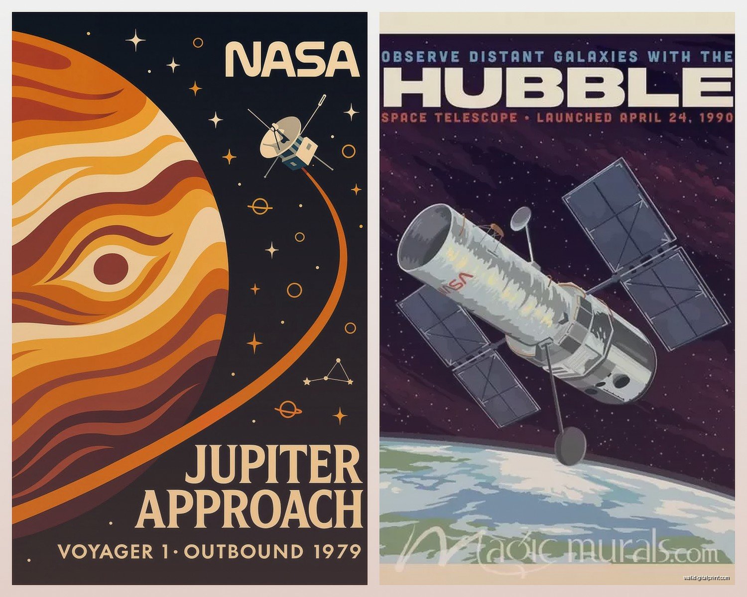
Vintage Mission Posters
Here’s where it gets fun. NASA’s Jet Propulsion Laboratory makes these retro-style space tourism posters that are absolutely gorgeous. They’re free to download too from their website. The ones for exoplanets like Kepler-16b and TRAPPIST-1e have this 1960s national park poster vibe. I printed the full set of like 14 posters and they’re stunning.
For printing these though—don’t cheap out and use your home printer. The colors will look washed out and you’ll be sad. I use a local print shop that does giclée printing or you can order through places like Printful or Nations Photo Lab. Size matters here because these were designed as digital art so they scale really well up to 24×36 inches without looking pixelated.
What Actually Works in Different Rooms
Living rooms need something with visual impact but not too busy. I learned this the hard way when I put a super detailed star chart above a client’s couch and it just looked… chaotic? Like there was too much happening. What worked better was a single large-scale image—either a planet (Saturn is always a winner) or a nebula with good color contrast.
The Carina Nebula prints work surprisingly well in living spaces because the gold and blue tones coordinate with a lot of existing color schemes. I’ve got one in my own living room and people always ask about it.
Home Offices and Studies
This is where you can go full space nerd. Mission patch collections, blueprint-style technical drawings of spacecraft, vintage NASA recruitment posters. I have a client who’s an engineer and we did an entire gallery wall of Apollo-era technical diagrams and it’s his favorite thing in his house.
The blueprint aesthetic works because it reads as sophisticated without being too literal. You can find these on Etsy—search for “NASA technical drawings” or “spacecraft blueprints.” Quality varies wildly though. Look for sellers who specify archival paper and actual print methods rather than just “printed poster.”
Oh and another thing—if you’re doing a gallery wall with space stuff, mix in some actual framed objects. I found vintage View-Master reels of the moon landing on eBay for like $15 and framed those alongside prints. Adds dimension.
Kids Rooms But Make It Not Juvenile
Parents always ask me how to do space themes that won’t feel babyish in two years. The trick is avoiding anything with cartoon astronauts or that super primary color palette.
Instead go with:
- Actual photographs from Mars rovers in black frames
- Constellation maps with clean, minimal design
- The solar system to scale (this one’s educational and looks clean)
- Vintage NASA poster reproductions
I did my nephew’s room with framed photos from the Curiosity rover and he’s obsessed. They’re just landscapes but they happen to be from another planet which is objectively cool.
Size and Placement Real Talk
Everyone hangs art too high. I see this constantly. The center of your artwork should be at 57-60 inches from the floor—that’s average eye level. For stuff above furniture, leave 6-8 inches between the furniture top and the bottom of the frame.
For big statement pieces like a massive nebula print, you want it to take up about 2/3 to 3/4 of the wall width it’s on. Too small and it looks like it’s floating awkwardly. I made this mistake in my own dining room and had to size up.
Framing Options That Don’t Suck
Okay so this is gonna sound weird but the frame matters more than you think with space imagery. I’ve tested a bunch of options:
Black frames work for literally everything. They’re the safe choice and they make the colors in nebula photos pop. I use the Ribba frames from IKEA for smaller prints (cheap and they look fine) or for nicer stuff, Framebridge does custom framing and their quality is legit.
White or light wood frames can work for more minimal spaces or if you’re going for that Scandinavian look, but be careful with really colorful space images—sometimes the contrast is too much.
Metal frames, especially in brass or copper tones, look amazing with vintage NASA posters. There’s something about the retro aesthetic that just works with warm metallics. I found some affordable options at Target actually.
For the blueprint-style technical drawings, I love using those thin black metal frames with white matting. Makes them look like they came straight from the archive.
Matting Yes or No
Generally yes for anything smaller than 16×20. The mat gives your eye somewhere to rest and makes the piece feel more substantial. White or off-white mats are your safest bet. I’ve tried black matting with space images and it can work but it’s tricky—sometimes it makes the piece feel heavy.
Where to Actually Buy This Stuff
Beyond the free NASA downloads (which again, seriously check out images.nasa.gov), here’s what I’ve found:
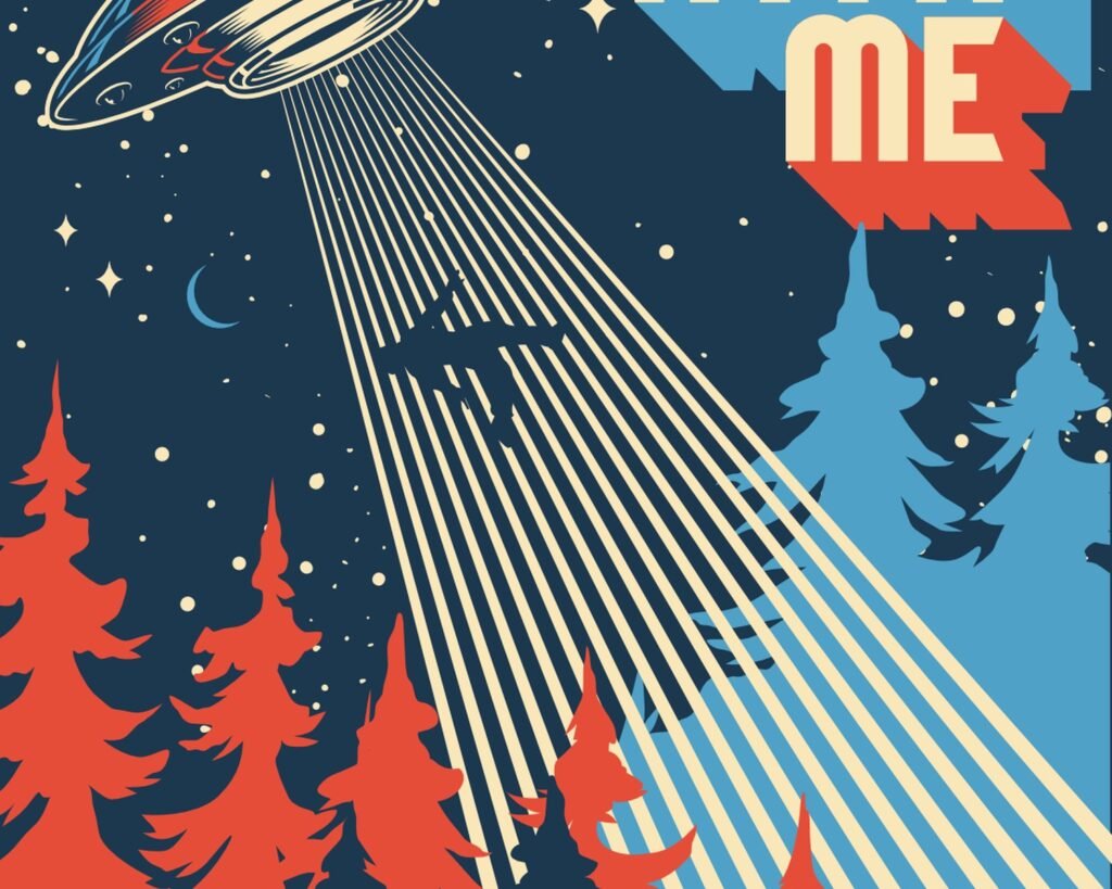
Society6 has tons of artists doing space-themed work. Quality is hit or miss depending on the artist but their return policy is decent. I got a really cool abstract interpretation of the Voyager Golden Record from there.
Etsy is where you find the weird specific stuff—vintage star charts, antique astronomy illustrations, custom constellation maps. Search terms that work: “vintage NASA,” “celestial map,” “astronomy print,” “space program poster.”
Redbubble is similar to Society6, lots of independent artists. Good for more artistic interpretations rather than straight photography.
For actual photography prints, look at NASA’s official partners or go straight to the source and download then print yourself.
The Canvas vs Print Debate
I used to be anti-canvas for photography because it can lose detail but I’ve changed my mind for certain space images. Nebulas and abstract cosmic imagery actually look pretty good on canvas—the texture adds something. But for anything with fine detail like technical drawings or vintage posters, stick with paper prints under glass.
Acrylic or metal prints are having a moment and they work really well for modern spaces. The colors are super vibrant and they have this gallery feel. More expensive though—expect to pay $150+ for a decent sized metal print.
Lighting Considerations Nobody Talks About
If you’re investing in nice space art, light it properly. Picture lights are great for smaller pieces or if you’re renting and can’t install track lighting. Battery operated LED picture lights have gotten really good—I use them in my apartment.
For gallery walls, track lighting or strategically placed can lights work better than individual picture lights. You want even illumination without glare on the glass.
Natural light is tricky with space photography because the colors can fade over time. UV-protective glass is worth it if the piece is getting direct sunlight. Or just don’t hang your expensive Hubble print in that spot.
Mixing Space Art with Other Stuff
You don’t have to go full space theme in a room. Actually it’s better if you don’t unless you’re doing like a dedicated space or office. I mix NASA imagery with other art all the time.
What works together:
- Space photos with abstract art in complementary colors
- Vintage NASA posters with mid-century modern design pieces
- Black and white moon photographs with other B&W photography
- Constellation maps with botanical prints (sounds random but the scientific illustration vibe ties them together)
I’ve got a gallery wall in my living room that’s got two nebula prints, a vintage botanical illustration, and a abstract geometric piece and somehow it all works because the color palette is cohesive.
The Color Palette Thing
Space imagery comes with built-in color schemes. Nebulas give you blues, purples, golds, oranges. Mars gives you rusty reds and browns. The moon is obviously going grayscale. Use these to inform your room colors or work with what you’ve already got.
If your room is mostly neutral, a colorful nebula print becomes your statement piece. If you’ve got color already happening, maybe go with B&W moon photography or those minimal line-drawing constellation maps.
DIY Options That Actually Look Good
Wait I forgot to mention—if you’re crafty at all, you can make some really cool stuff. I made a series of moon phase prints using NASA imagery and it cost me maybe $30 total for six frames.
Download high-res moon photos from NASA, edit them to be the same size and orientation in Photoshop or even Canva, print on good paper, frame in identical frames. Instant gallery wall.
Same concept works for planets, different nebulas, various Mars landscapes, whatever. The key is consistency in how you present them—same frame style, same matting, hung with equal spacing.
Okay so funny story, I was watching The Expanse while doing a project and got inspired to do this whole Martian landscape thing for a client’s basement bar. We used actual Mars rover photos printed large-scale and it legitimately looks like you’re on another planet down there.
Budget Breakdown Reality Check
You can do this at basically any price point. Here’s what I’ve spent on various projects:
Budget option ($50-100): Download free NASA images, print at Costco or local print shop, IKEA frames. Totally doable and looks fine.
Mid-range ($200-400): Mix of purchased prints from Society6/Etsy, nicer frames, maybe one custom framed piece as a focal point.
Investment level ($500+): Custom framing, larger format prints, metal or acrylic prints, gallery-quality matting, professional installation.
I’ve done all three and honestly the budget option can look just as good if you’re thoughtful about it. The main difference is in the details—the quality of the frame, the paper stock, whether there’s UV-protective glass.
The most important thing is that the imagery itself is high quality. A beautiful image in a cheap frame still looks pretty good. A mediocre image in an expensive frame still looks mediocre.
Installation Tips
Use a level. Seriously. Your eye can tell when something’s off even if it’s just slightly crooked. I use a laser level for gallery walls because trying to eyeball multiple pieces is a recipe for insanity.
For heavier pieces, use proper wall anchors. Drywall anchors for drywall, toggle bolts for hollow walls, masking tape won’t cut it no matter how much you use.
Gallery walls: lay everything out on the floor first, take a photo, measure it all, then transfer to the wall. Or trace your frames on kraft paper, tape the paper to the wall, adjust until it looks right, then nail through the paper and remove it.
Command strips work for lightweight frames but check the weight limits. I’ve had mixed results—they’re great for renters but I’ve also had frames crash down at 3am which is not fun.
Look, there’s obviously more I could say about this but you’ve got enough to get started. The main thing is just pick images you actually like looking at and don’t overthink it too much. Space stuff is inherently cool so it’s kinda hard to mess up completely.